I design books and the spaces they inhabit. Based in Amsterdam, I am engaging in the cultural field and occasional teaching.
Education:
DHBW Ravensburg/UOR Reading
(B.A.)
Werkplaats Typografie (M.A.)
Contributions/Features/Awards:
Rencontres d’Arles Book Awards, 2025 … 100 Beste Plakate, 2023 … Schönste Schweizer Bücher, 2022 … Schönste Bücher aus aller Welt, 2022 … Certificate of Typographic Excellence Tokyo TDC, 2021 … 2×Schönste Deutsche Bücher, 2020 … Weltformat Newcomer Award Nominee, 2019 … ADC Nagel Bronze – Junior Award, 2019 … Group exhibition at Chemnitz Open Space, 2019 … GDA – Newcomer Nominee, 2019 … Cnap publishing grant, 2019 … Förderpreis für junge Buchgestaltung (Shortlist), 2019
Workshops/Lectures:
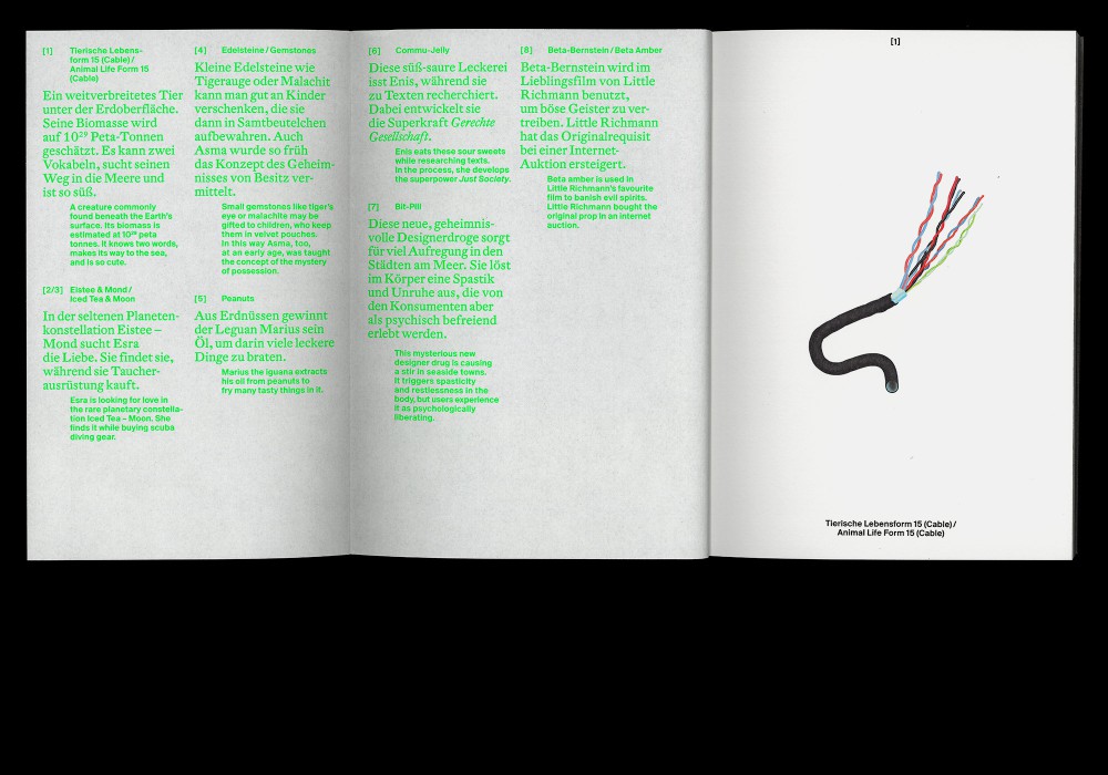
One Trick Pony, Design Academy (Hangzhou, China), 2024 … Residency at ESCAPE Gallery, Shanghai, 2024 … The Scent of new Binding, HSD Düsseldorf, 2024 … The List, Design Summer (Hangzhou, China), 2023 … The List, Pratt Institute (New York, USA) … Informationstypografie, DHBW Ravensburg, 2022–ongoing … Show your Grid, HGB Leipzig, 2023 … Editorial design module at HAW Hamburg (with Hanna Osen), 2022 … Typo Talk at Typografische Gesellschaft München (with Daniel Zenker), 2019
Selected Clients/Collaborators:
A24, The Bass Museum of Arts Miami Beach, Museum Folkwang, MdbK Leipzig, Pochen Biennale, Goethe-Institut, Thomas Mann House (L.A.), Stoschek Collection Düsseldorf, Spector Books, Akademie der Bildenden Künste Wien, DAM, Haus der Kulturen der Welt, Bauhaus Stiftung, Österreichisches Filminstitut, Kunstsammlungen Chemnitz
Contact:
mail@hannesdrissner.com
+49 (0) 152 576 831 10
Instagram
© 2026 Reproduction or modification in any form or by any means prohibited without prior permission. Last updated: 08.05.2026
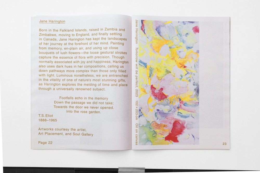
About:
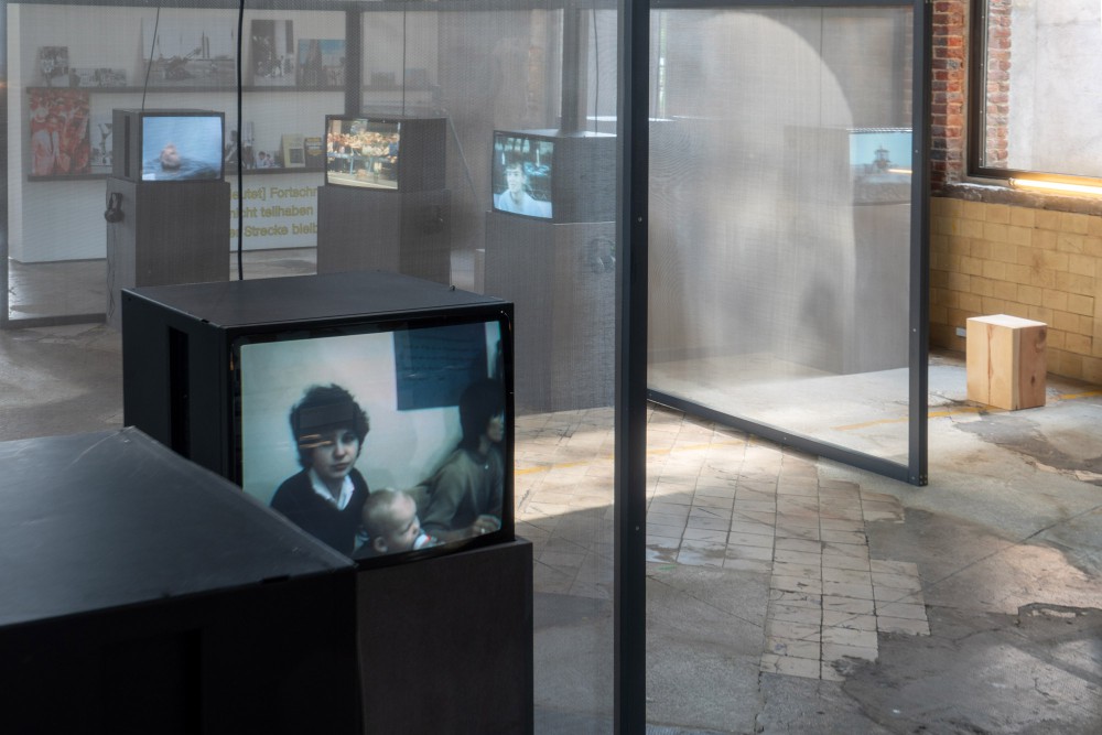
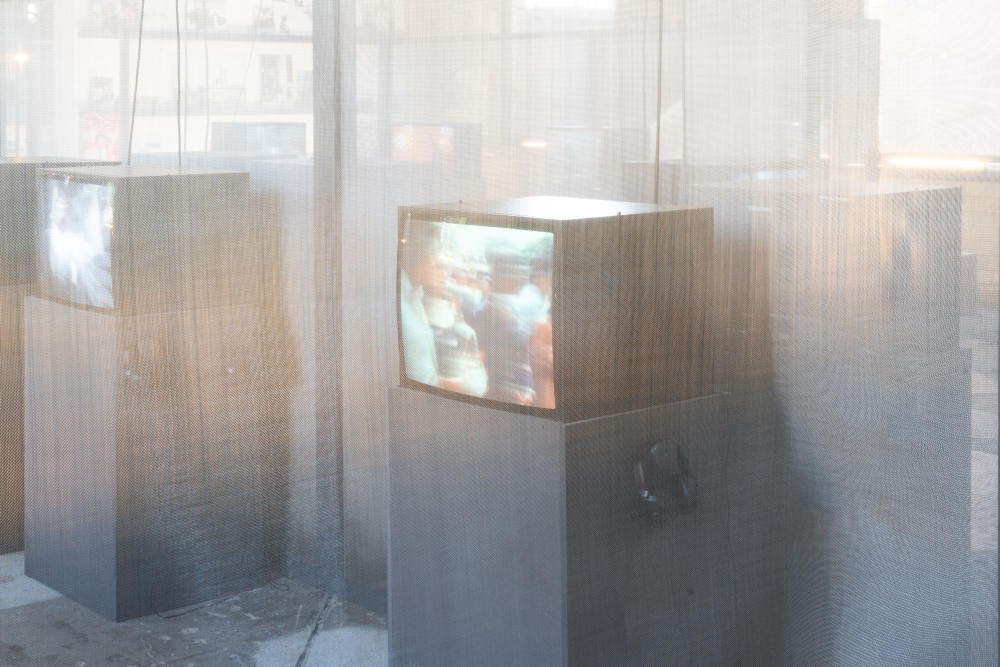
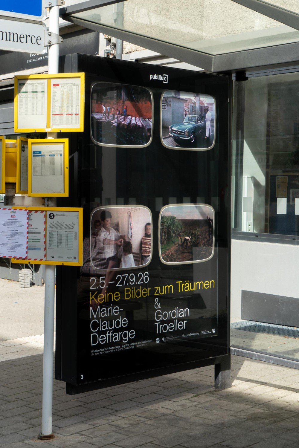
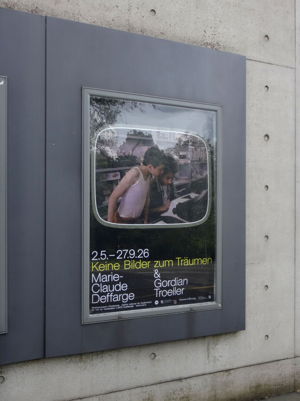
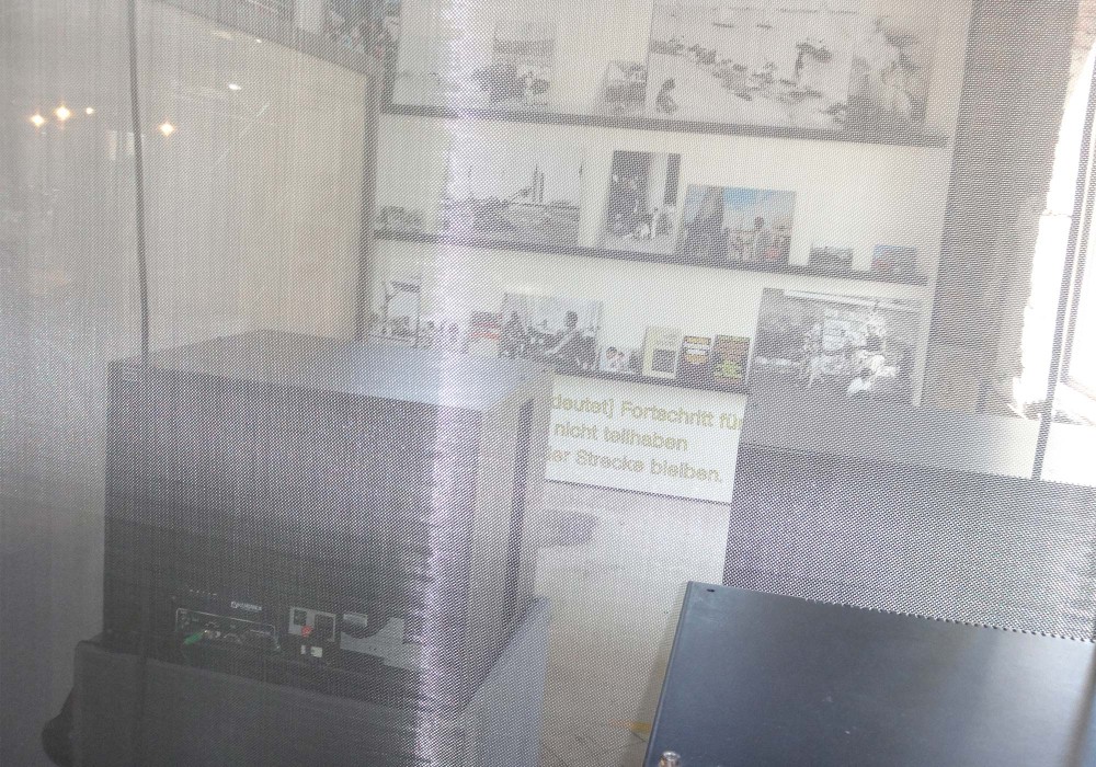
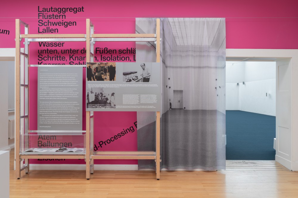
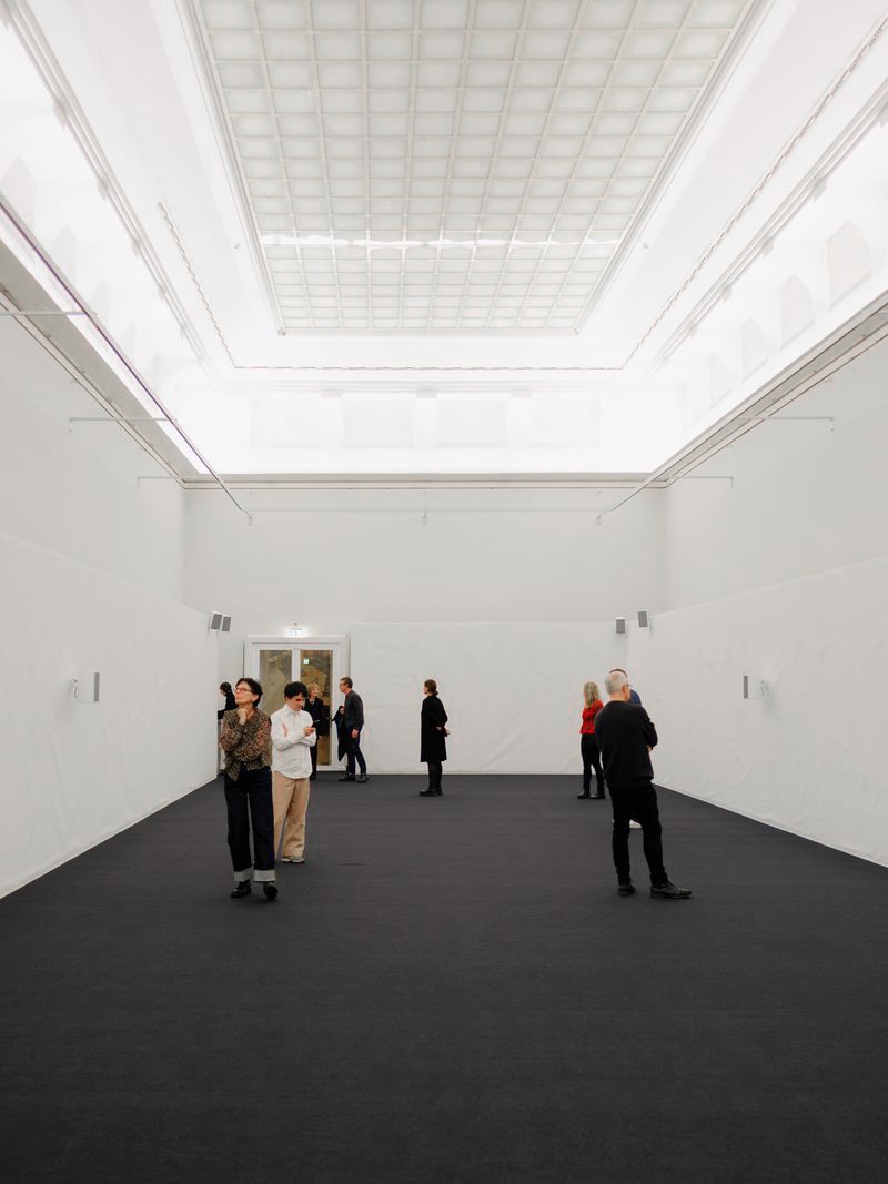
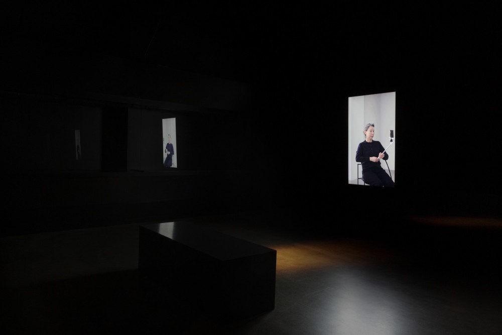
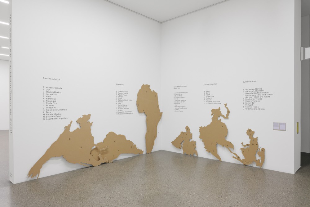
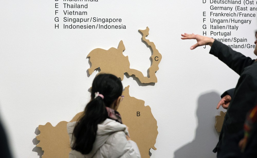
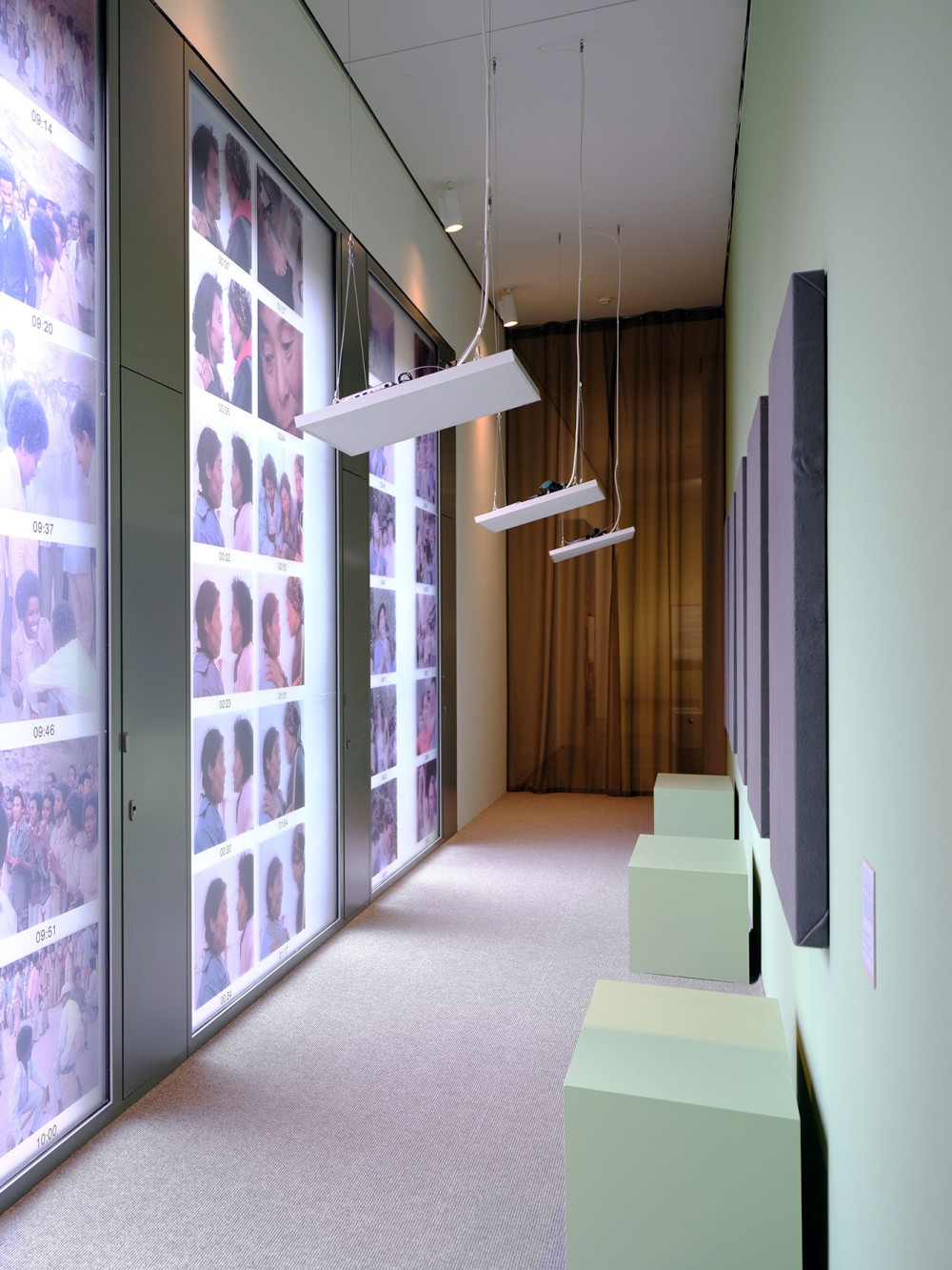
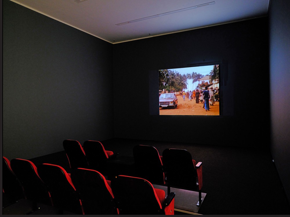
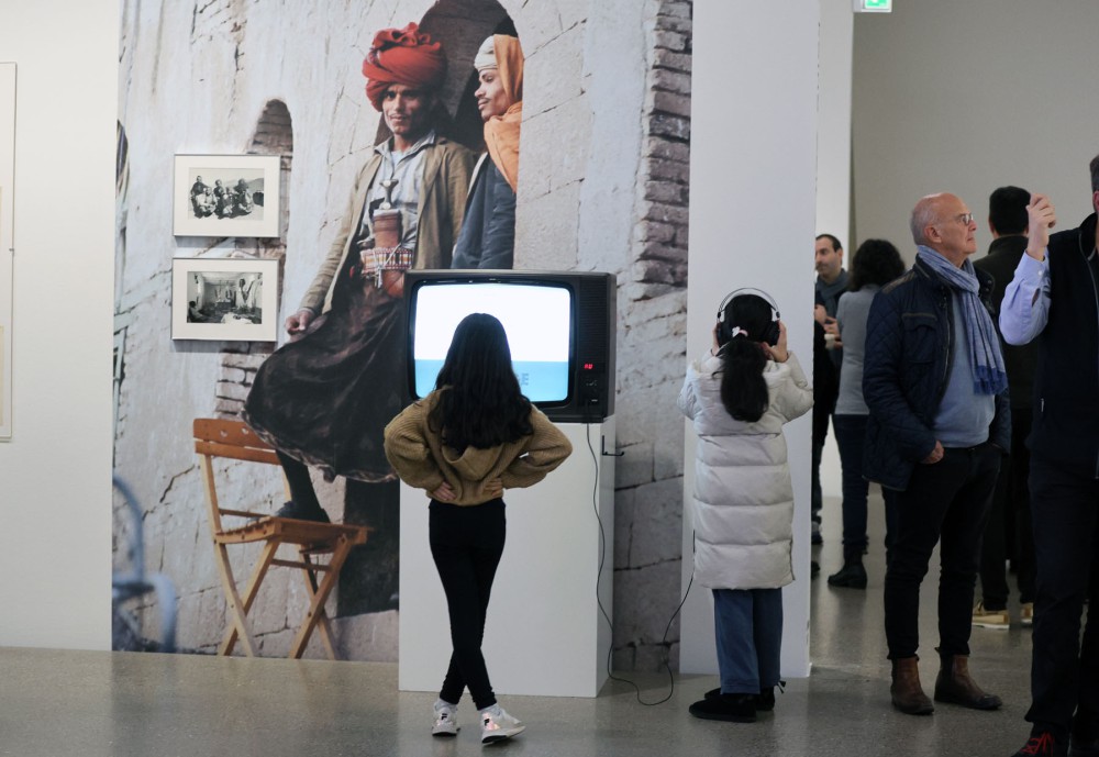
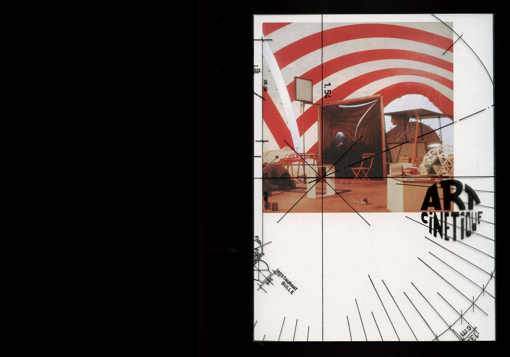
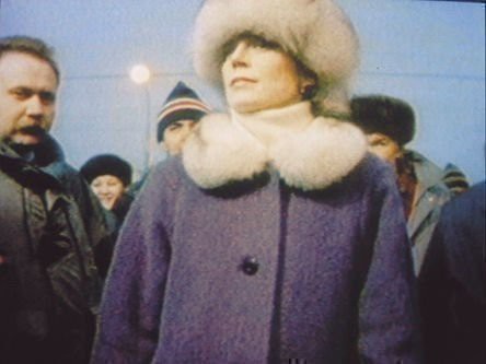
The second exhibition of the photo journalism duo Deffarge & Troeller focusses on their body of film works archived at CNA Luxembourg. The scenography, developed with Elias Erkan, is based on the decision to show their films on a set of 15 Hantarex screens – instead of a cinema format. The semi transparent structures are separating the room into thematic islands, referencing a blown up screen and its pixelation, and also hinting towards a division of the room into multiple domestic homes in which the audience simultaneously watches multiple films and meanwhile steps into the scene.
See here for the first exhibition instance and publication at Museum Folkwang in 2025.
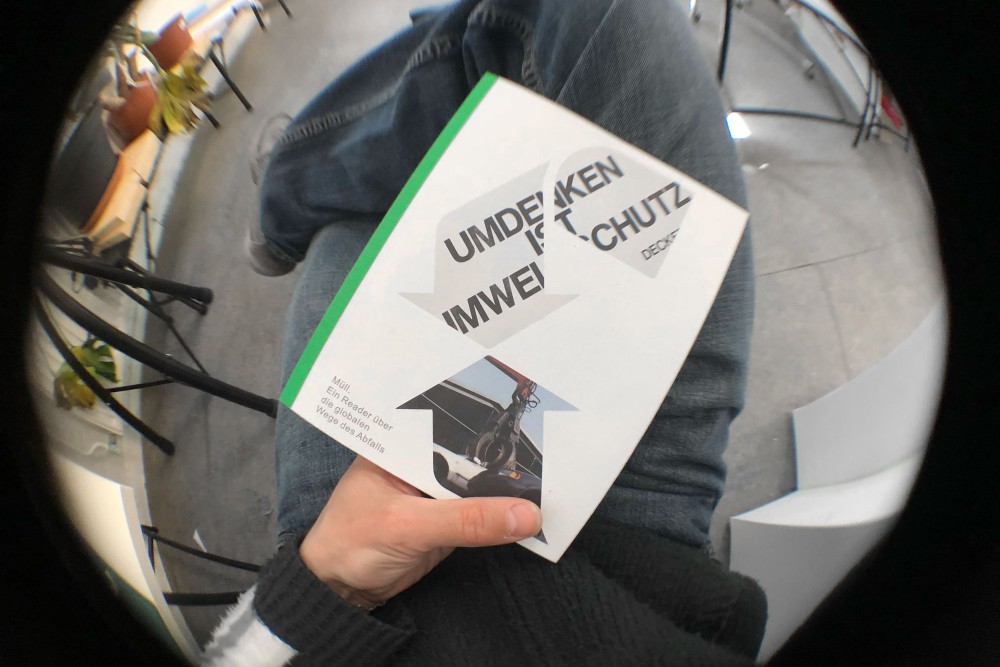
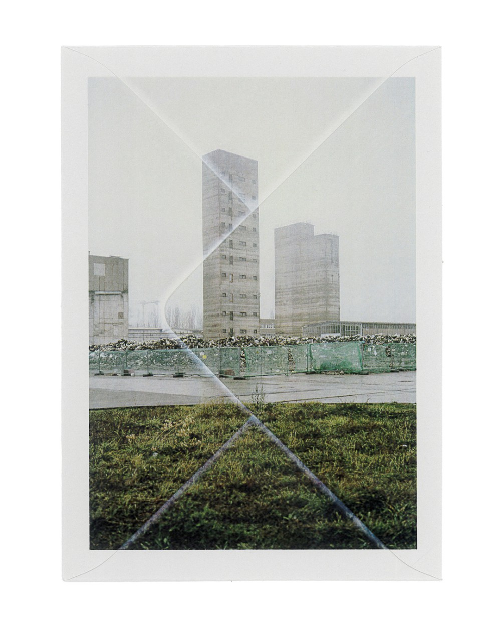
About:
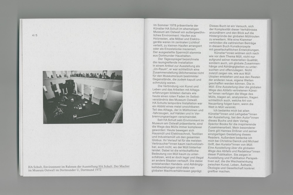
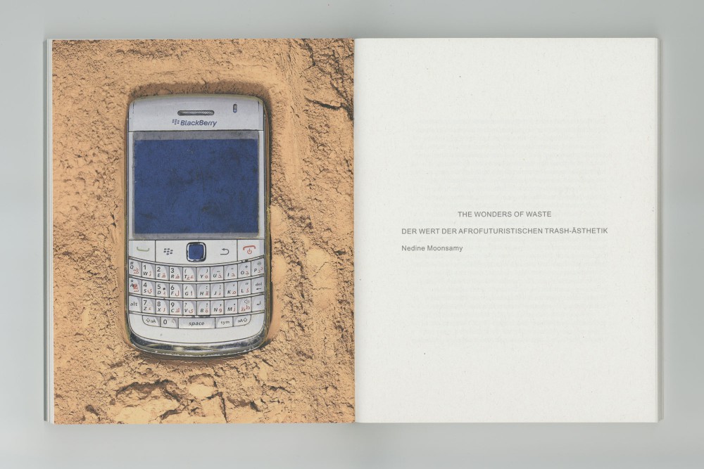
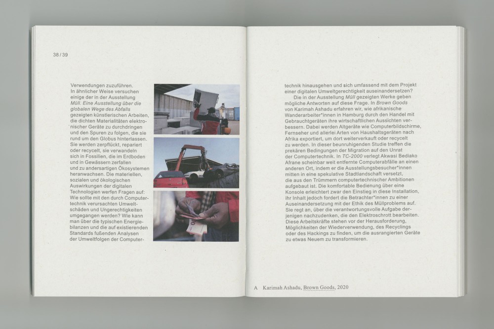
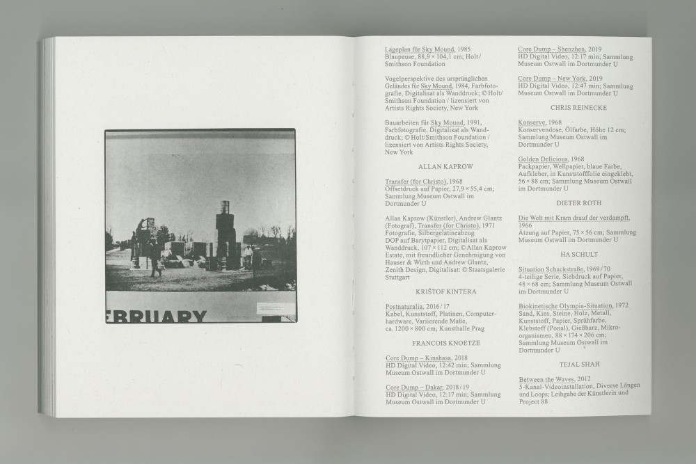
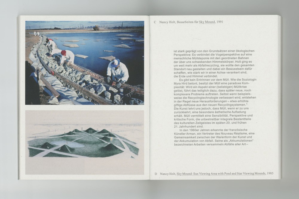
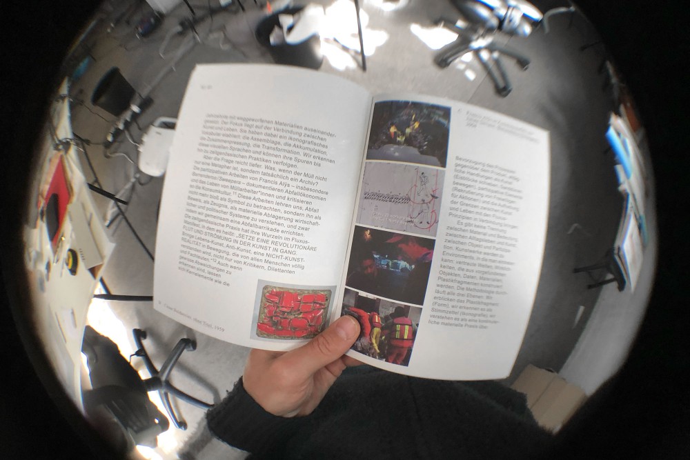
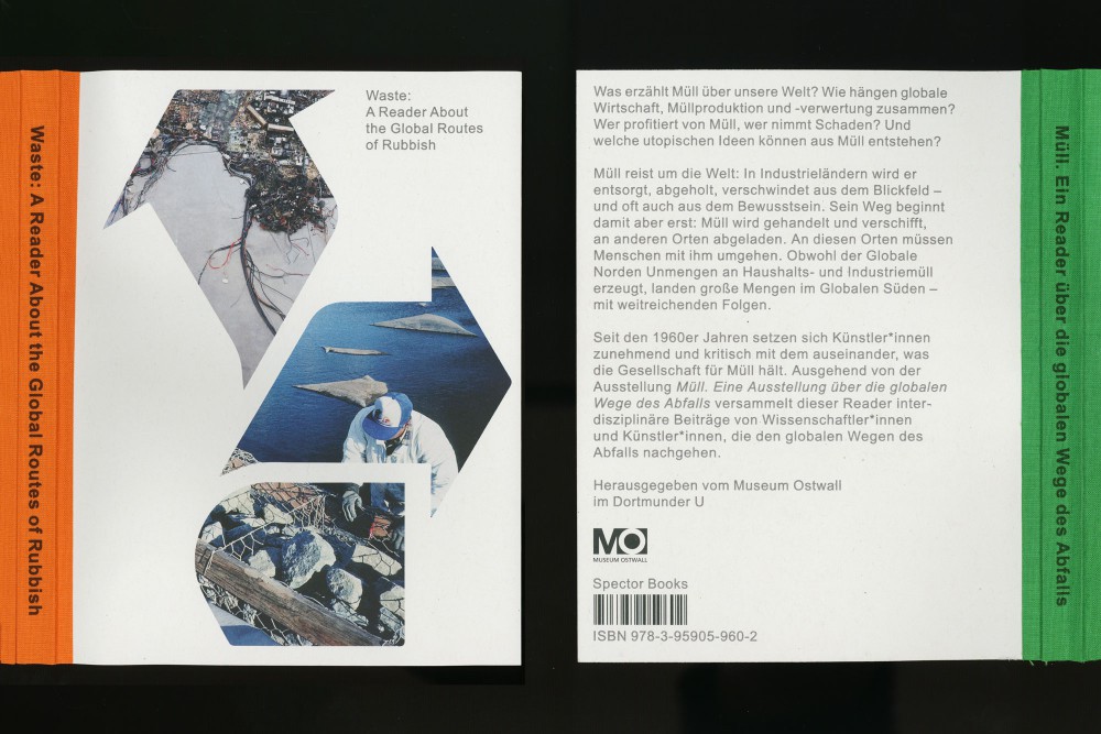
Published in conjunction with the exhibition Waste at Museum Ostwall, this reader collects interdisciplinary essays by scientists and artists in combination with featured artworks, and is typeset in Times and Arial Ecofont. The publication is maximising print-sheet efficiency on a regular 70 by 100 format (close to no offcuts) and intentionally leaves large margins around the pocket book text formatting.
Paper:
Open Spine with double-cover
Circle Offset 80, 150, and 250 g/m²
About:
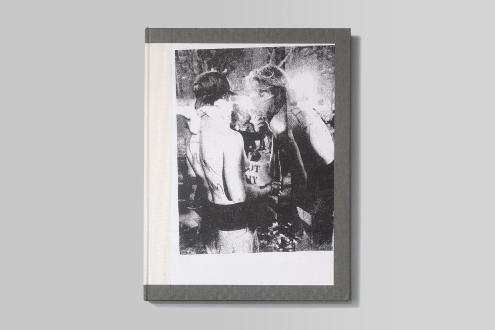
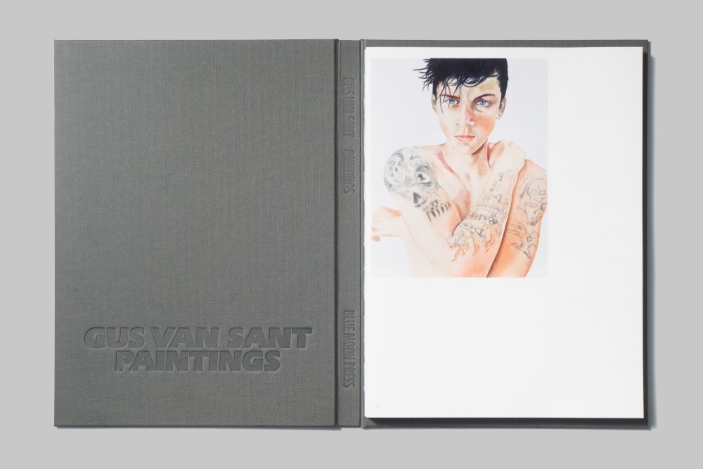
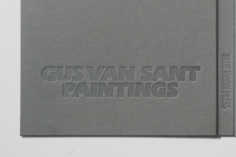
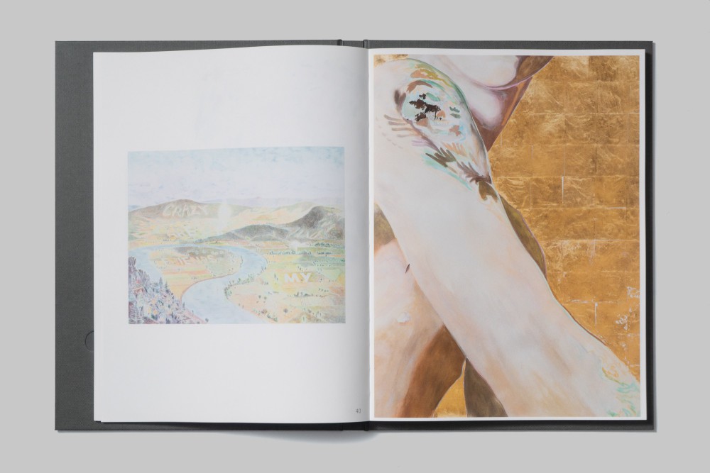
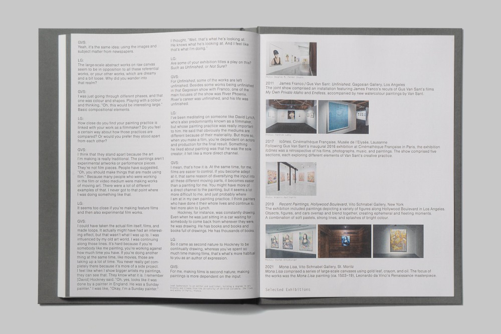
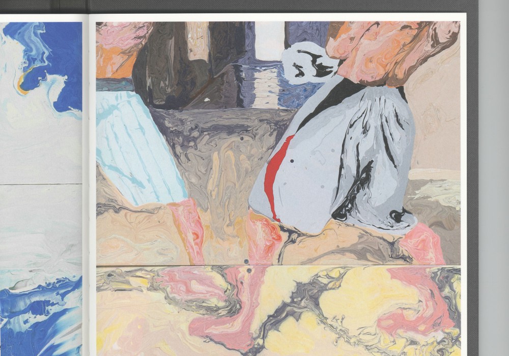
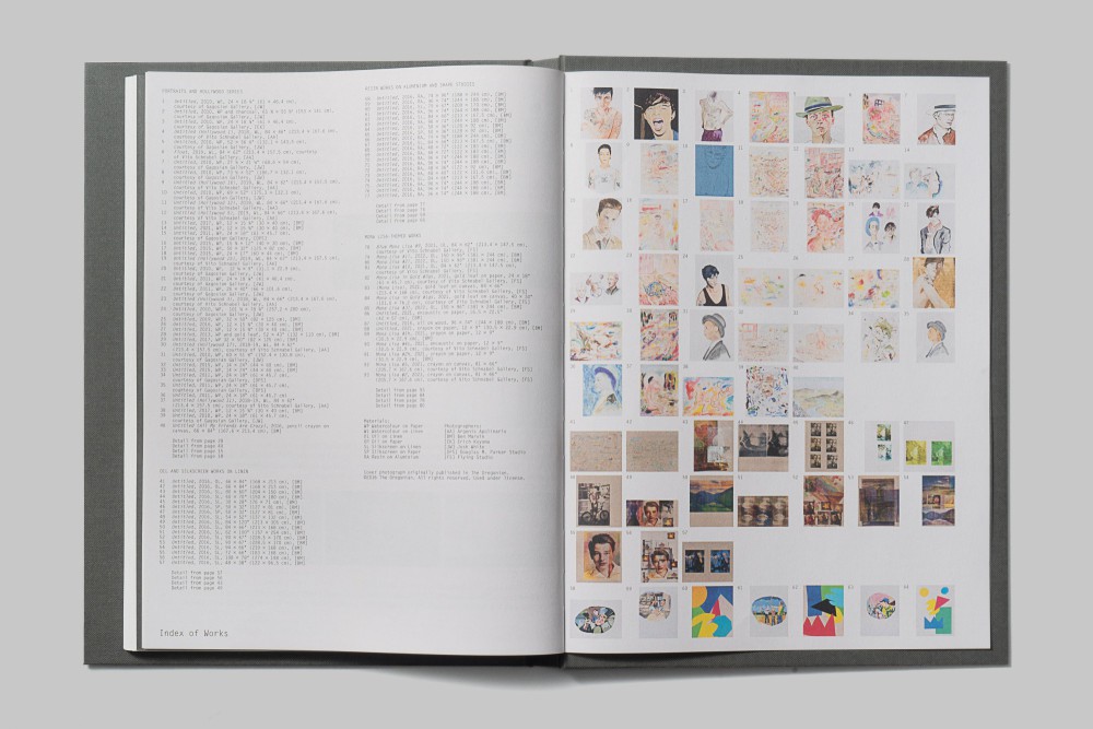
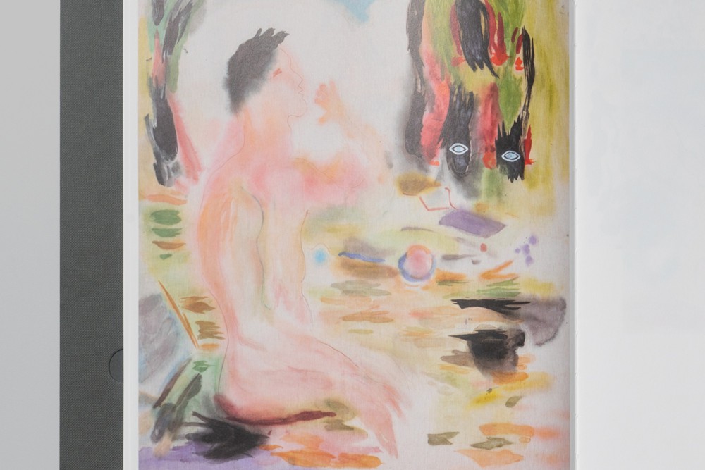
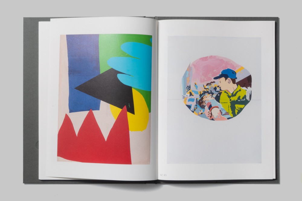
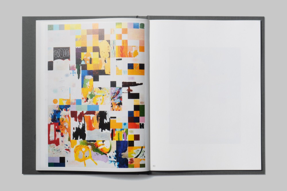
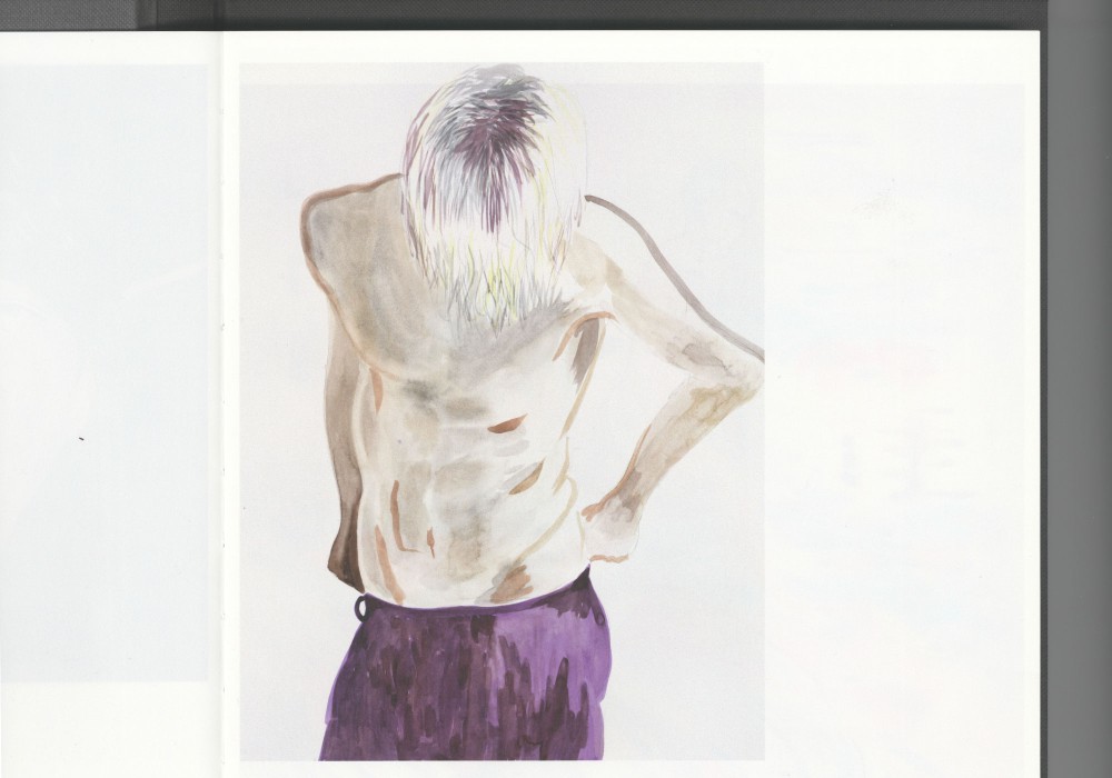
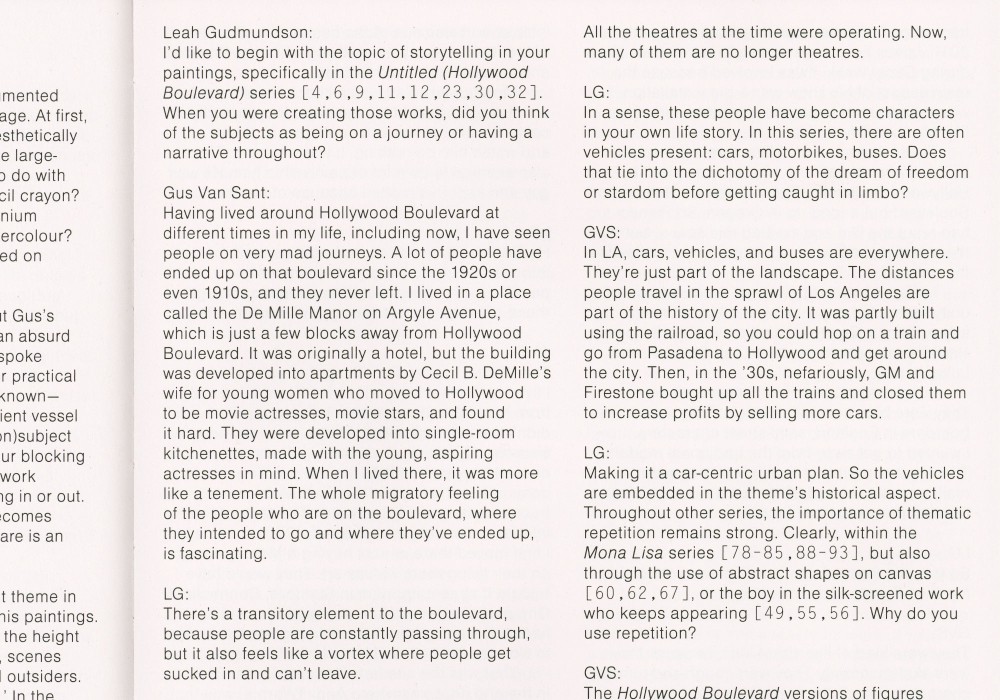
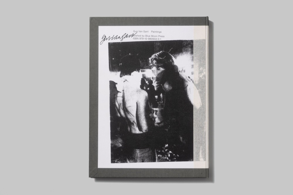
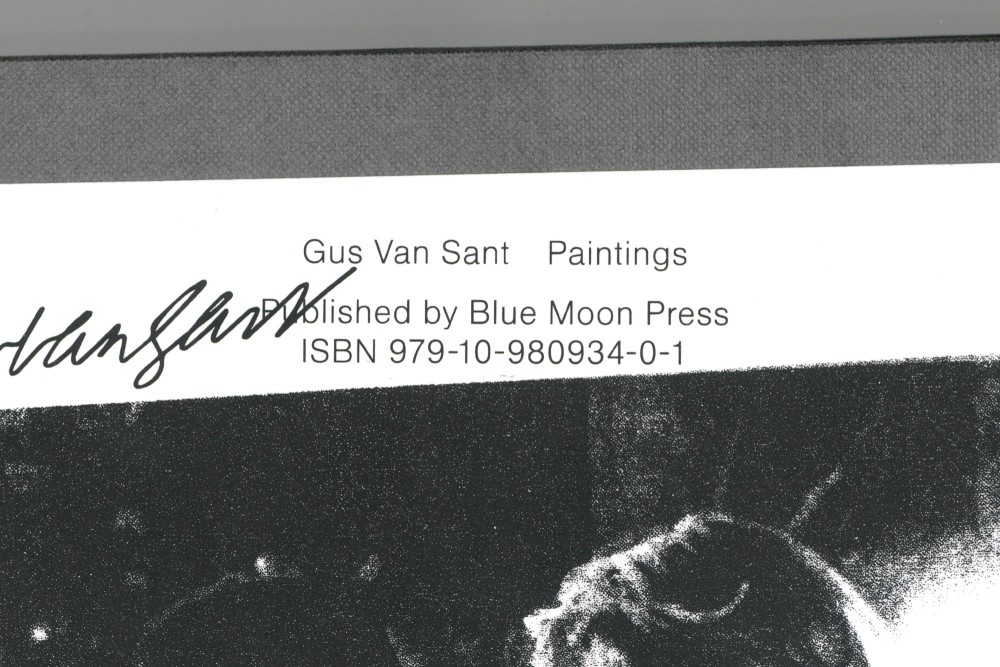
As the first to be published monograph on Gus Van Sants paintings the interior of the book brings together a wide overview of the works he has produced until this day. Sequenced in a rather associative way the book shows different series vis-a-vis, focusing on reoccurring motives and themes throughout different media and across the entire chronology of his work.
The hardcover of the publication is bound inside out, giving the association of having been ripped off, flipped around, and now wrapping a „new“ bookblock. Together with the outside front and back cover motive being two test screen-prints (signed and stamped on the back) this comes together resembling Gus Van Sant’s paintings as literally the flipside of his popular practice: making movies.
Paper:
Gardapat 11 Ivory 115 g/m²
Holmen TRND 2.0 70 g/m²
F-Color neuleinen & glatt 120 g/m²
Whiteboard 1,5 mm
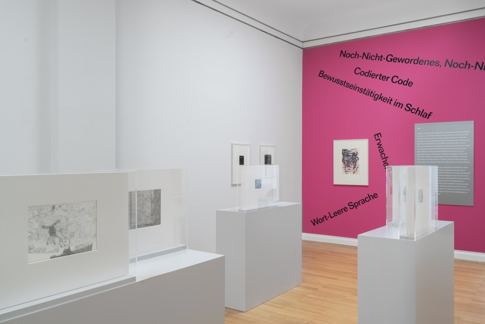
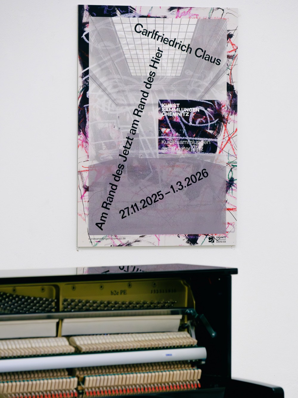
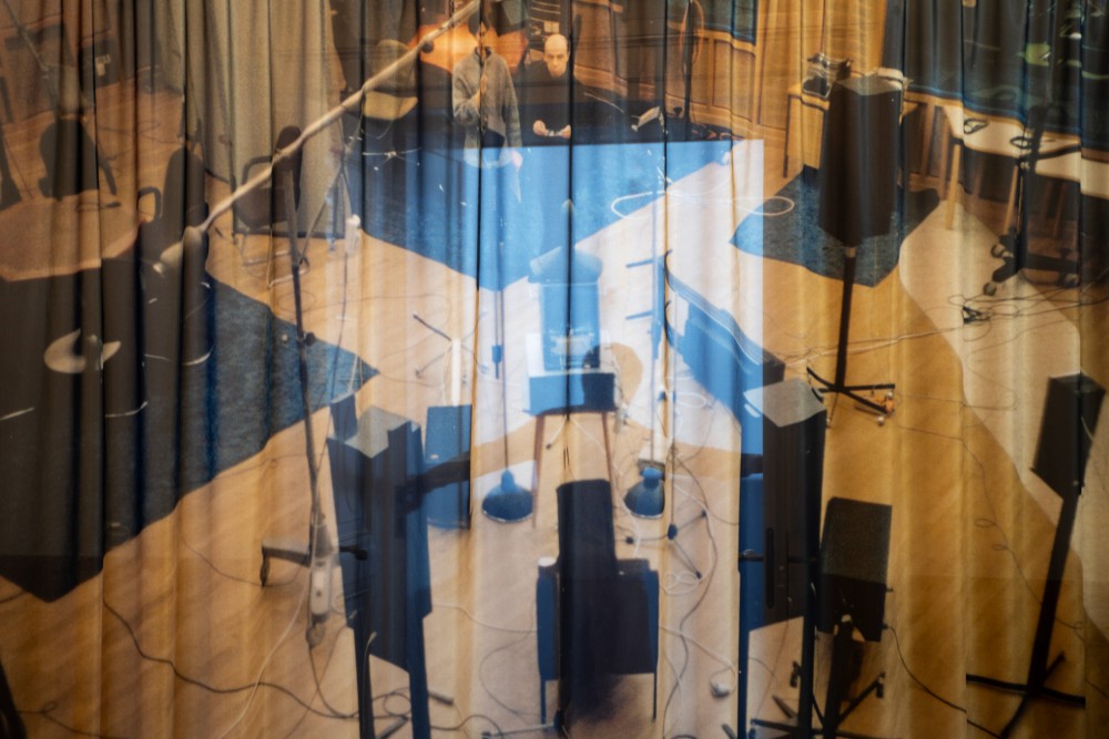
About:
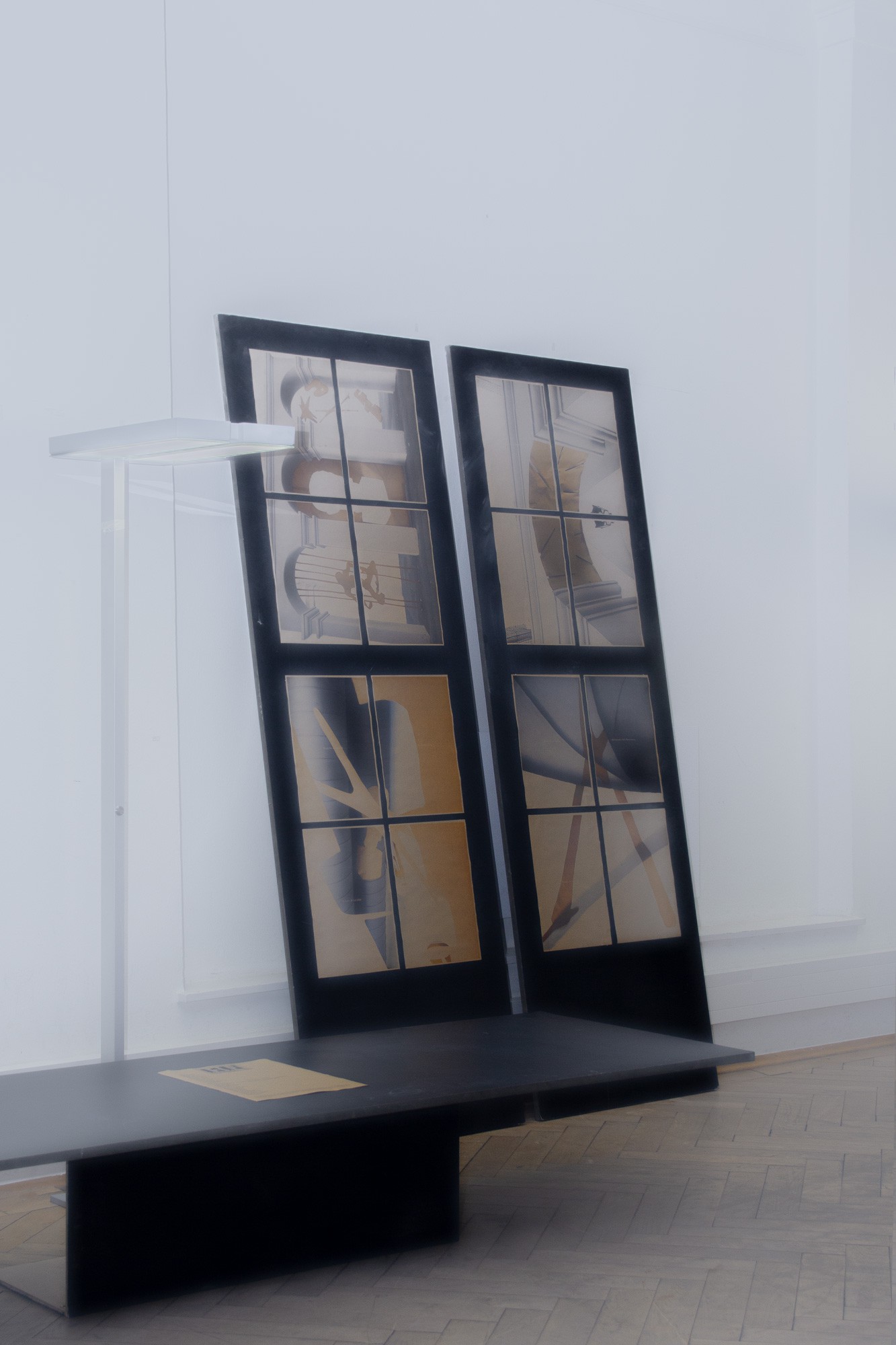
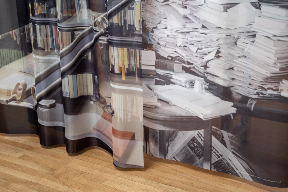
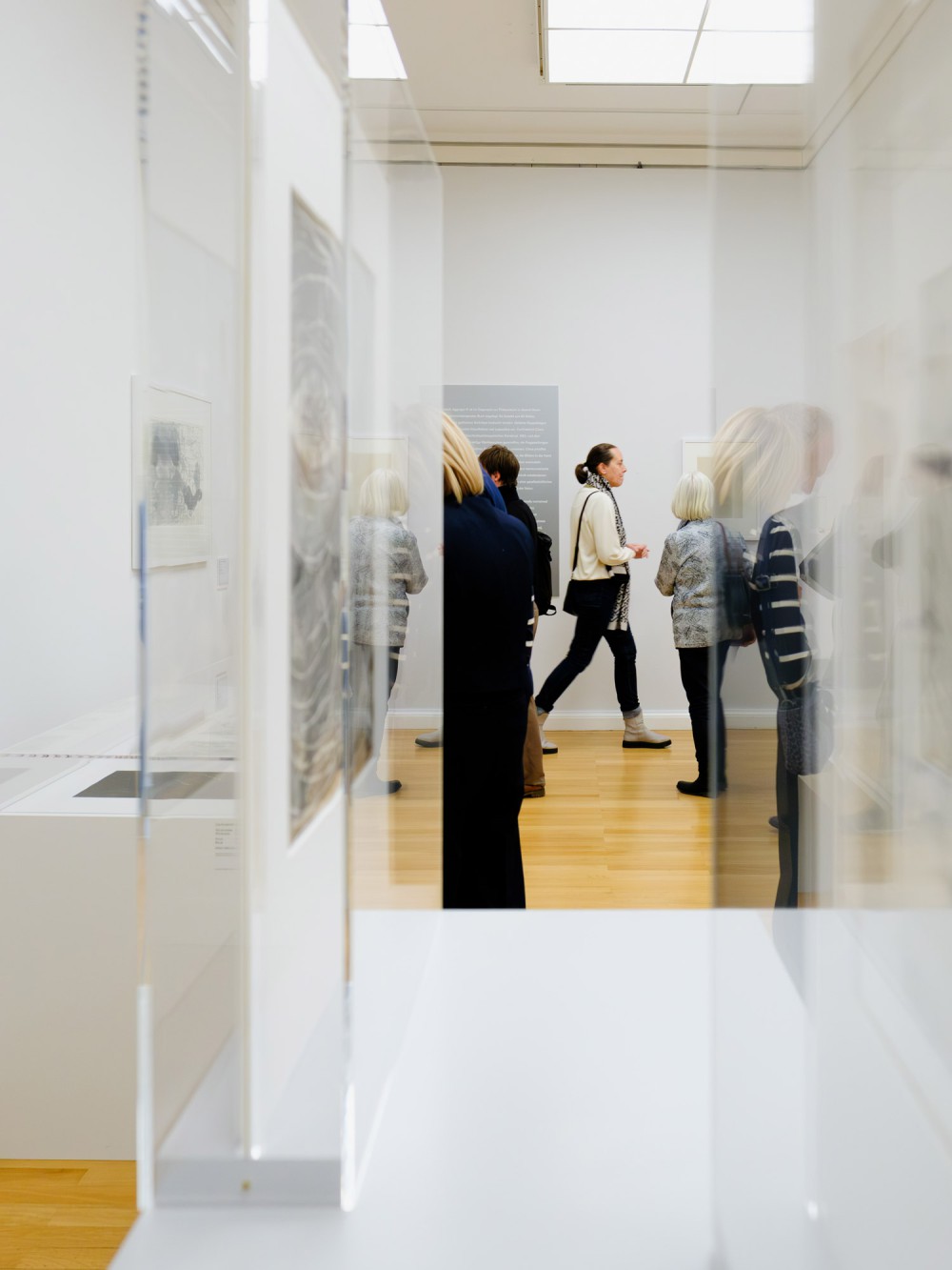
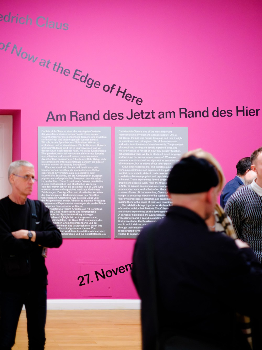
For the exhibition Carlfriedrich Claus. Am Rand des Hier am Rand des Jetzt at Kunstsammlungen Chemnitz we developed scenography around topics of experimental sound, transparency, literature, and language. Some of many aspects filtrated from Claus’ practice. The curtains work as windows into different stages of his life – ranging from a mess of books at the artists studio to the rearrangement of his library its current home: the Claus-Archive at Kunstsammlungen Chemnitz.
About:
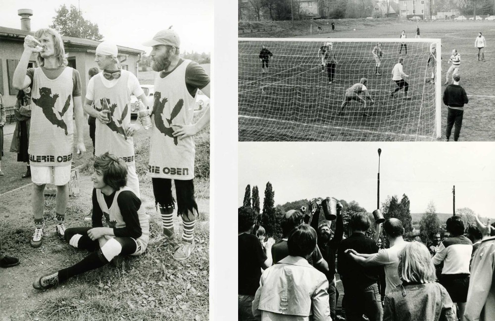
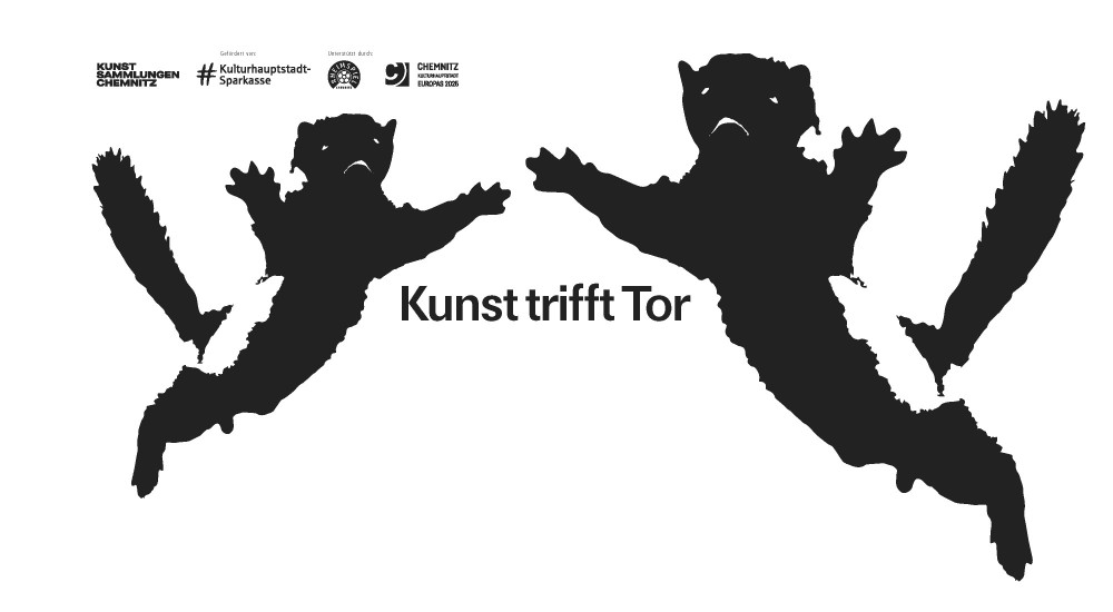
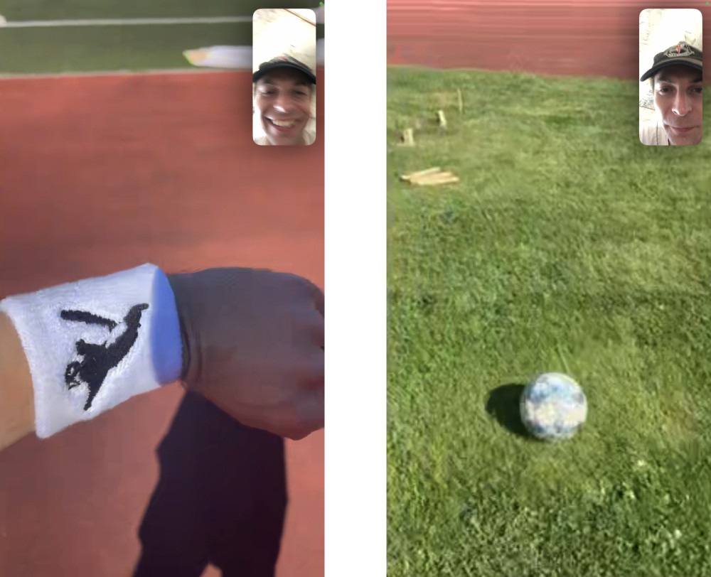
As part of the exhibition "Gallery Oben and Clara Mosch: Artistic Free Spaces in Karl-Marx-Stadt," Kunstsammlungen Chemnitz organised a football tournament in memory of the artist football matches of the 1970s and 1980s. As a continuation of the theme of duality and coexistence (see exhibition design/catalog for reference) – paired with the world of football – the visuals are pairing existing motives with football merchandise. The two derby team shirts from the 80’s now united in one re-intervention.
Designed in collaboration with Elias Erkan
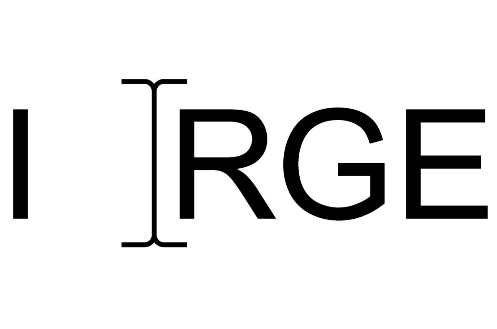
About:
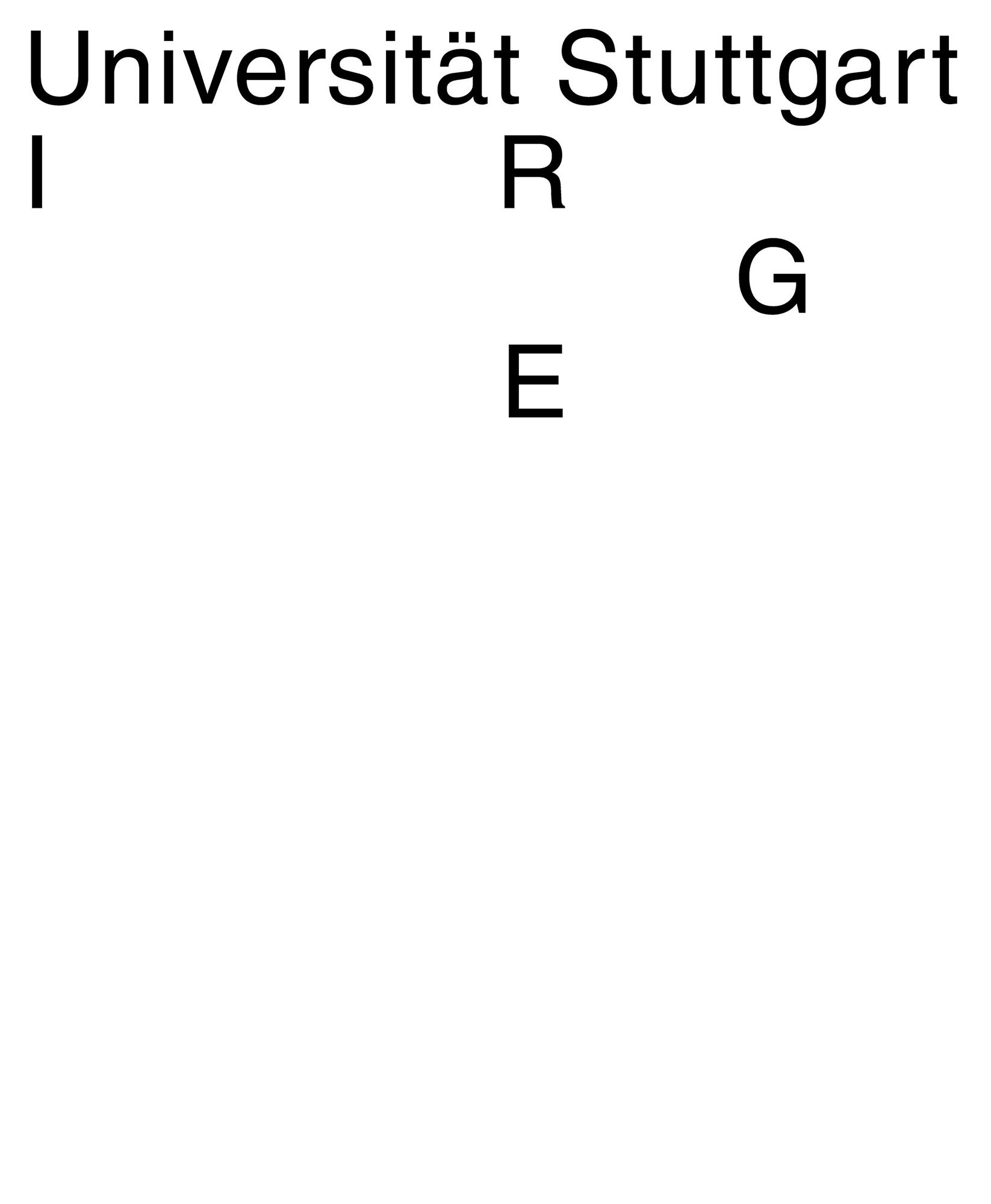
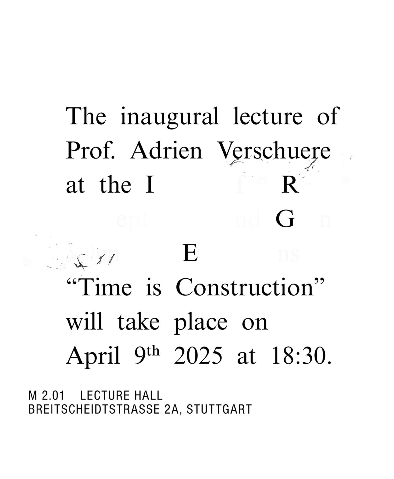
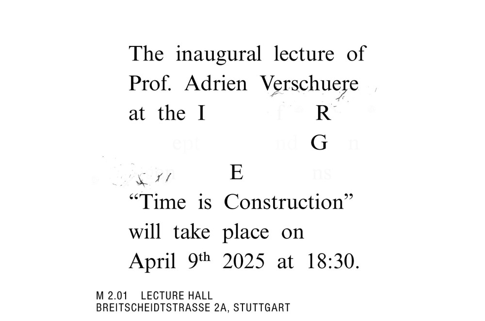
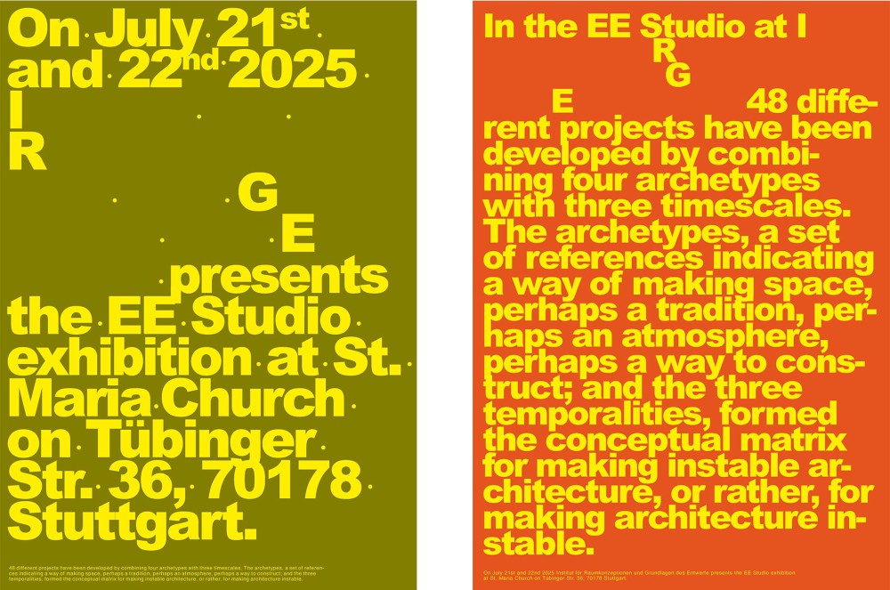
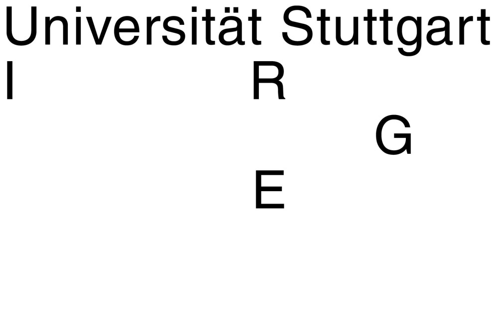
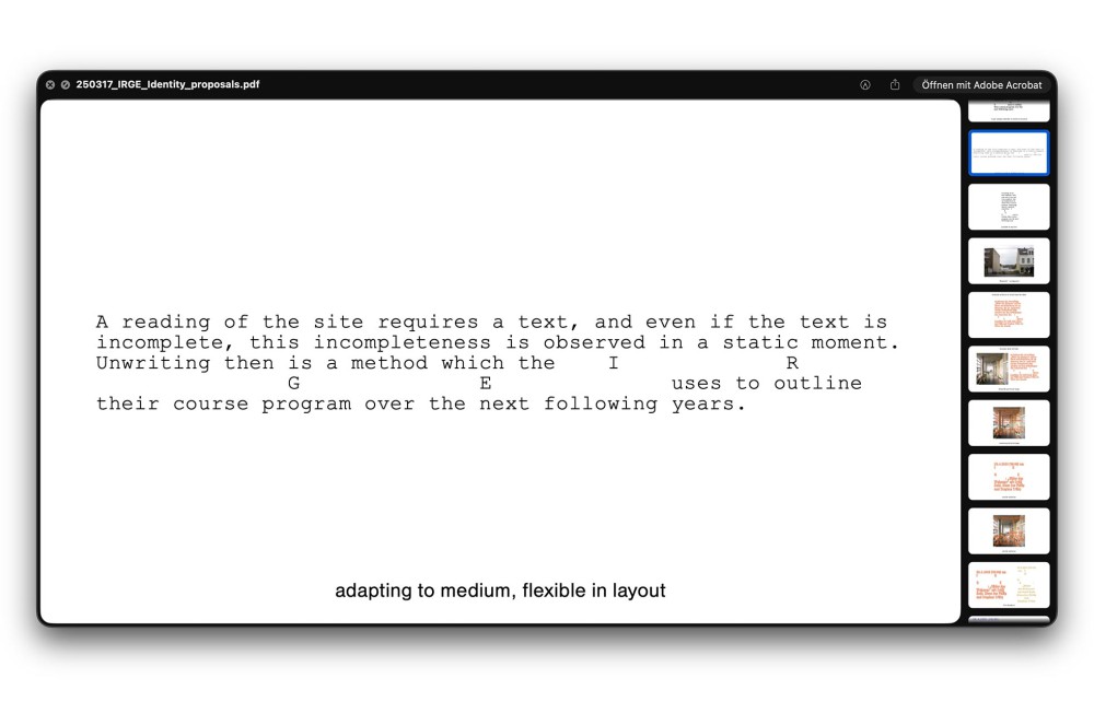
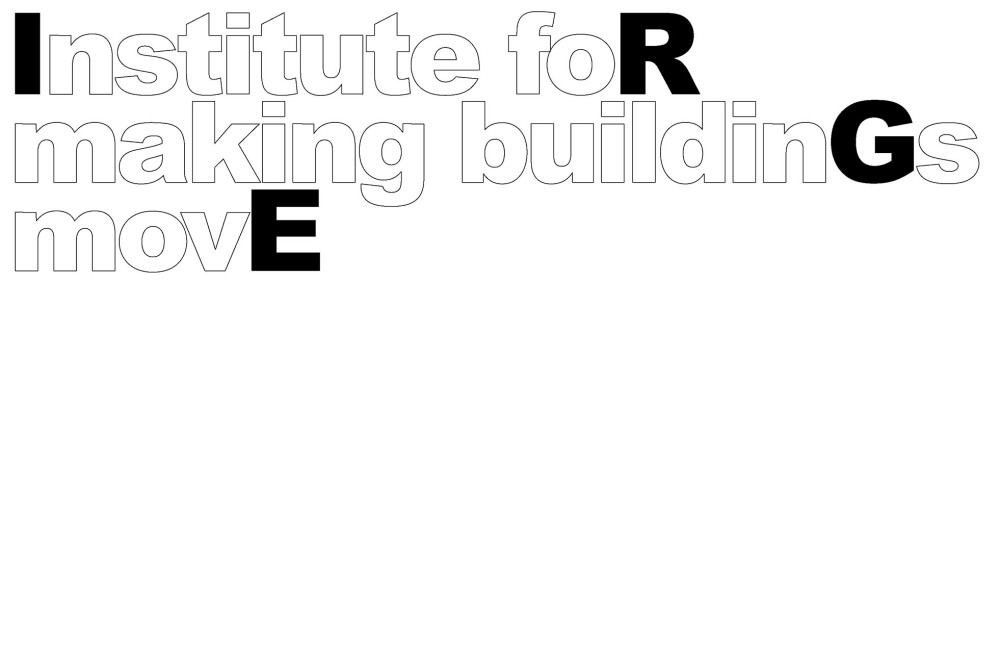
Rebranding for the IRGE Institute for Spatial Conception and Fundamentals of Design at the University of Stuttgart, for the new teaching position of Adrien Verschuere (Baukunst/BE). Throughout the identity the IRGE Logo is always presented in a spelled out form and within sentence structures. The absence of all letters except the initials of the acronym opens gaps in the structure of the sentences and presents the institutes identity as a fluid and adaptable system instead of a static logo. The discrepancy between the dynamics of architecture and its static conception is the focus of the institutes work. Exploring and communicating architecture as an ongoing process: a continuous flow of transformations and an incomplete project.
About:
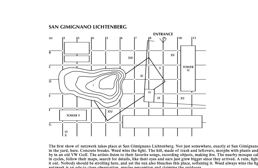
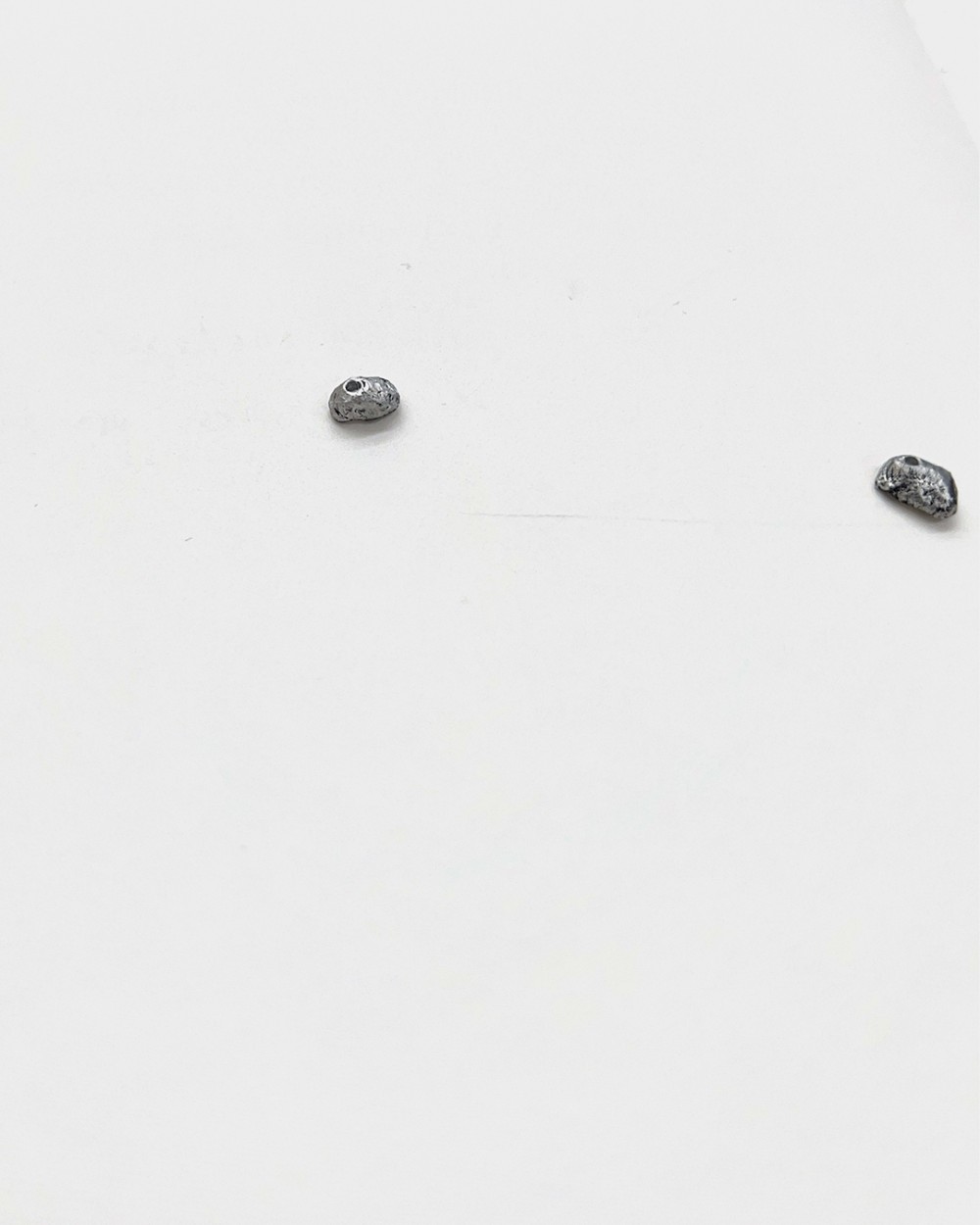
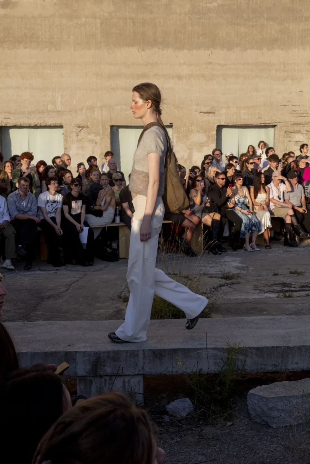
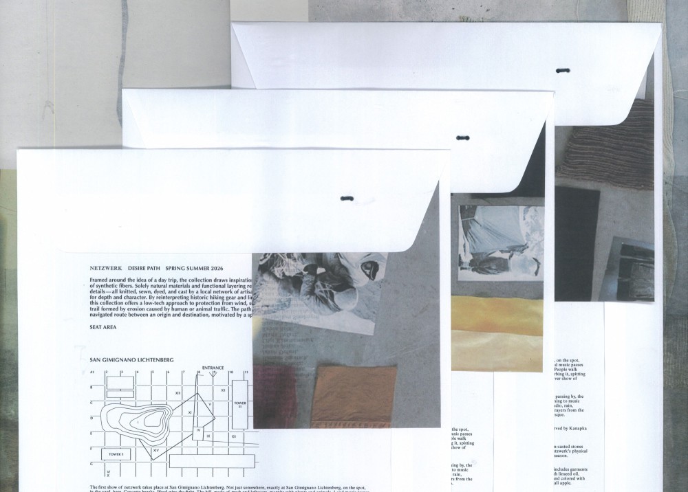
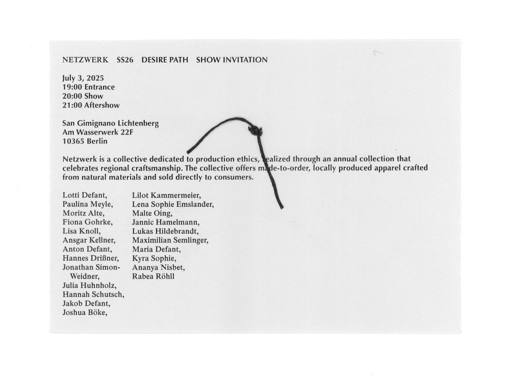
The first show of netzwerk took place at San Gimignano Lichtenberg. As part of the collaborators I contributed the graphic components and the "labels" which are replicas of small rocks, casted in aluminium and sewn onto each garment.
Typeface:
Optima Bold, Times
About:
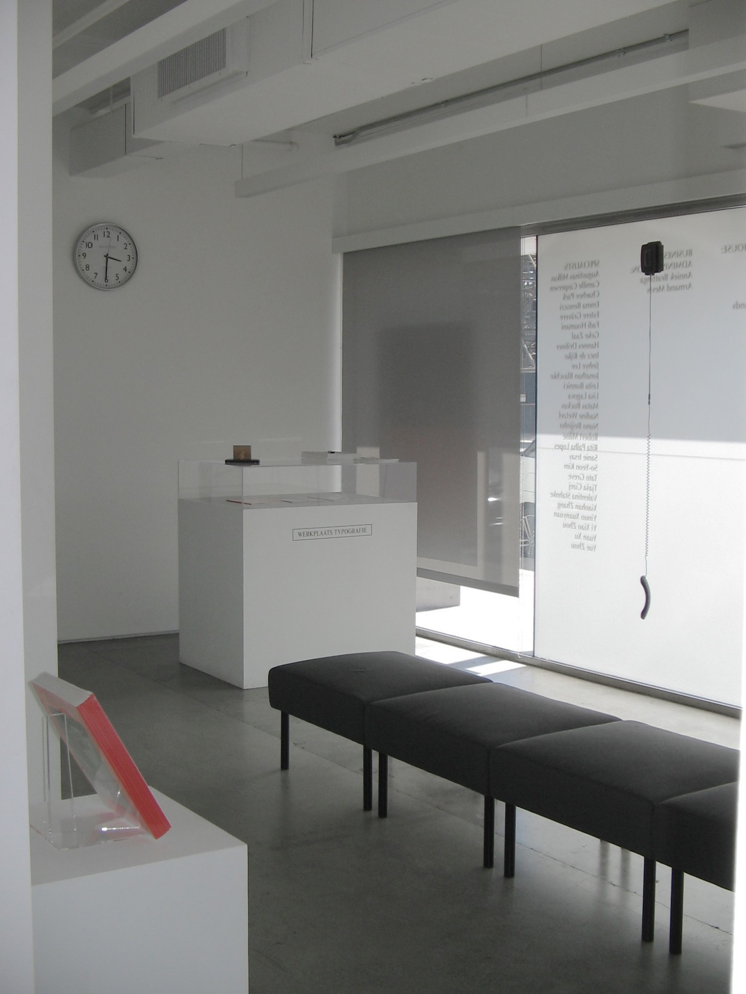
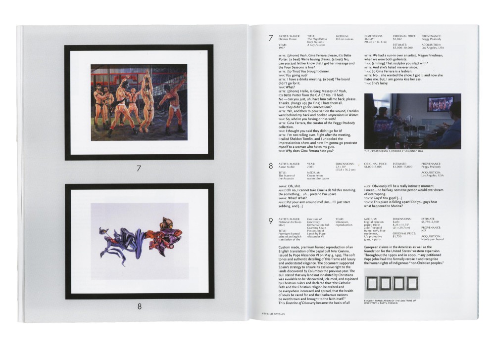
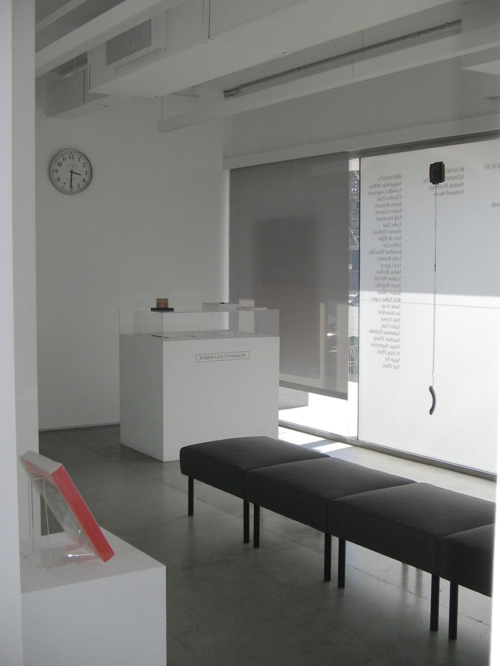
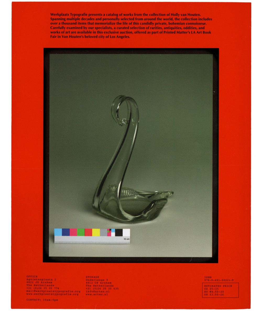
For Printed Matter’s LA Art Book Fair from May 15–18, 2025, we presented a catalog of ‘Works from the Collection of Holly van Houten.’ The project was a collective work with Nuno Beijinho and Lisa Lagova at Werkplaats Typografie. Addressing topics of value (creation) and provenance all items in the collection are contributions by Werkplaats participants, which after they had been collected defined the personality of the fictional character Holly van Houten.
In physical space we auctioned the auction catalog itself (the price of the publication would fluctuate throughout the entire fair). The prints on the wall, aswell as the telephones (sound installation) on the window were extracted information from the catalog into the room.
Typefaces:
Optima, Futura, Scala
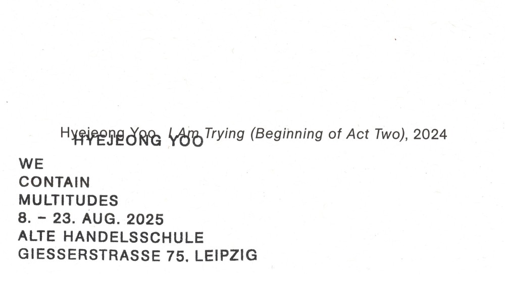
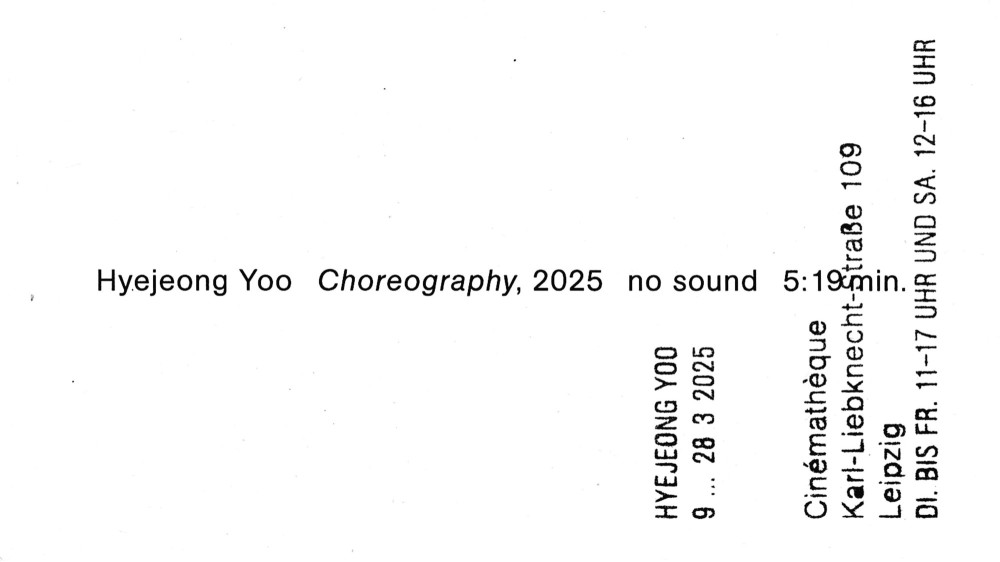
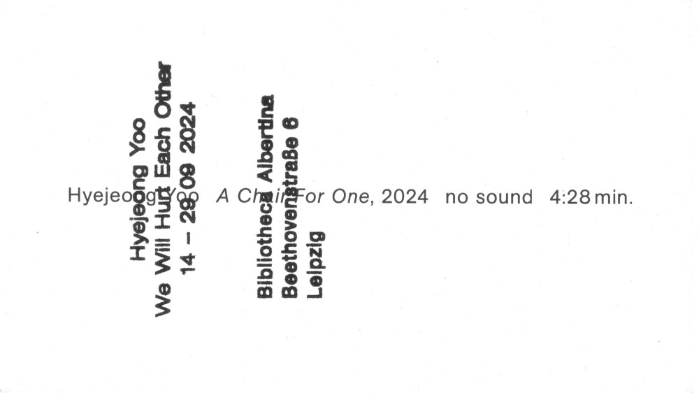
About:
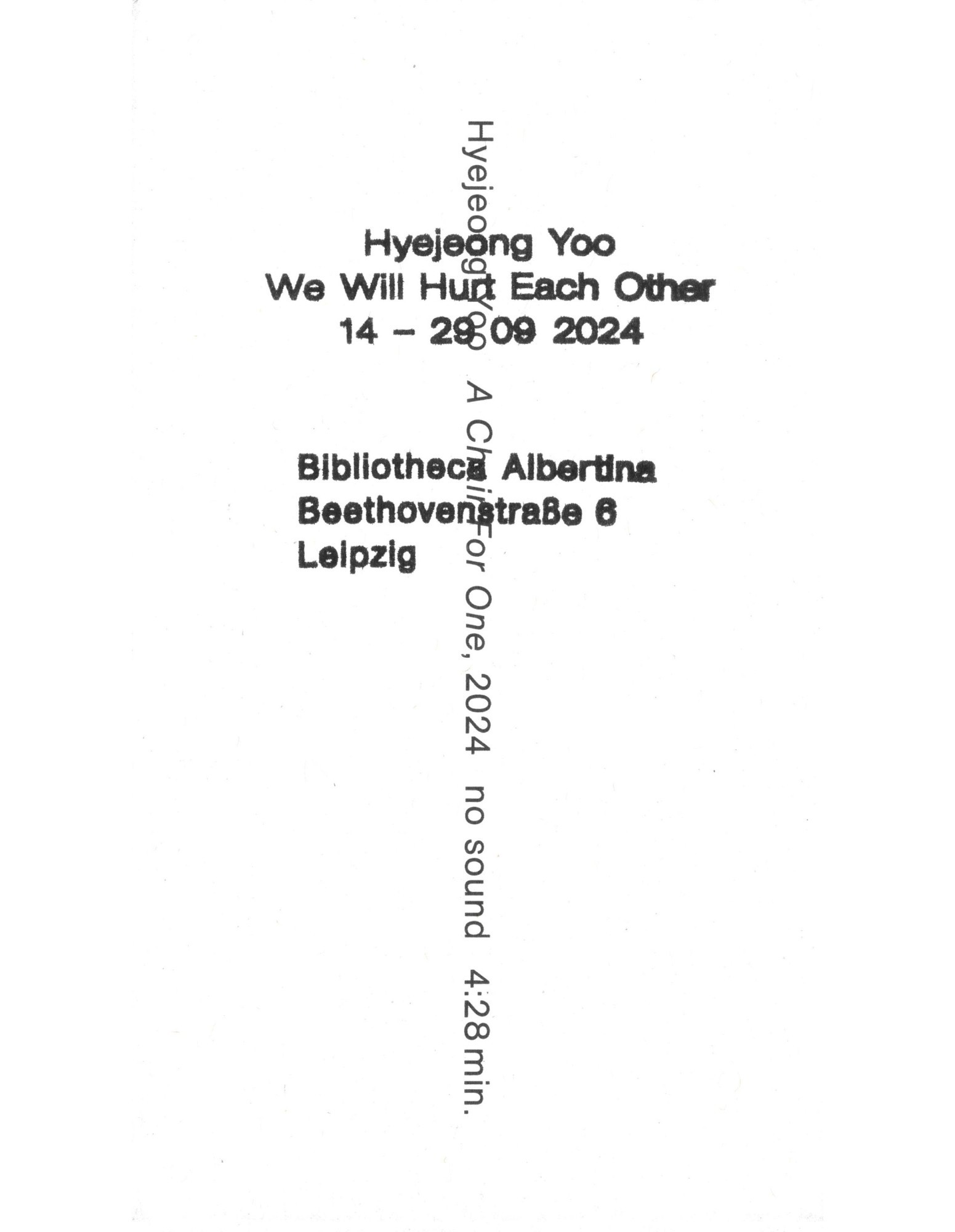
Hyejeong’s identity consists of a new stamp for every exhibition announcement, while the base typography for her postcards and posters stays the same. On every announcement her name appears twice.
Typeface:
AG (Buch), full family
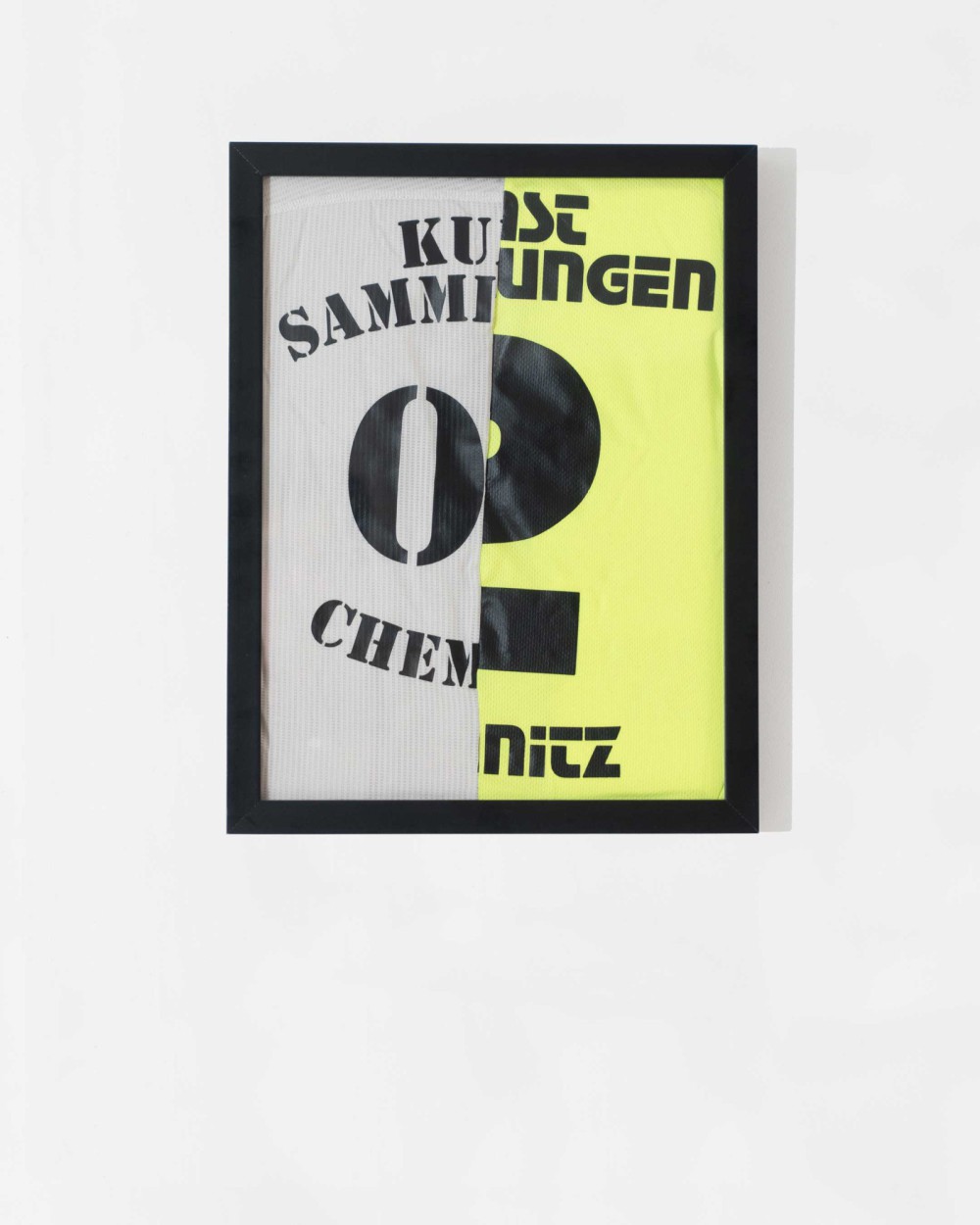
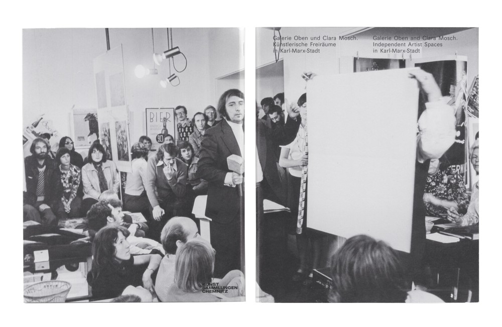
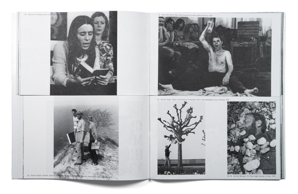
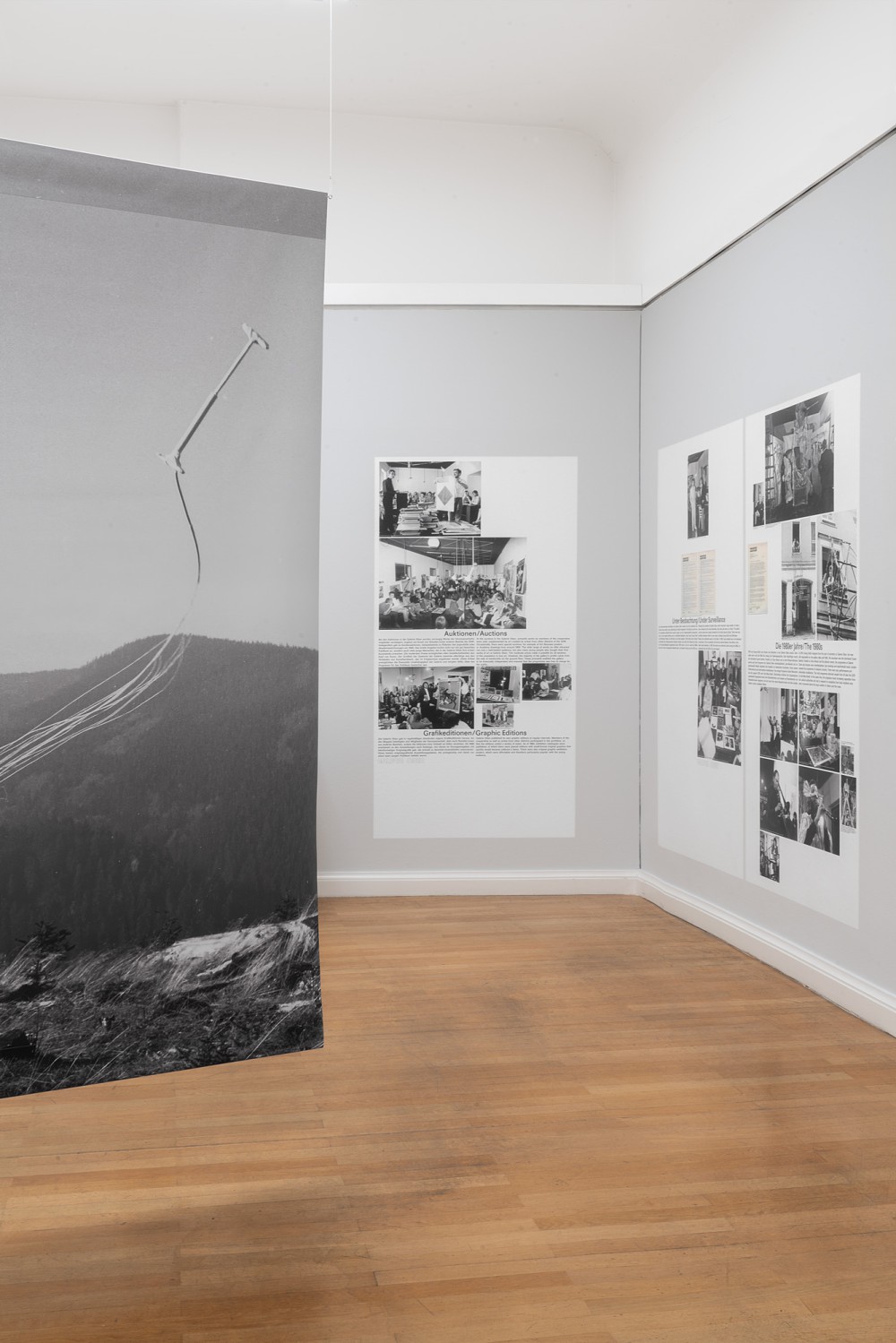
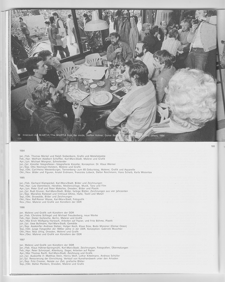
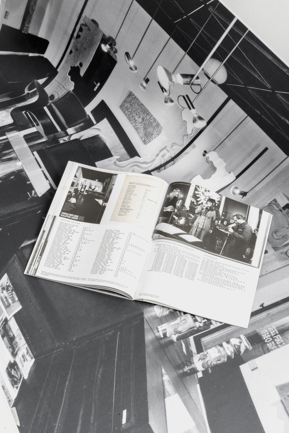
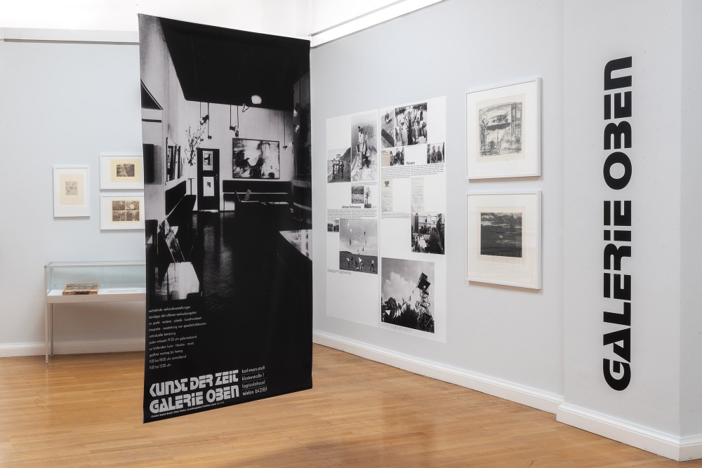
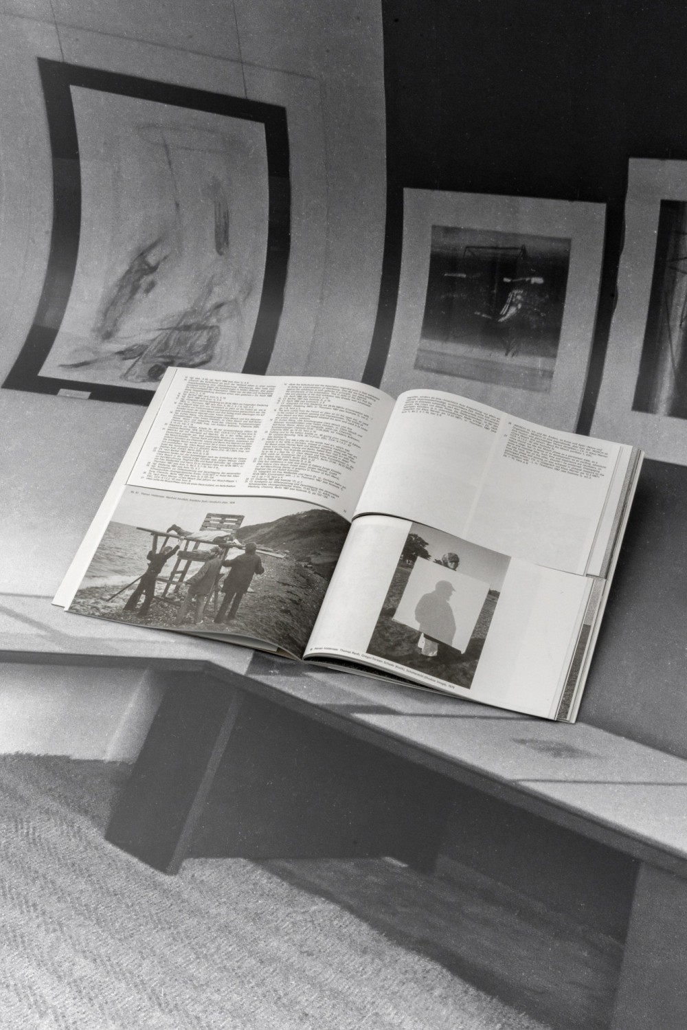
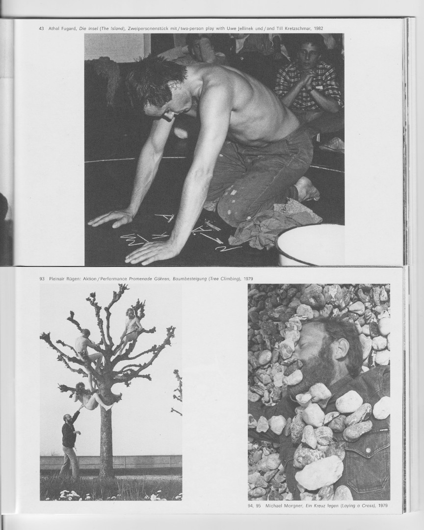
About:
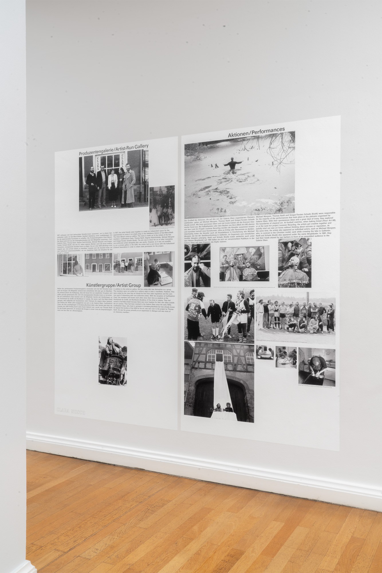
With the Galerie Oben and the artists’ group Clara Mosch (1977–1982), the city of Chemnitz had two simultaneously existing institutions with unconventional exhibition programme, actions and events. The exhibition- and book design reflects on the topic of simultaneity and it’s formal aspects for a viewing and/or reading experience.
The book cut in halves allows for a mix and match of text and imagery of the two institutions and reading direction that is less organised in the spirit of the time then.
Curated by Marie Winter and designed in collaboration with Elias Erkan.
Typefaces:
Maxima
Paper:
250 g/m² Chromo Duplex GD2
CircleOffset Premiumwhite 80 g/m²
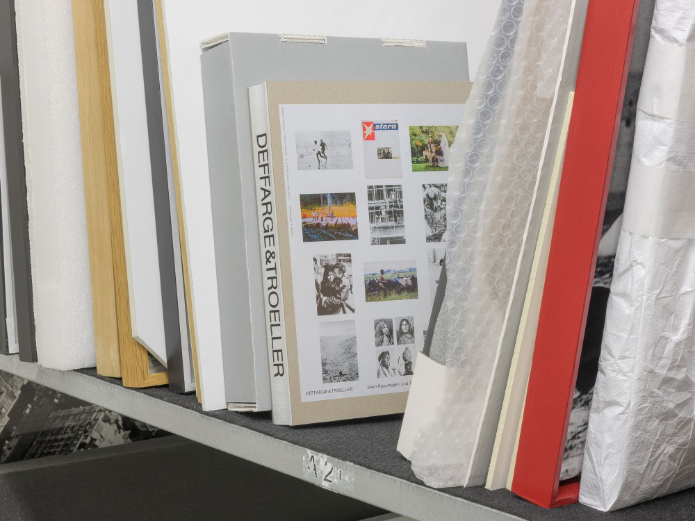
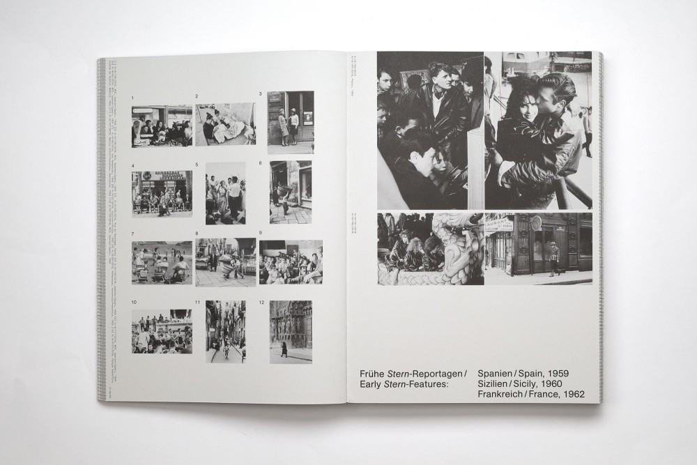
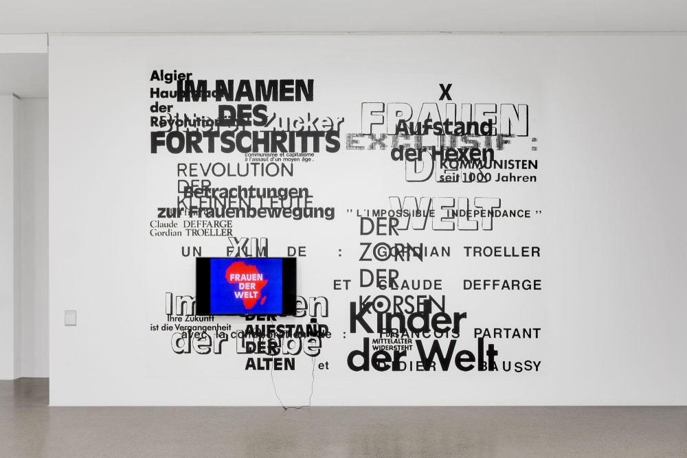
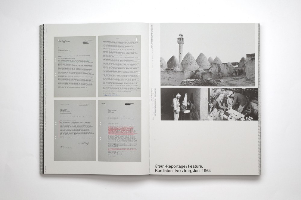
About:
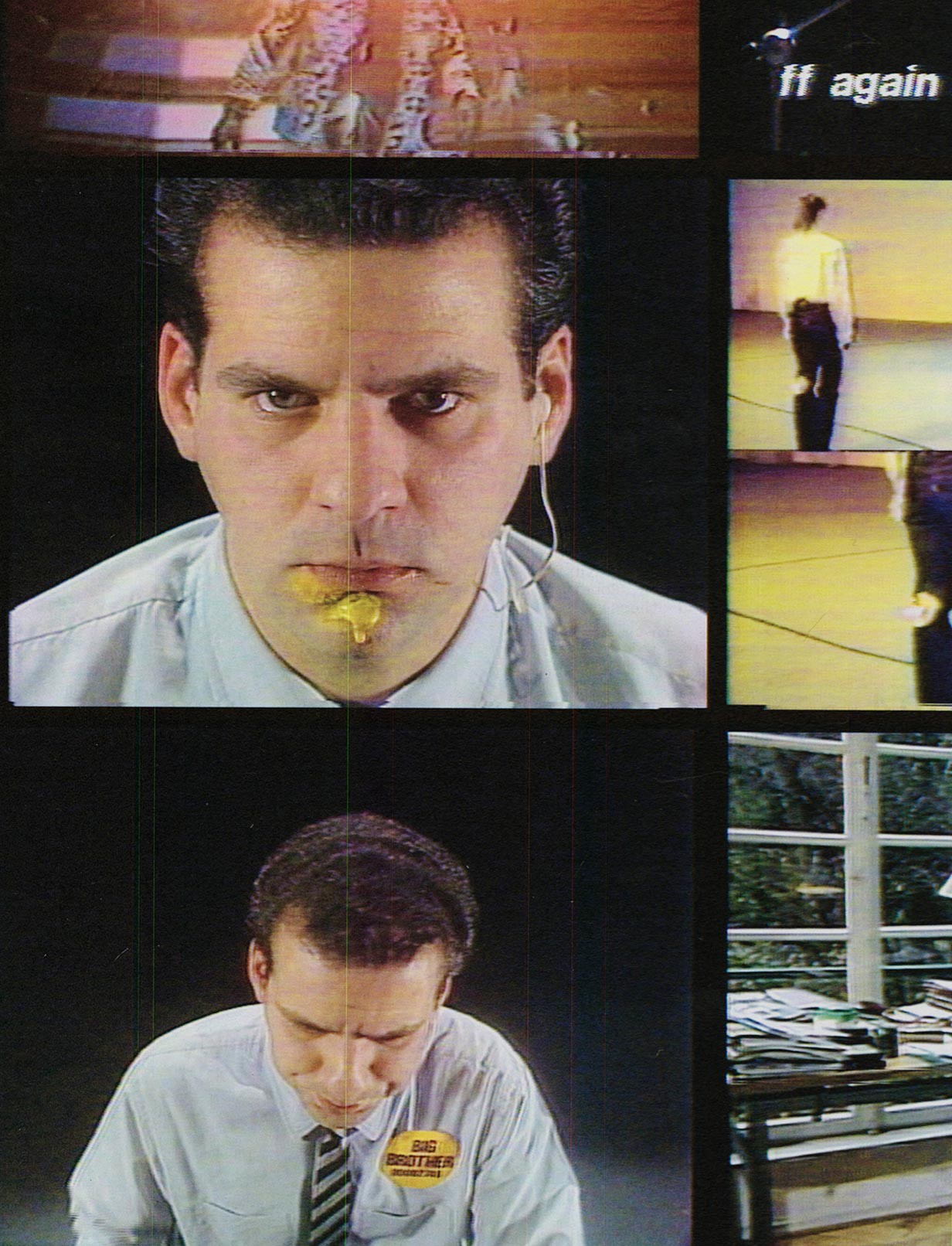
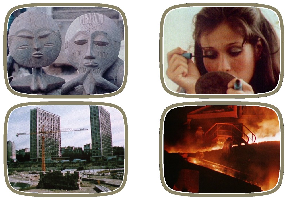
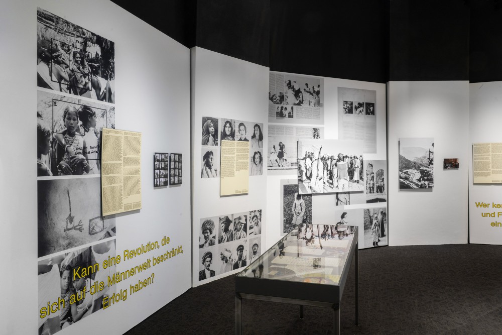
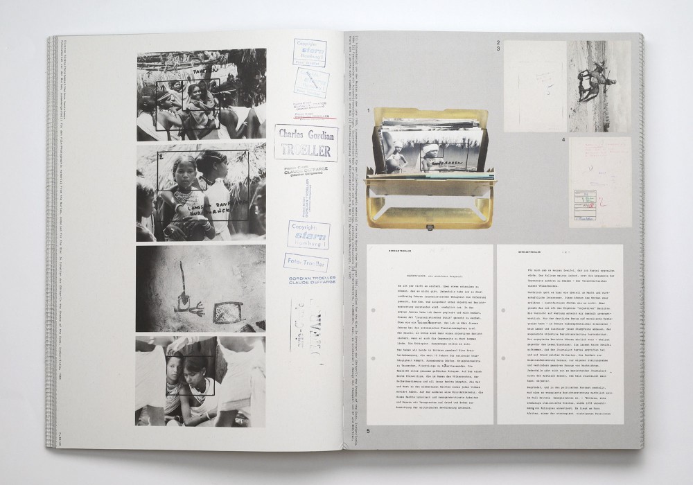
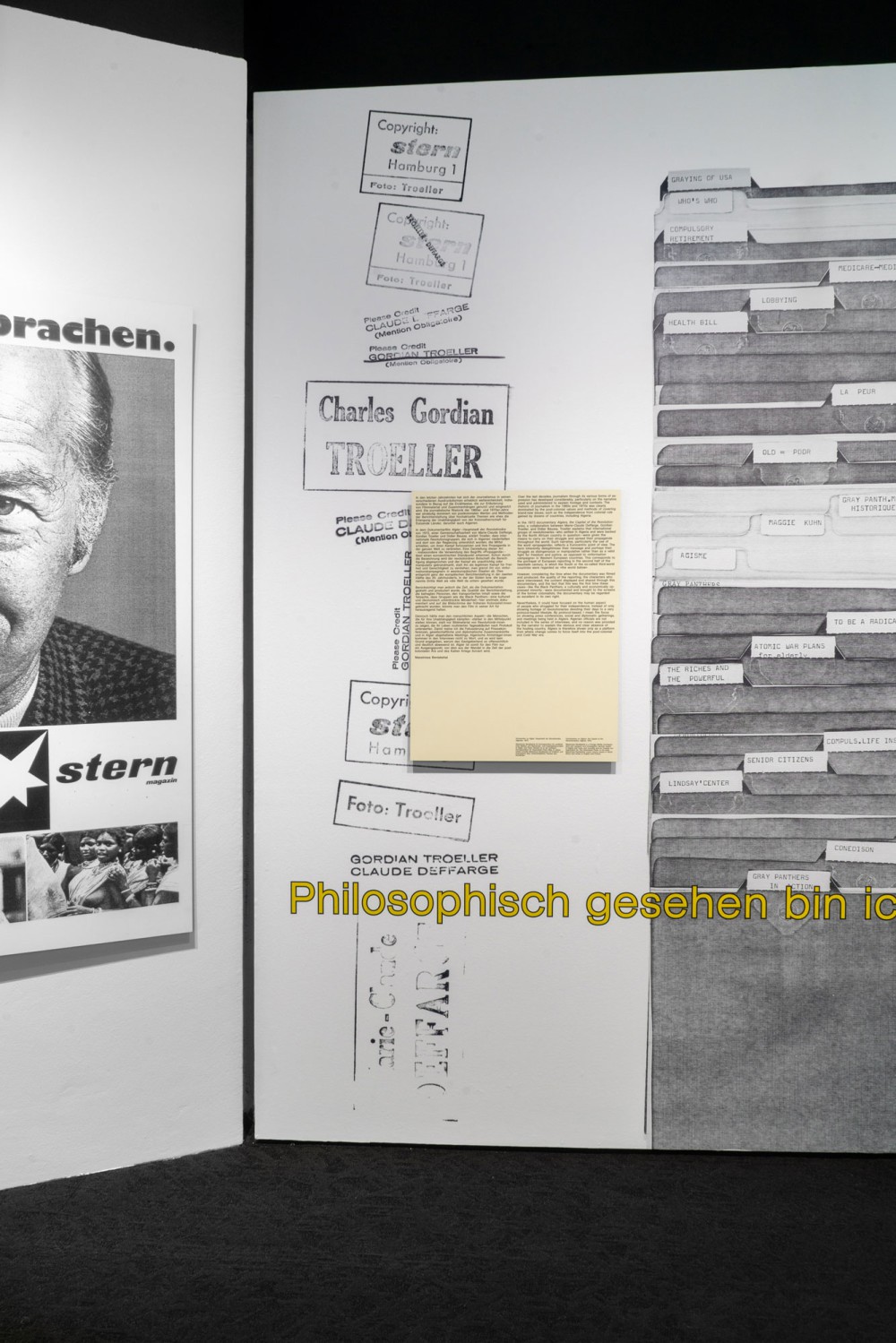
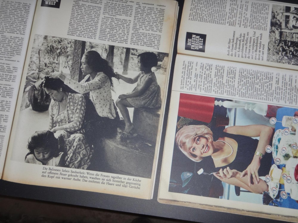
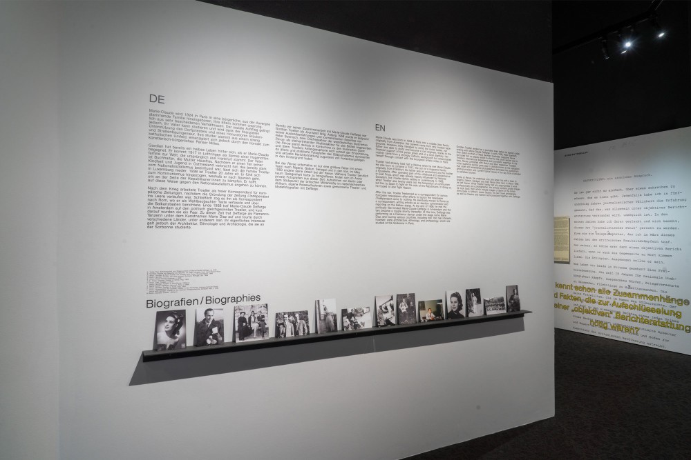
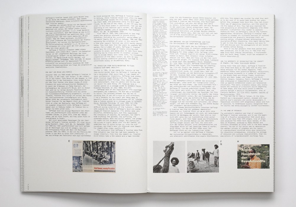
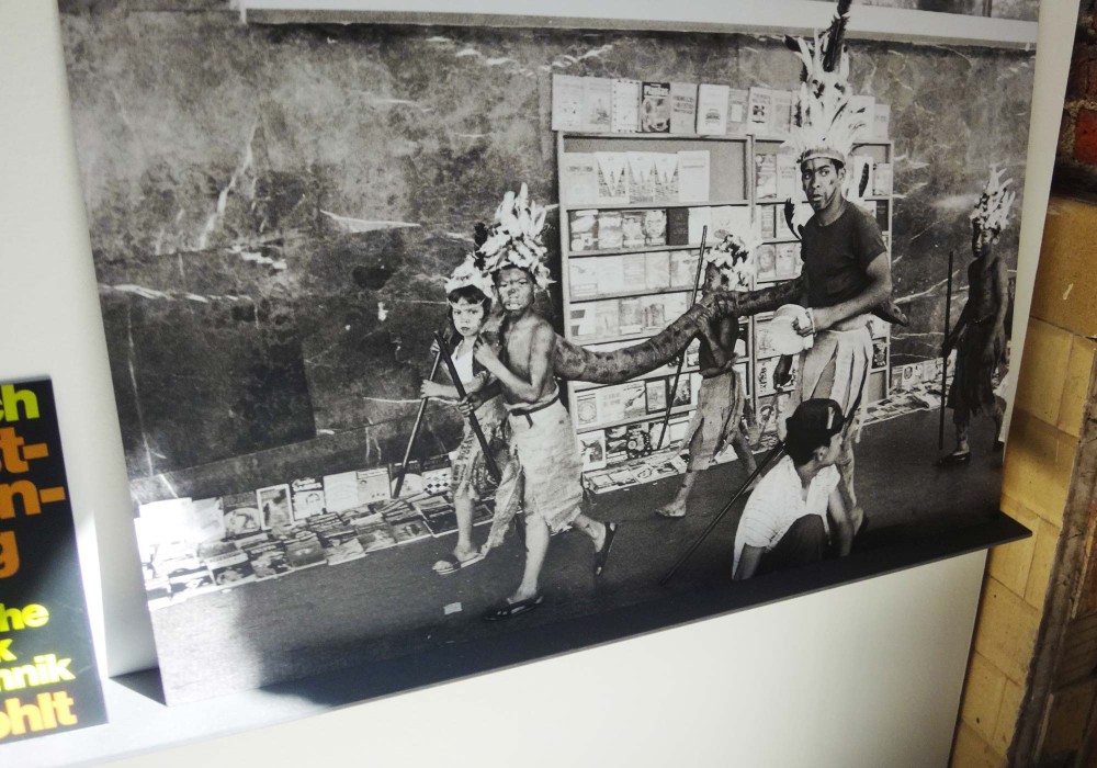
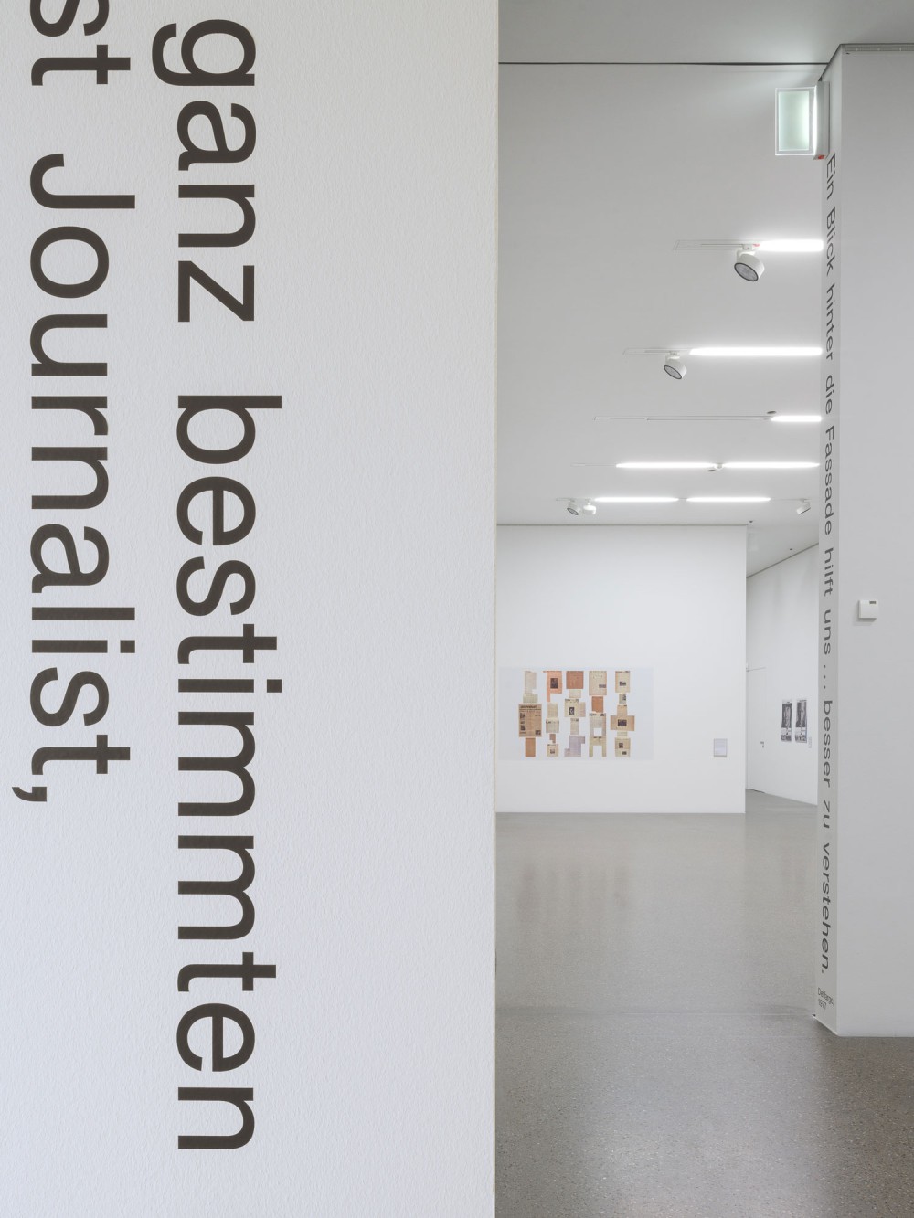
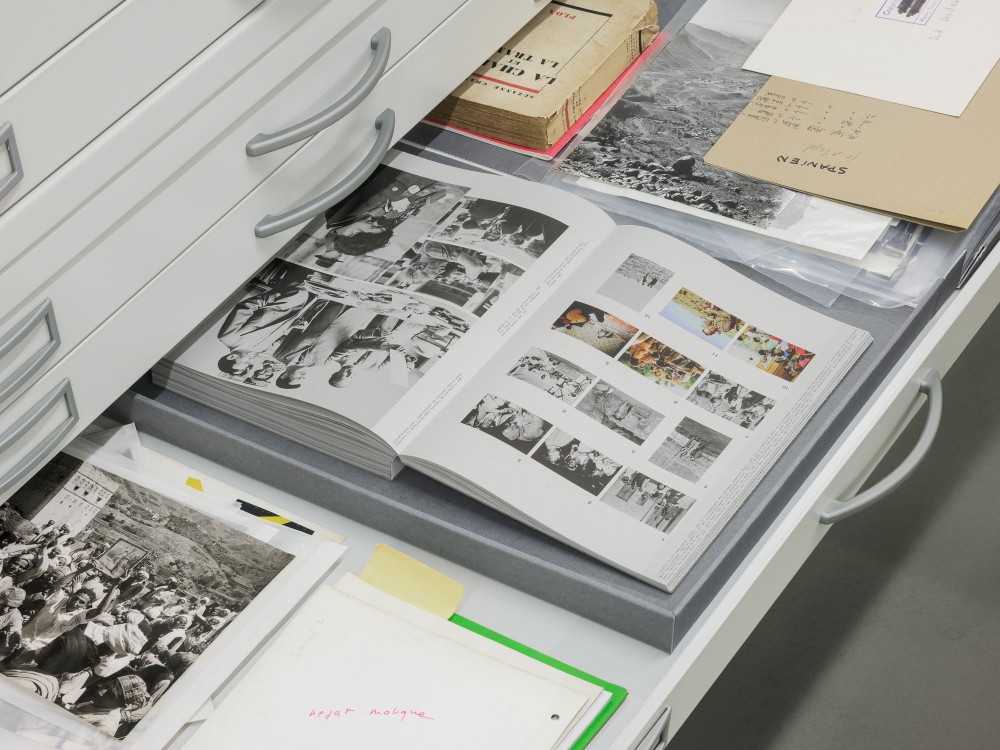
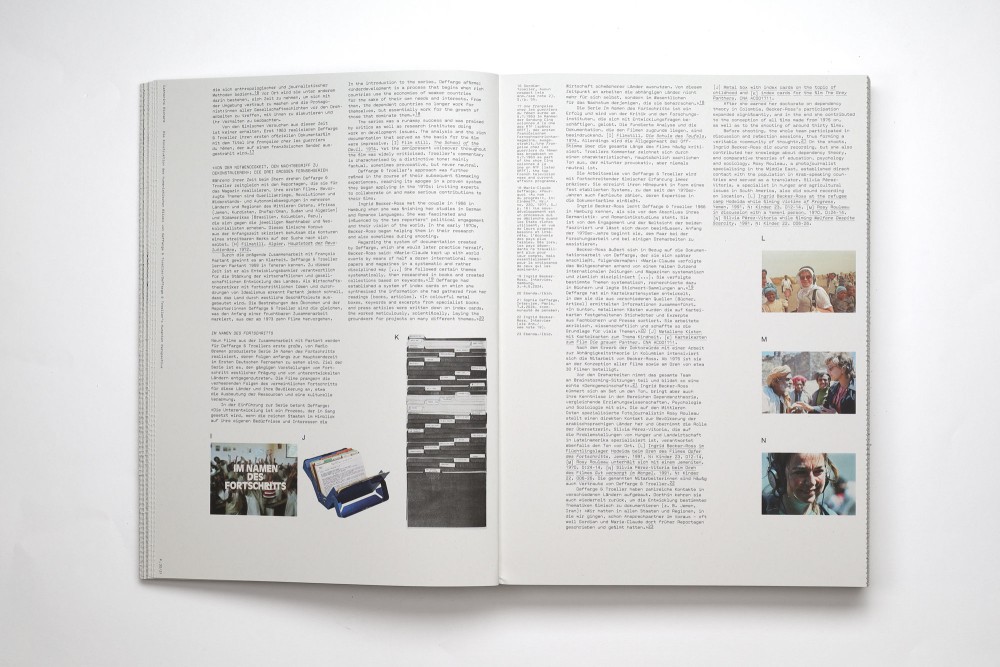
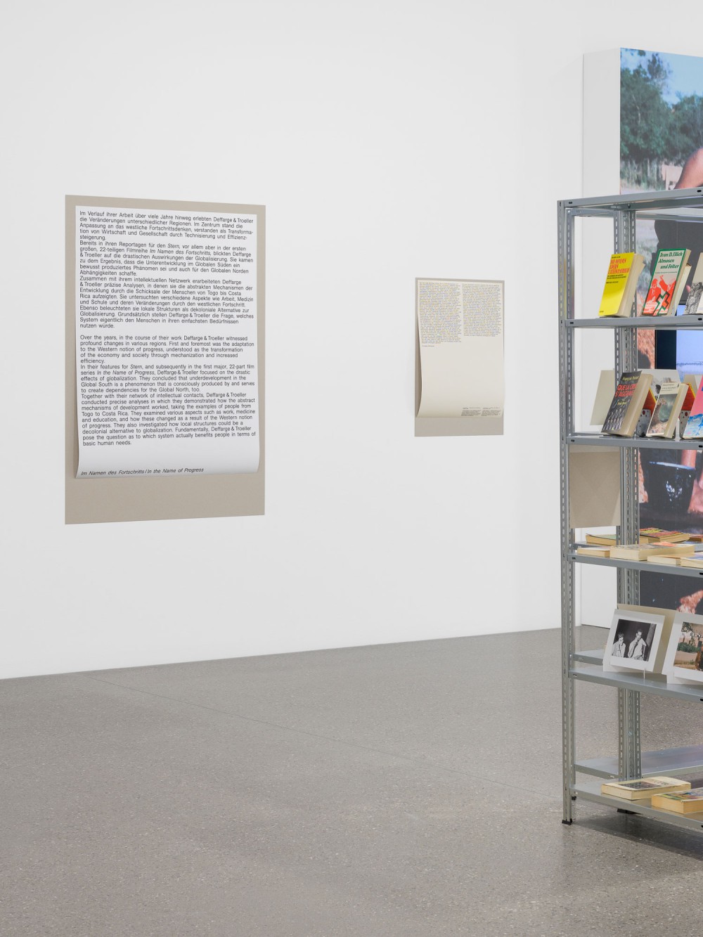
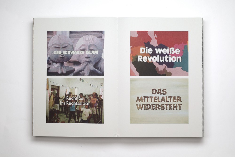
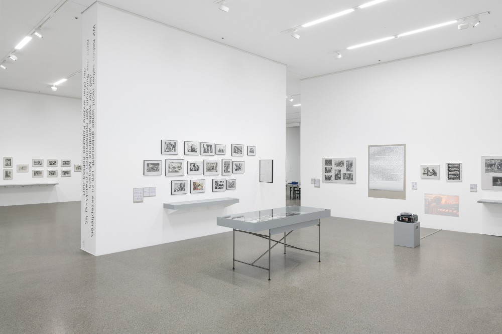
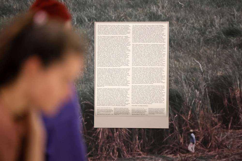
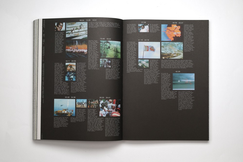
An exhibition design and correlating catalog at Museum Folkwang, partnering with CNA Luxemburg (published with Scheidegger and Spiess). Deffarge & Troeller worked in political and critical journalism from the 1950s onwards.
At the heart of this presentation is the Deffarge & Troeller archive, with countless material that had never been shown in the context of an exhibition as such. The archive as a principle also became the basis of all designed manner, all done in collaboration with Elias Erkan. Reaching from decisions of working with contact sheet layout principles and methods of enlarging and organising on one side, and using the straightforward materials we found existing in the archive on the other. These were evenly used on exhibition design aswell as the book format.
Typefaces:
Akzidenz Grotesk Buch
Valentine (Lineto)
Paper:
Circle Offset 150 g/m²
About:
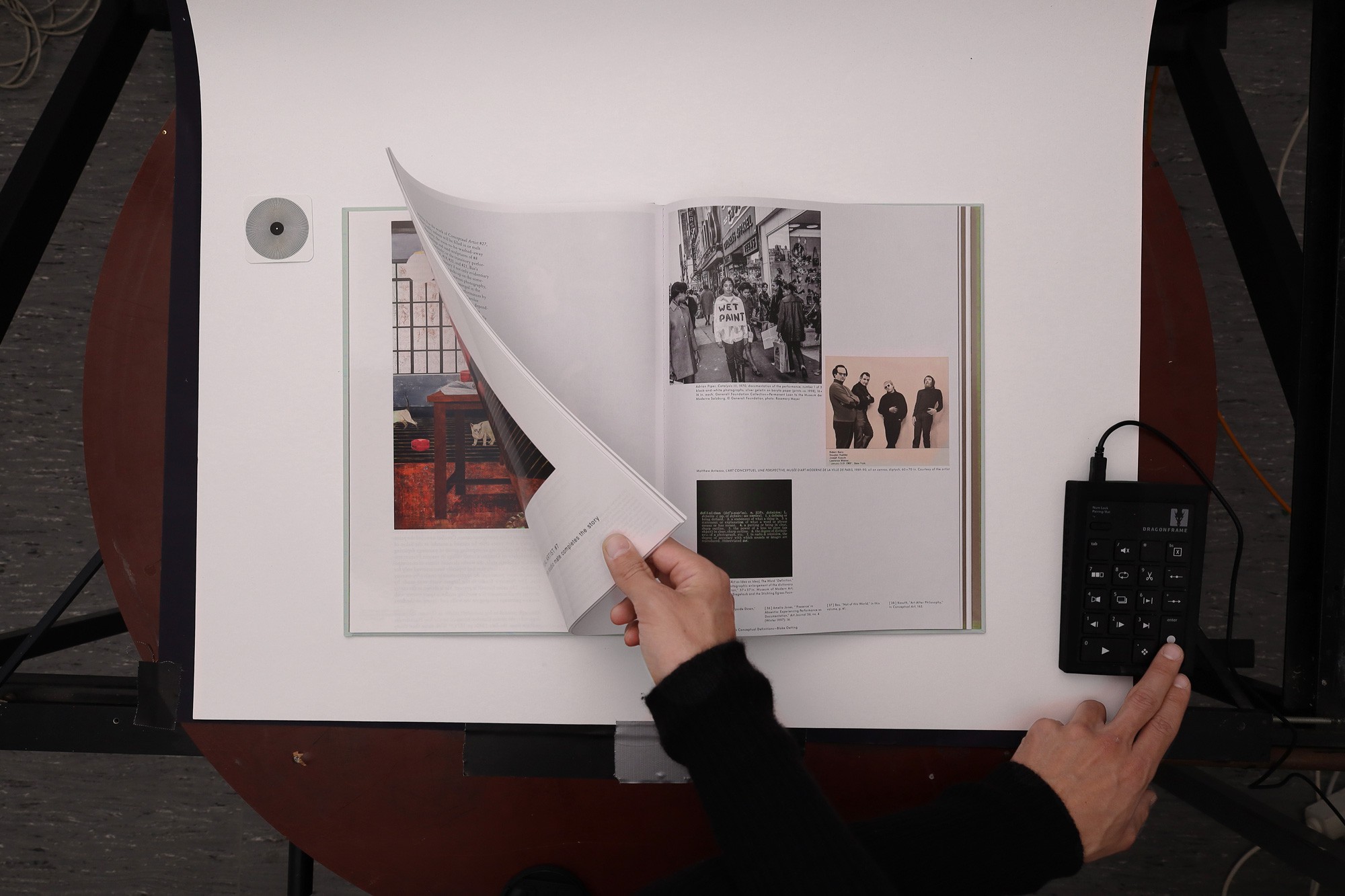
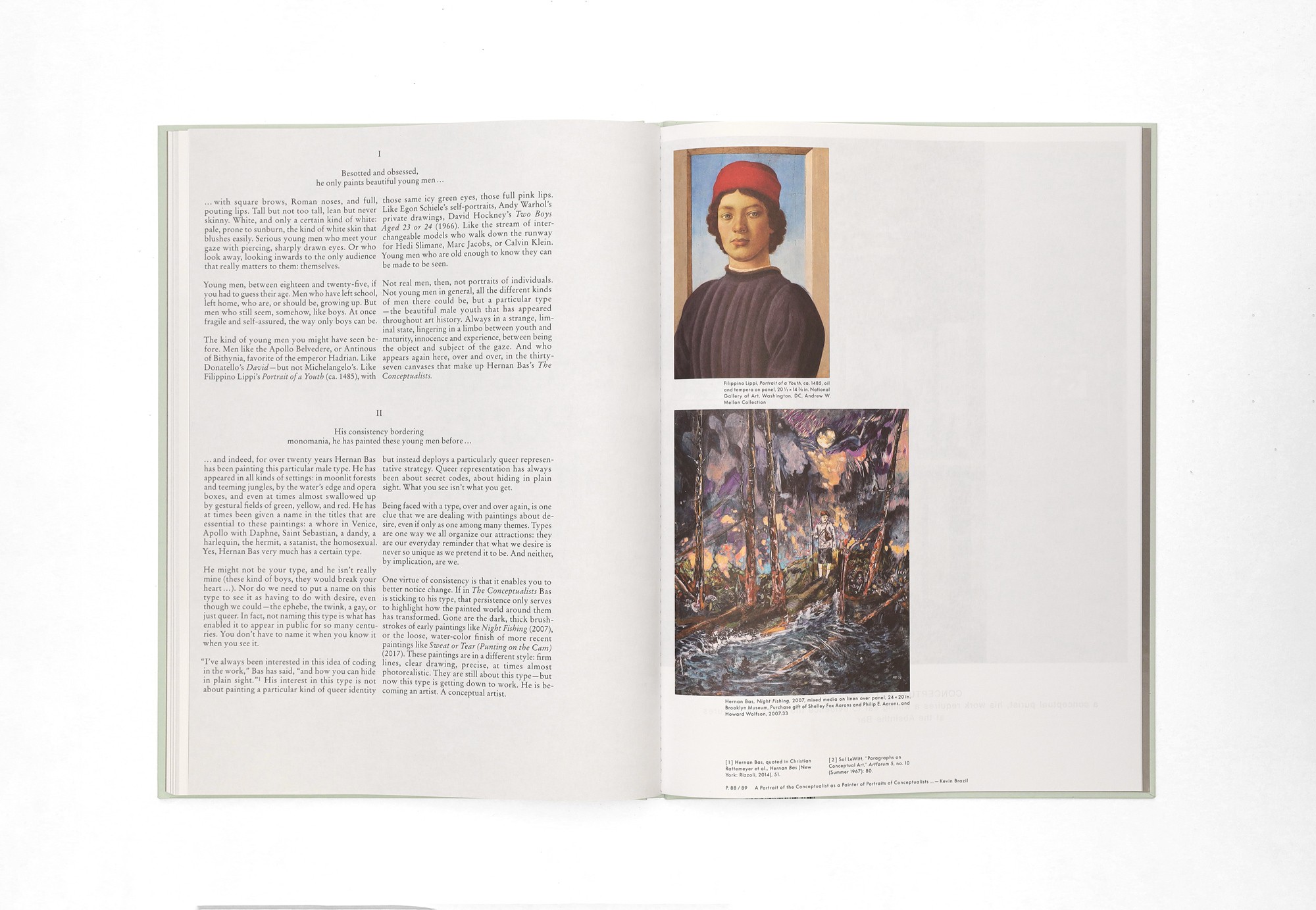
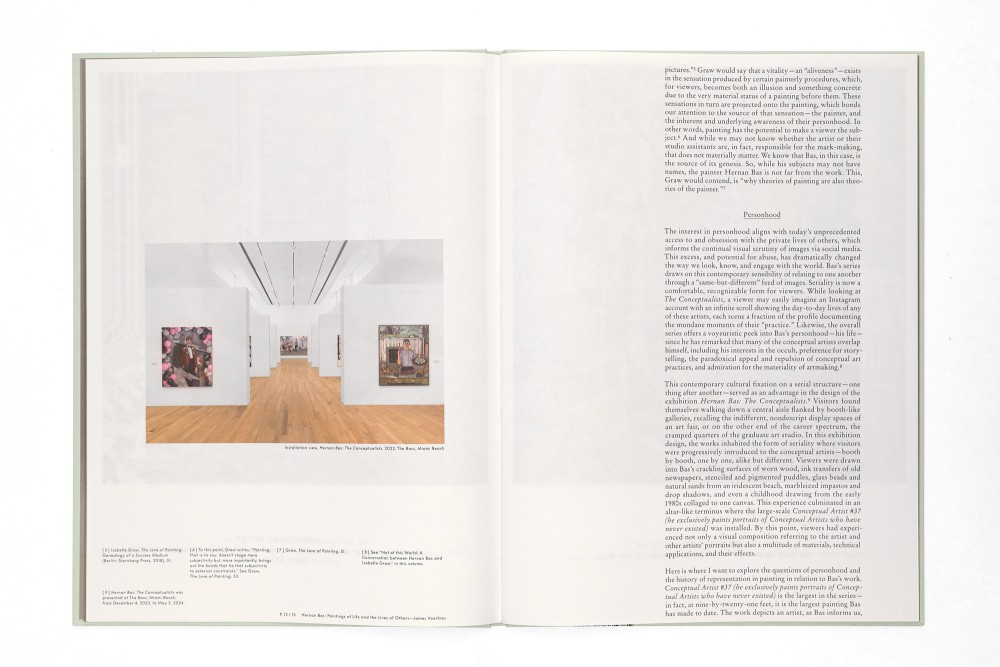
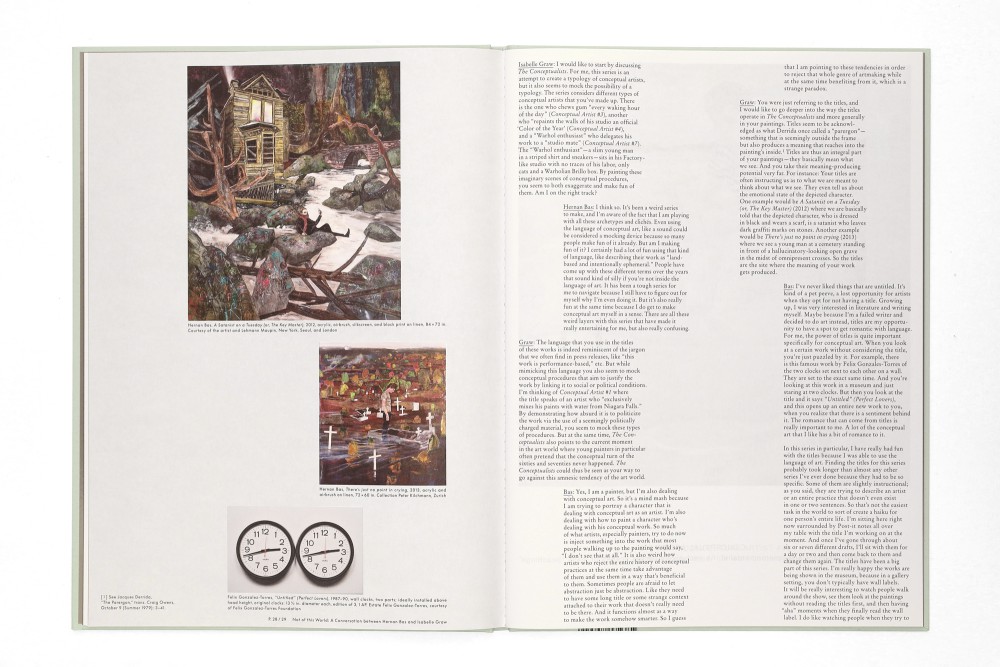
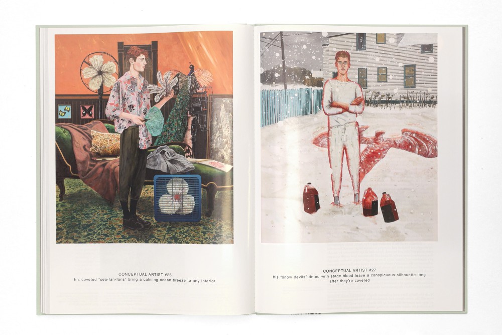
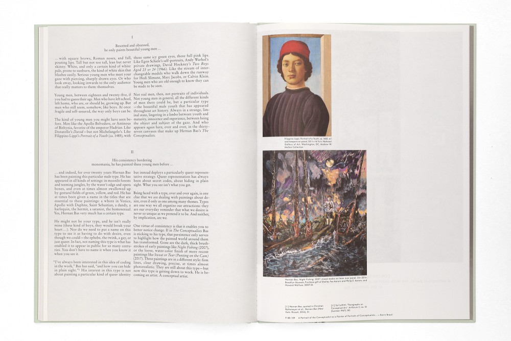
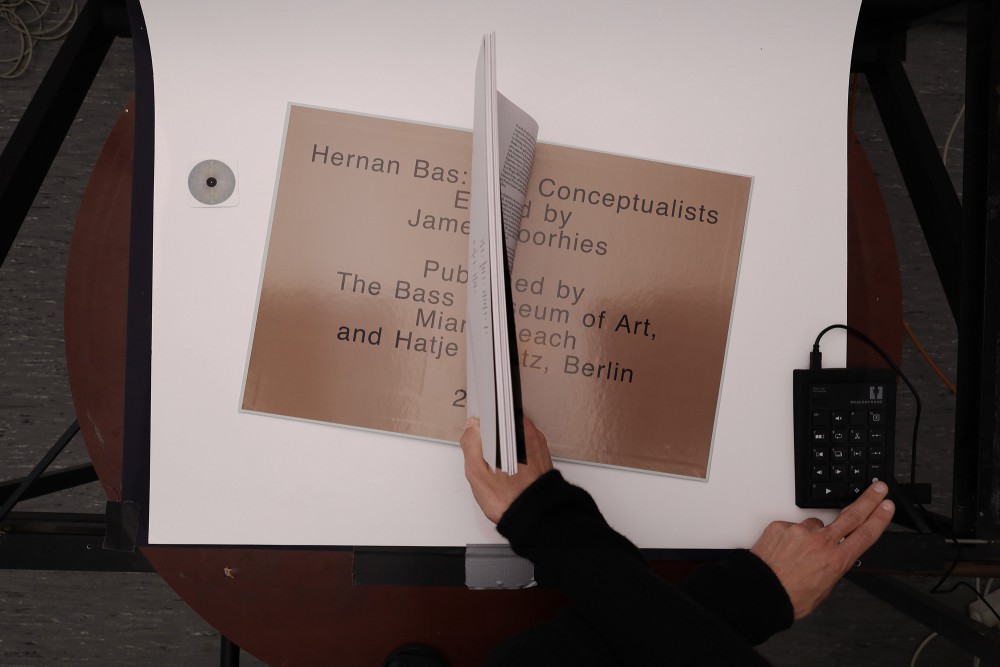
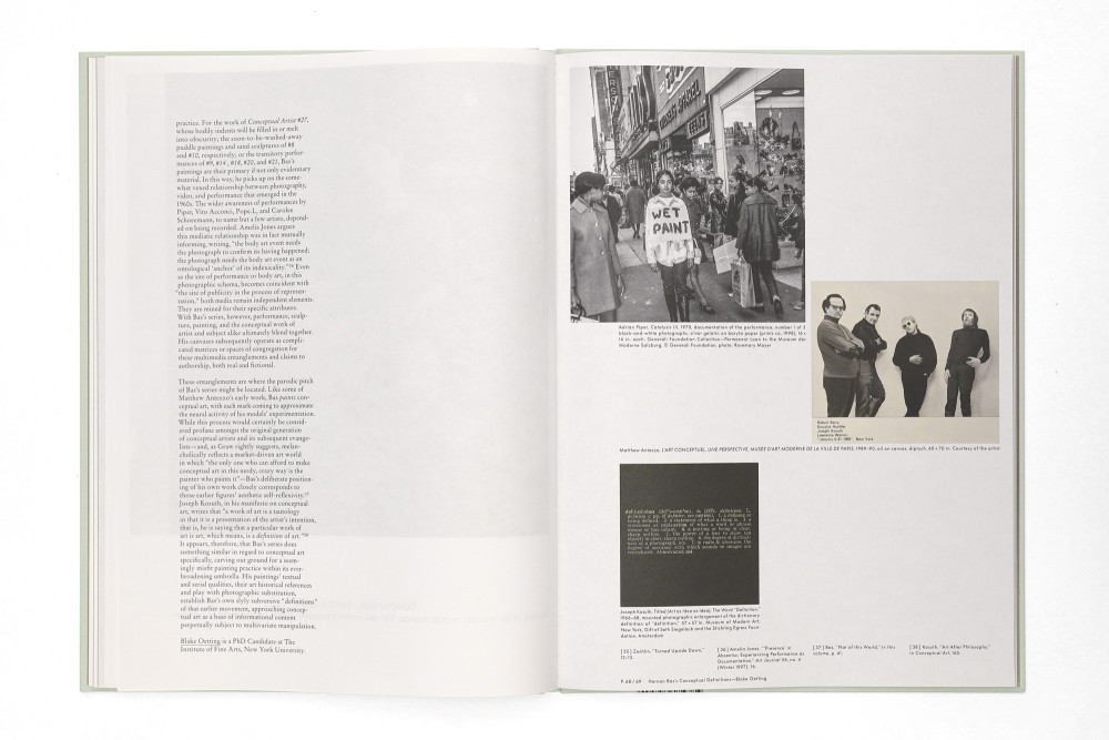
Edited and initiated by James Voorhies, designed with Elias Erkan, and with texts by Kevin Brazil, Isabelle Graw, Liz Munsell, Blake Oetting, and James Voorhies this catalog focuses on Hernan Bas’ series The Conceptualists, shown at The Bass MOA in Miami Beach.
The self referenciality in Hernan‘s work was the key moment of conceptualizing this catalog in which the conceptual artist paints exclusively conceptual artists. Seeing oneself in the reflection of the mirror on the cover while reading the description is playing this card again. The book is a constant back and forth between painting spreads and interrupted text flows that overlap with the placement of the painting sequences.
Hardcover with thread sewn saddle stitch through the endpapers. The paper is ordered in alternating coated glossy spreads and uncoated spreads of the onsided coated Astralux. Two mirroring UV CMYK printed plates on cover and back.
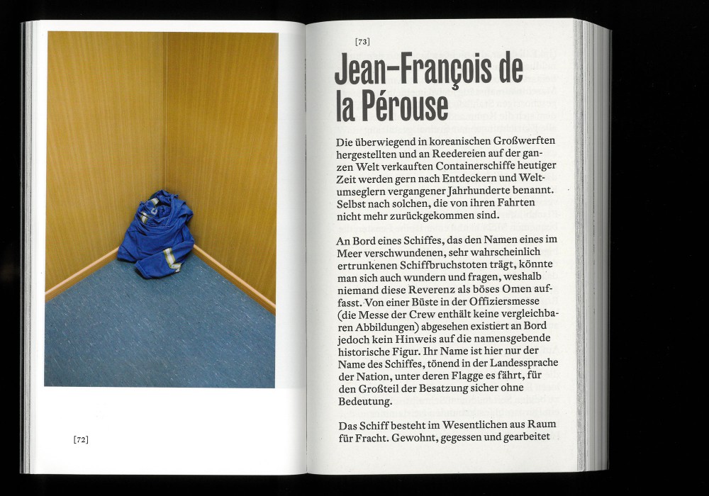
Typeface:
Stempel Garamond
Helvetica
Futura
Paper:
Mirri Spiegelkarton 180 g/m²
Peyer Seda 115 g/m²
Astralux 80 g/m²
About:
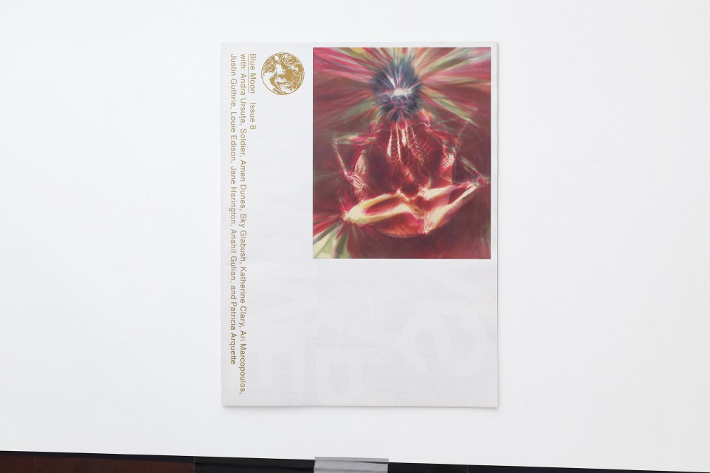
Blue Moon is a Paris-based independent newsprint publication, edited by Leah Gudmundson, and loosely dedicated to cultural figures and mysticism.
The Helvetica stretches to size, filling the page to the last line or going with the images, while the interviews stay classy with serifs.
Typeface:
Helvetica
Rongel
Paper:
Improved Newsprint 55 g/m²
About:
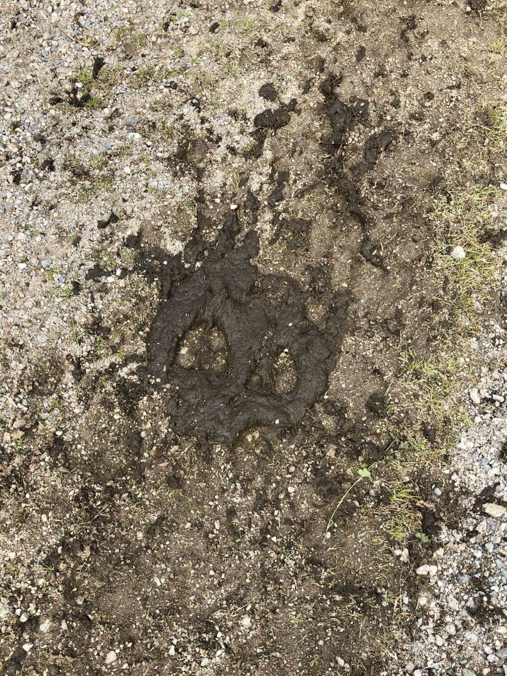
On a hike in Switzerland, after hours of walking, I look down and see a piece of cow shit that gets me struck: What I see looks back at me like the original Zero Skateboards skull.
A month later, being in China, I produced a batch of 30 micro fiber towels for the last days of summer.
Out of stock
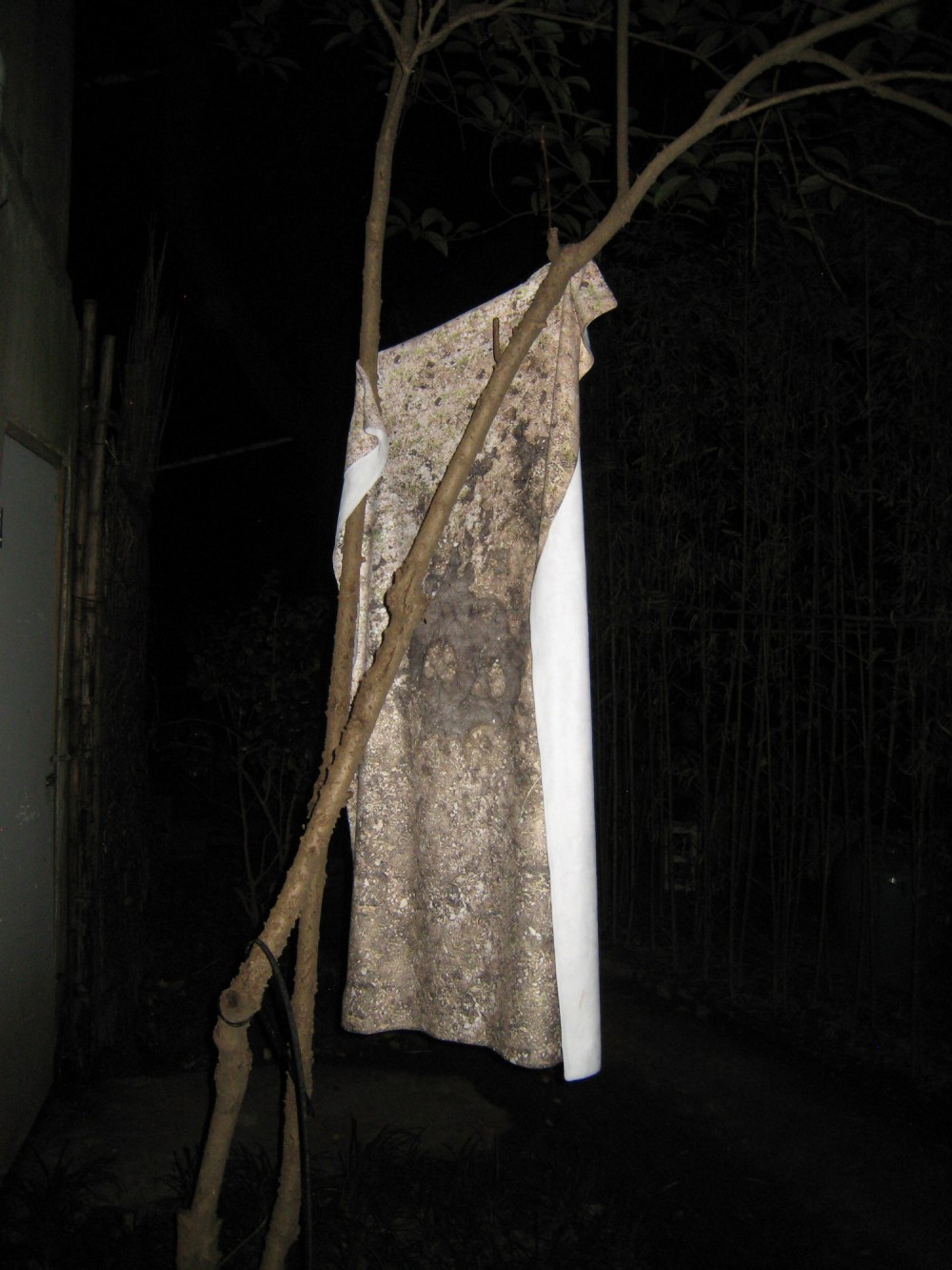
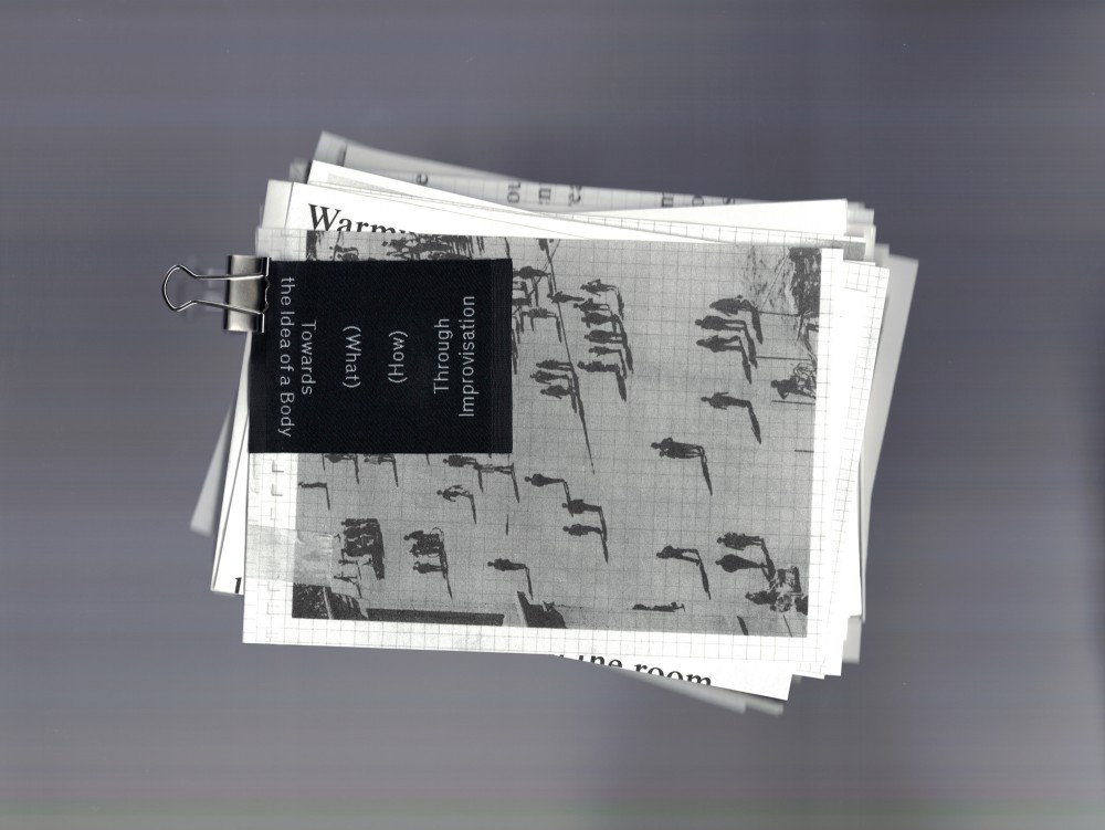
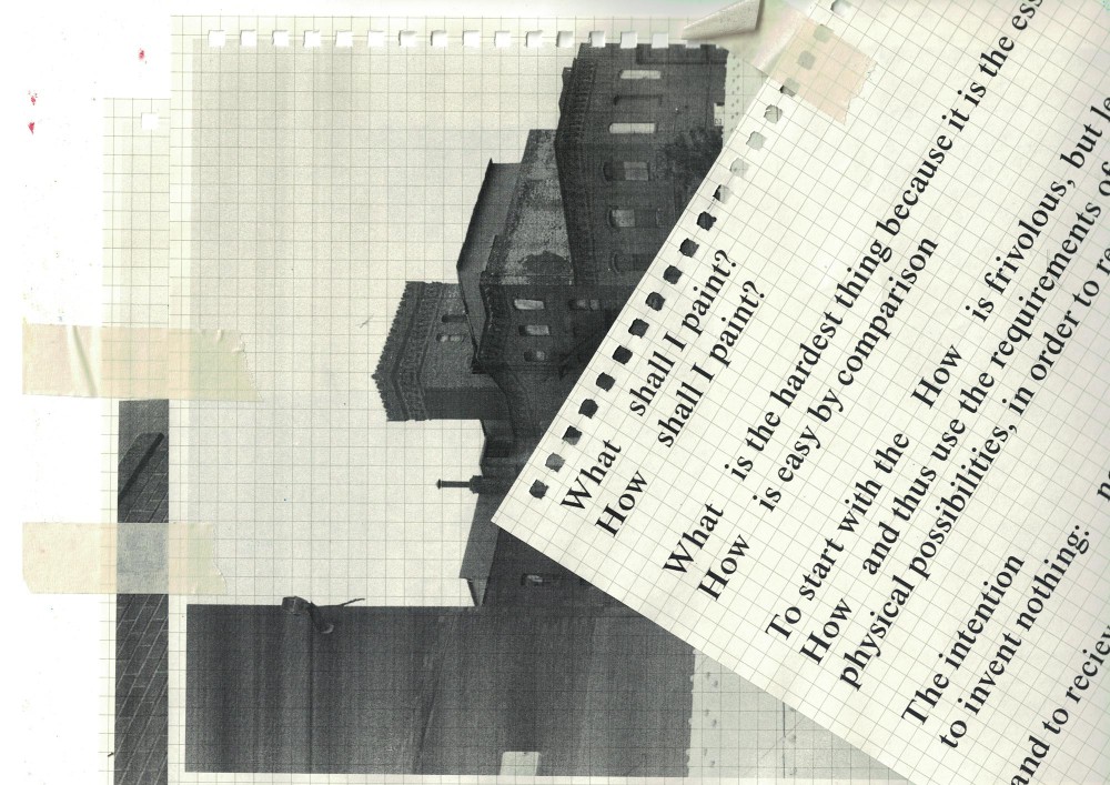
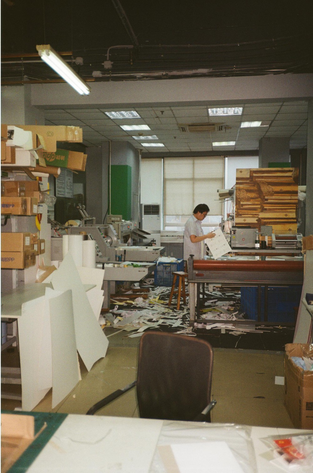
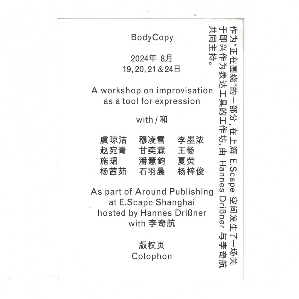
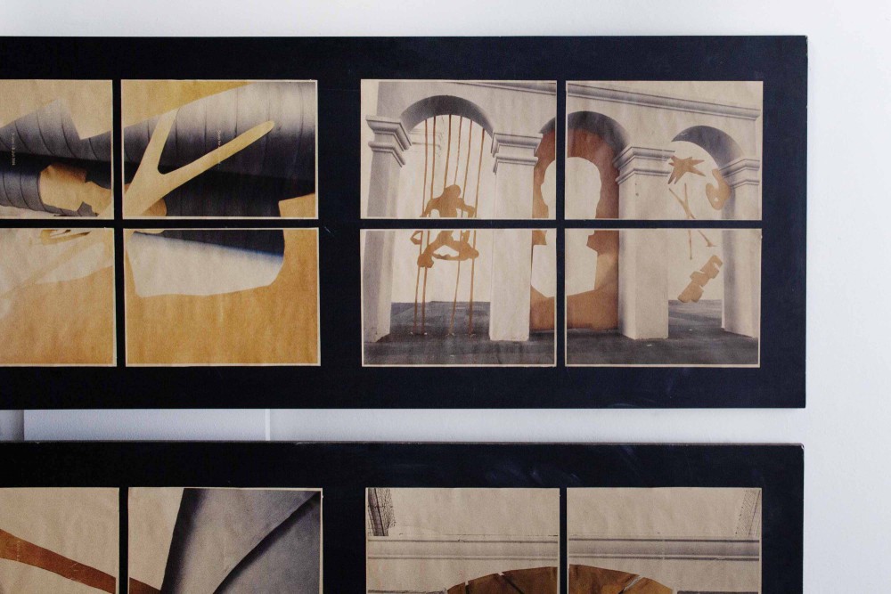
About:
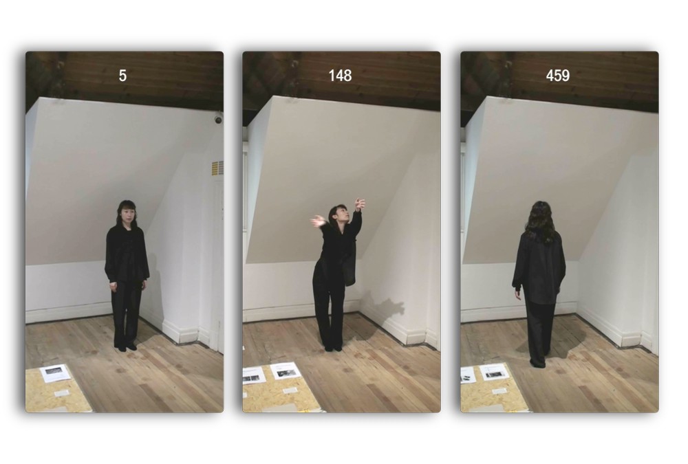
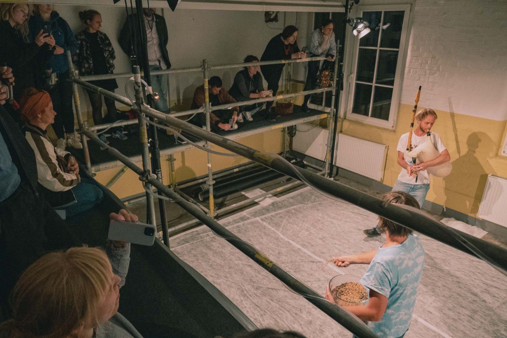
A workshop on improvisation as a tool for expression, as part of Around Publishing, a month long exhibition and residency at E.Scape Shanghai held together with Qihang Li .
Based off of a set of clothing and a novel of choice each participant developed a visual gesture through a chosen medium. The results were shown printed in an exhibition and each gesture was activated through a commissioned performer.
We projected the field of graphic design thinking—our common ground—into the an area of expression and movement: Improvisation dance and performance. Using our patterns and knowledge in a new context. Doing it for the first time. Doing it for the fun of it. Creating an alphabet to learn a new language.
About:
A leaflet for a non existing exhibition with non existing sculptures in the spirit of Isamu Noguchi’s textil work "Study for an Absent Sculpture": Creating a visual and the correlating typography facing absence as a subject and working with its spatial aspects.
About:
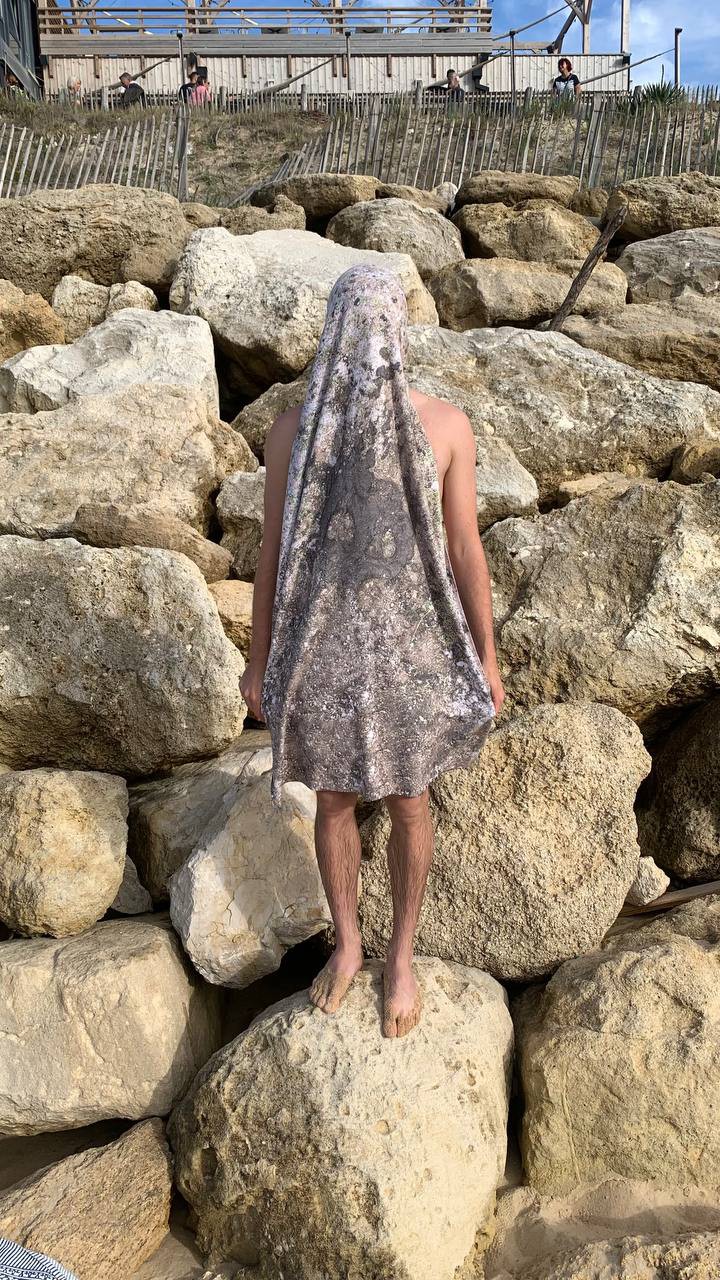
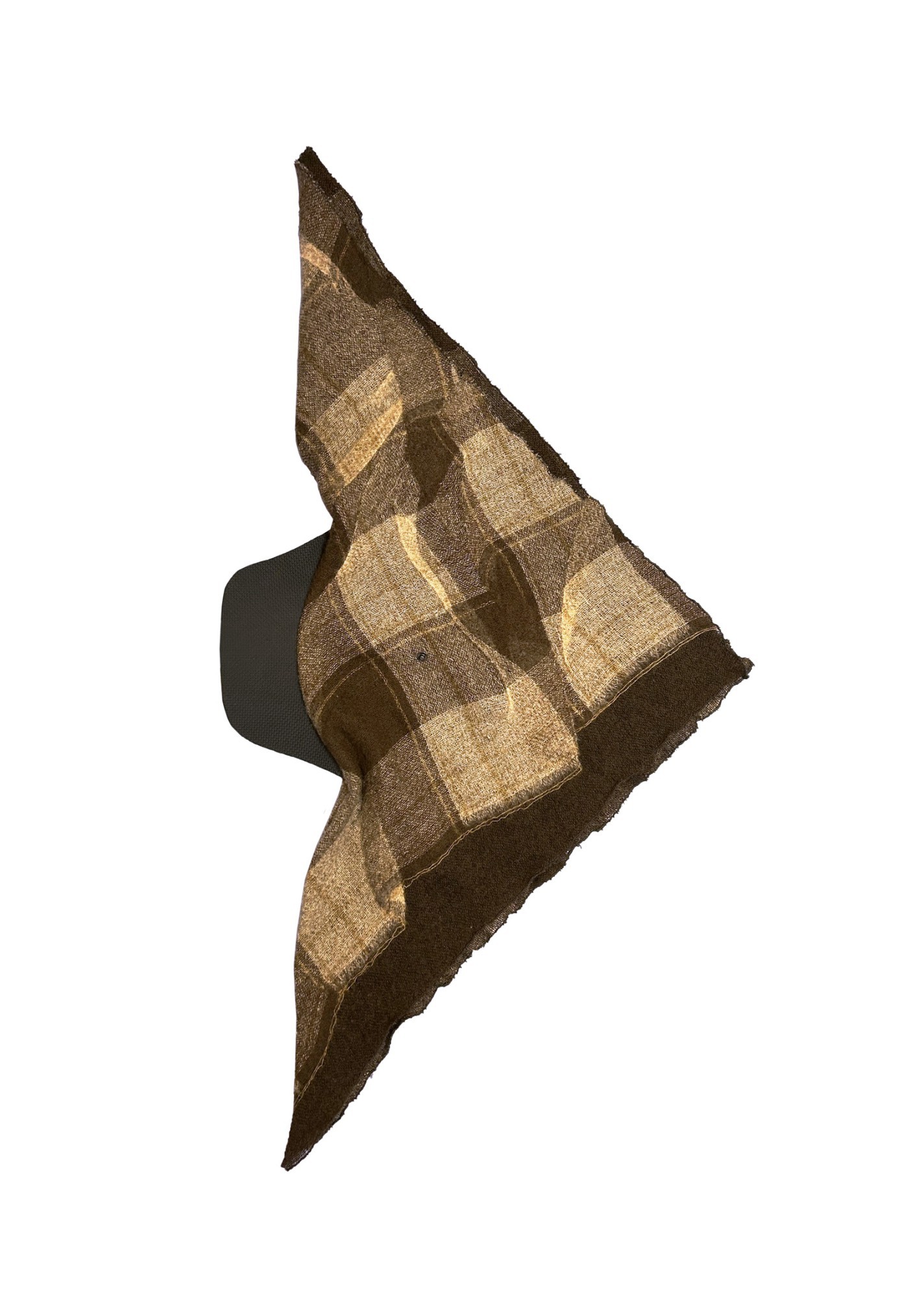
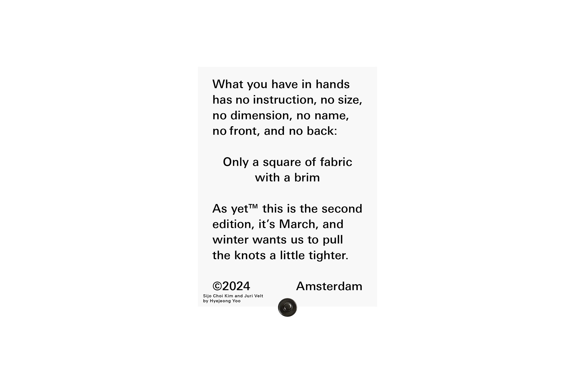
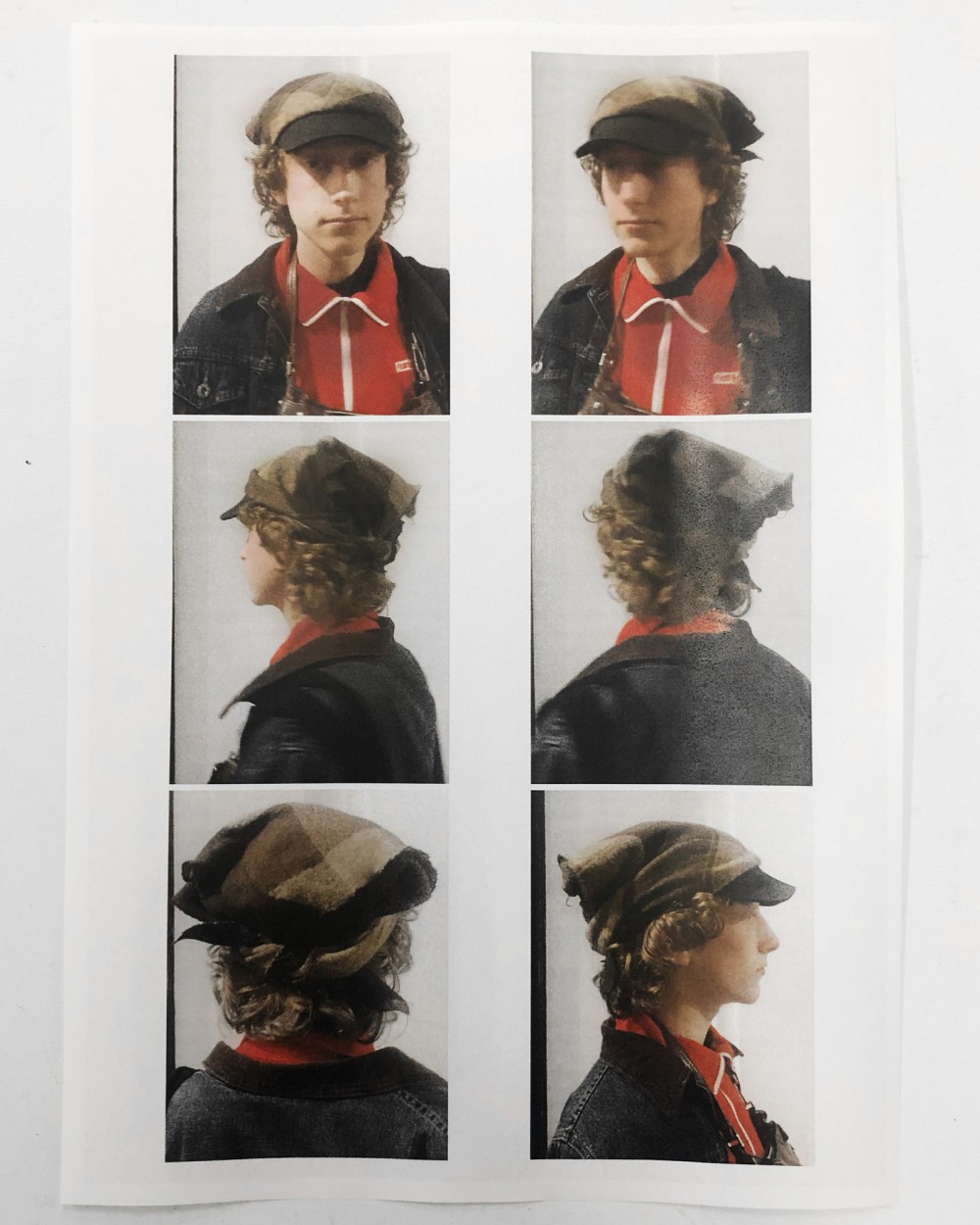
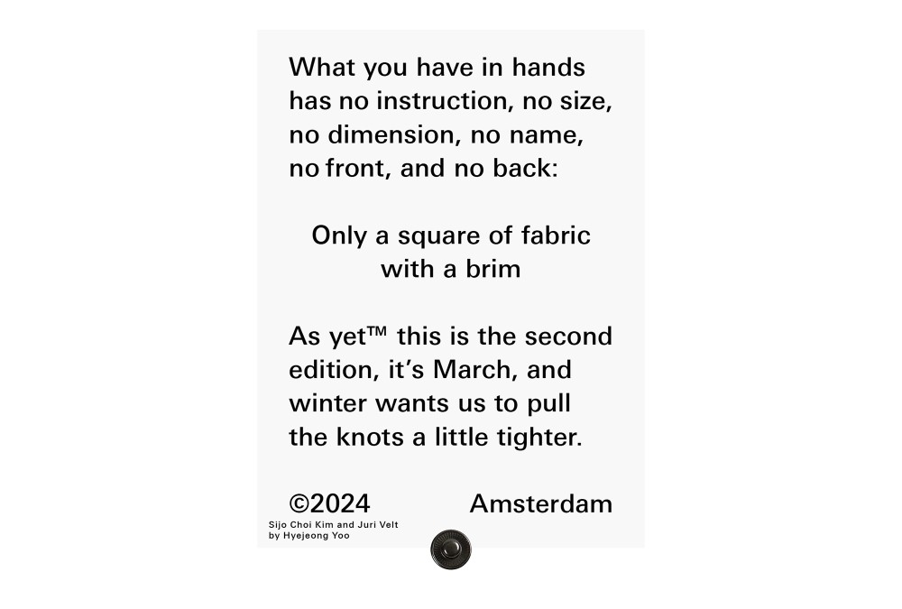
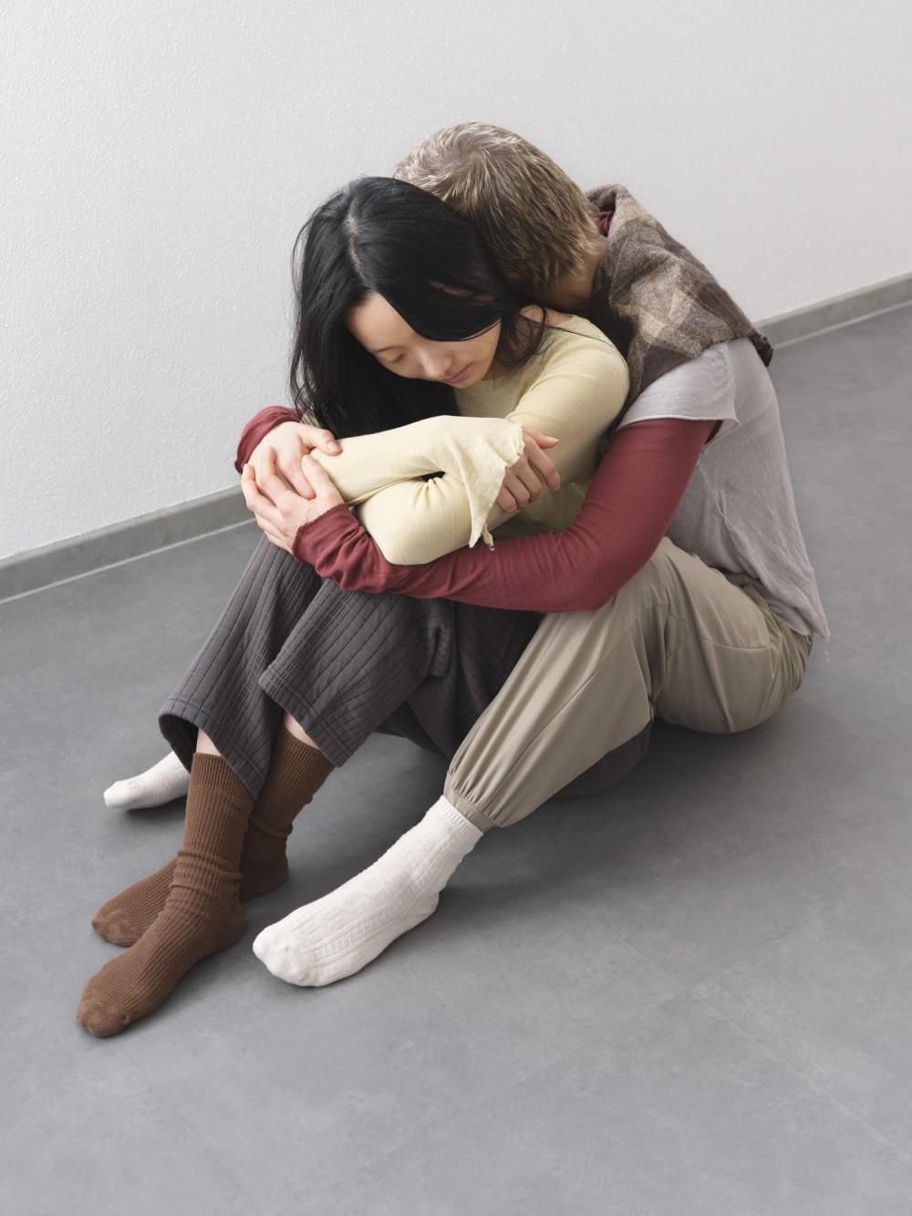
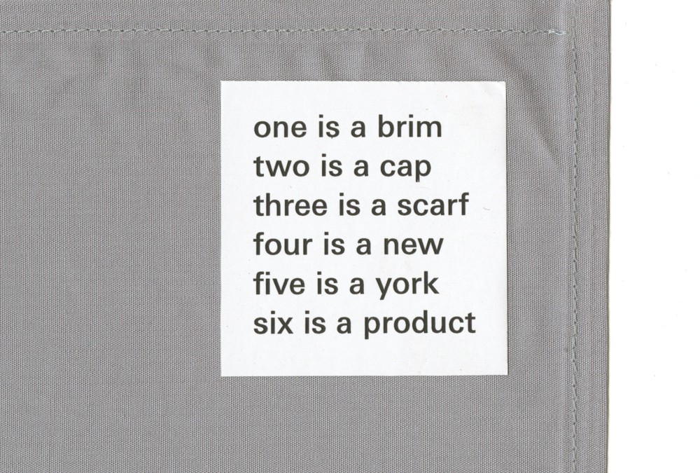
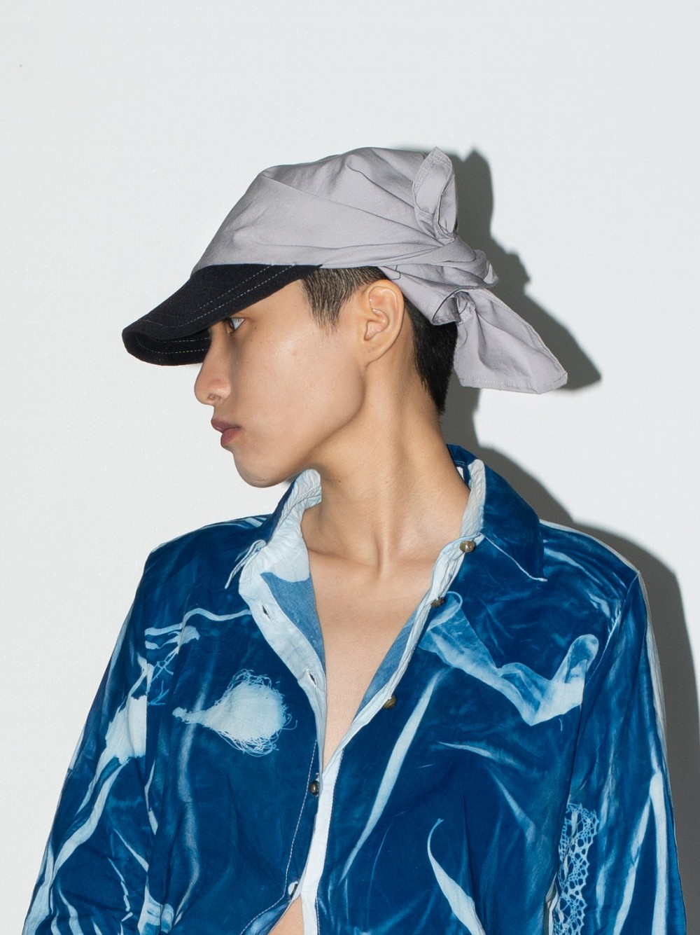
Second edition of the bandana + cap + scarf fusion: Another square of fabric with a neoprene brim. Triple felted japanese wool, with a machine distorted pattern. Each piece has a different pattern the fabric alternates.
Worn by Marian, photographed by Hyejeon, body knot by Sijo and Juri.
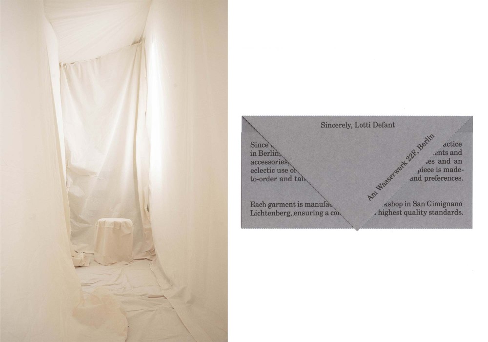
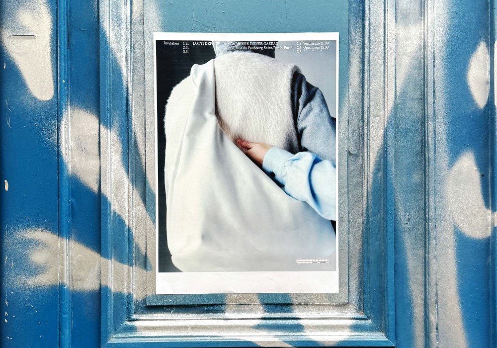
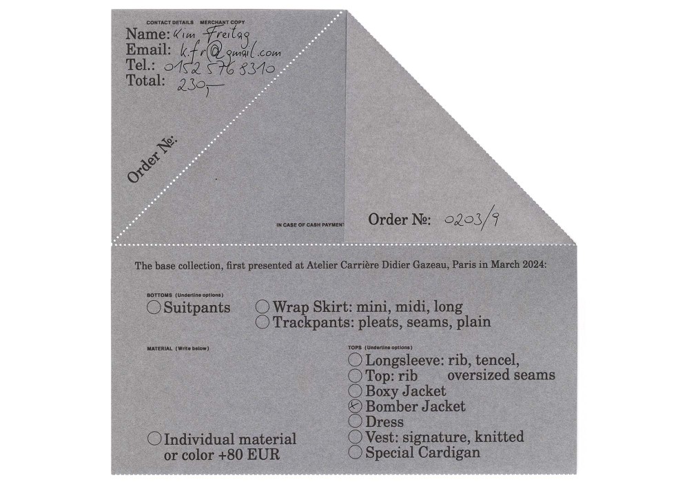
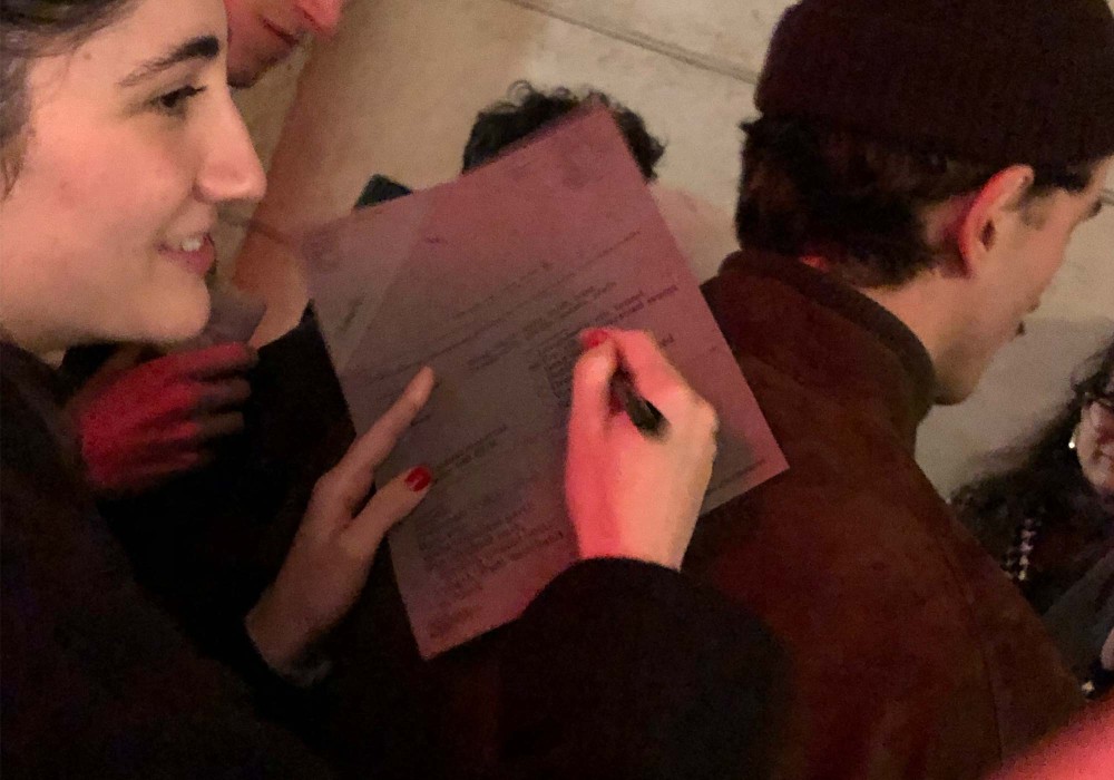
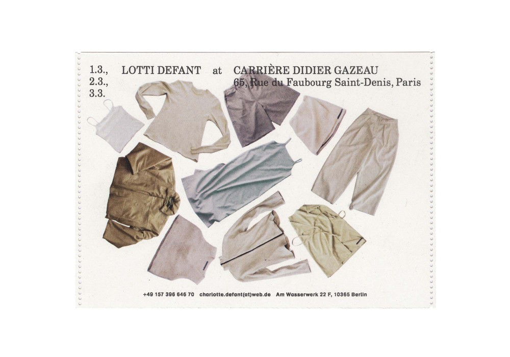
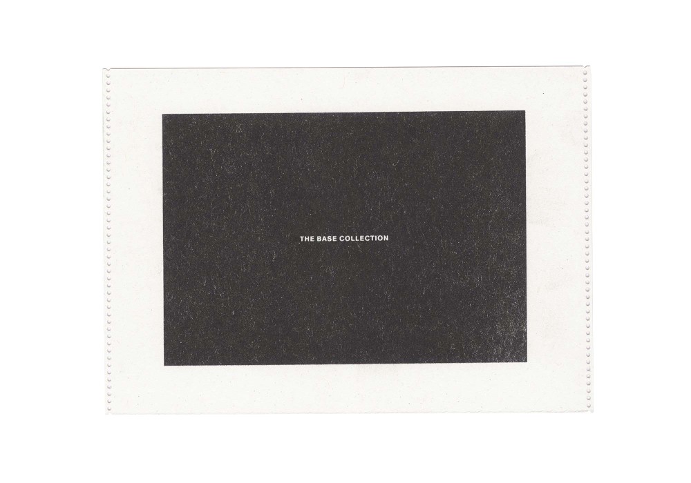
About:
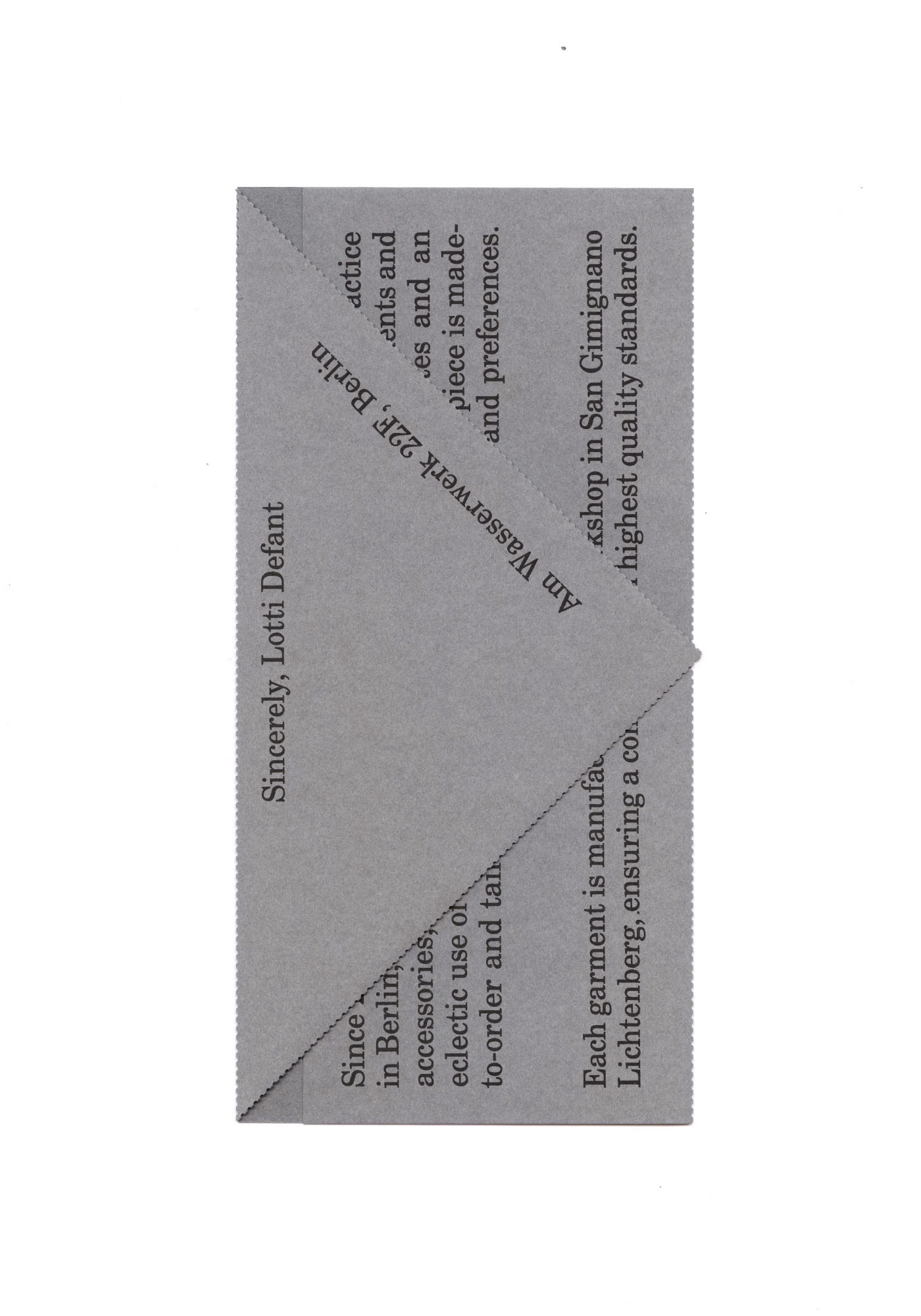
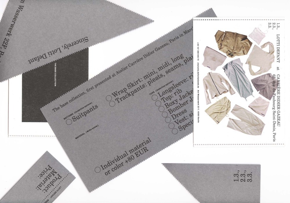
The first set of Lotti Defant’s rebranding in conjunction with her debut "Base" line released at Carrière Didier Gazeau in Paris. For the launch we developed an ordersheet/identity card mashup for her custom and made to order pieces. Scenography by Anton Defant and Ansgar Leander
Risoprinted on 230 gramm cardboard, hand scored and printed at ArteZ Arnhem in an edition of 75. Postcards are Riso over color Inkjet.
Typeface:
Century Schoolbook
AG Schulbuch
About:
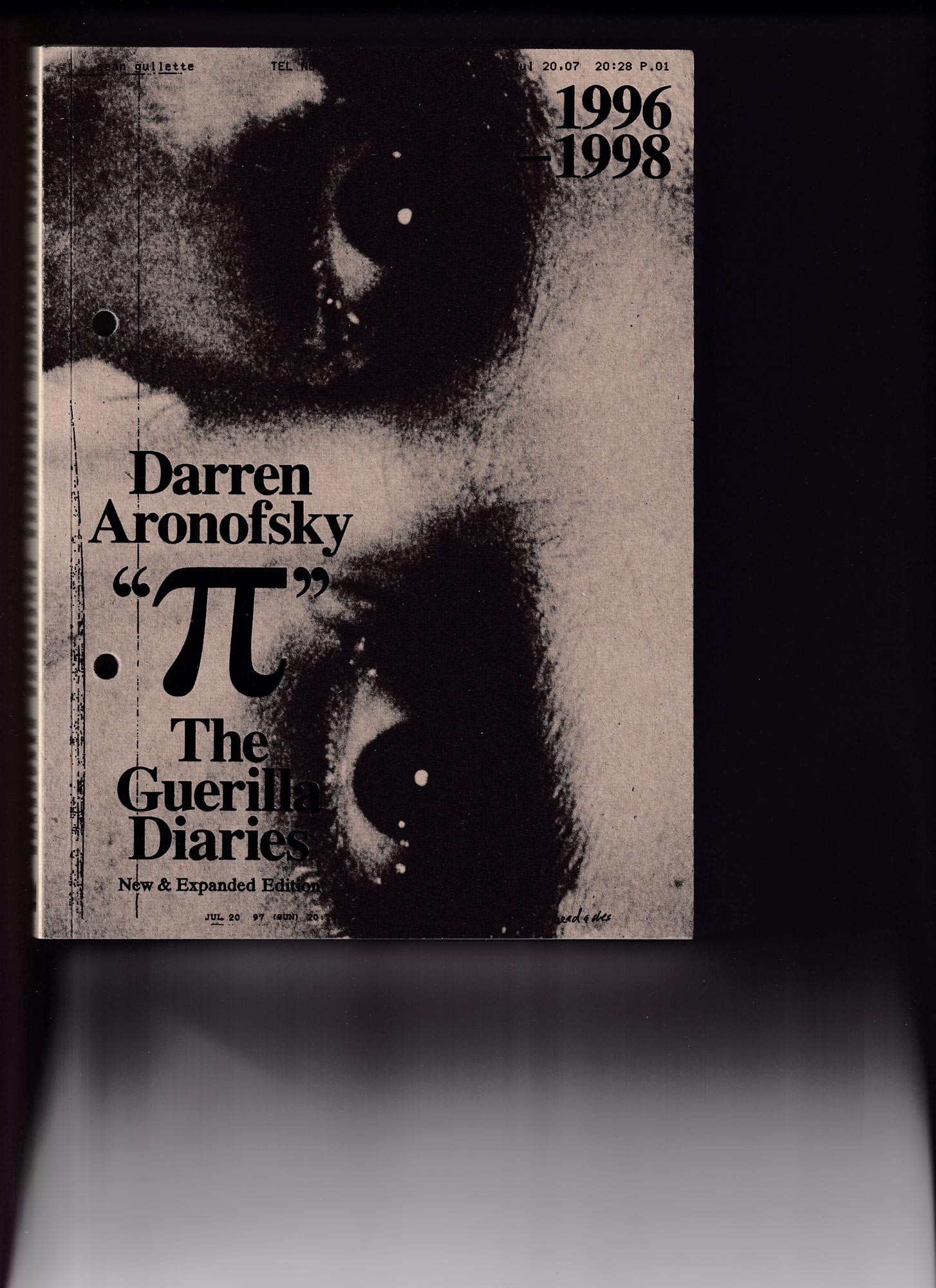
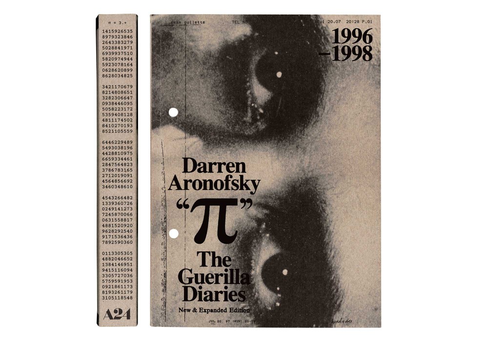
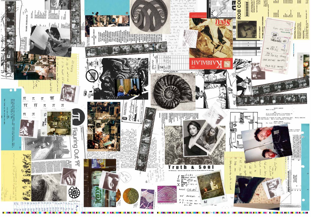
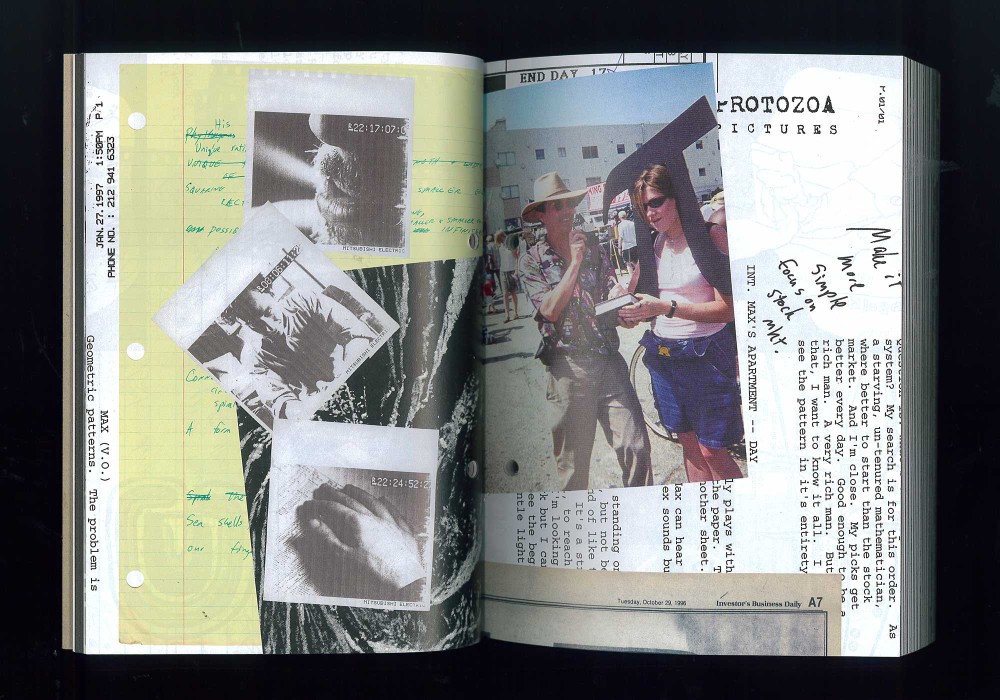
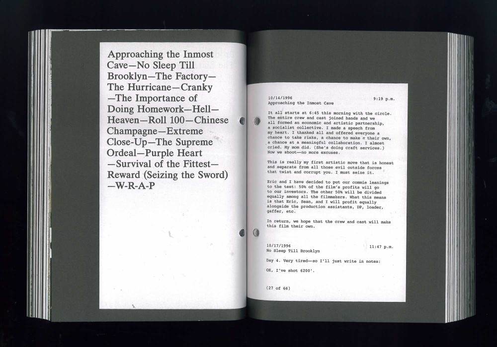
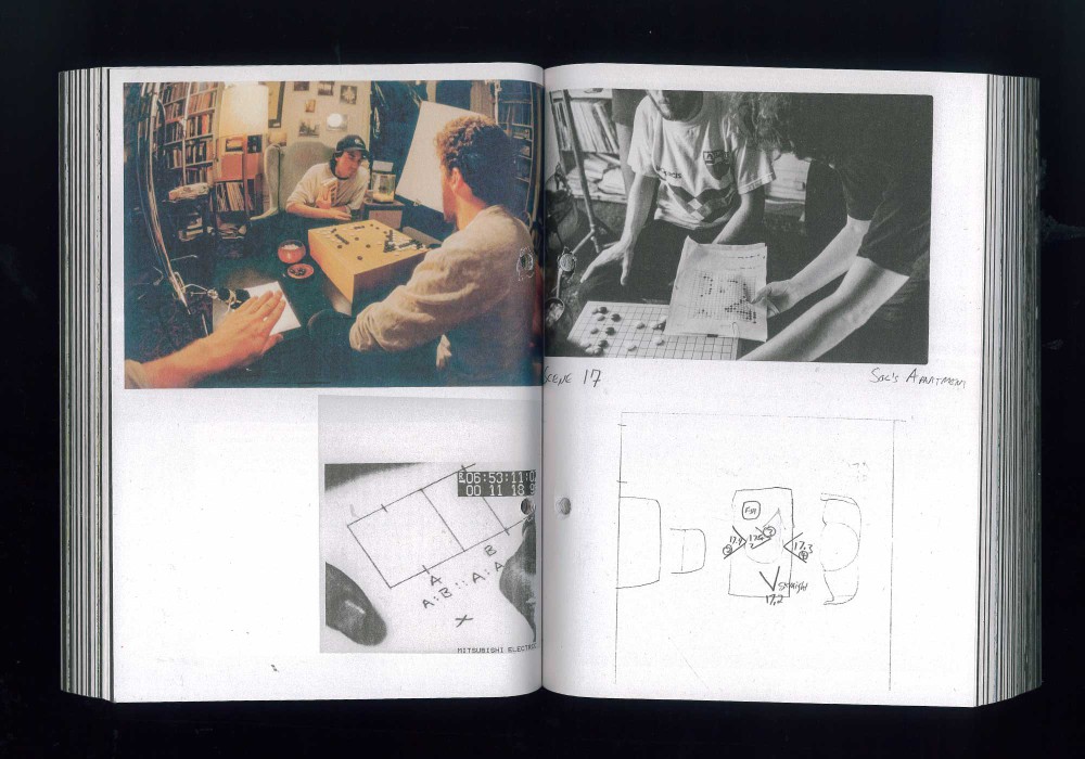
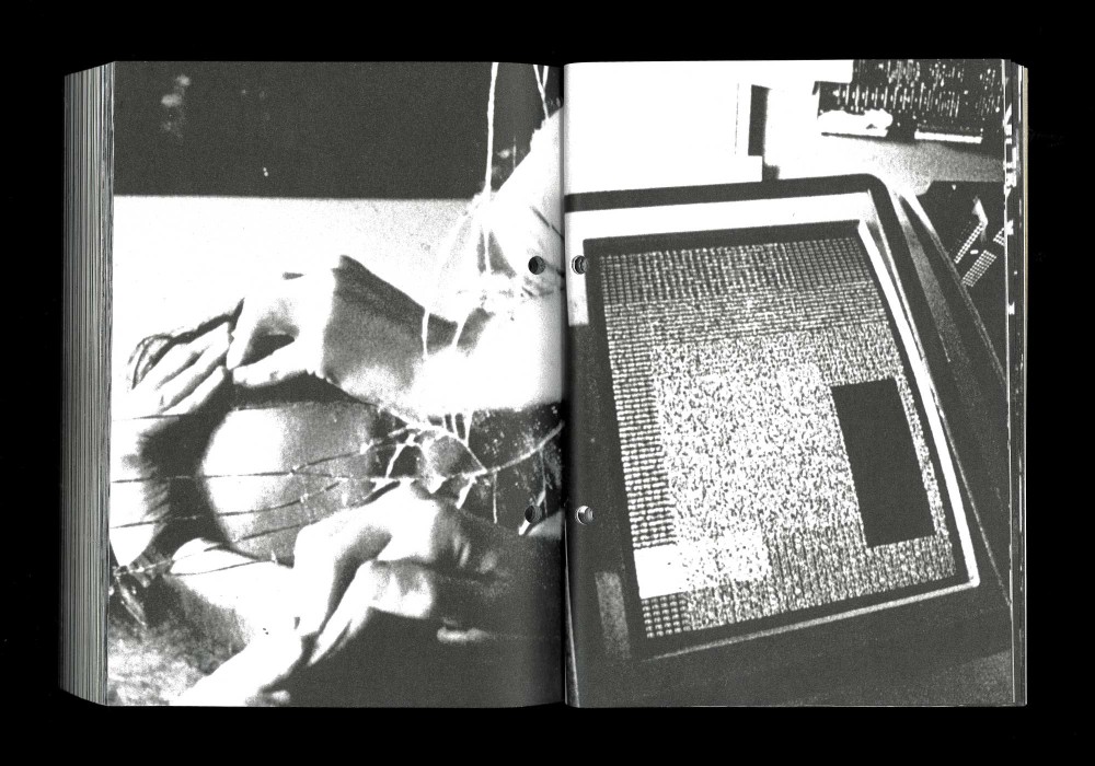
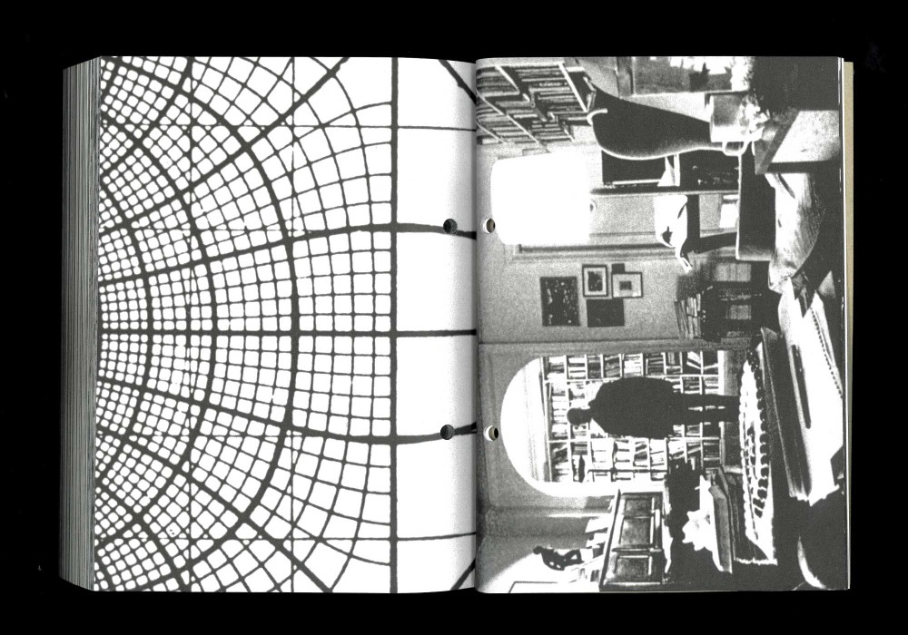
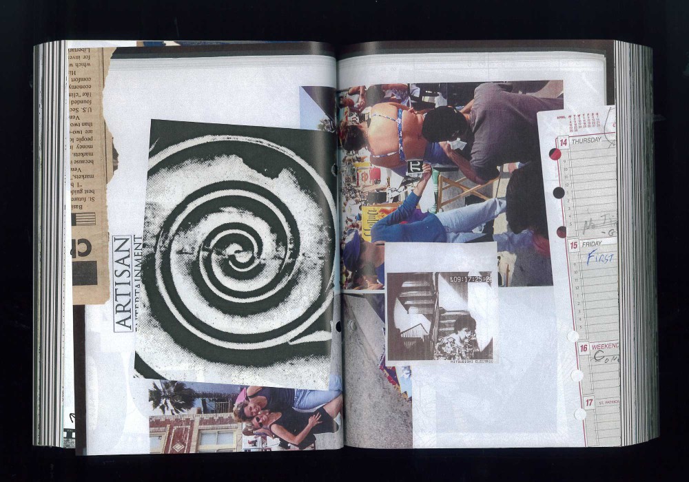
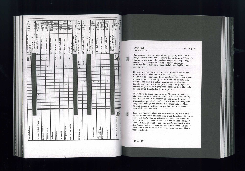
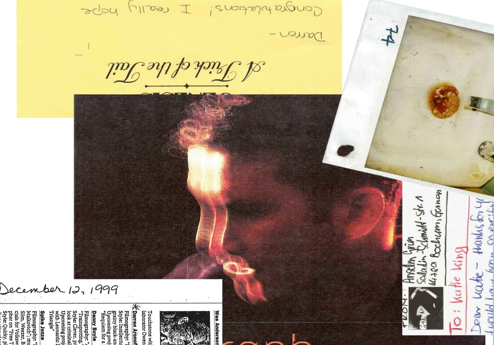
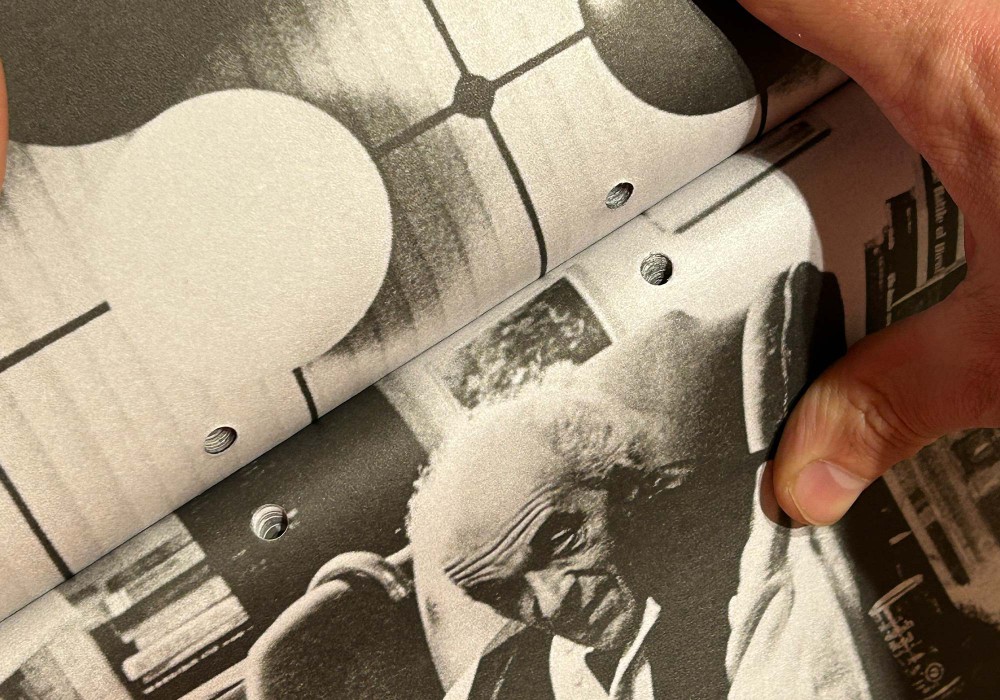
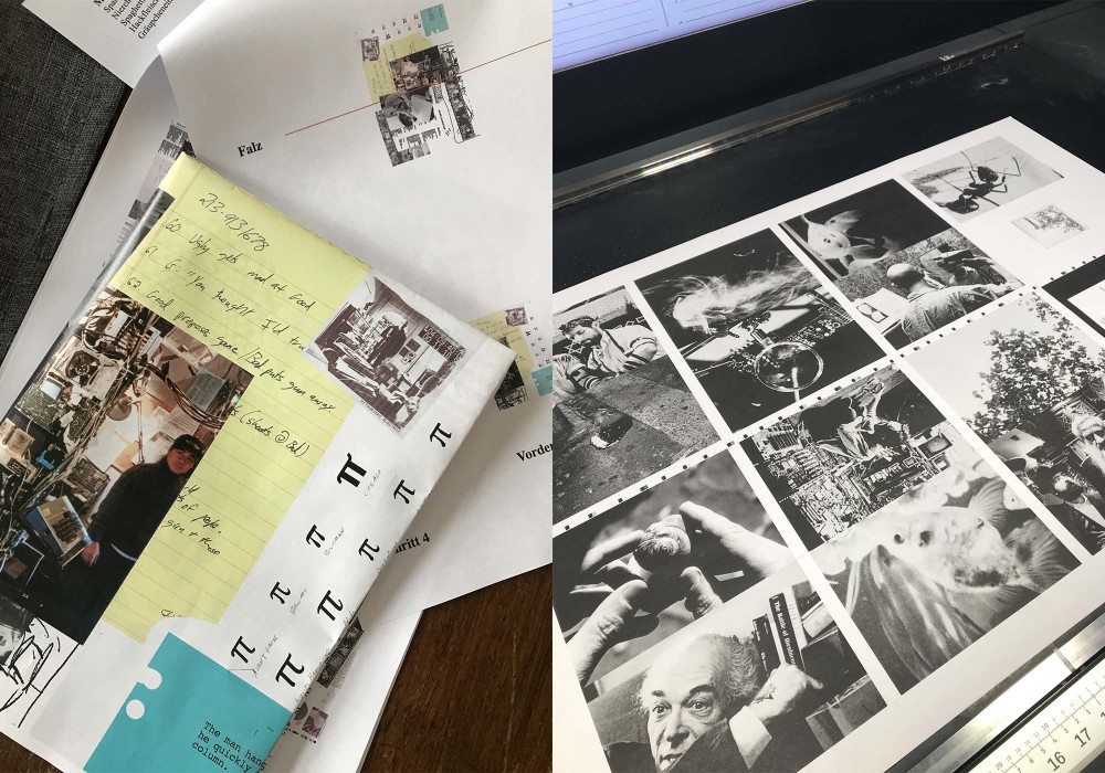
In 1998 Darren Aronofsky was a 27-year-old would-be filmmaker struggling to make his first feature, Pi. This book is his diary of those years—alongside hundreds of photos and materials pulled from the archives. In collaboration with Fabian Bremer this book was designed as a container of sorts. An ephemeral collection, that can be filed itself through the holes drilled into the book object. The glossy sections in between the chapters are layed out as messy maniac wall posters that are then cut into 16 page signatures. A re-ocurring layout headache, that refers to Aronofsky’s filmmaking in a very literal way.
Thread-sewn softcover with black foil embossing on cover.
Typeface:
Times New Roman
Helvetica
Courier
Paper:
Holmen TRND 80 g/m²
Speed Gloss 70 g/m²
About:
This is the second cover I did for Laura Bielau: Her latest publication TEST, which started with a colony of ants that she temporarily set up in her studio. In this experimental arrangement, she observed the hierarchical and state-building organization of the insects. In our personal hierarchical organization I did the cover and she did the interior of the book. Read more and definitely buy the book via the Spector Books website.
Thread-sewn softcover with one flap (folded to the outside) in the back. Loose postcard on top.
Typeface:
Univers Std.
Paper:
Magno Satin 170 g/m²
Serviliner GD2 230 g/m²
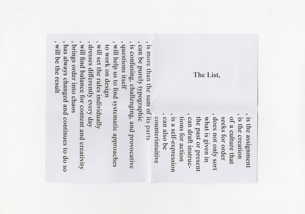
About:
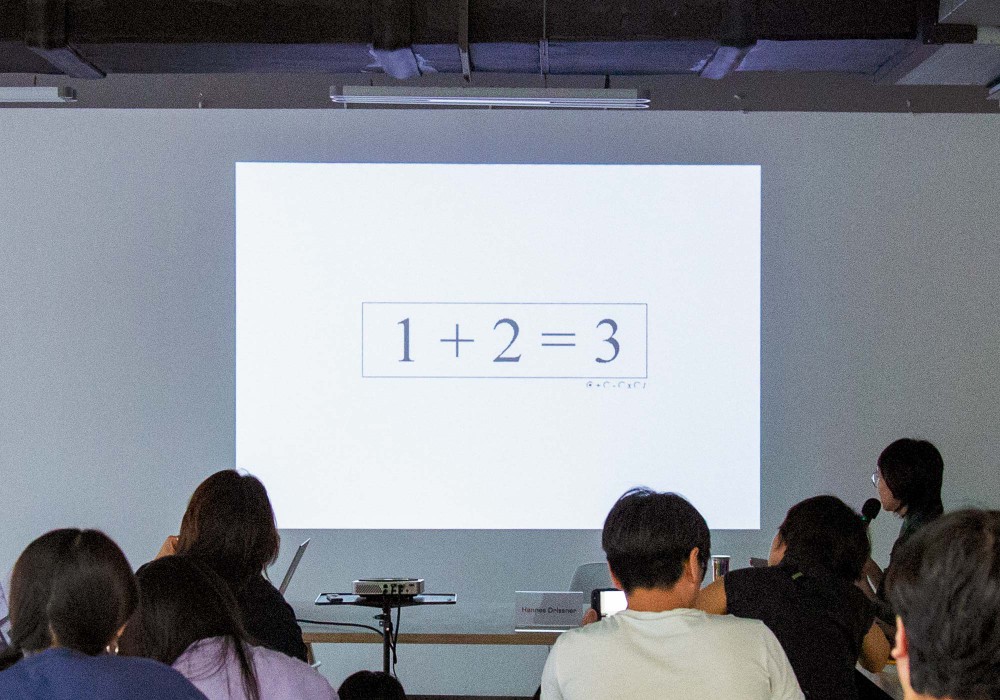
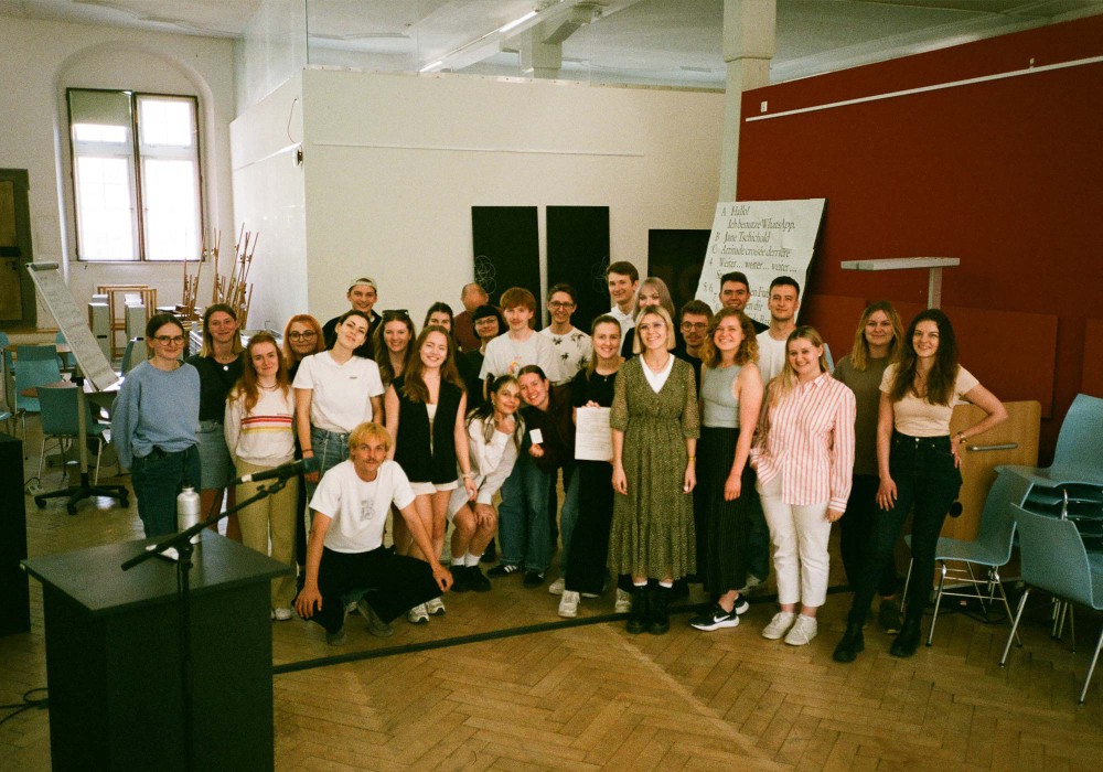
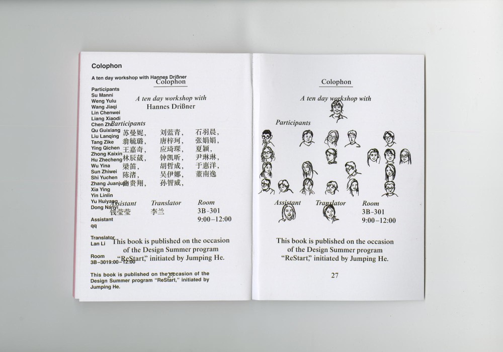
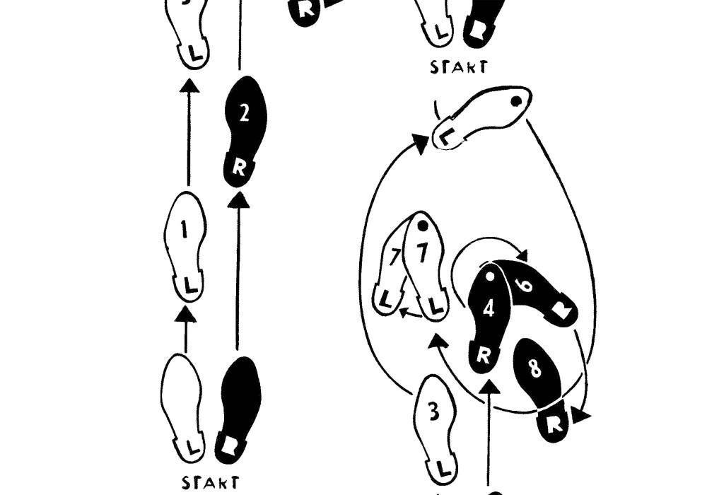
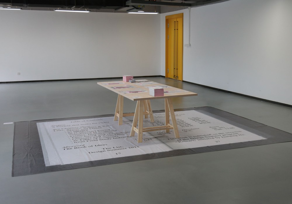
A workshop format I have carried through multiple iterations at different occasions. After the first attempts at DHBW Ravensburg I announced the class in the following way for the Hangzhou Design Summer program in China:
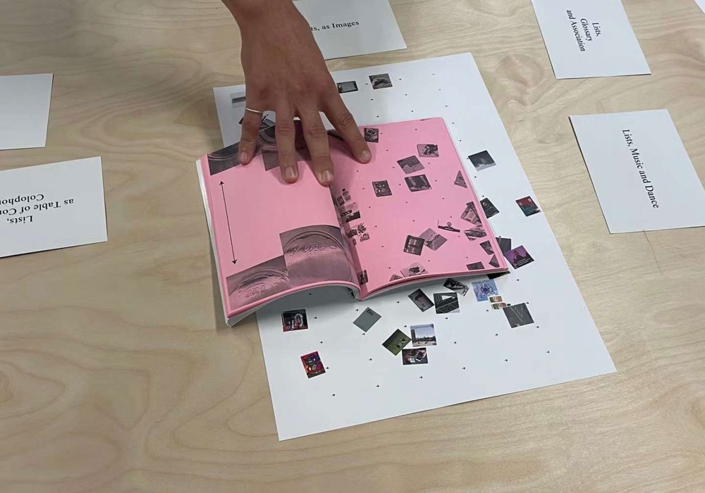
—The List
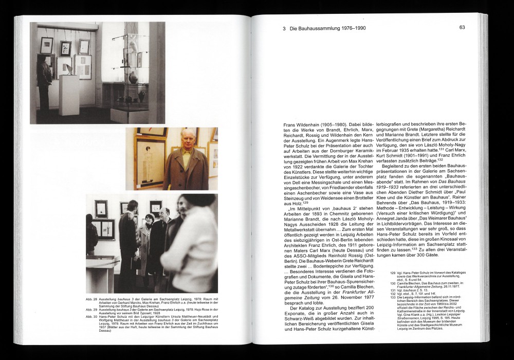
—The List will build the assignment
—The List is the creation of a culture that seeks for order
—The List does not only sort what is given in the past or present
—The List can draft instructions for future action
—The List is a self-expression
—The List can be counterintuitive poetry
—The List can be purely typographic
—The List has always changed and continues to do so
—The List is more than the sum of its parts
—The List will help us to find systematic approaches on design
—The List will set the rules individually
—The List will balance content and creativity
—The List will be the result
About:
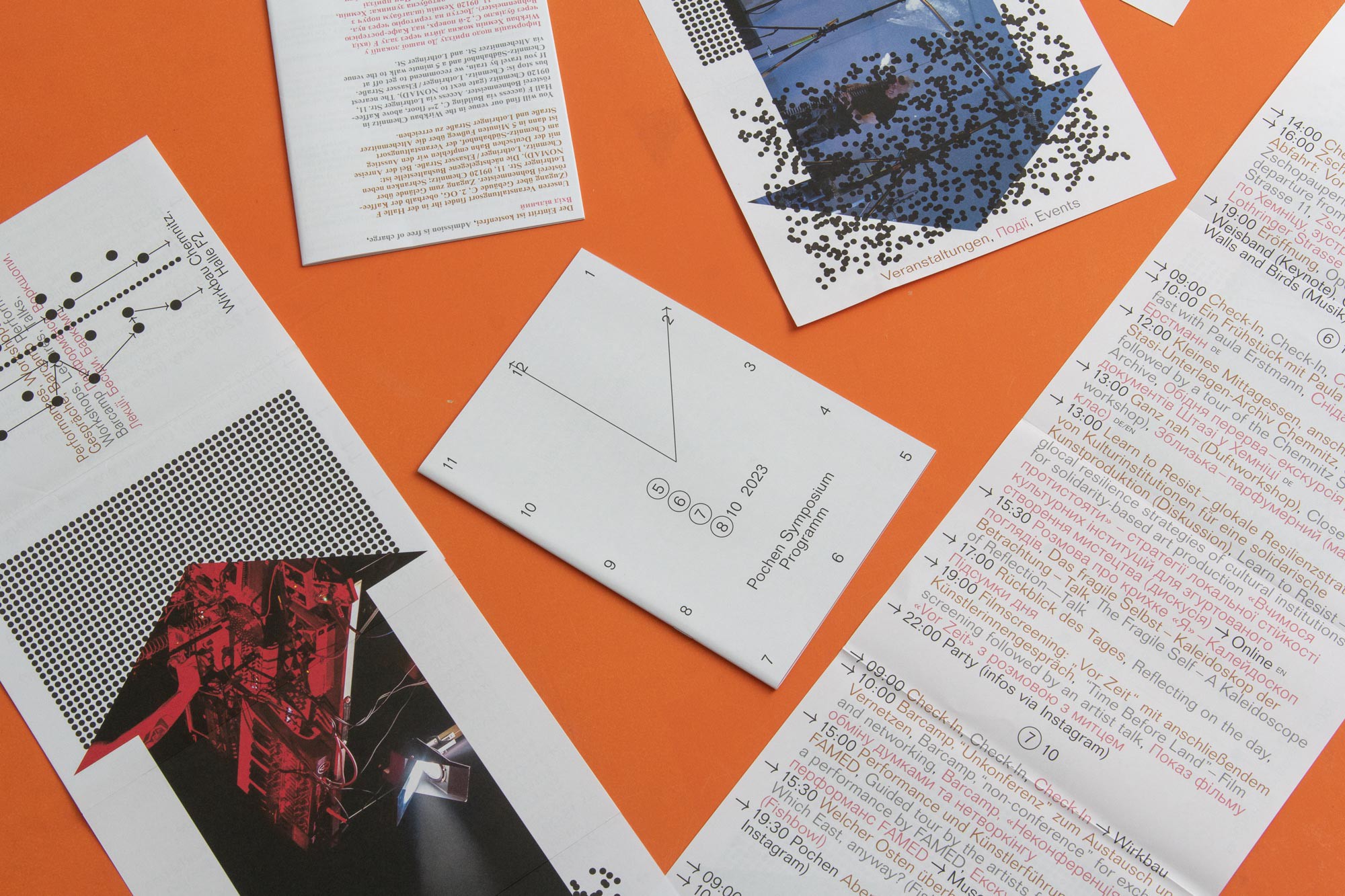
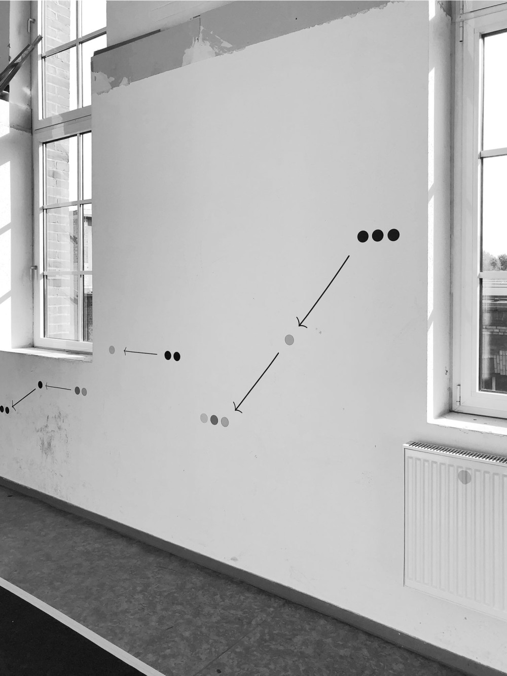
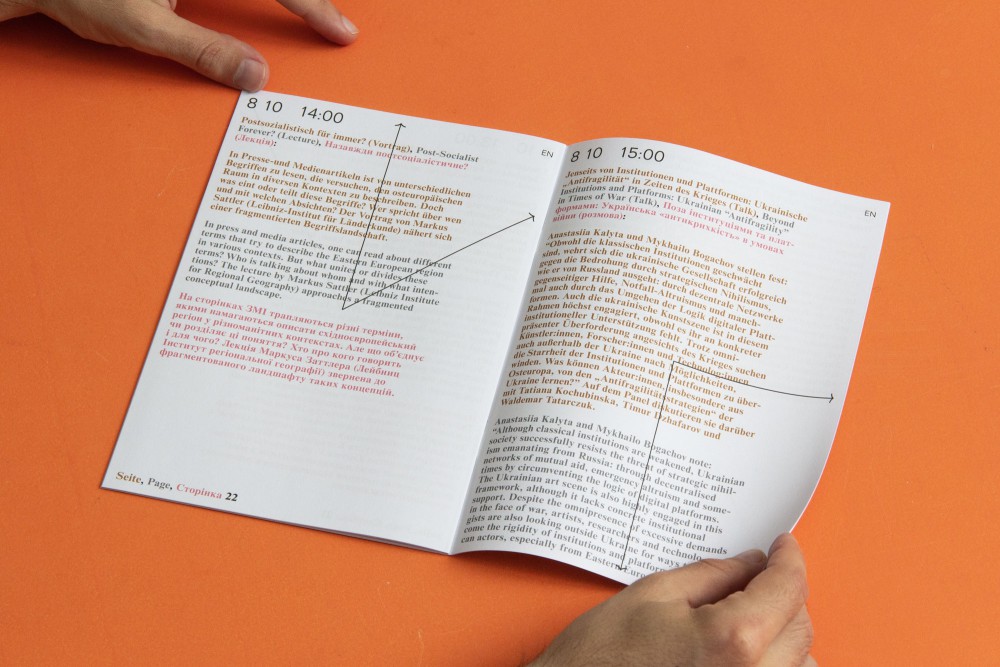
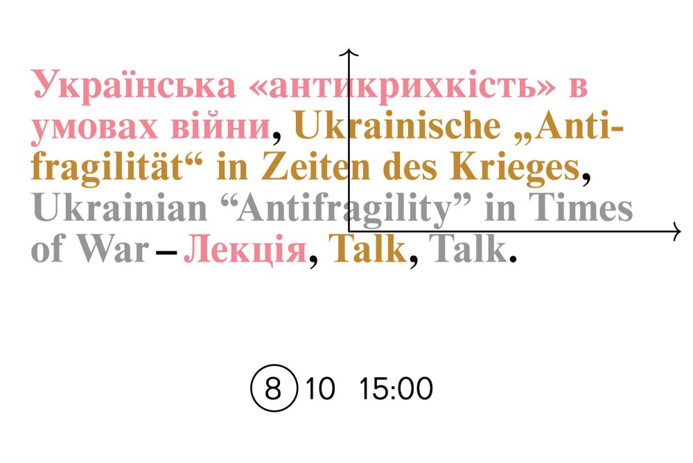
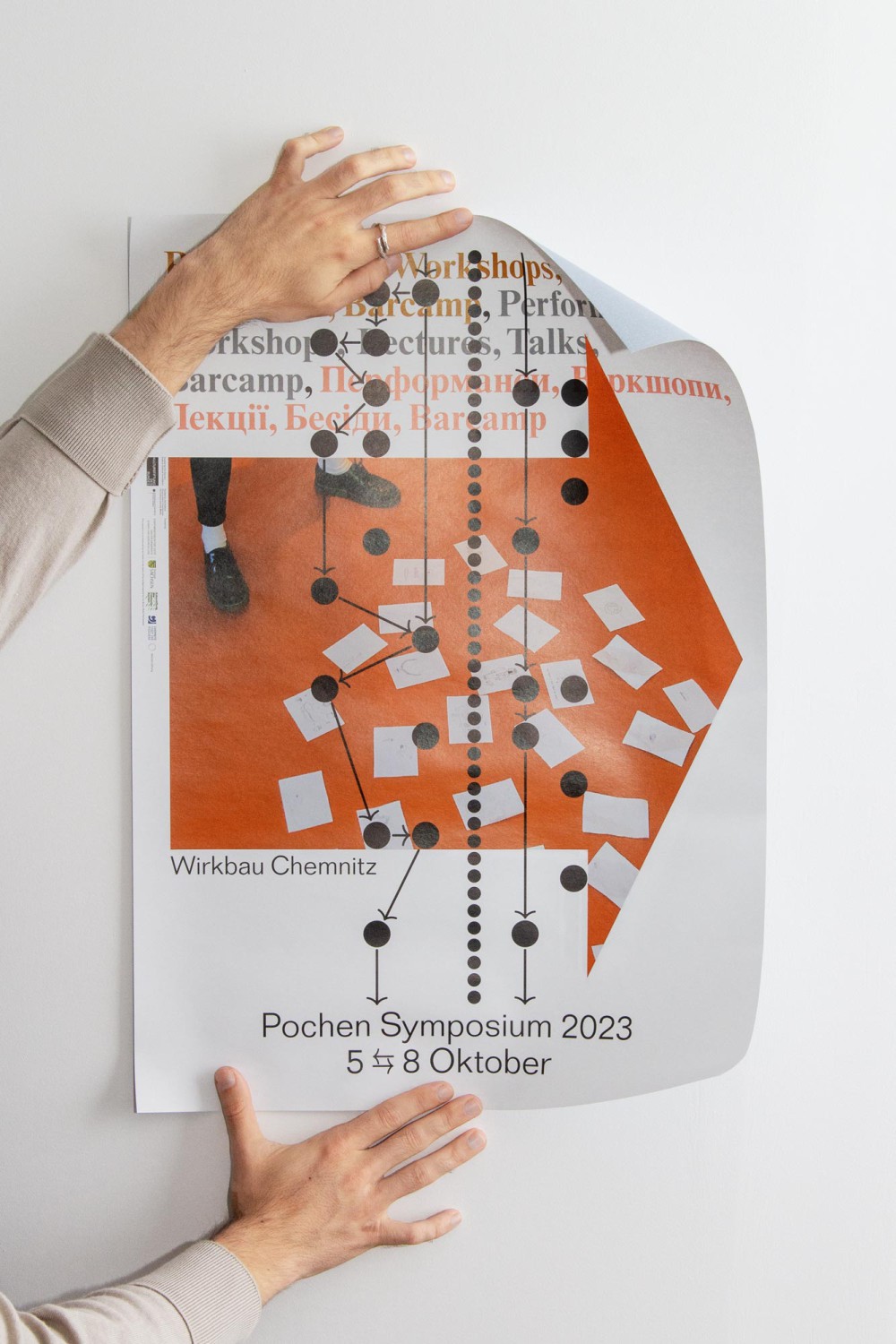
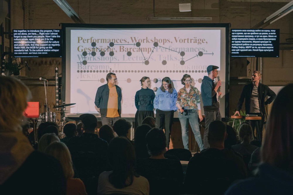
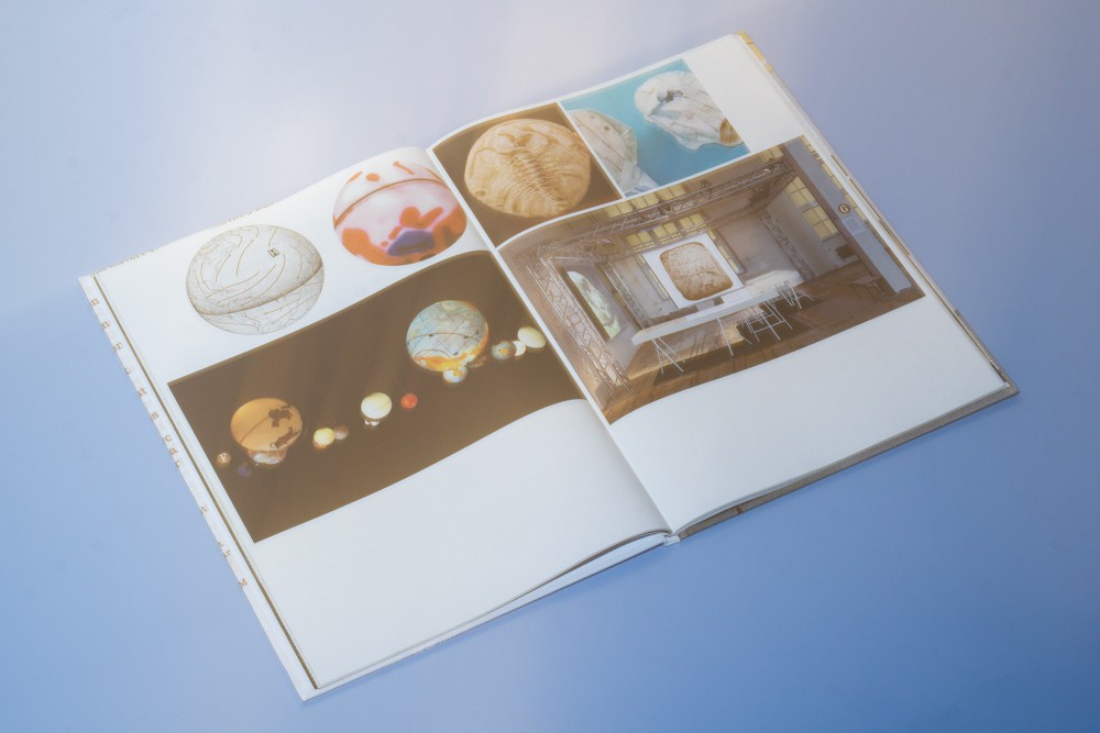
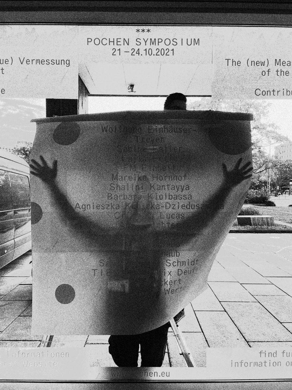
This years Pochen Symposium is circling around "fragility" in local and global challenges of Eastern Europe, to prepare the following Biennale in 2024. The graphic identity (developed with Elias Erkan) is looking into the methodology of a symposium instead of facing visual aspects of the topic: Diagrams, direction, left, right, linearity, complexity, and not lastly arrows seemed like a rich world to dive into. Besides that we developed a language system that prevents hierarchy by rotating order and seamless transitions from sentence to sentence. It’s giving a seemingly language free thought.
Calendar leporello, 32 page brochure, signage system, posters, and web applications.
Typeface:
Folio, Times
About:
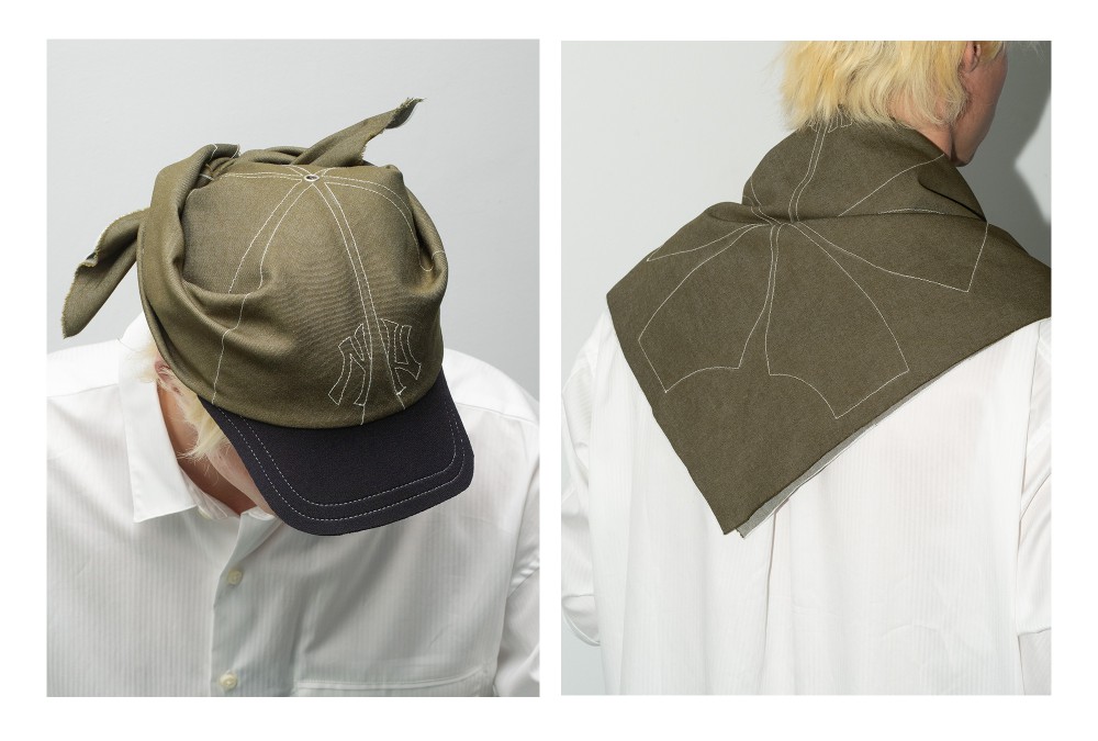
The first edition of my multi purpose headwear product. Made from denim squares of fabric with a machine sewn pattern of a run-over Yankees cap.
Sewn by Annie, photography by Shisi, worn by Tong, and heatpressed labels with help from Isaac.
About:
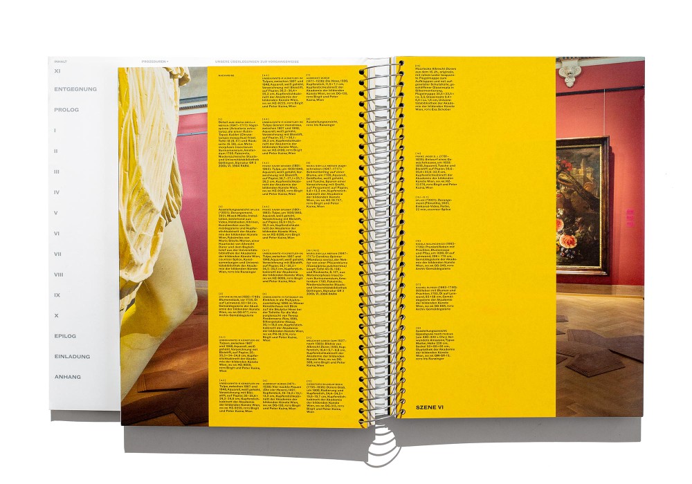
The Indian-based Raqs Media Collective has selected works from the historical art collection of the Academy of Fine Arts Vienna which were set against current positions. In a process of decolonialization the book continues a rather challenging and controversal take on exhibition-making. The book structure transfers the exhibition scenes directly into print and provides a poetic outline in a continuous image caption. Appearence and reappearence of silver printed ghost images additionally opens a layer of context. It took various Schnitzels and deep laptop investigations to finish this book in a period of 1.5 years.
Silver Wire-O binding with three different paper stocks, 4C+silver printing and shortened pages. The cover is a 6 page wrap around with three small spines covering the spiral. An additional cardboard is inserted in the back to support the spiral.
Typeface:
Monotype Grotesque
Paper:
Arena 70 & 300 g/m²
Profi Bulk FSC 100 g/m²
About:
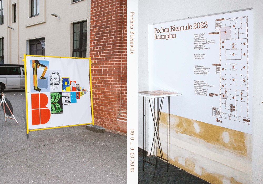
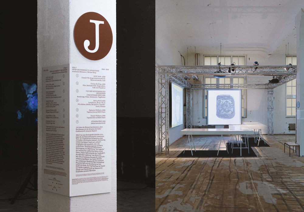
Finally: The retrospect catalog of the 2022 Pochen Biennale. The interior mirrors the exhibition space and all its visual elements into the very purpose of the catalog: Archiving. It’s also so electric, if you rub it against your head it’ll stay there for good.
Thread sewn hardcover, CMYK + Copper PMS five color printing. Four electrostatic inlays, randomly placed.
Typeface:
Quadrant (Vincent Chan)
Paper:
Bavaria glänzend 90 g/m²
1.5 mm cardboard
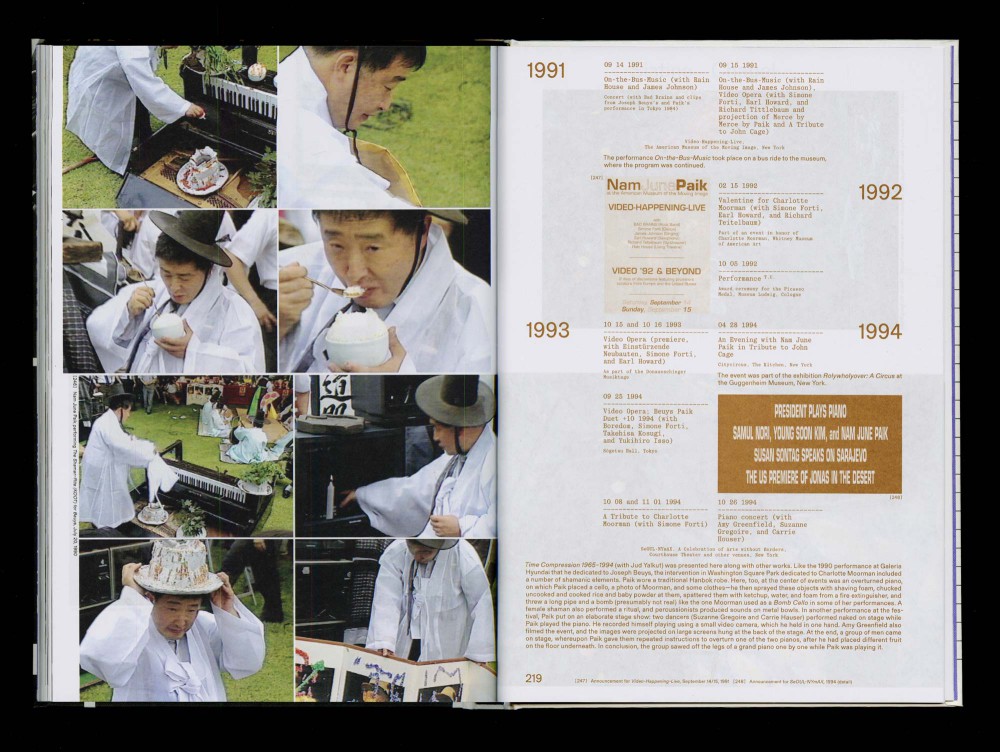
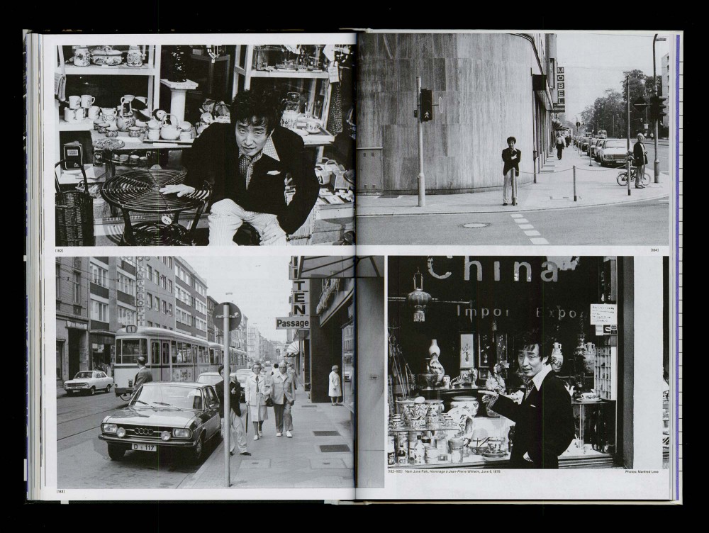
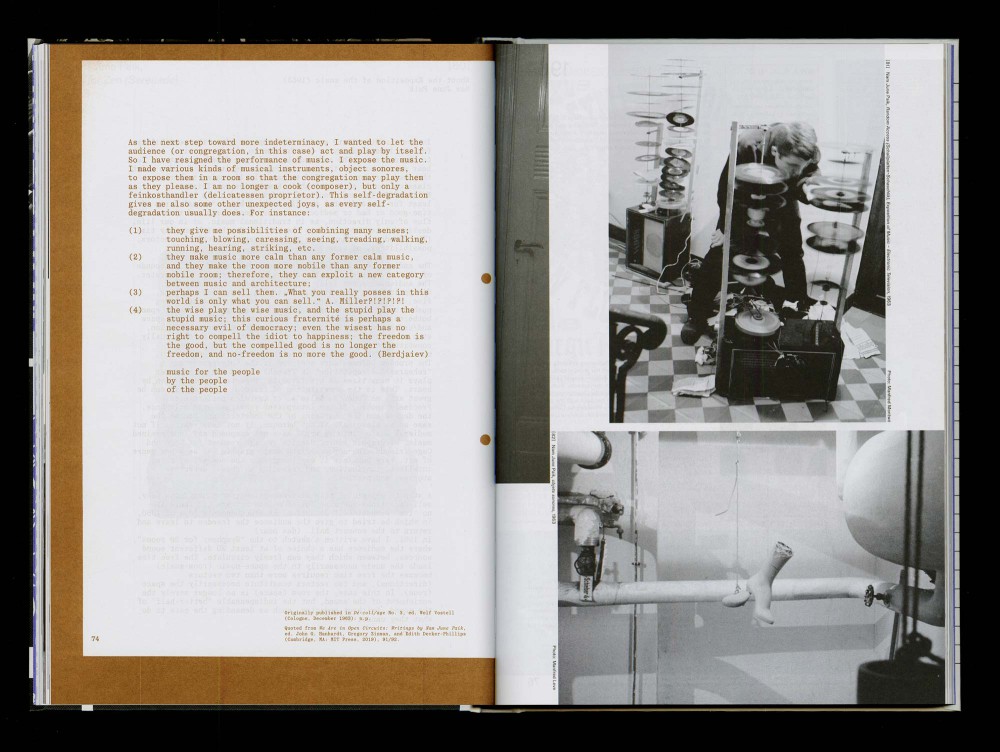
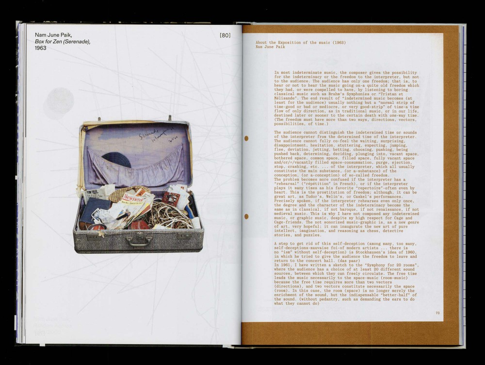
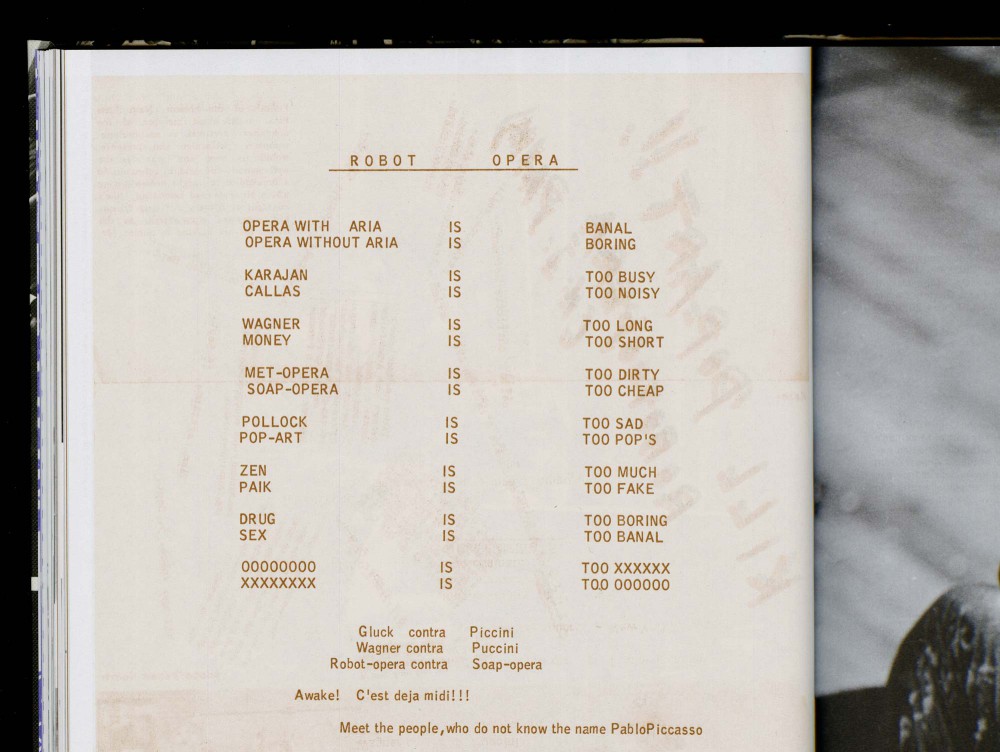
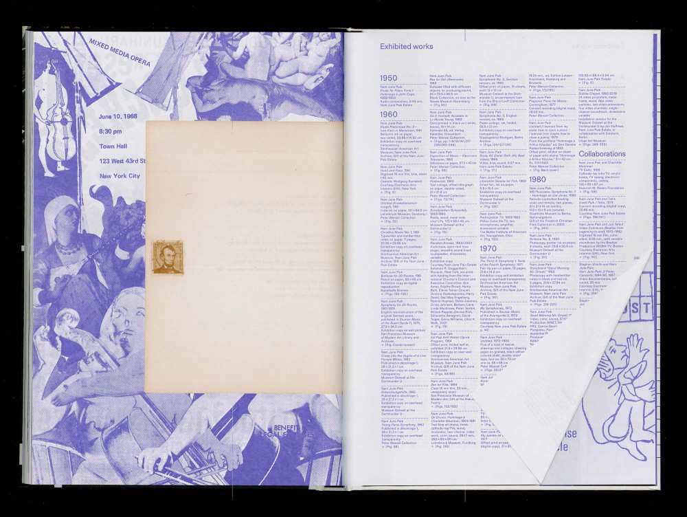
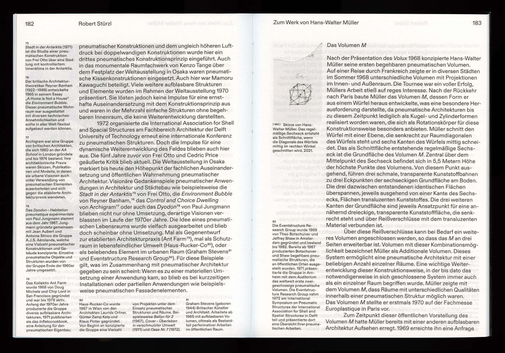
About:
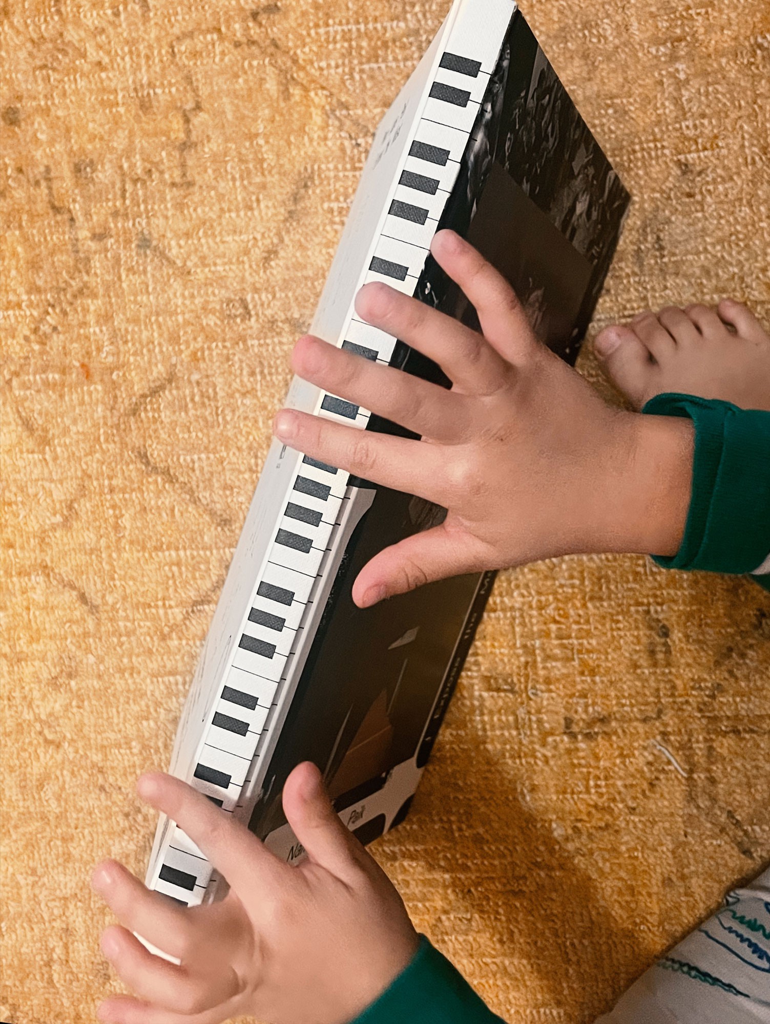
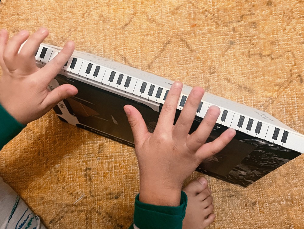
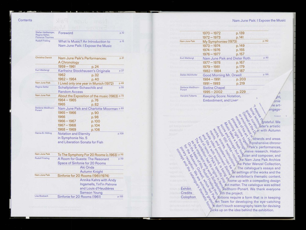
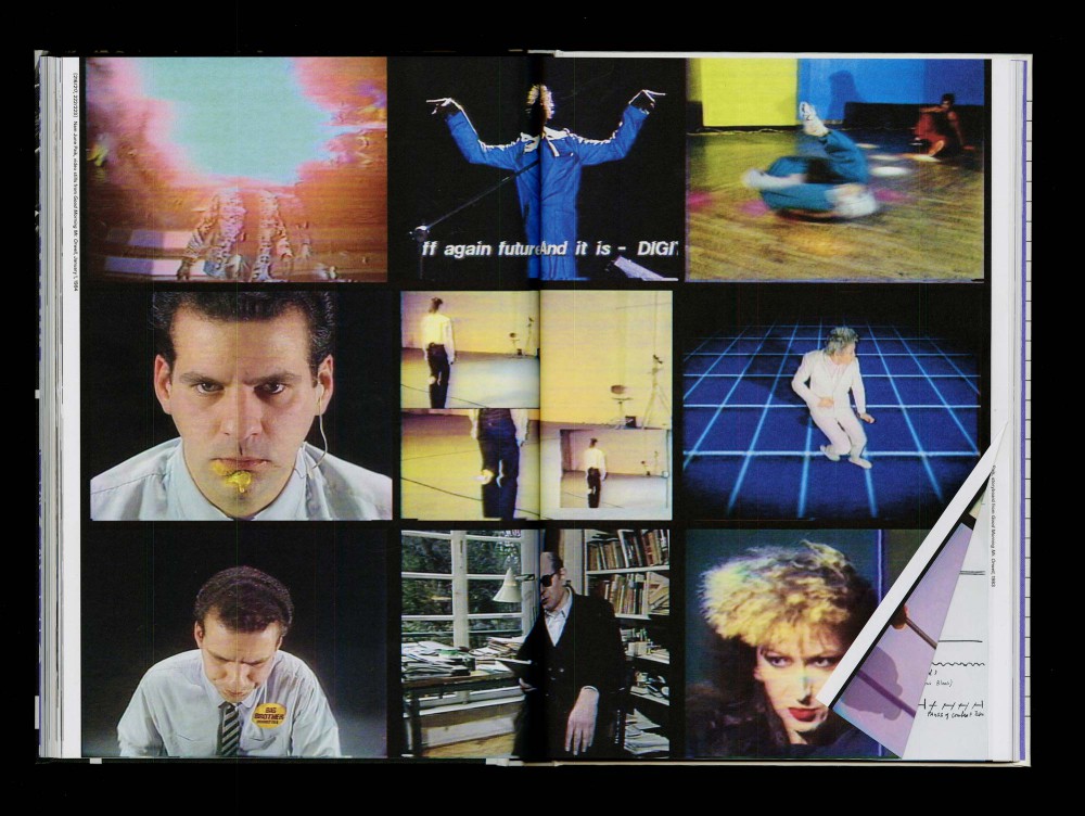
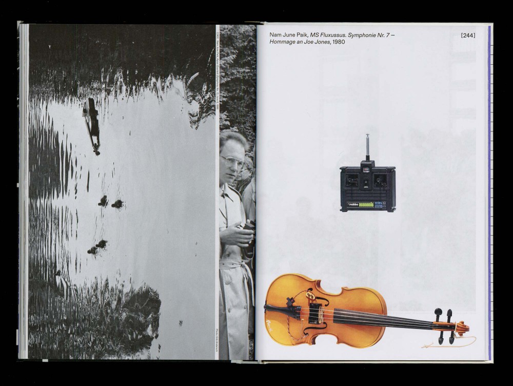
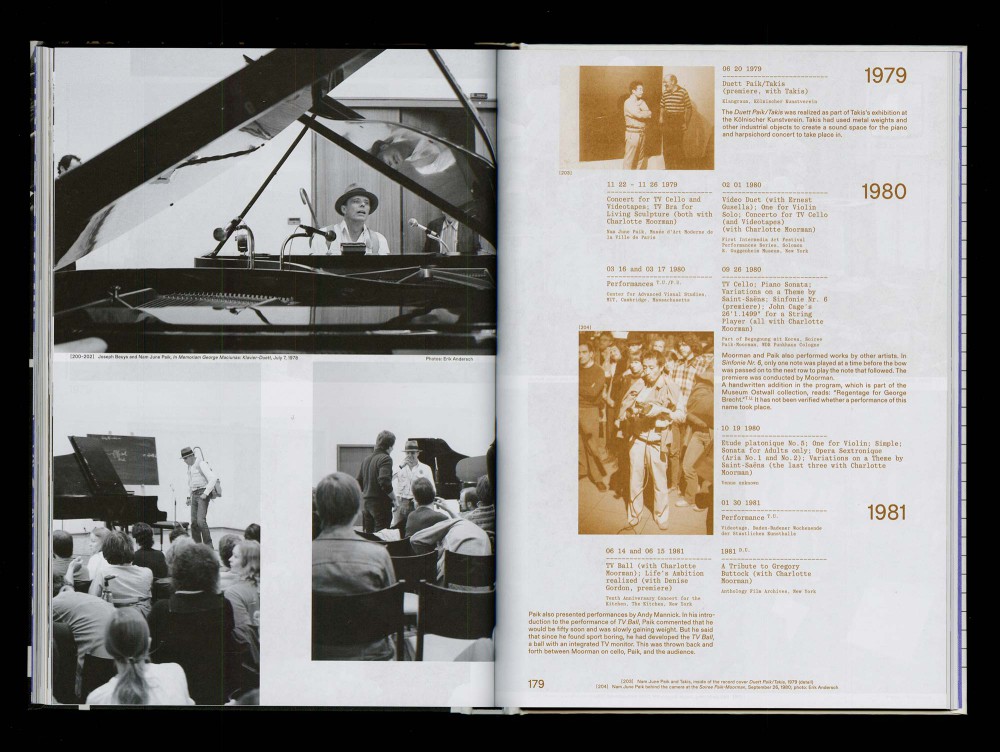
This publication spotlights on a feature of Nam June Paik’s work that has been largely overlooked: live moments, a consistent element running all through his artistic career. One focus of the book is on the way Paik approaches music as a score, a concept, and an event. The immediate experience of the audience and their active involvement are crucial components in Paik’s work. This resulted in a very open design framework with a lot of flexibility for improvisation aswell as an interactive piano keyboard on the spine of the book.
Thread-sewn hardcover.
Typeface:
Gerstner Program / Quadrant
Paper:
Circle Offset Premium White 80 g/m²
Magno Gloss 90 g/m²
About:
Writing this soon.
Typeface:
Gerstner Programm
About:
MATRIX MODERNE | OSTMODERNE Bauen, baubezogene Kunst und Formgestaltung in Ostdeutschland und dem Europa der Nachkriegszeit. Herausgegeben von Frédéric Bußmann und Diana Kopka für die Kunstsammlungen Chemnitz und erarbeitet gemeinsam mit Philipp Freytag. Die Publikation erscheint als Print-on-Demand in Druckform als auch Digital.
Typeface:
Marist
Paper:
Circle Offset 80 g/m²
About:
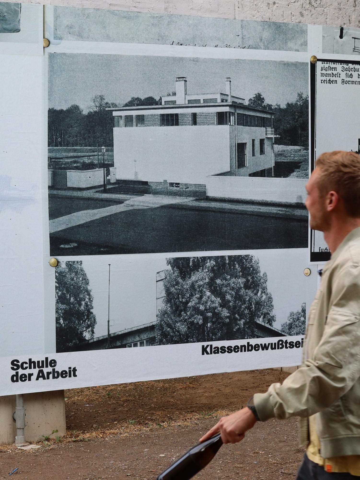
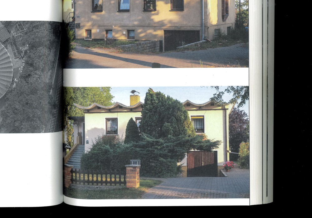
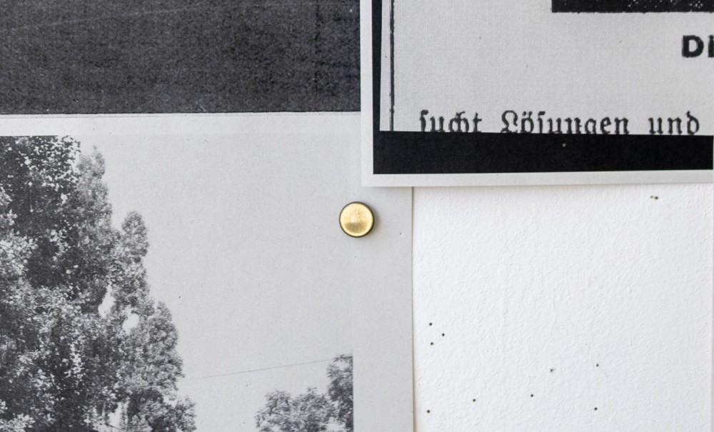
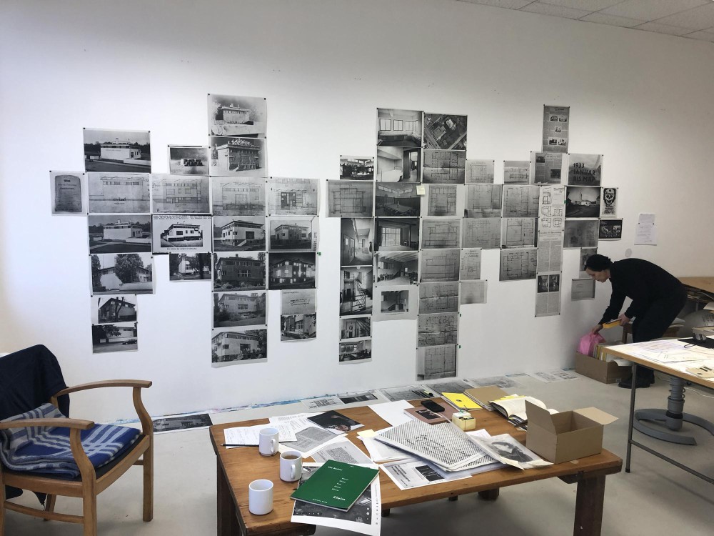
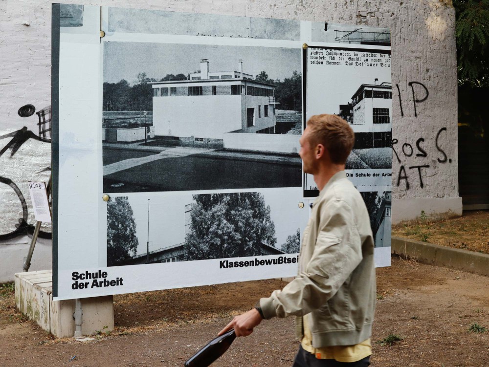
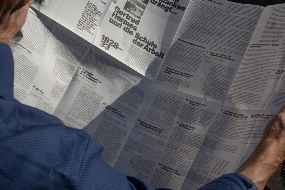
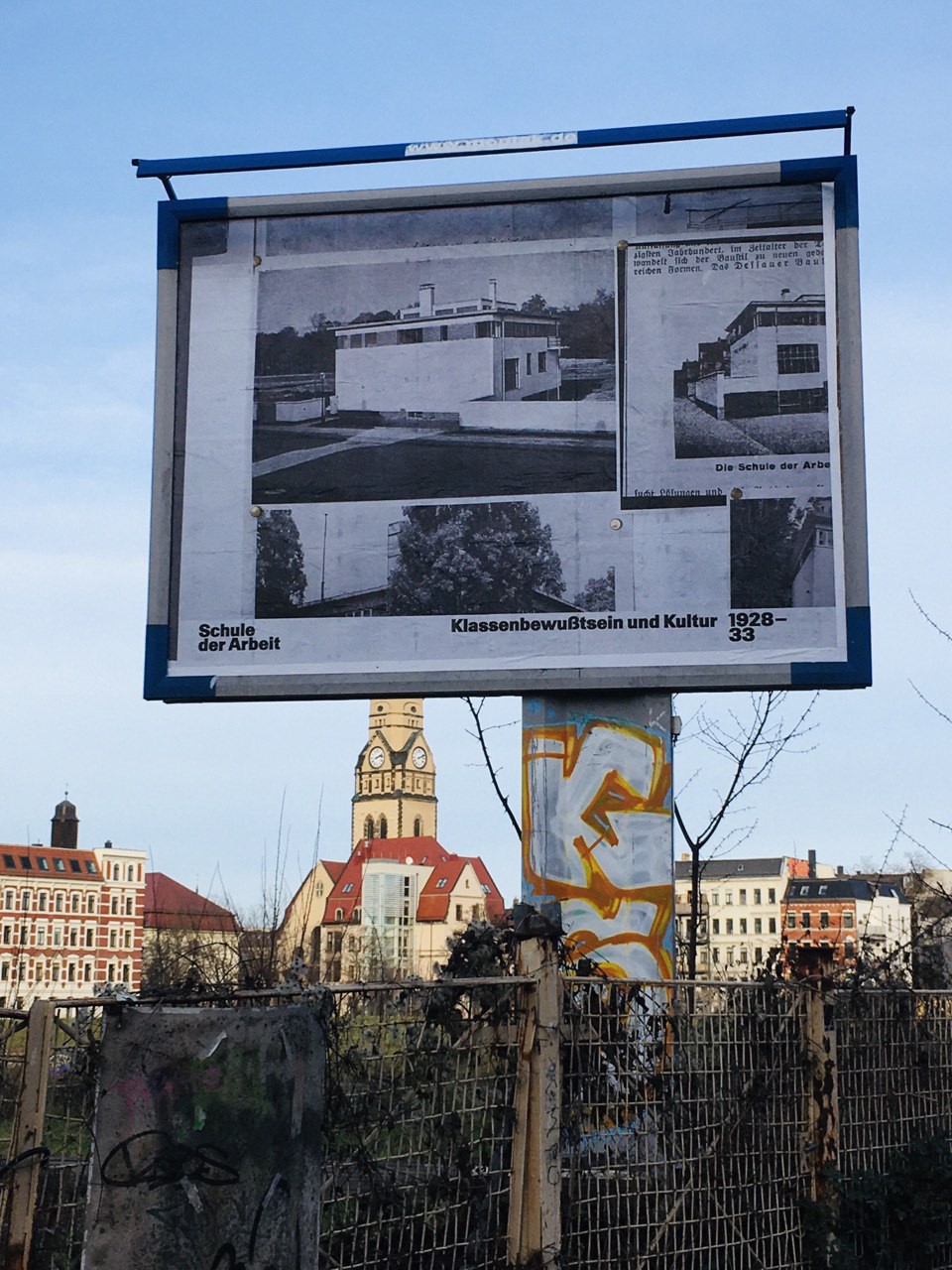
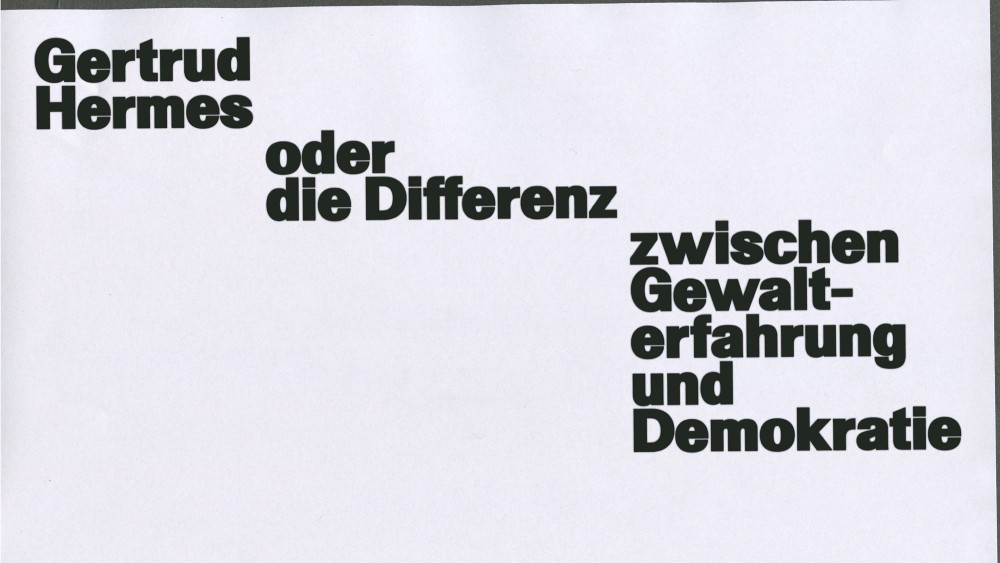
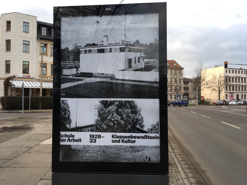
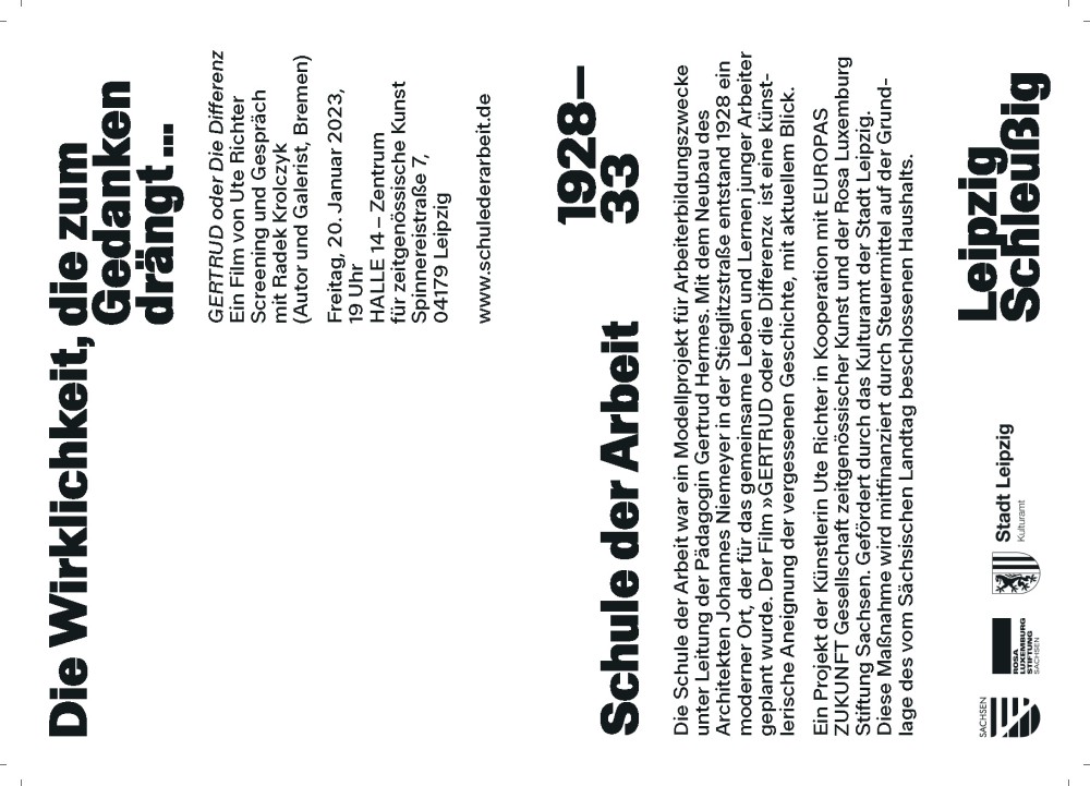
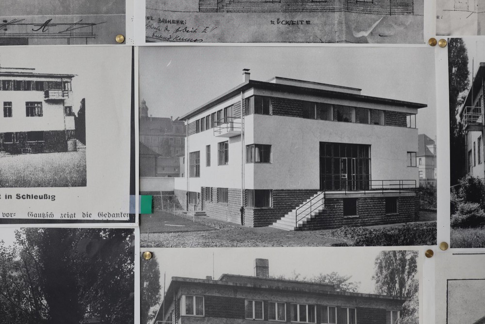
The archive artwork Schule der Arbeit by Ute Richter is about a model project of workers’ education in Leipzig (1928-33). In conjunction to multiple events we have produced video graphics, invitation cards, a folded poster and various large format billboards aswell as Citylights.
Typeface:
Walter Alte (Dinamo Typefaces)
About:
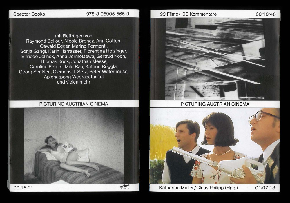
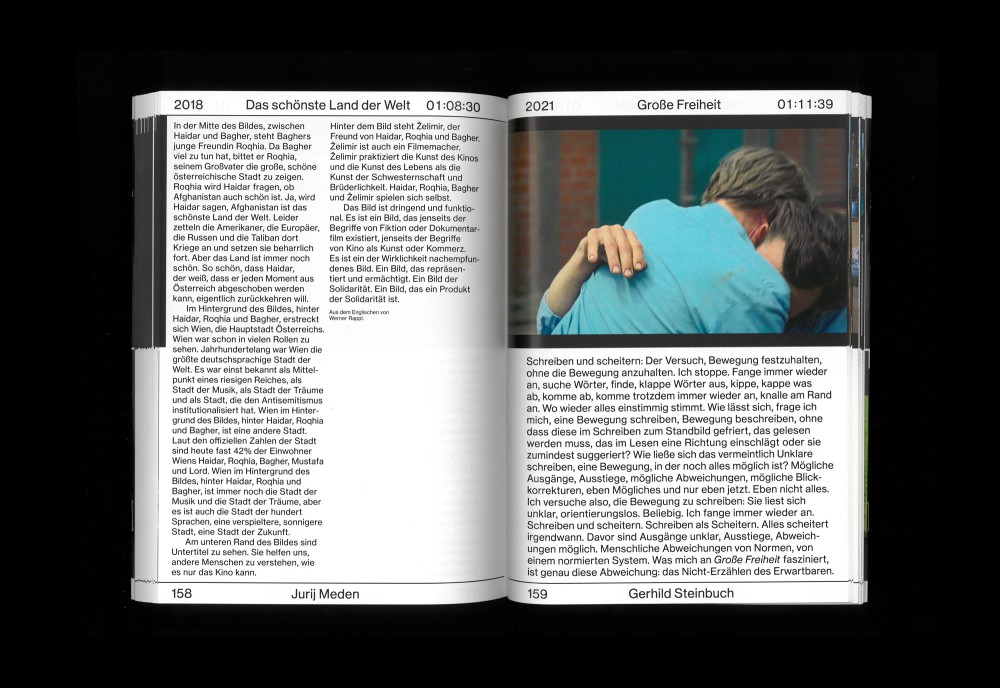
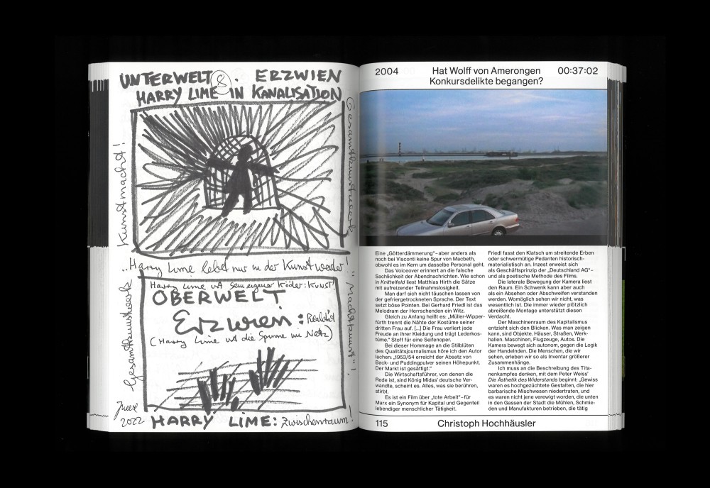
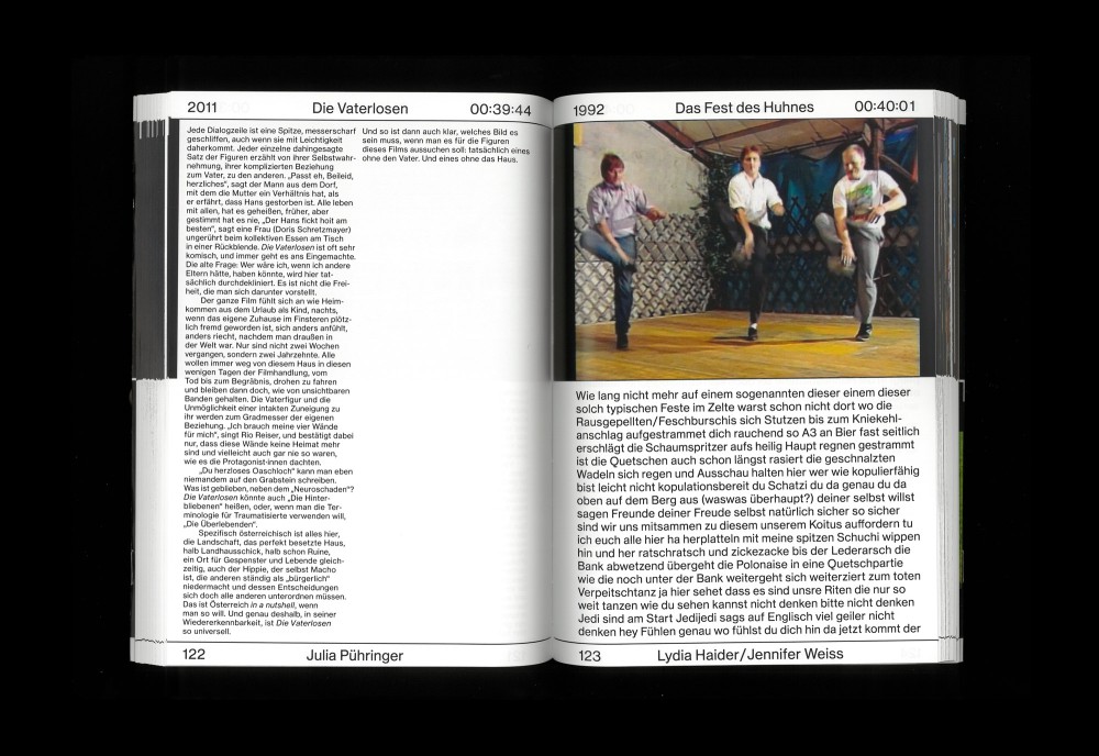
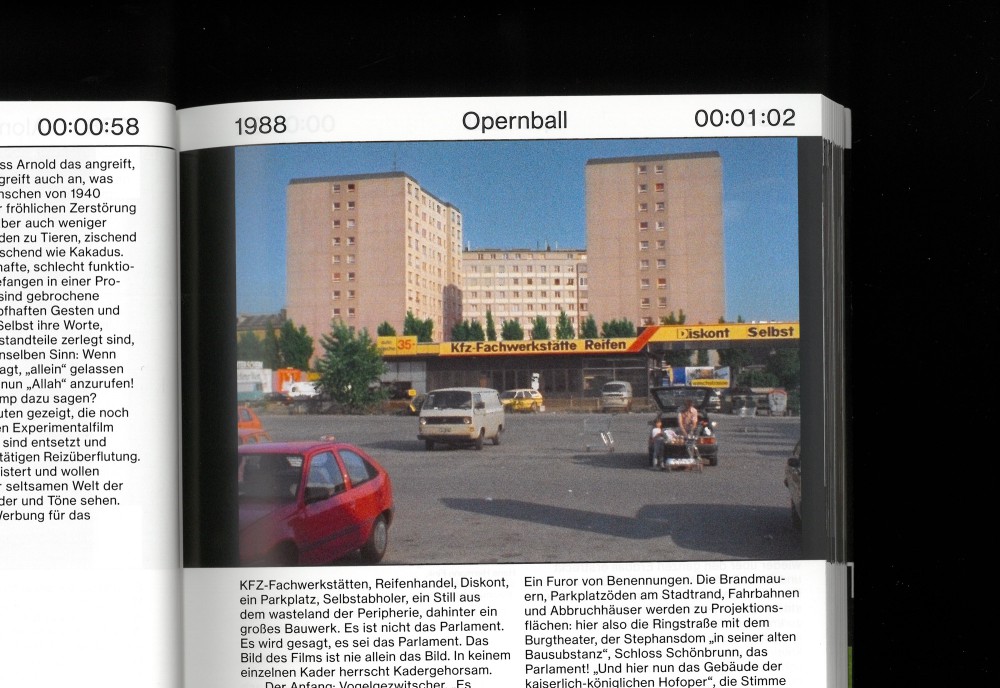
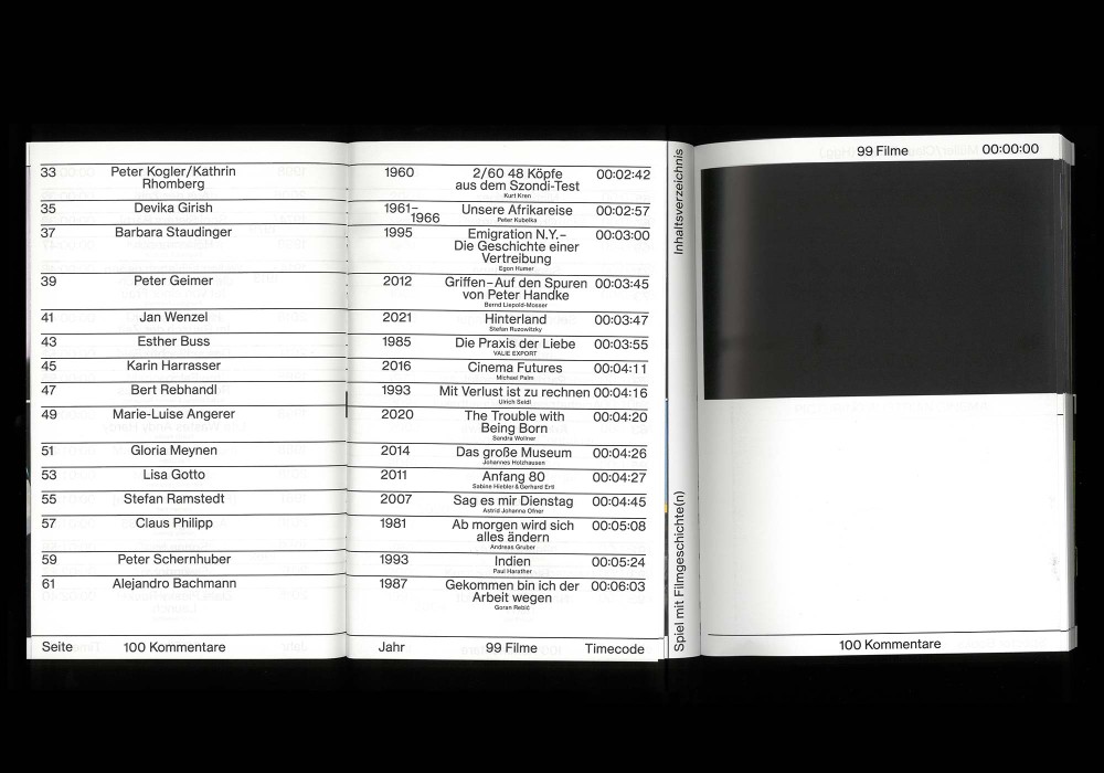
A book of texts and images that plays with history, stories and what it might mean to stop (cinematic) time: 99 individual frames from 99 works by 99 Austrian filmmakers since 1945, each described by 100 international writers and journalists from the fields of criticism, film theory, and science.
Thread-sewn softcover with flaps including two stapled booklets within.
Typeface:
PAC Custom with anti-inktraps and a washed out, slightly rounded character.
Paper:
Wirbalin 401 Cotton White 300 g/m²
Arto Magic 115 g/m²
Lona Offset 60 g/m²
About:
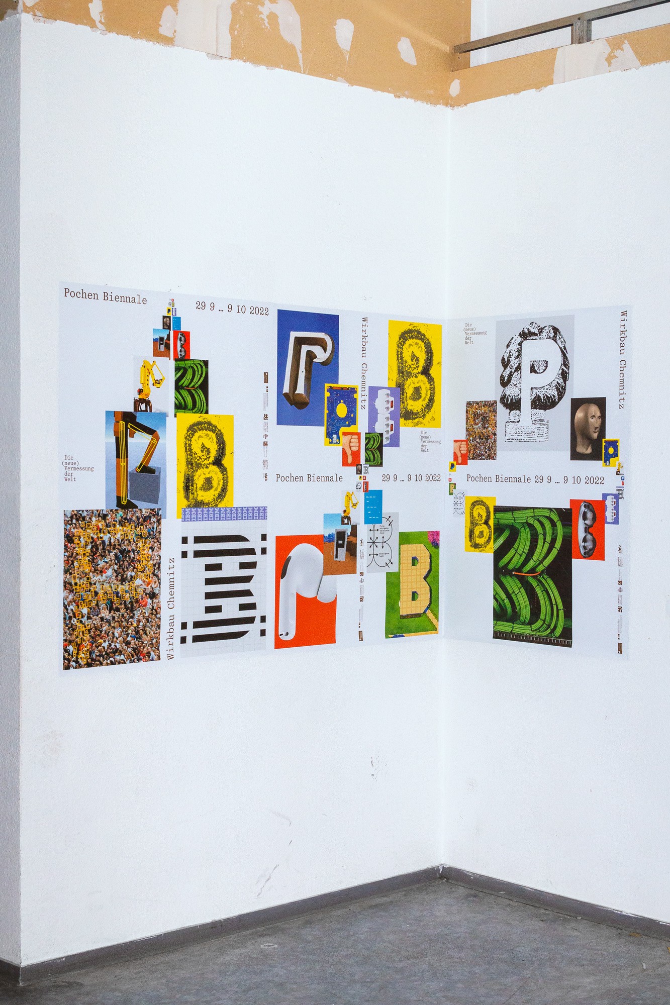
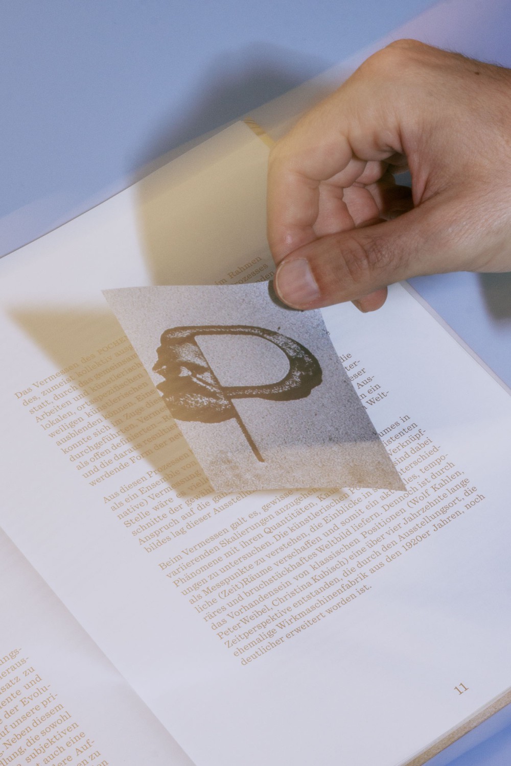
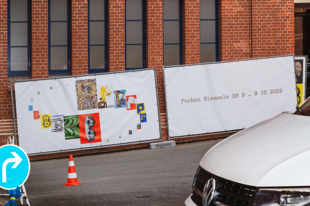
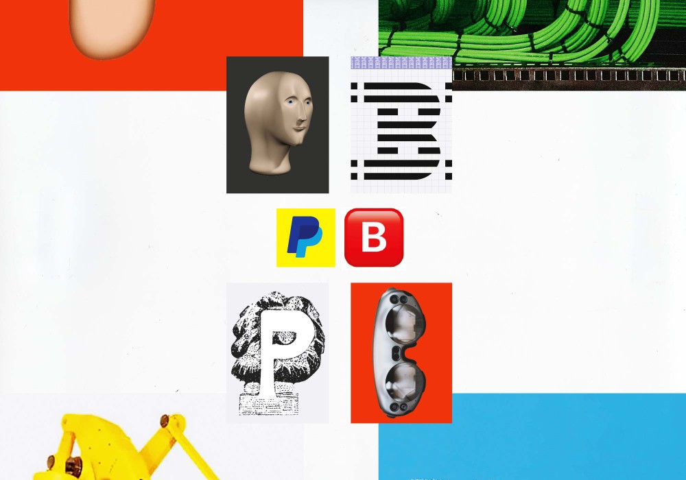
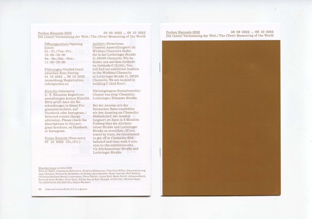
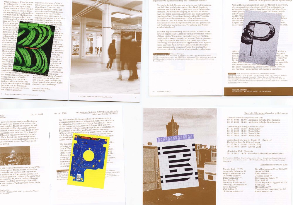
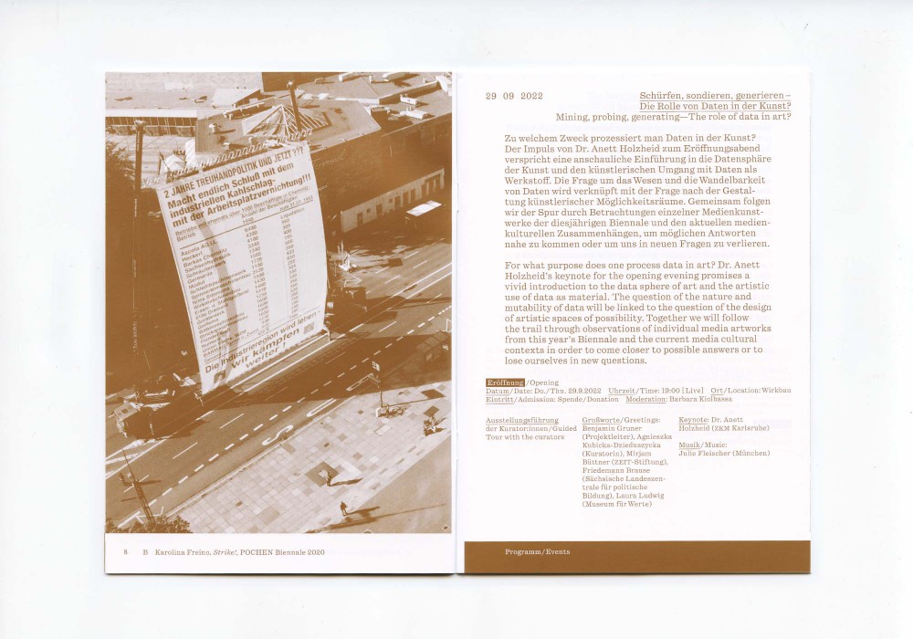
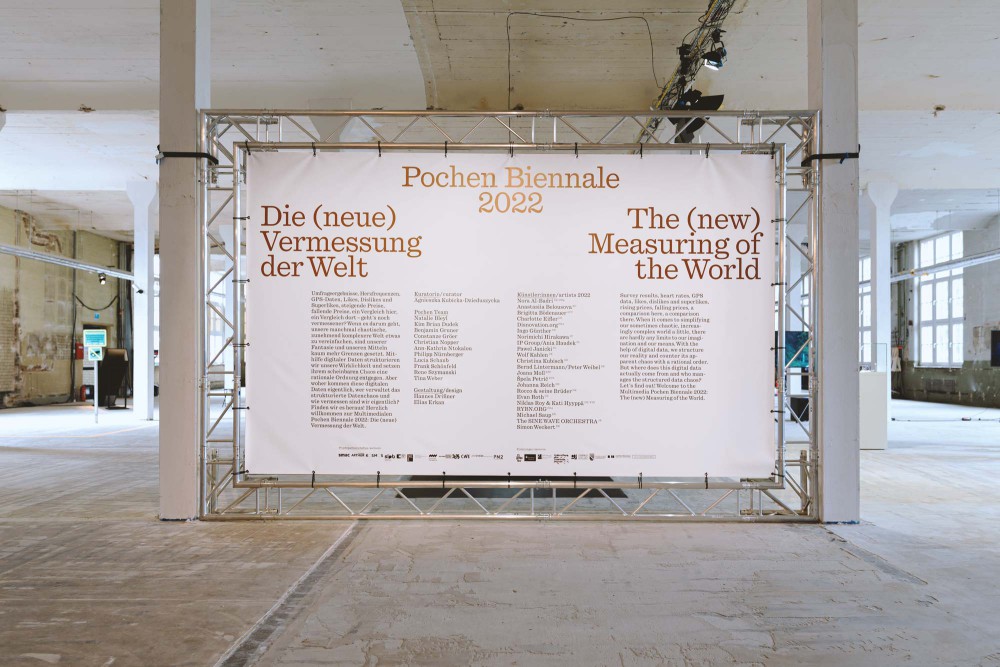
With the third edition of the Pochen Biennale in 2022, POCHEN presented international multimedia artists under the artistic direction of Agnieszka Kubicka-Dzieduszycka. In an ongoing process I have been developing an identity together with Elias Erkan. Referring to the topic of data and processing we have created a set of imagery in forms of the letters P and B.
Print-on-demand Posters in A3 and A0, PVC Banners, and signage system on 5mm Forex boards in CMYK + Pantone Metallic
Typeface:
Quadrant (Vincent Chan)
About:
OUT OF SPACE: DUSSELDORF VARIATION, curated by Junni Chen and Sophia Scherer, is a five-day intervention of art in public spaces across Düsseldorf bringing artworks into dialogue with specific sites in the city. I used this metaphorical change of perspective in combination with stylized projection test screens as the base for the visual identity.
Offset Printed in Pantone Neon Orange and Pantone Black 7C. Trailer animation and moving pixel juggeling by Lucas Hesse.
Brochure:
Holmen TRND 80 g/m²
Multi Art Gloss 110 g/m²
Typeface:
Supreme (Lineto)
About:
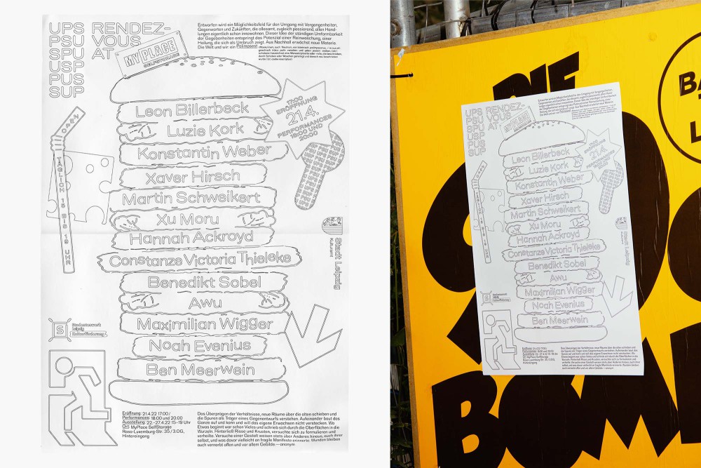
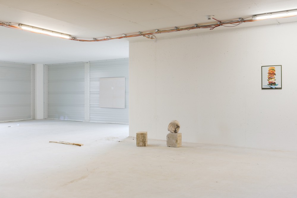
The exhibition UPS_PSU_SPU_USP_PUS_SUP, Rendez-Vous at my place presented
works of various artists exploring the motif of palimpsest in a variety of forms on 1000m².
With young artistis from Leipzig, Düsseldorf, Berlin, Porto, Leeds and Vienna - melting together in dialectic draft of commenting on the world. Curated and organized by Leon Billerbeck.
About:
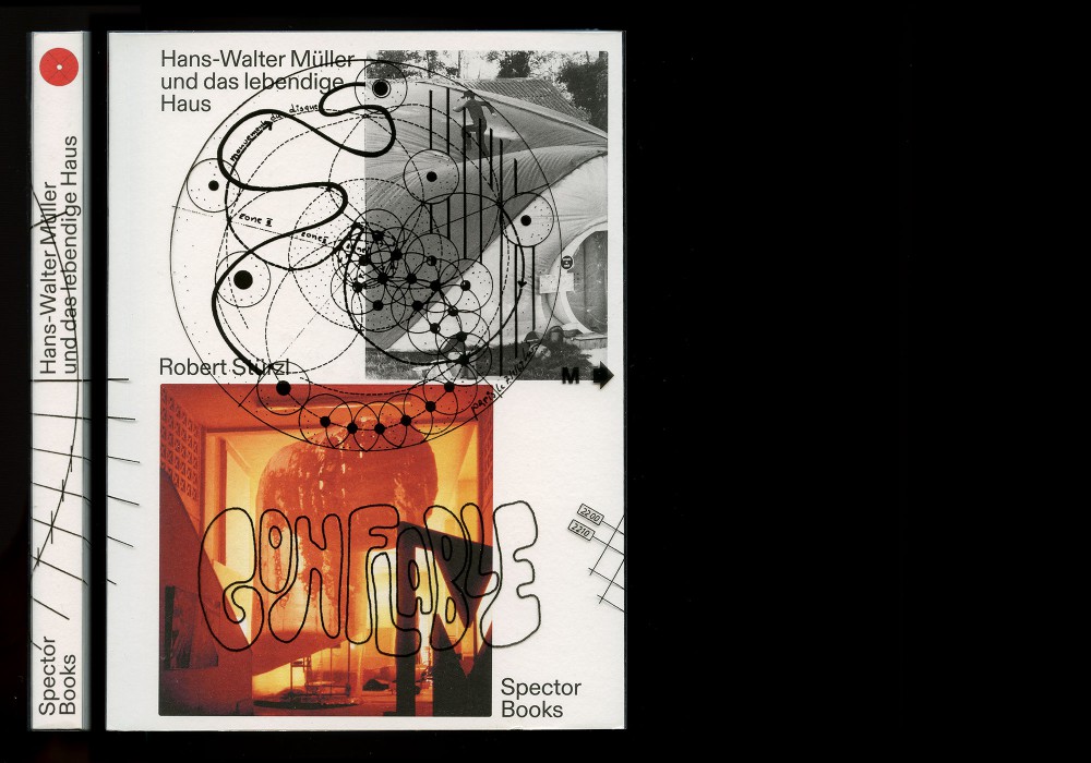
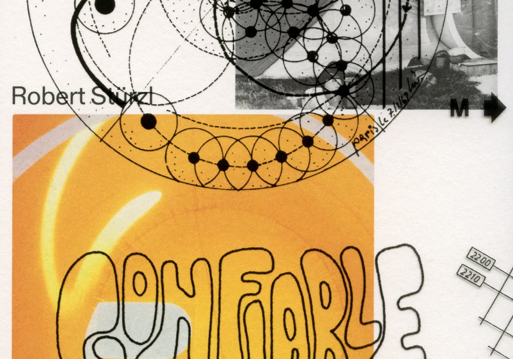
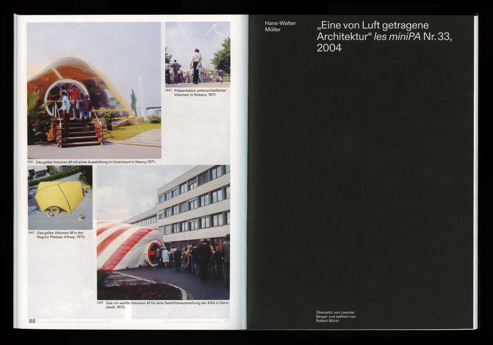
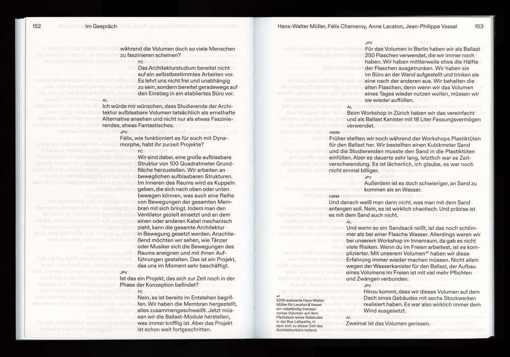
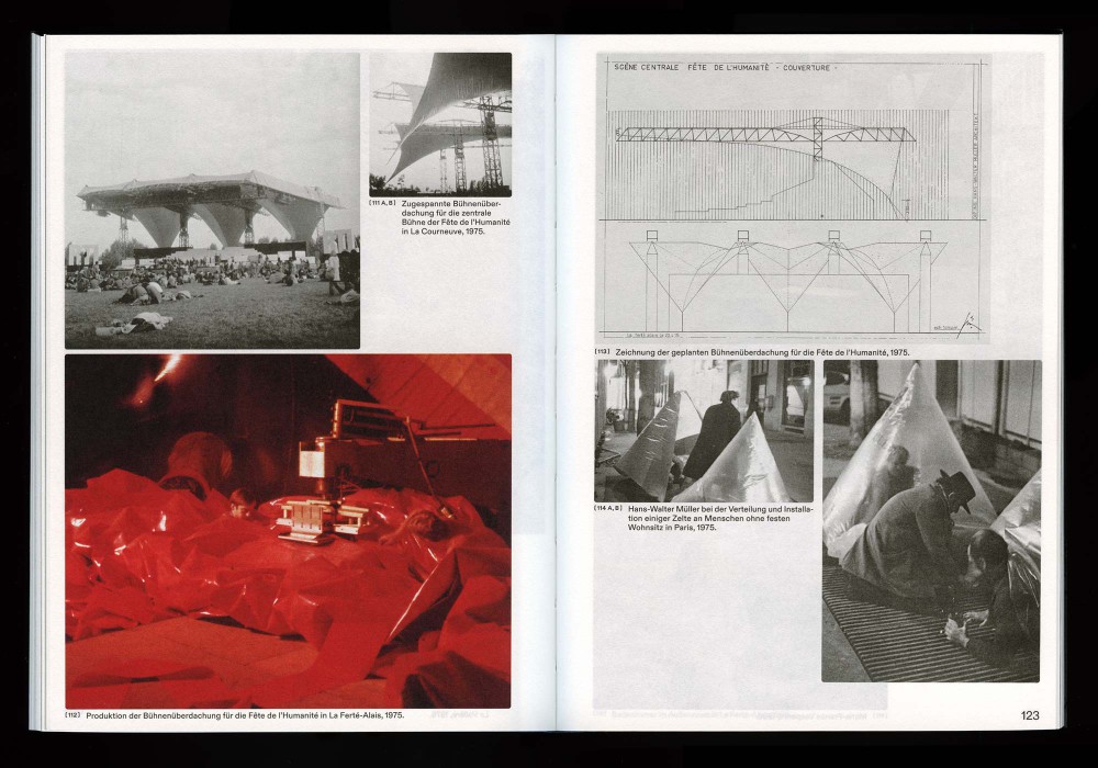
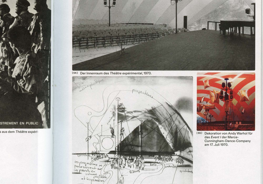
This publication is based on Robert Stürzl’s discussions with the architect, civil engineer, and artist Hans-Walter Müller, who has been developing forms of pneumatic architecture since the late 1960s. The book combines conversations, photographs and drawings from Müller’s archive with early texts written by the architect and a comprehensive catalogue raisonné. The publication thus provides German readers with the first in-depth study of the life’s work of the visionary architect and champion of living architecture.
Thread-sewn softcover with screen printed PVC dust jacket. German and French language editions. The book is available here.
Paper:
Arena Rough 90 g/m² and 300 g/m²
Typefaces:
Diatype (Dinamo)
About:
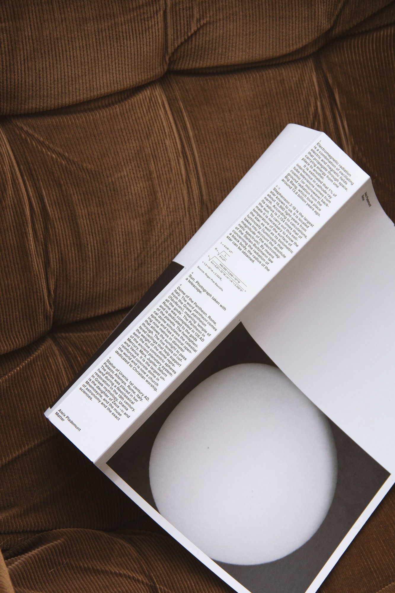
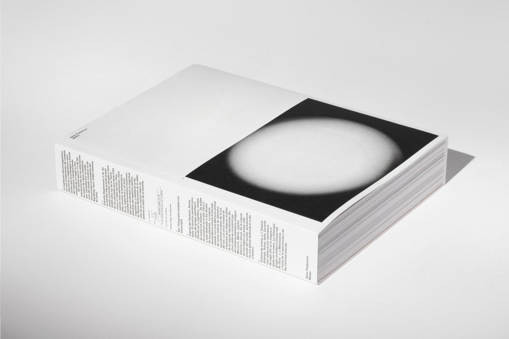
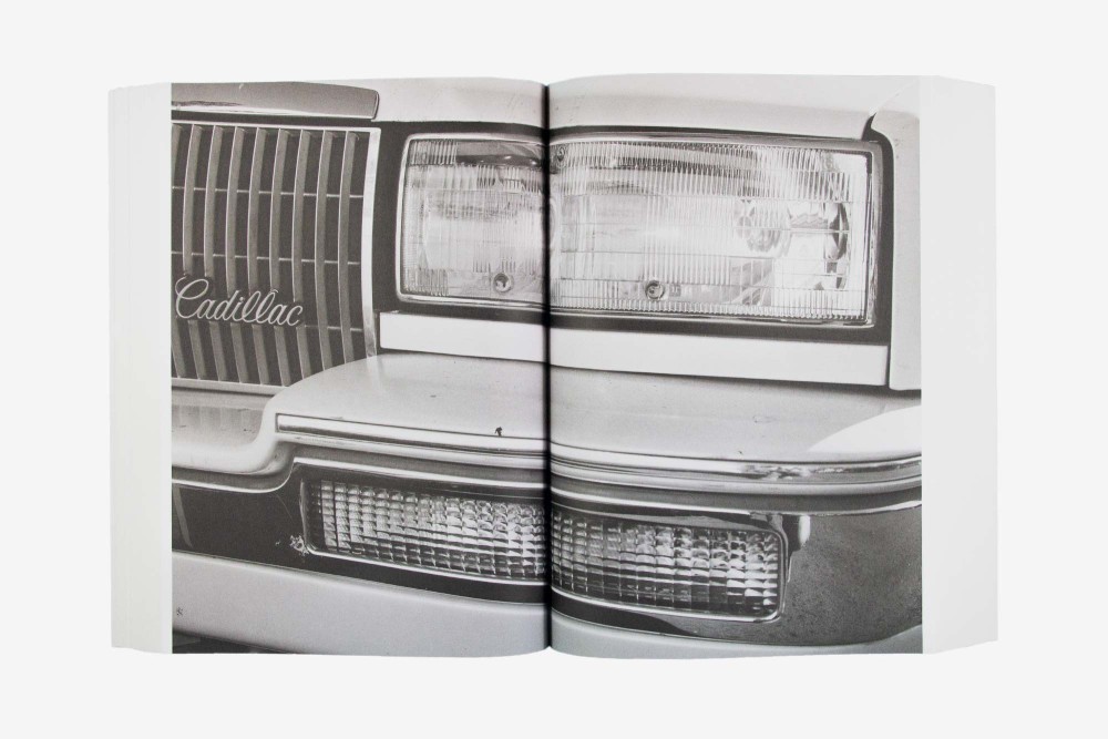
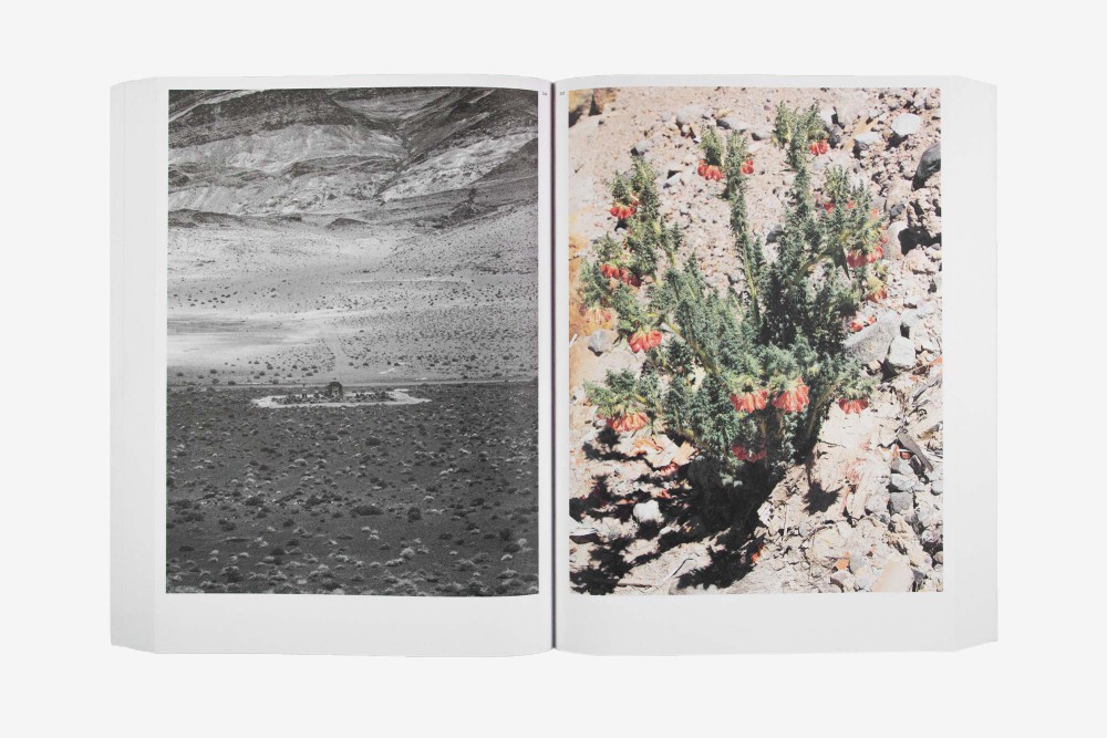
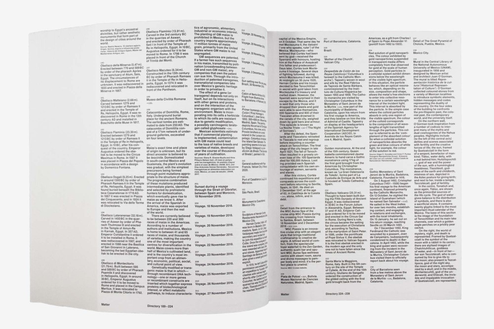
Since 2013, Aleix Plademunt has been working on Matter, his most extensive photographic project. The 640 page brick tackles the age-old question of existence.
Designed in close collaboration with Fabian Bremer and Pascal Storz. The book is available at Spector Books and Ca l’Isidret.
Paper:
Holmen Trend 90 g/m²
Typeface:
Nimbus Sans
About:
Stapled softcover series with exchanging centerfold inlays. Designed in close collaboration and under supervision of Markus Dreßen, Jan Wenzel and Anne König 2018. and redesigned 2022 with Elias Erkan. The catalogs can be digitally read here.
Paper:
Various Printshop stock papers in around 90 g/m²
Typeface:
Agipo (Radim Peško)
Apax (François Rappo
About:
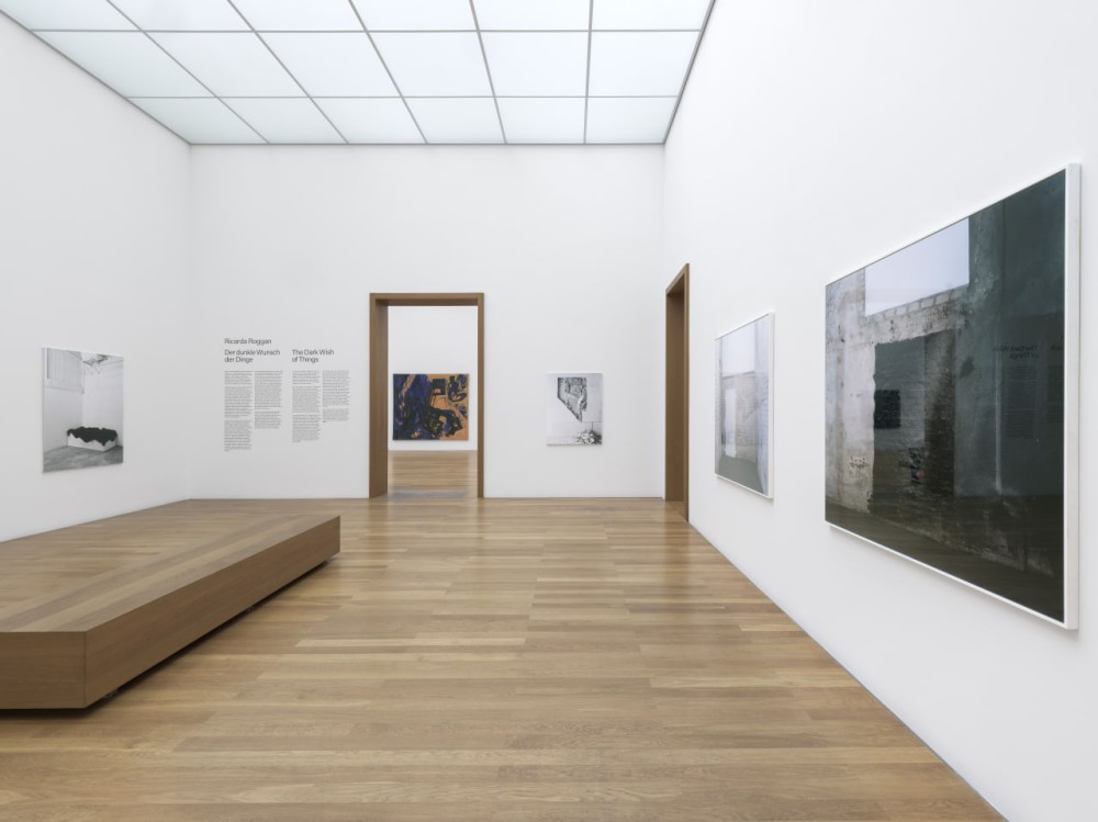
Layout and typesetting for Ricarda Roggans solo exhibition at MdbK Leipzig. Legible, simple, reserved.
Plotted type on wall and printed metal metal plates for the works
Typeface:
Acumin Pro
About:
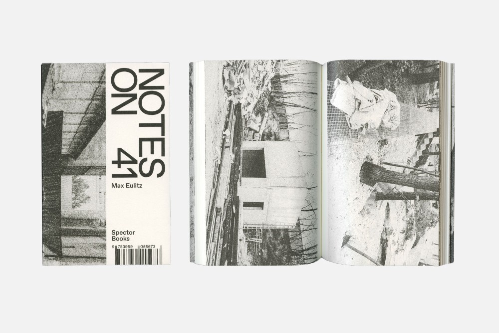
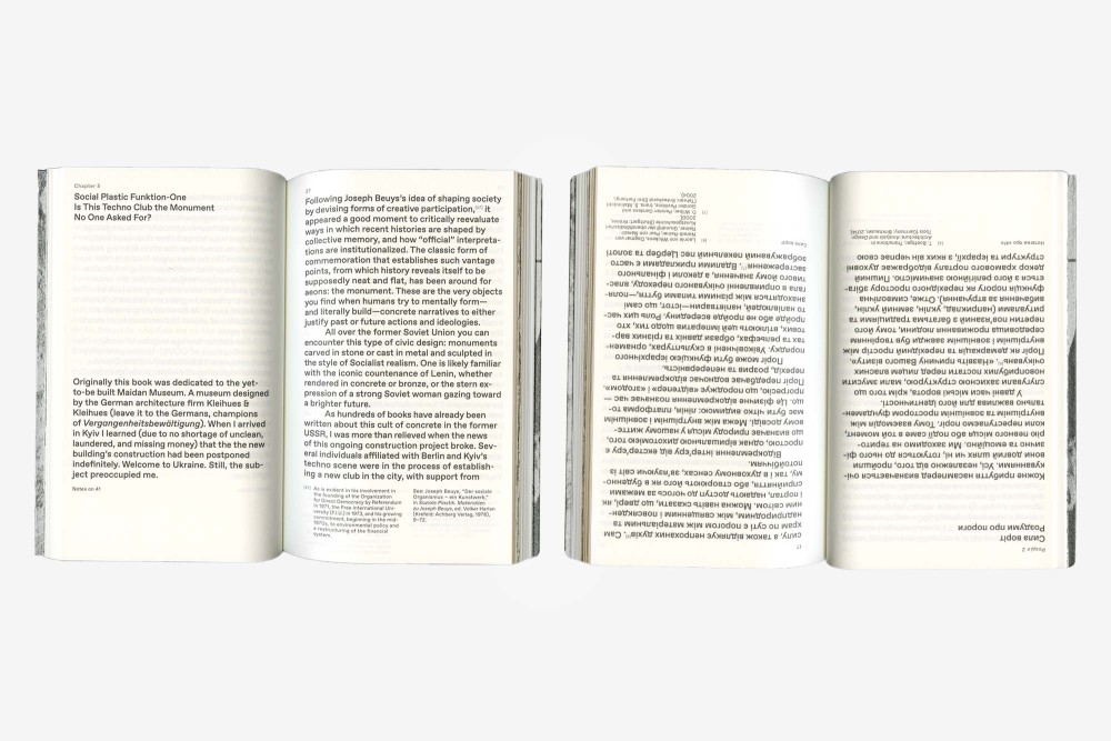
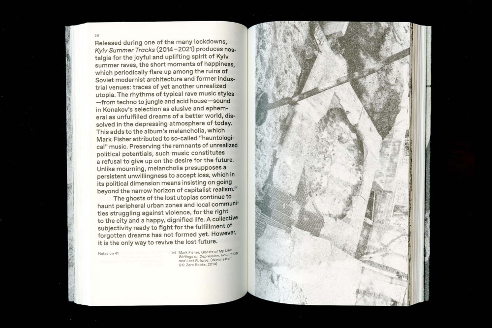
Max Eulitz’ Notes on 41 is a collection of essays illustrating the circumstances surrounding the creation of a nightclub in Kyiv. The book outlines structural challenges in the historical context and considers the complexity of the sociopolitical situation in Ukraine.
English-Ukrainian, perfect bound flip-book as a softcover with flaps and matt varnish. Ukrainian typesetting by Alexey Malygin
Paper:
Munken Print Creme 15 80 g/m²
Typeface:
Favorit Pro (Dinamo)
About:
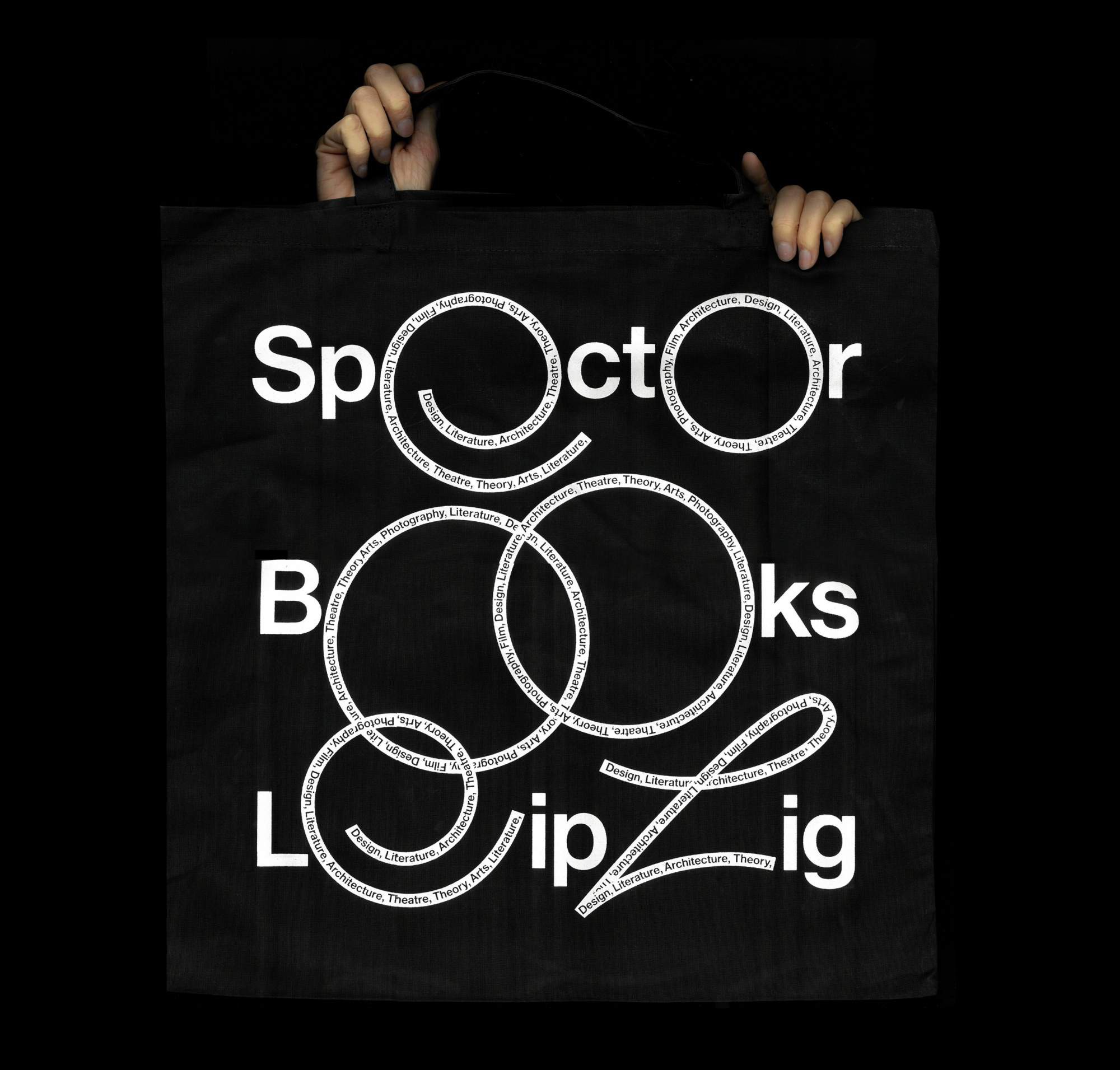
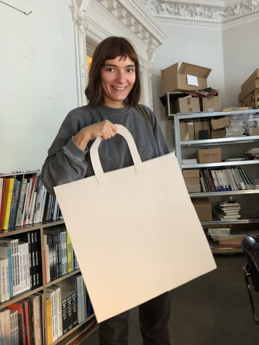
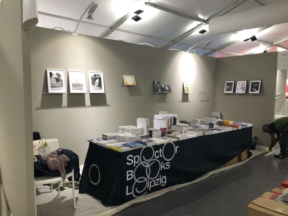
First ever Spector Books merch: big scale tote shoppers to fit all the books you ever wanted. Together with some ephemera for the Paris Photo booth.
Designed with Elias Erkan and Anna Wolf
Typeface:
Neue Haas
About:
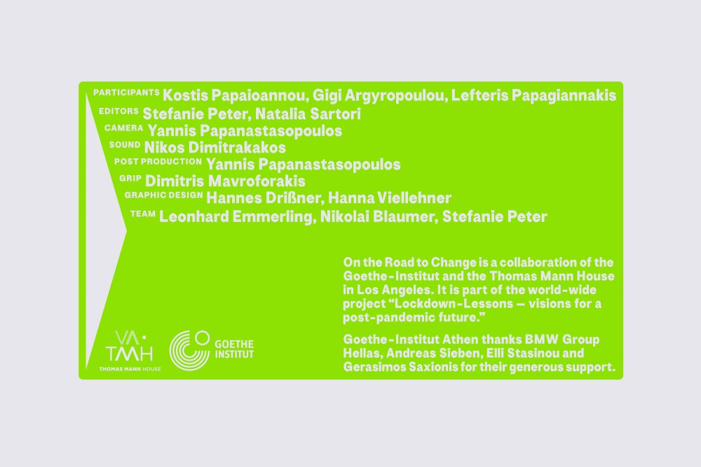
The video series On the Road to Change brings people in Los Angeles, Berlin, Athens and Delhi into conversation about what democracies can learn from the pandemic. It is a cooperation of the Goethe-Institut and Thomas Mann House in Los Angeles. Design derives from painted street typography that is stretched for legibility in movement. Five volumes, five bold colors, global discussions and plenty reasons to give this project a watch.
Concept and branding for the video series with all components and some communication adaptions. All credits for movements to Hanna Viellehner, queen of Aftereffects.
Typeface:
Vacuum (Nicolas Bernklau)
About:
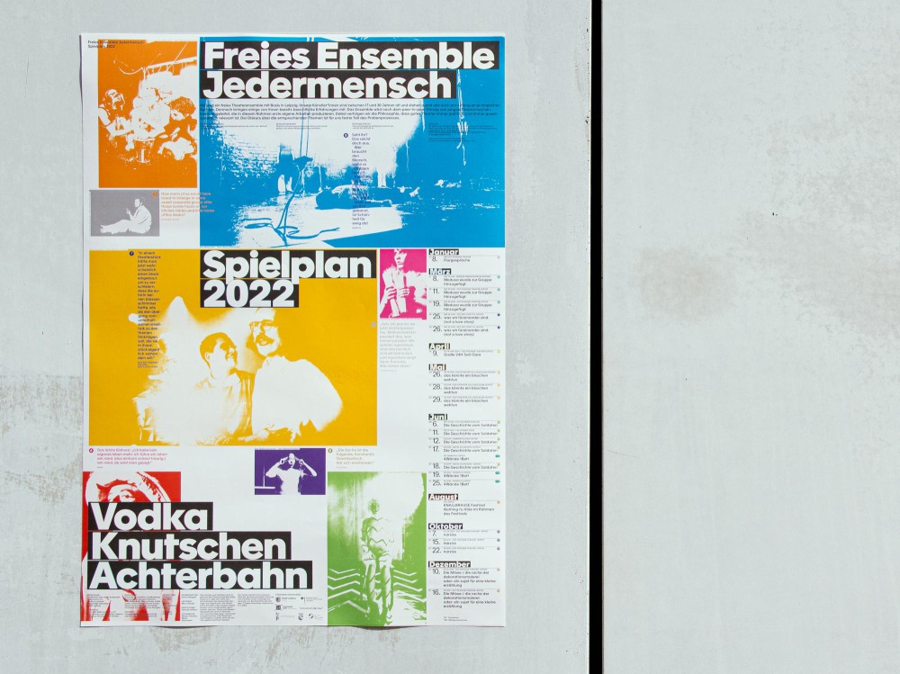
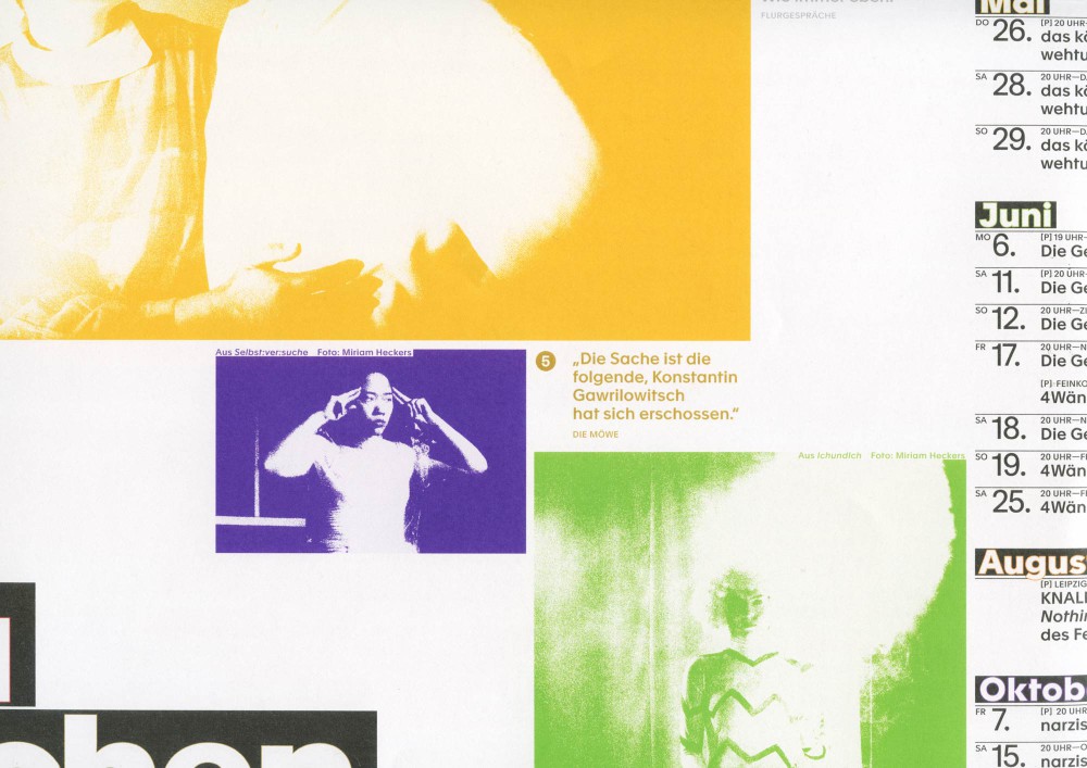
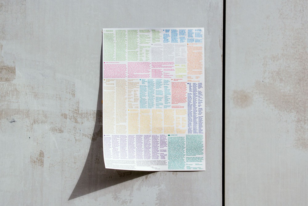
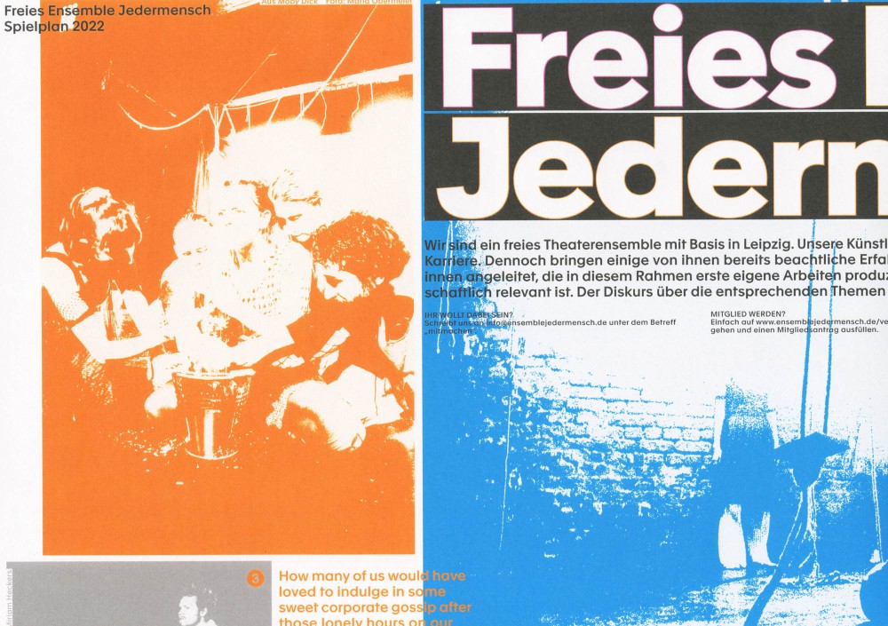
Multi-use Leaflet/Poster for Leipzig based Freies Ensemble Jedermensch, advertising their 2022 season program. A color code and numerals connect the images and calendar on front with the descriptions and details on the typographic back side.
Typeface:
Apax
About:
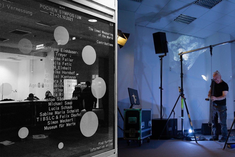
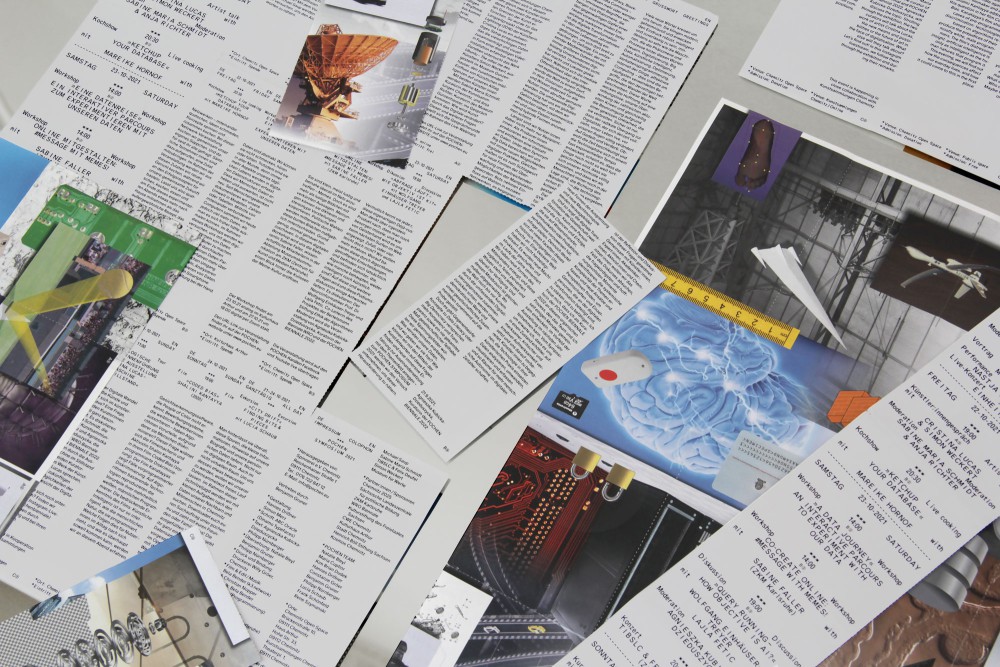
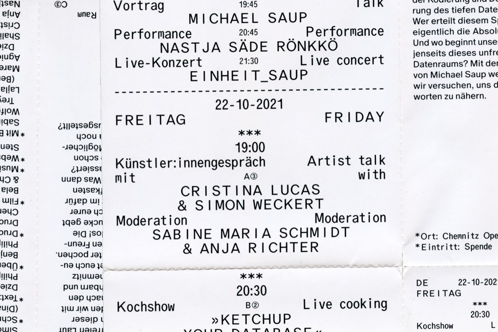
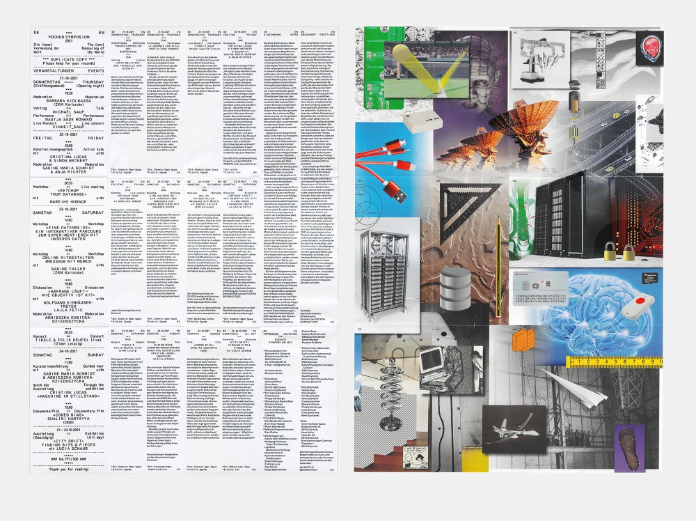
Identity, leaflet and window plots for the symposium of Chemnitz based »Pochen Biennale«. Bill/receipt style typography and collage designed together with Vienna legend Simon Merz.
The leaflet is perforated to make it a multi functional poster + overview + postcards for each event. Printed in CMYK and Drip-off varnish.
Paper:
Maxi Gloss 80 g/m² (leaflet)
Typeface:
Oracle (Dinamo Typefaces)
About:
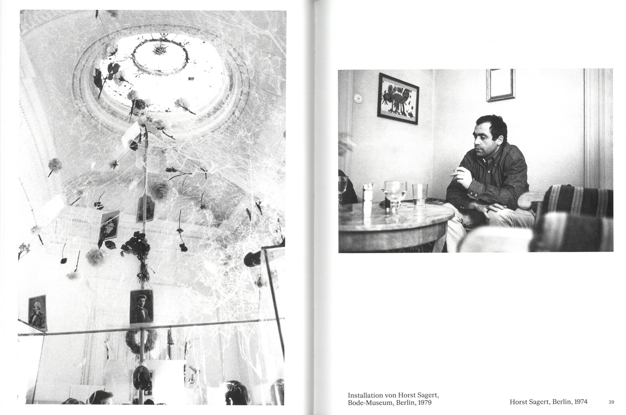
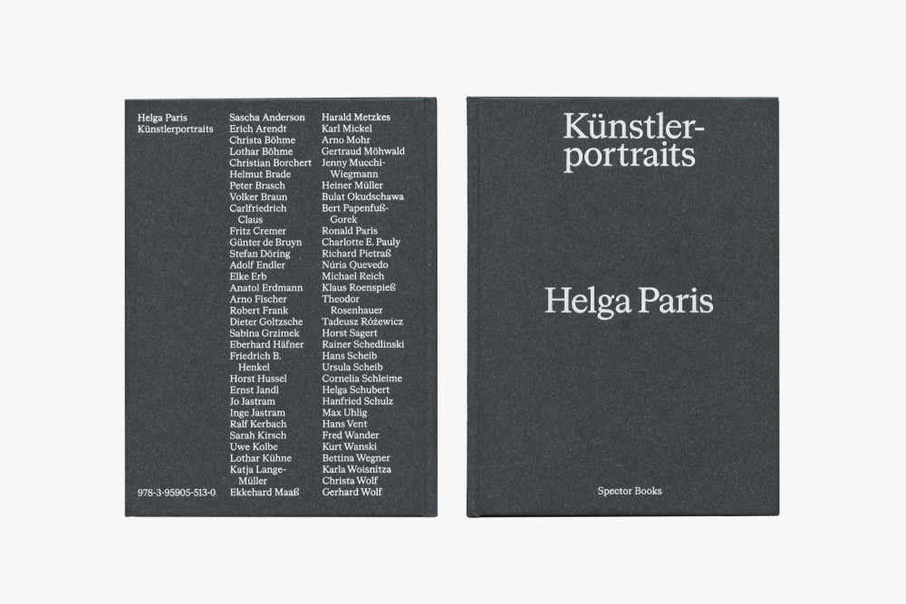
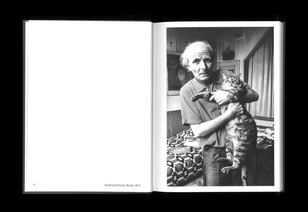
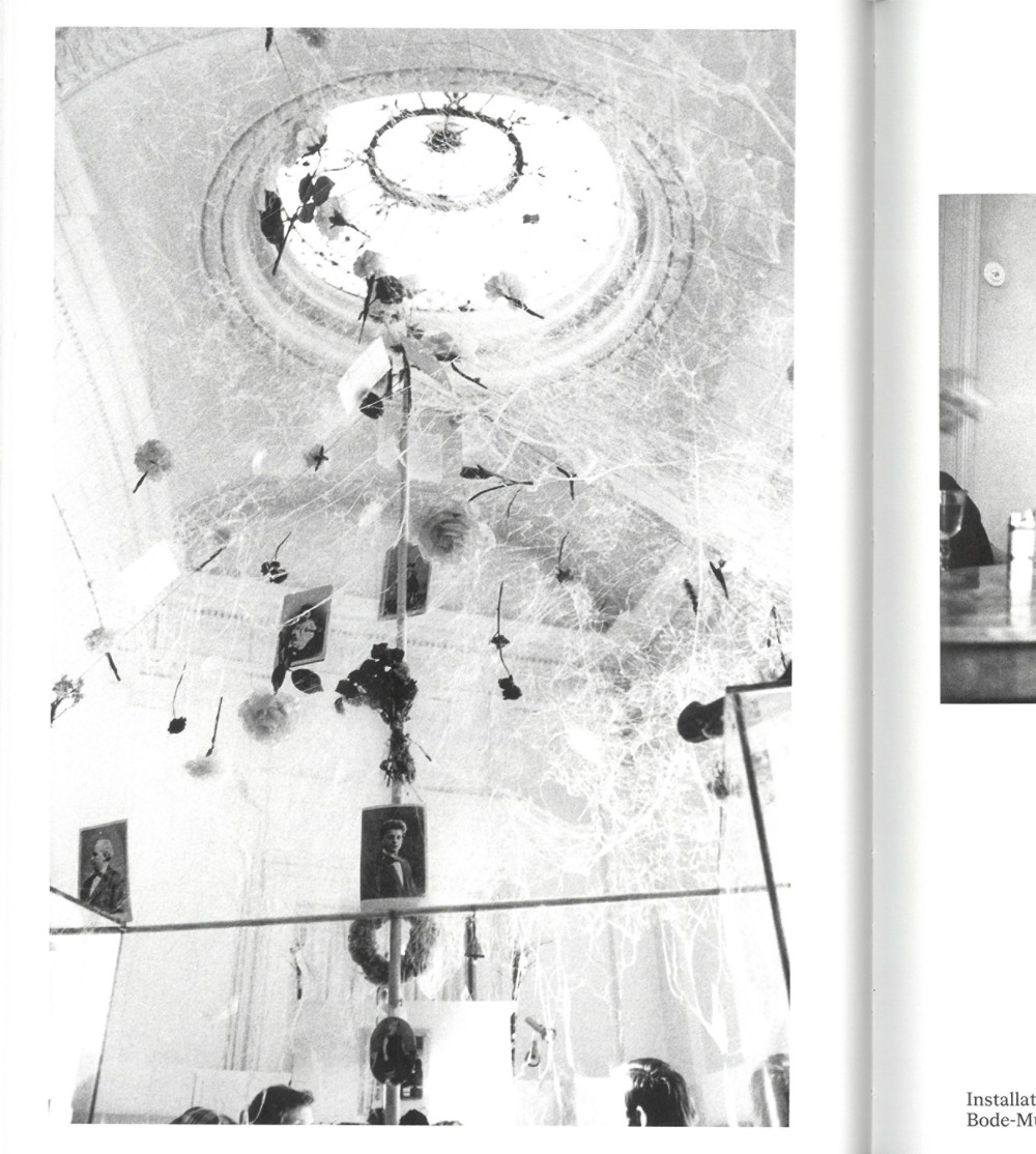
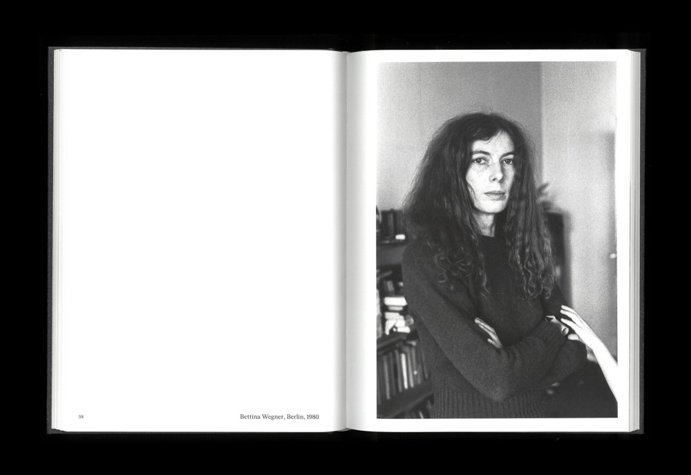
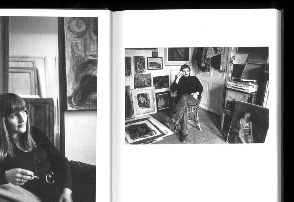
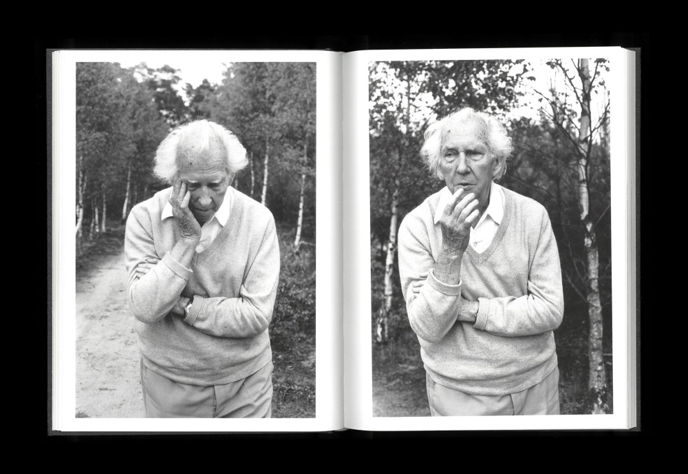
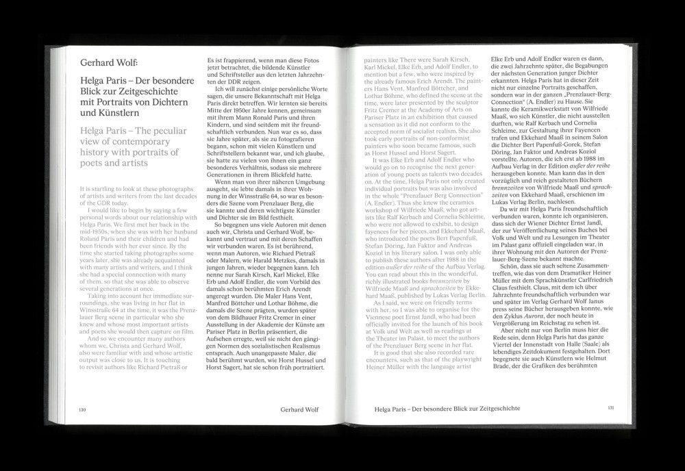
This book features Helga Paris’s portraits of artists and writers in the GDR that are being published for the first time.
Thread-sewn Hardcover with duplex printing in Pantone Black and warm Grey.
Paper:
Magno Sappi 110 g/m²
Typeface:
Cigars (Heavyweight)
About:
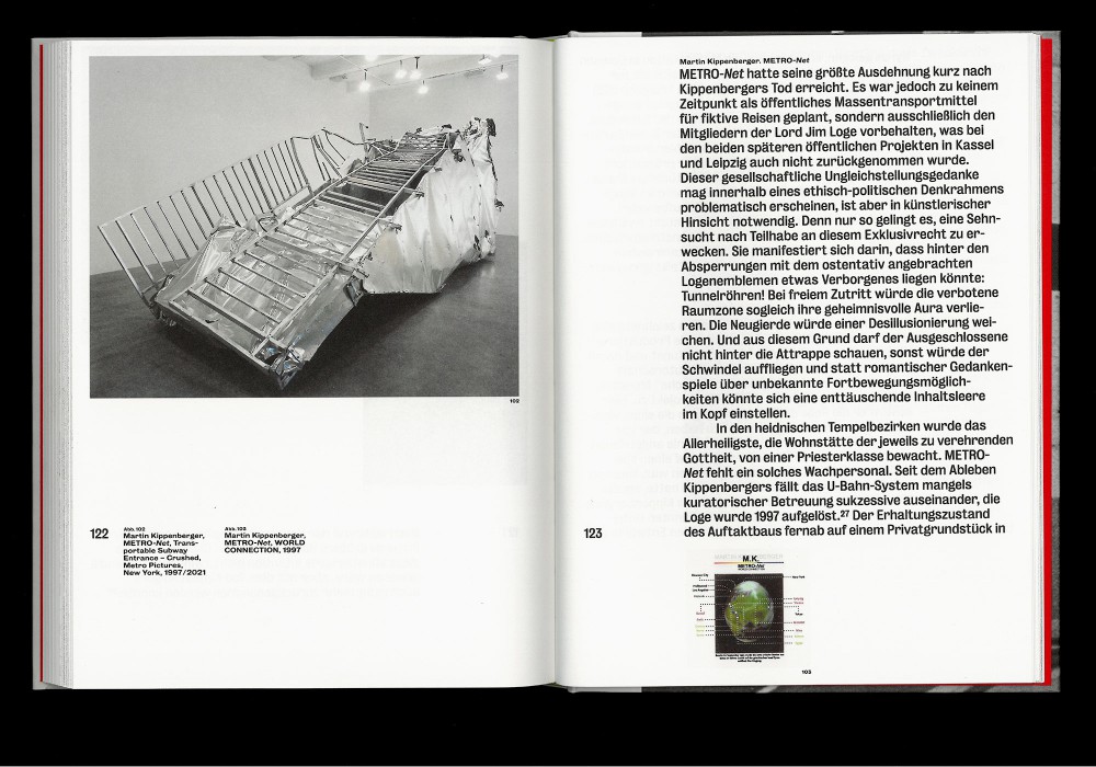
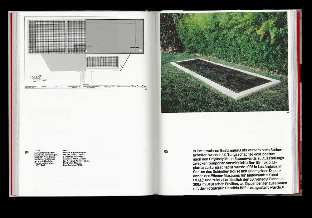
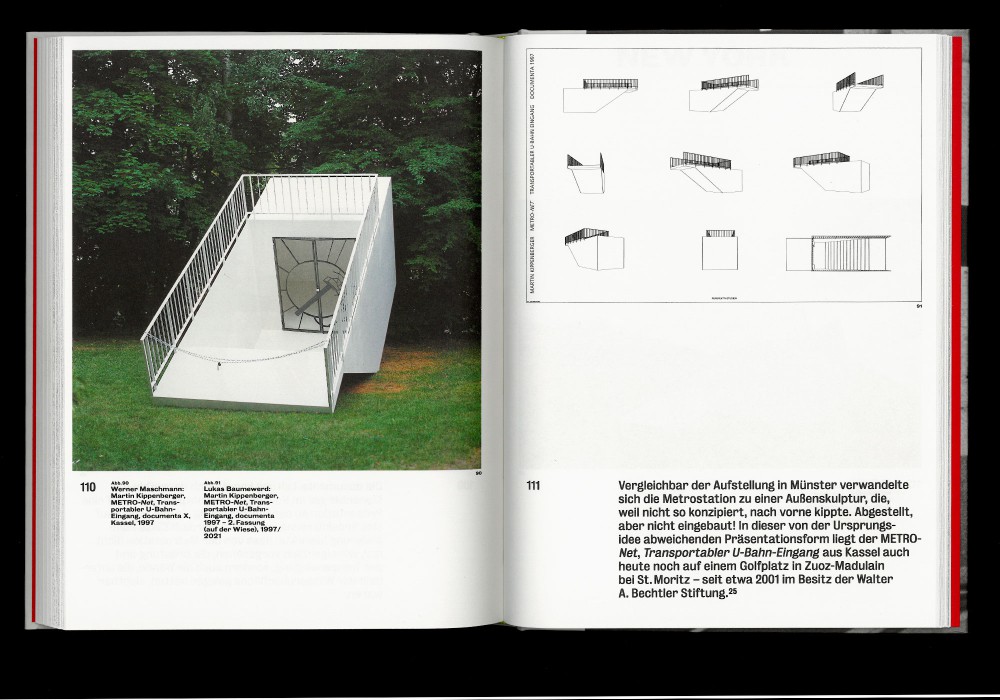
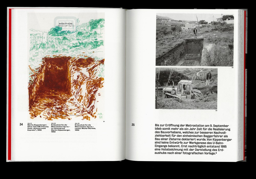
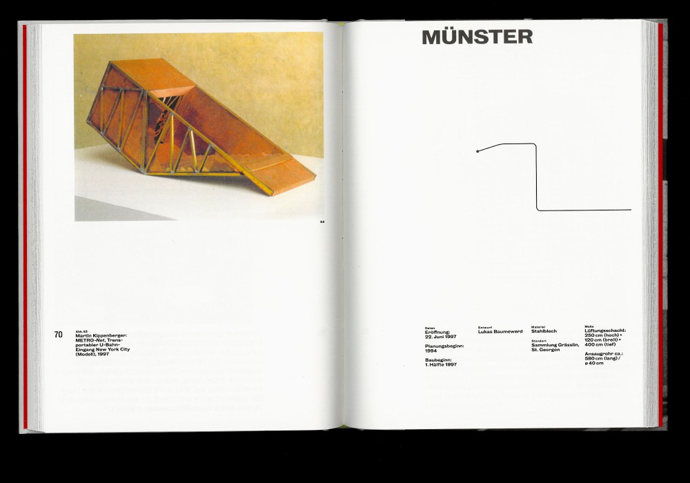
In the early 1990s, Martin Kippenberger developed the idea of a global underground network: METRO-Net. This created a means of travelling in the boundless space of the imagination. Its usability depends on the imagination. METRO-Net was intended to counter life’s predictable, rationally oriented parameters with a romantic sense of the world.
Thread-sewn hardcover with blind embossing on cover, designed in close collaboration with Fabian Bremer and Pascal Storz.
Paper:
Munken Print White 15 100 g/m²
Peyer Surbalin Seda
Typefaces:
Bureau Grotesk
About:
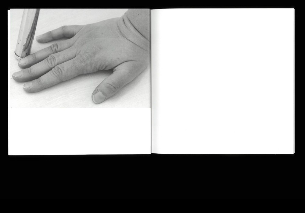
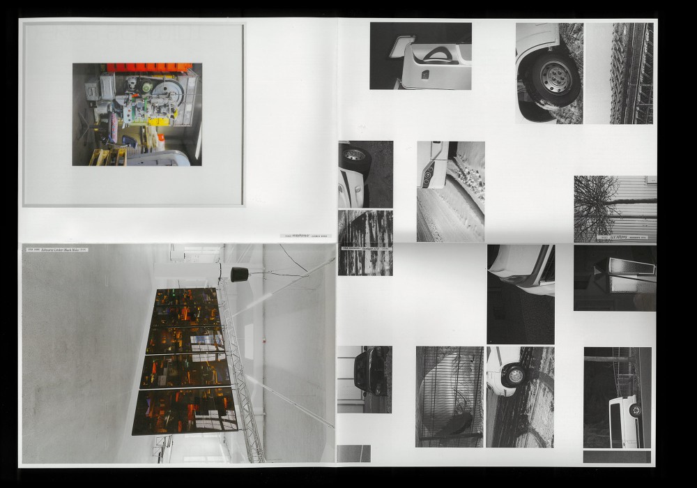
Laura Bielau’s photo book Arbeit (Work) is about the actual space of her work as a photographer and artist: the studio in which she operates. One aspect of the work centres on what she finds in this space, the resources she has at her disposal there, and the way she moves in it.
Perfect bound softcover and reckless monospace typography for the cover and flaps. the book is available here.
Paper:
Magno Sappi 115 g/m²
Typeface:
Custom
About:
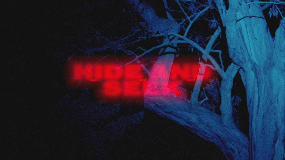
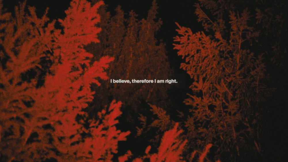
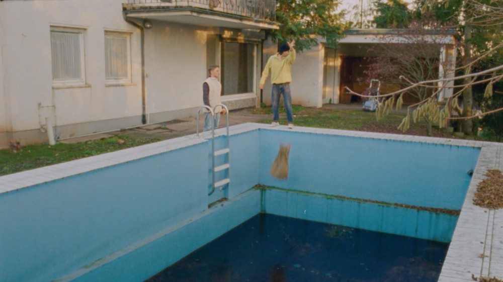
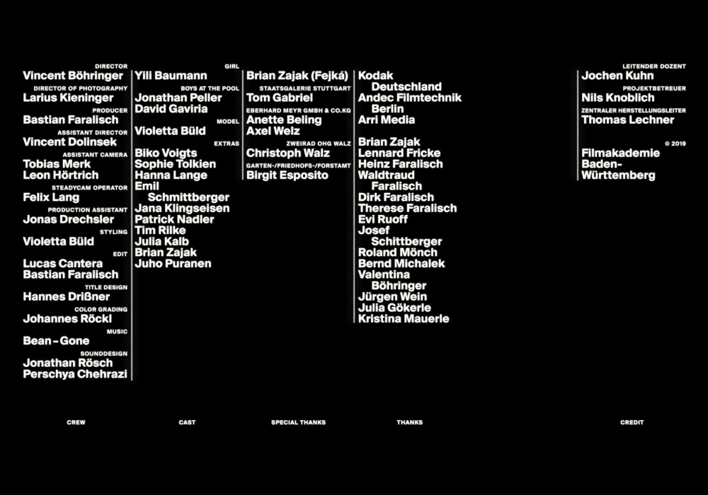
An experimental shortfilm by my big footed friend Larius Kieninger, dealing with the defintion of facts in a media shaped society. Executed as a project at Filmakademie Baden Württemberg GmbH Ludwigsburg.
Titling design and credits
Available to watch at Larius’ vimeo
About:
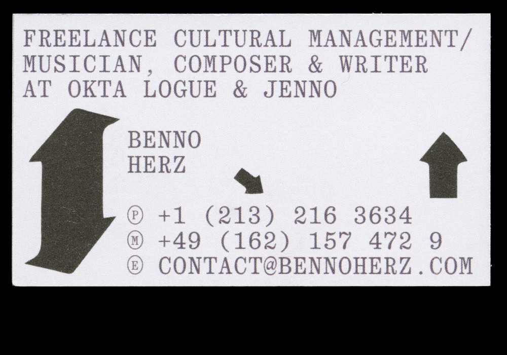
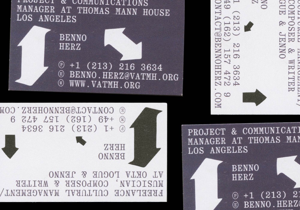
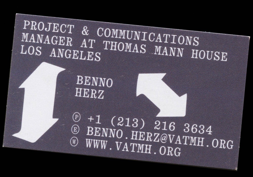
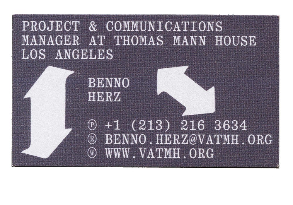
Business cards for multi-talented Benno Herz and his L.A. based freelance abilities aswell as his Thomas Mann House adress. Visually referencing a mixture of room keycards with swiping instructions and a Pacific Palisades hotel room touch. Definitely slides right into your pocket!
Printed in Los Angeles CA
Typeface:
Quadrant Text (Vincent Chan)
About:
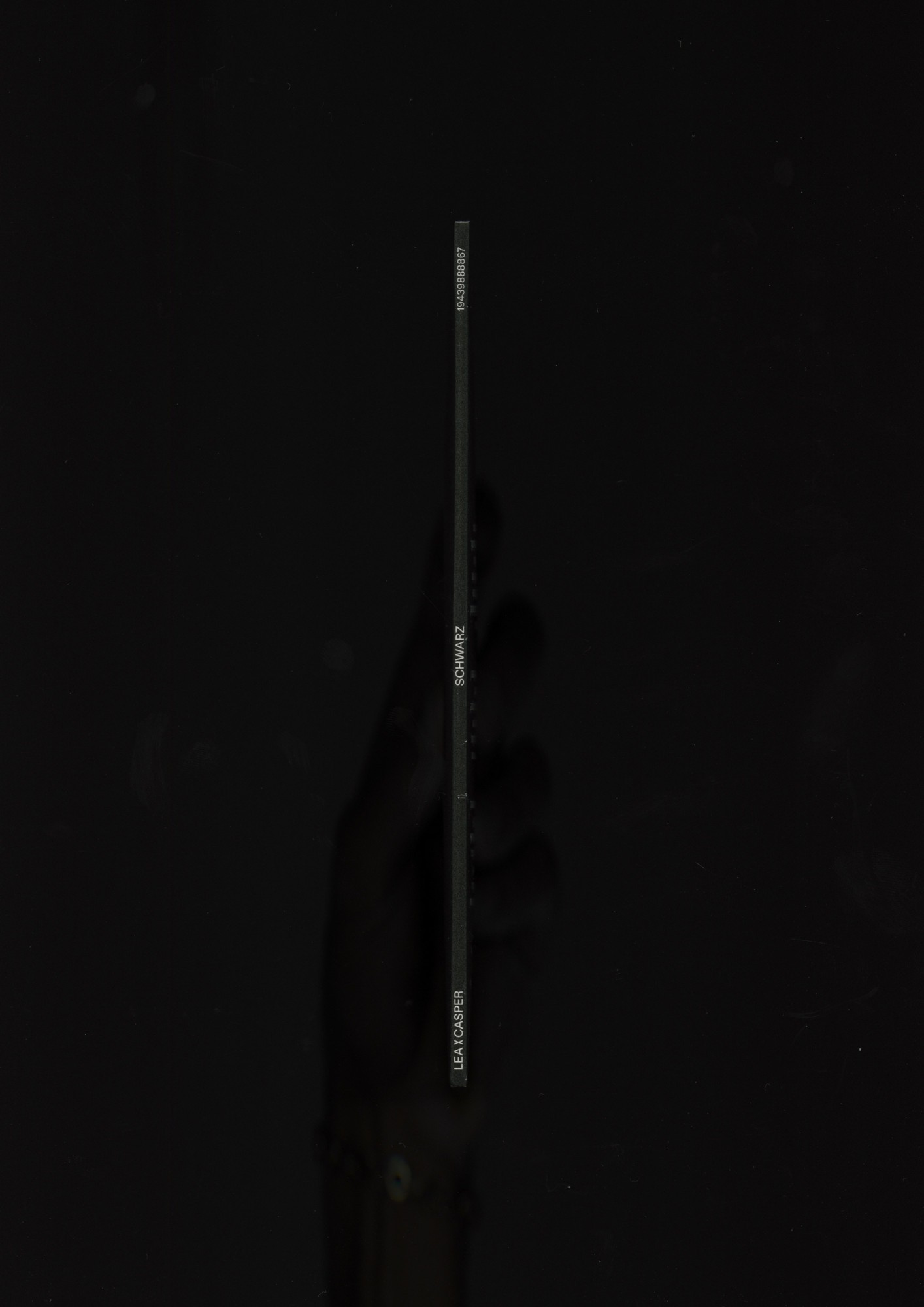
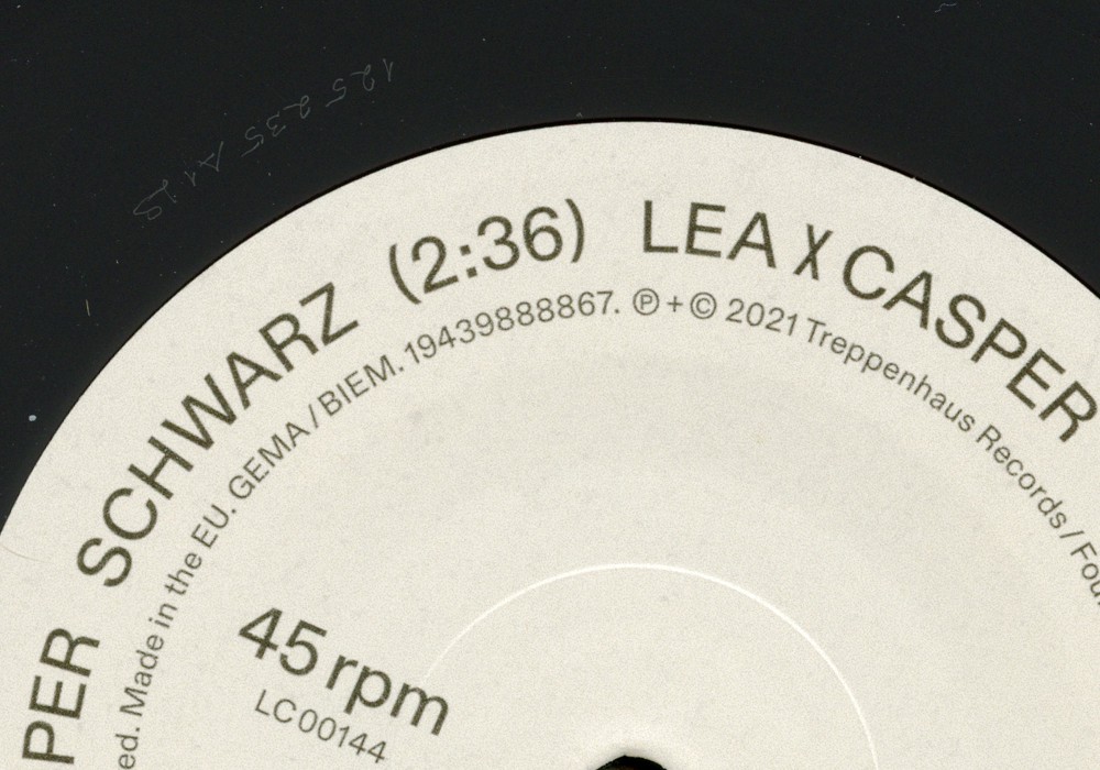
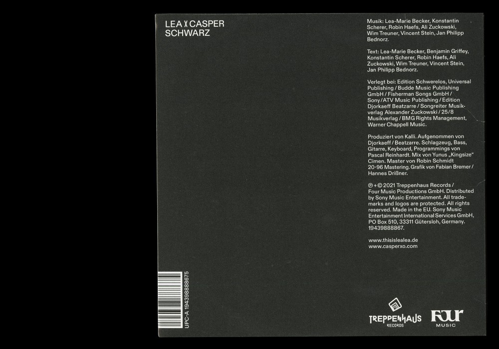
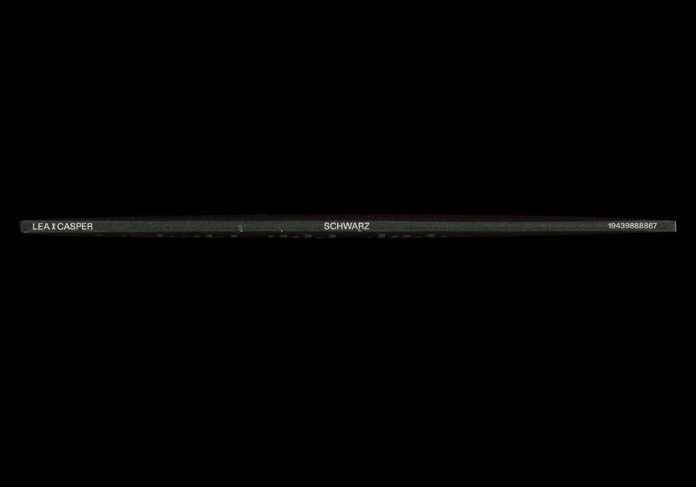
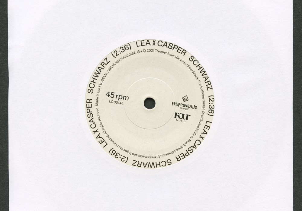
Together with Fabian Bremer I did the Typography for the LEA × Casper Single »SCHWARZ« released by Treppenhaus Records. With various drafts in the lottery it was the one with nothing but striking simplicity to be chosen :—)
Typeface:
Diatype
About:
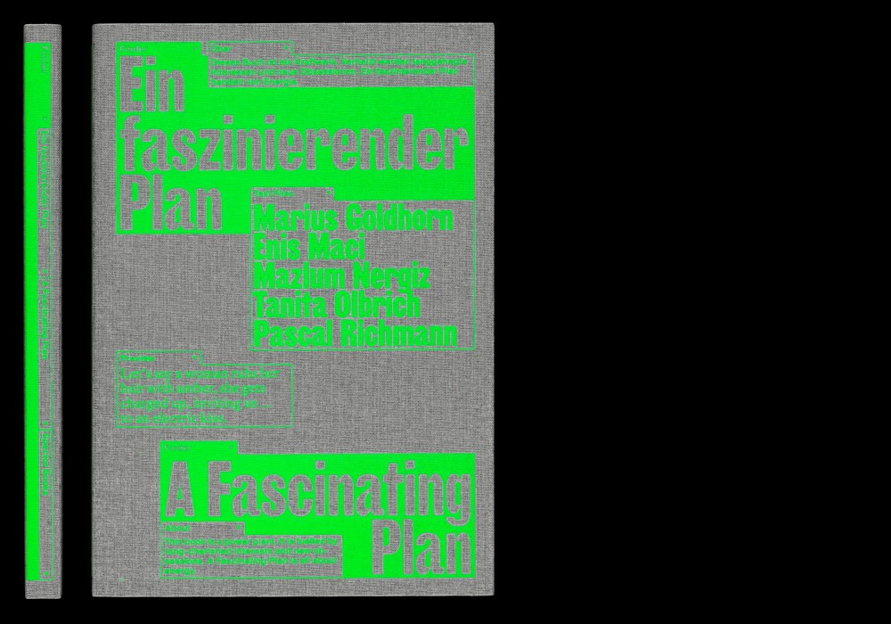
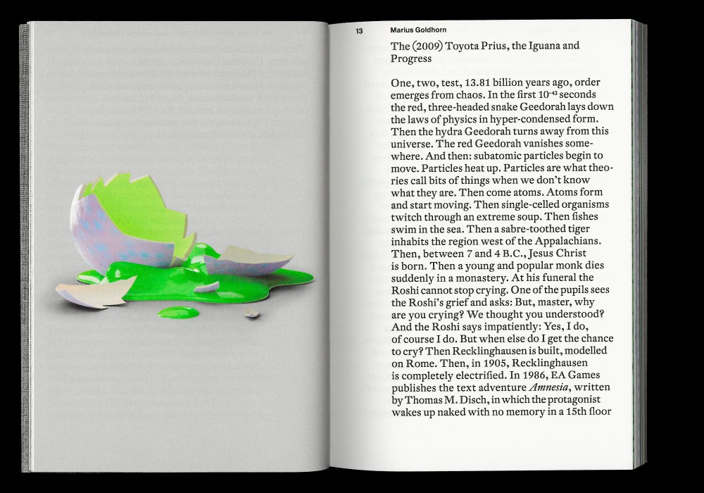
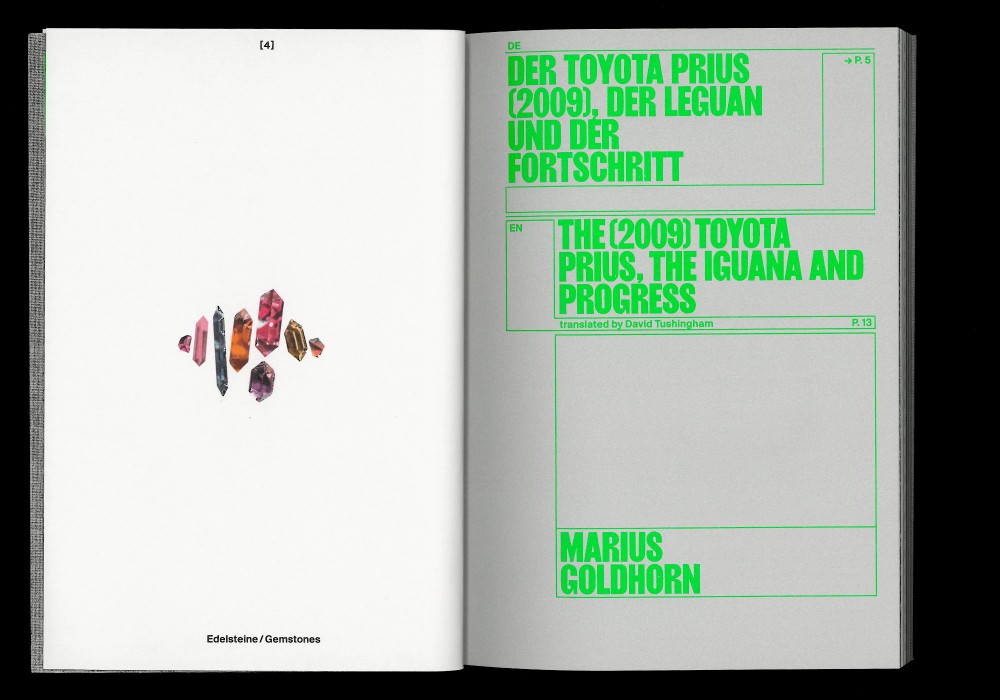
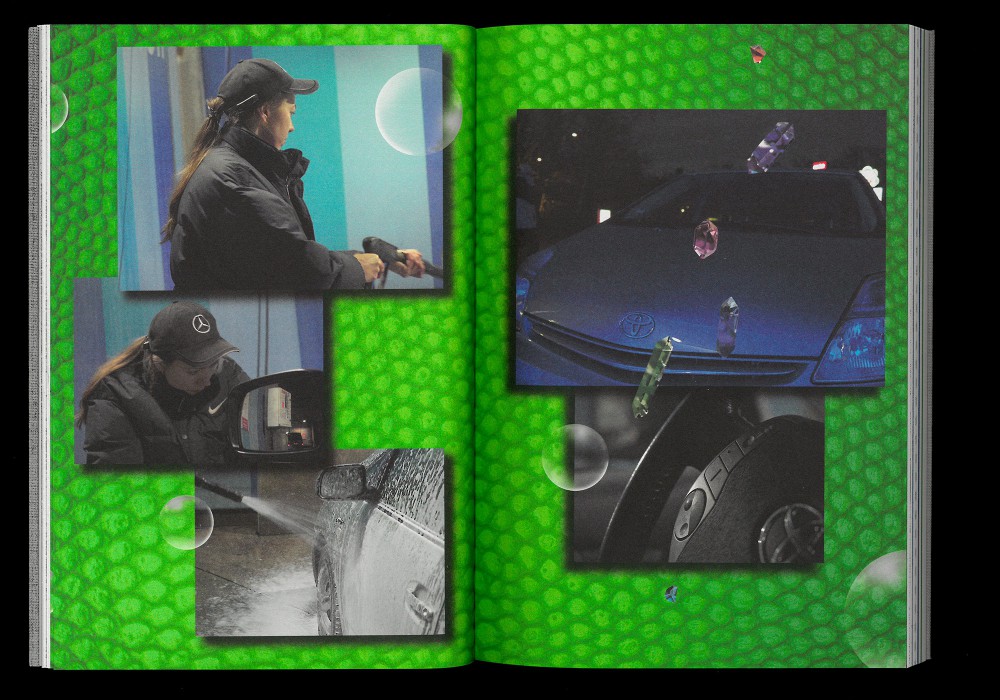
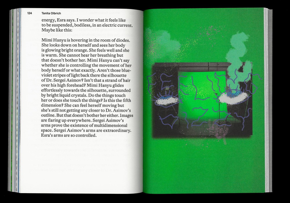
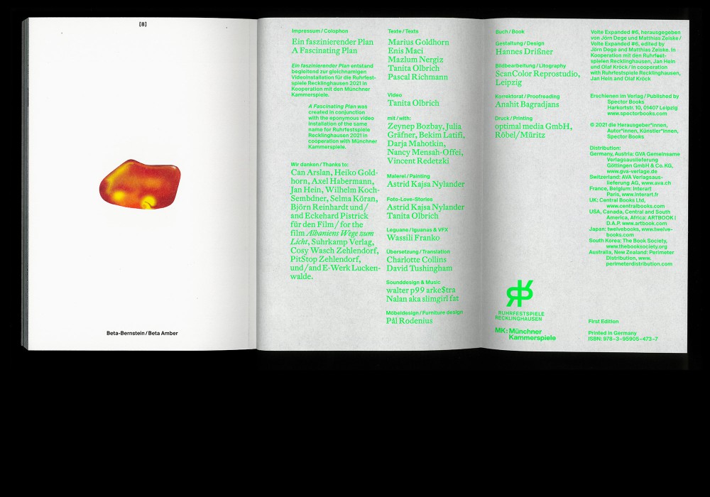
A Fascinating Plan is all about energy. This book is part of the video installation with the same title produced for the Ruhrfestspiele 2021 in cooperation with the Munich Kammerspiele.
Thread-sewn softcover, printed in CMYK and interpolated Pantone 402. Cover is a punky screenprint on linen fabric: referencing contemporary literature on classic structures.
Paper:
Kaliko Fly 90 g/m²
Typefaces:
Giros Bold (Radim Pesko)
DTL Fleischmann
About:
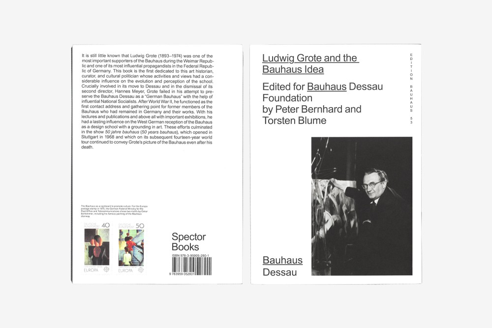
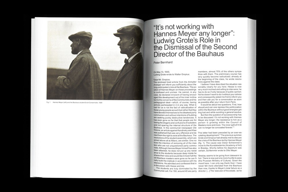
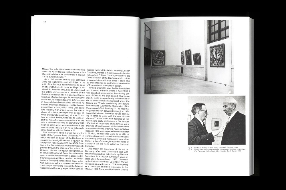
This book is the first comprehensive study of Grote’s activities as an ambassador for the Bauhaus. Here his problematic connections with the Nazi cultural scene and art establishment, are addressed, as is his influential position in the making of arts policy in post-war West Germany.
Thread-sewn Softcover. Published as Edition Bauhaus 53. Designed based on a concept of Katharina Köhler and Bauhaus Dessau.
Paper:
Munken Print White 16 90 g/m²
Typeface:
Arial
About:
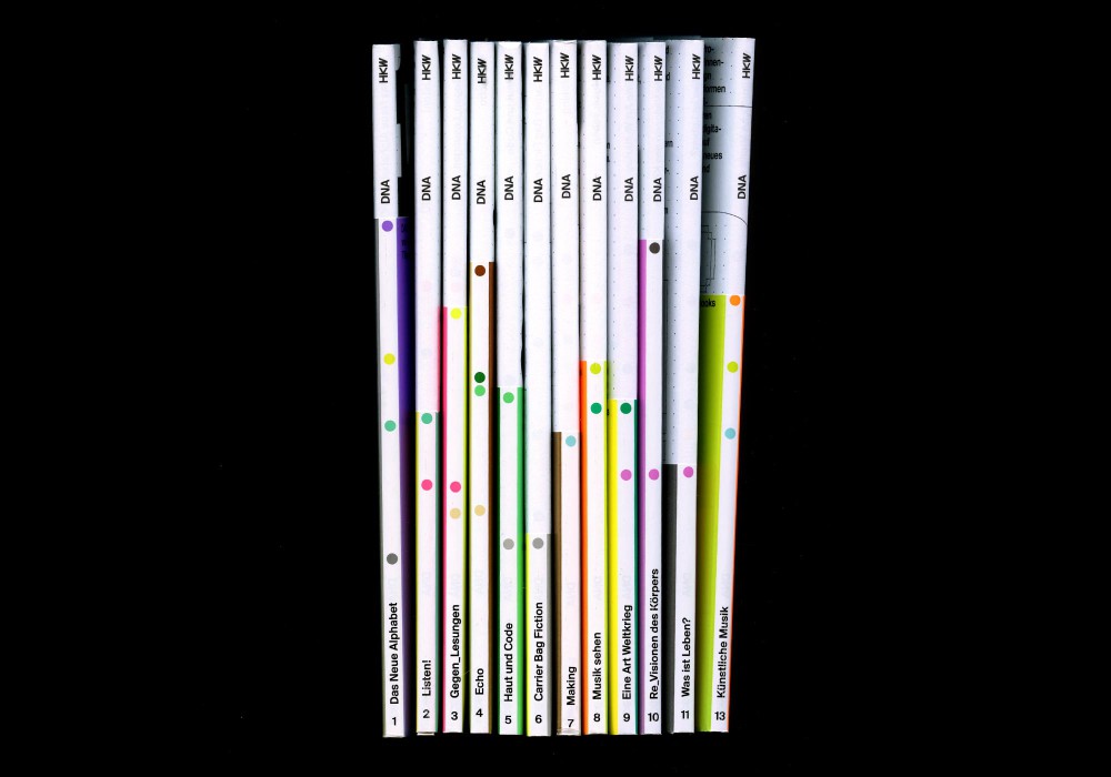
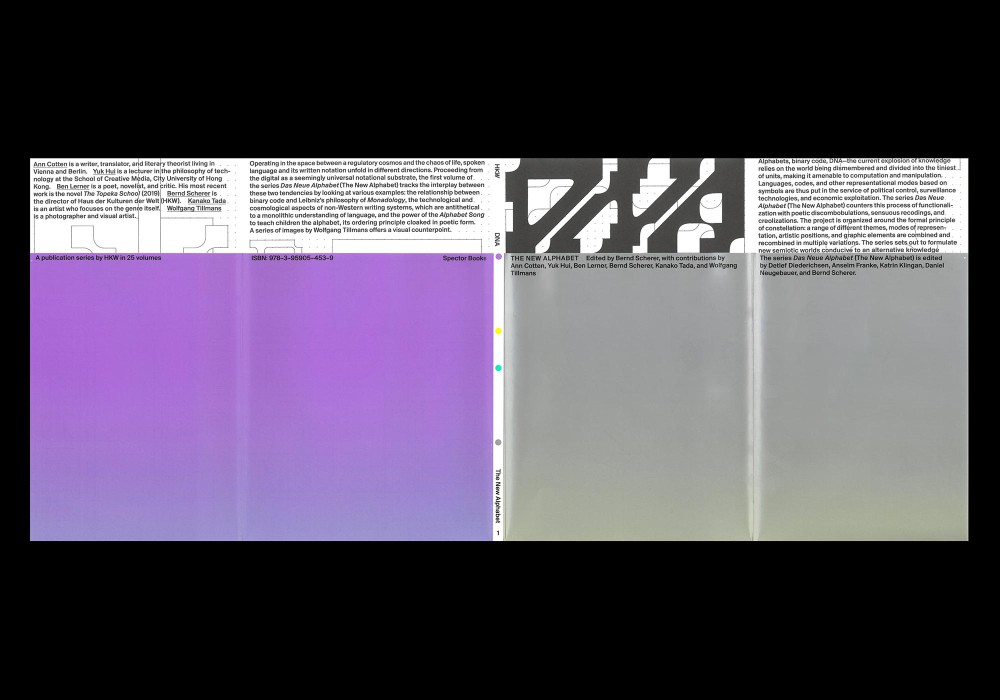
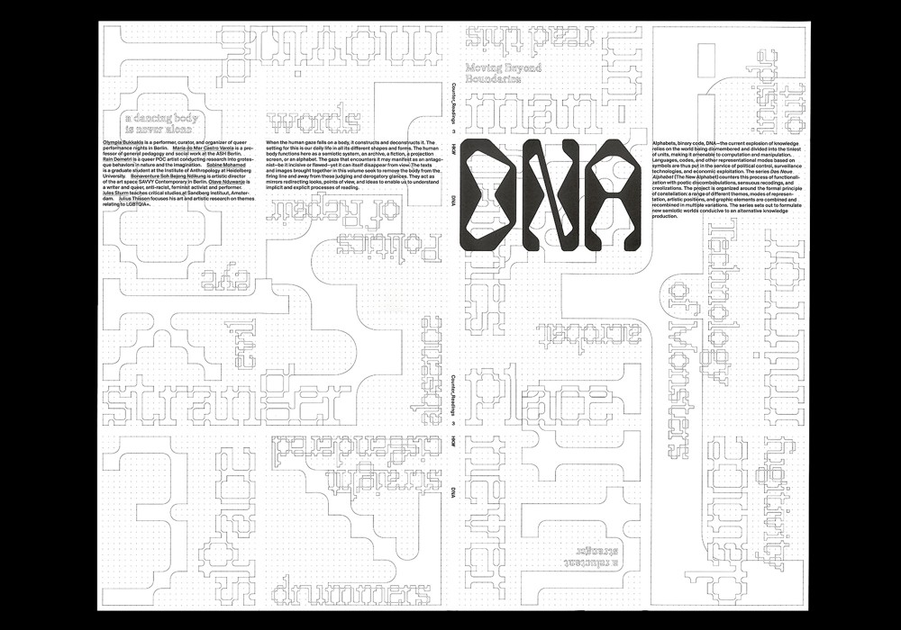
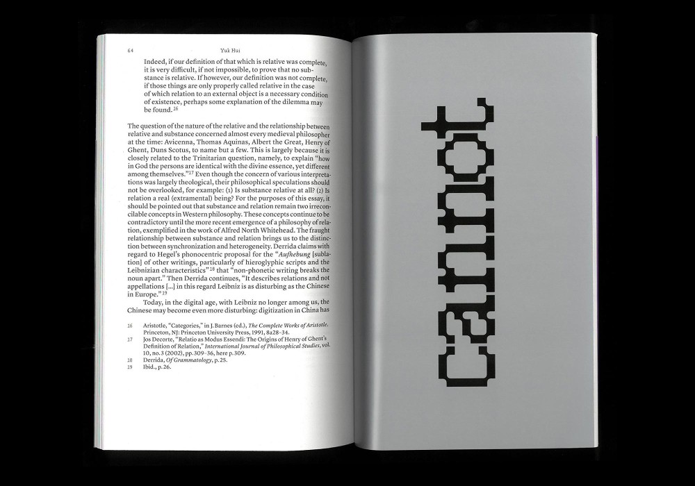
The DNA series sets out to formulate new semiotic worlds conducive to an alternative knowledge production. The topics range from Chinese pictograms to body language and music playlists. There is a feature on It’s Nice That with some more detail on the concept.
series of 25 perfect bound books for a two year program of the HKW Berlin in collaboration with Malin Gewinner, Markus Dreßen, Jan Wenzel and Olaf Nicolai. The books are covered with a series of individually folded dust jackets and printed in four Pantone colors each.
Awarded by TDC Tokyo and Schönste deutsche Bücher 2021 and another feature at Printmag
Paper:
Enviro Top 80 g/m² and 100 g/m²
Chromolux 90 g/m²
Typefaces:
Suisse BP (Ian Party)
Raster Roman (Florian Karsten)
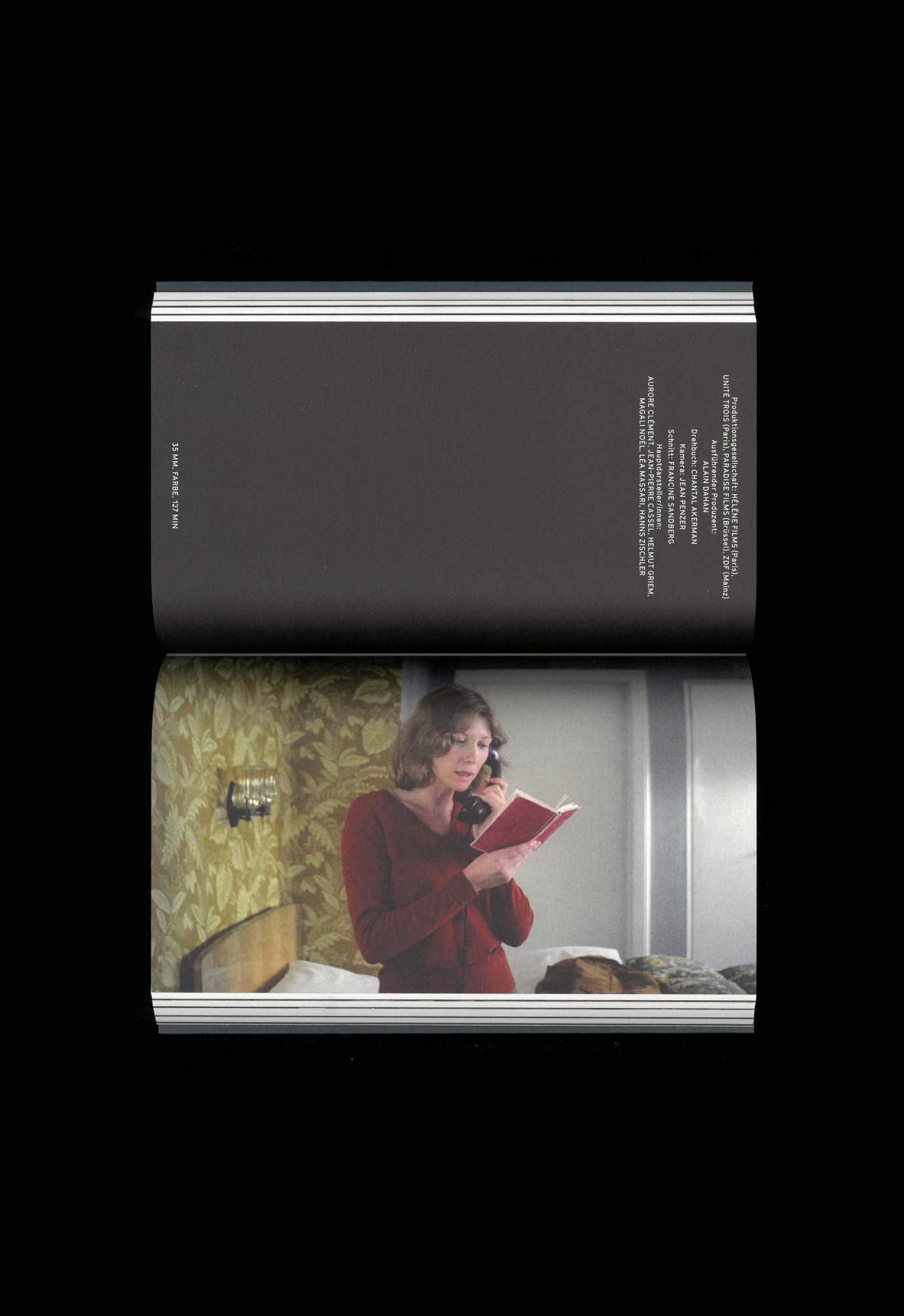
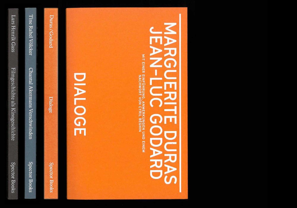
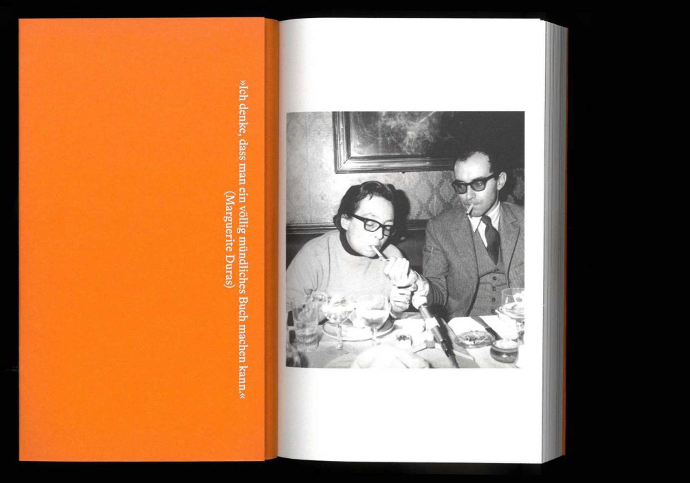
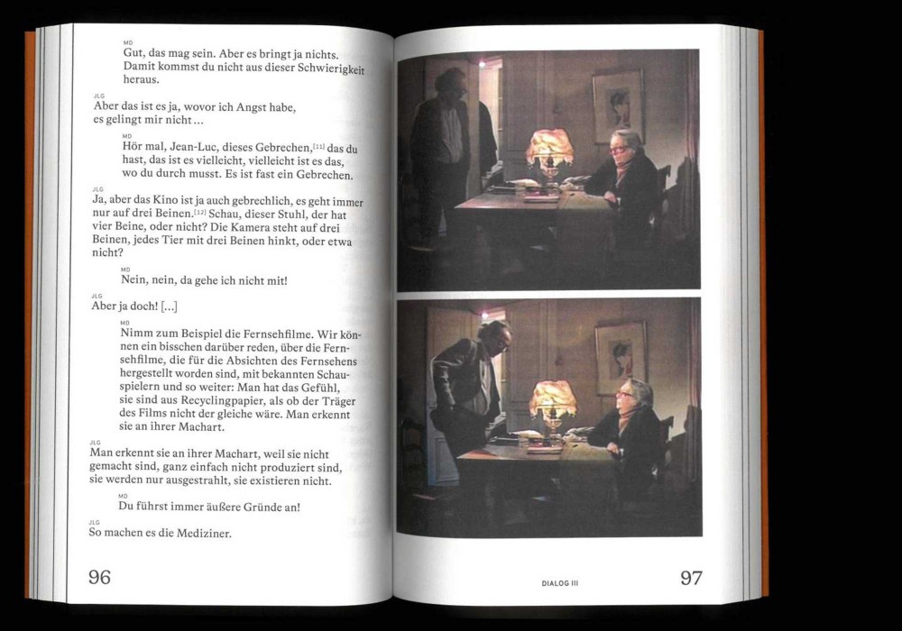
Three dialogues between Marguerite Duras and Jean-Luc Godard Dialoge are accompanied by an introduction, notes, and an afterword by Cyril Béghin.
Perfect bound softcover with flaps. The book format aswell as the fully folded out covers of this series perform as horizontally flipped movie-titles/credits. Published as the third title in the series Books on Films at Spector Books.
Paper:
Munken Print White 1.5 80 g/m²
Typefaces:
Bradford (Optimo)
GT Cinetype (Grilli Type)
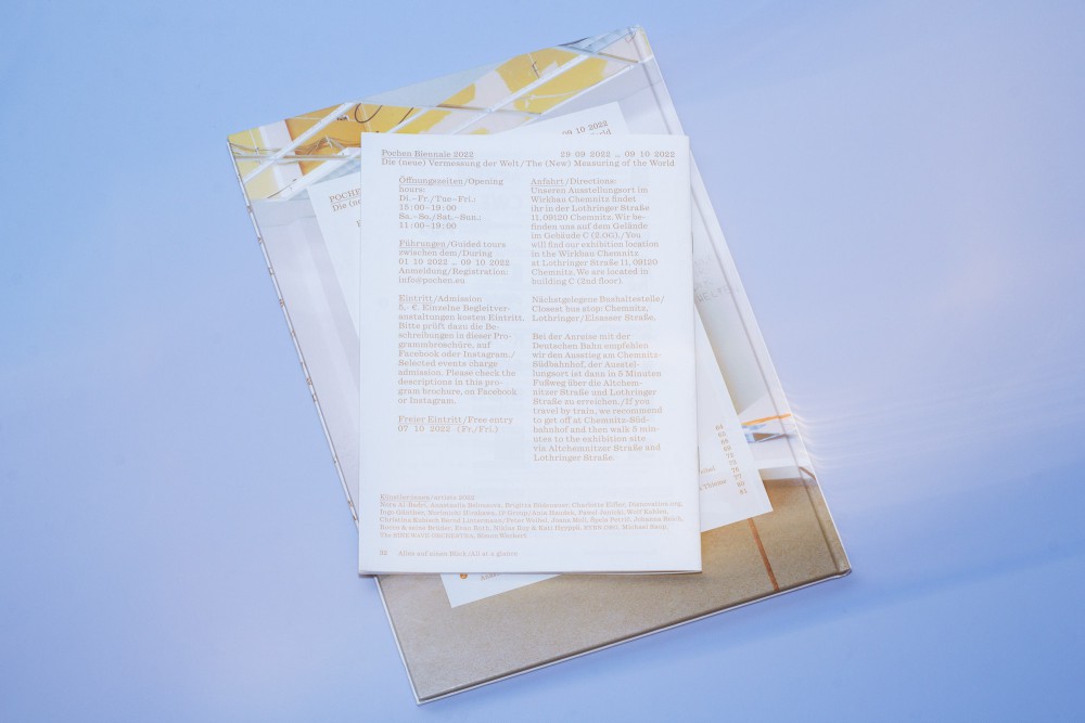
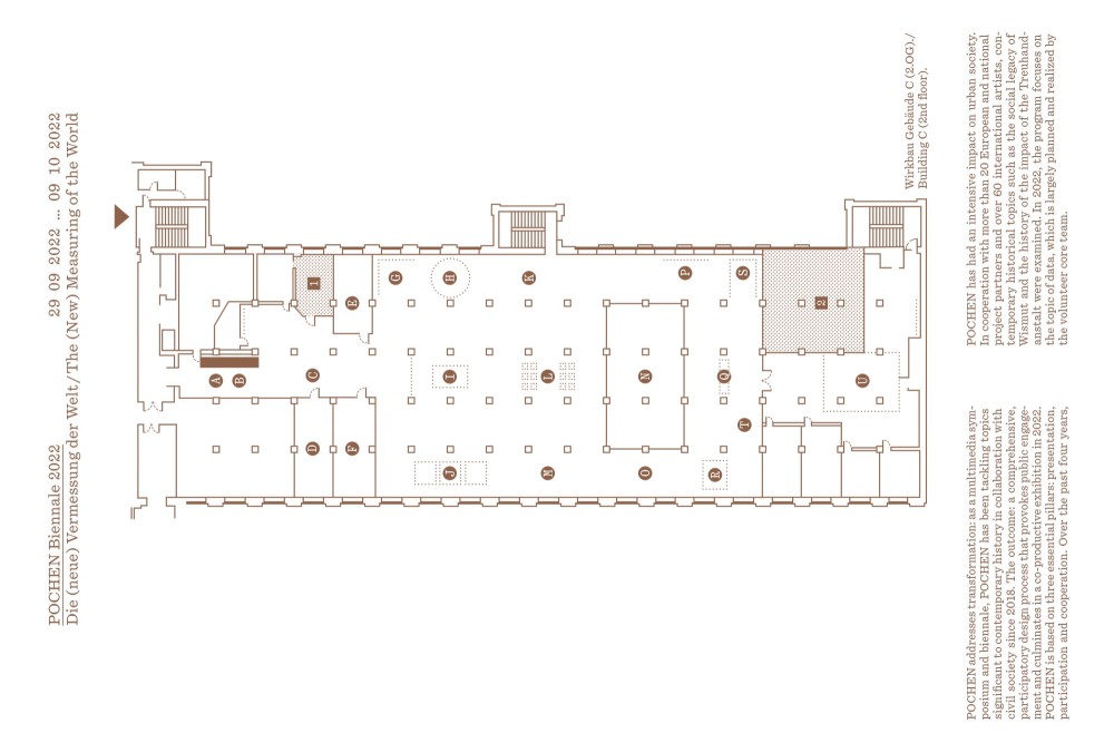
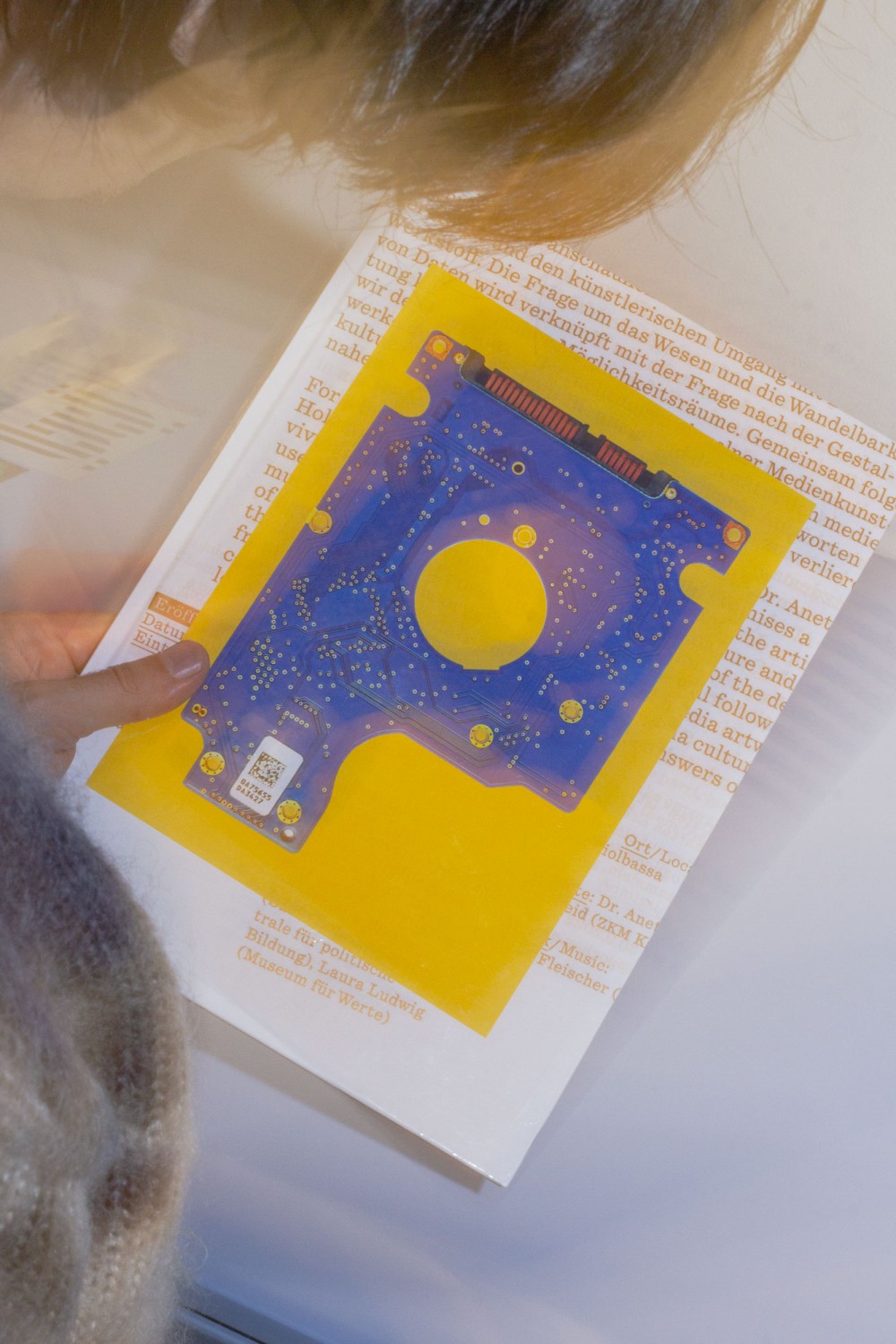
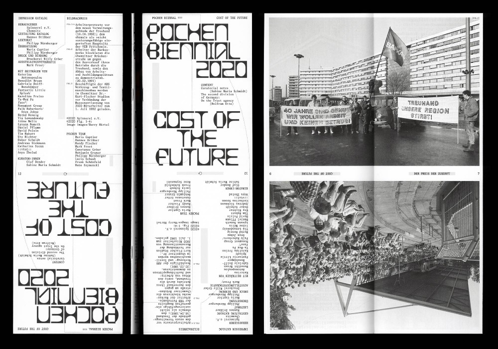
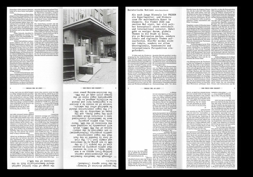
As an international forum for art and society, the POCHEN Biennale is a space for experimentation and discourse of multimedia art in Chemnitz. Concerning this years »Treuhand« topic, 20 international positions of artistic research, curated by Olaf Bender and Sabine Maria Schmidt aim to provoke a public debate on historically significant topics.
Unbound catalog consisting of 10 sorts of cross-folded posters in random order and a 12 page stapled brochure
Paper:
Mayspieß Astralux 80 g/m²
Circle Offset 70 g/m² / 300 g/m²
Typefaces:
Offkey Beta (Nicolas Bernklau)
Bradford (Laurenz Brunner)
About:
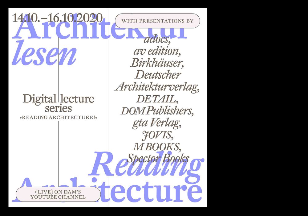
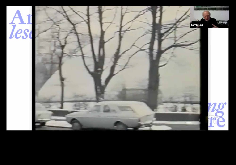
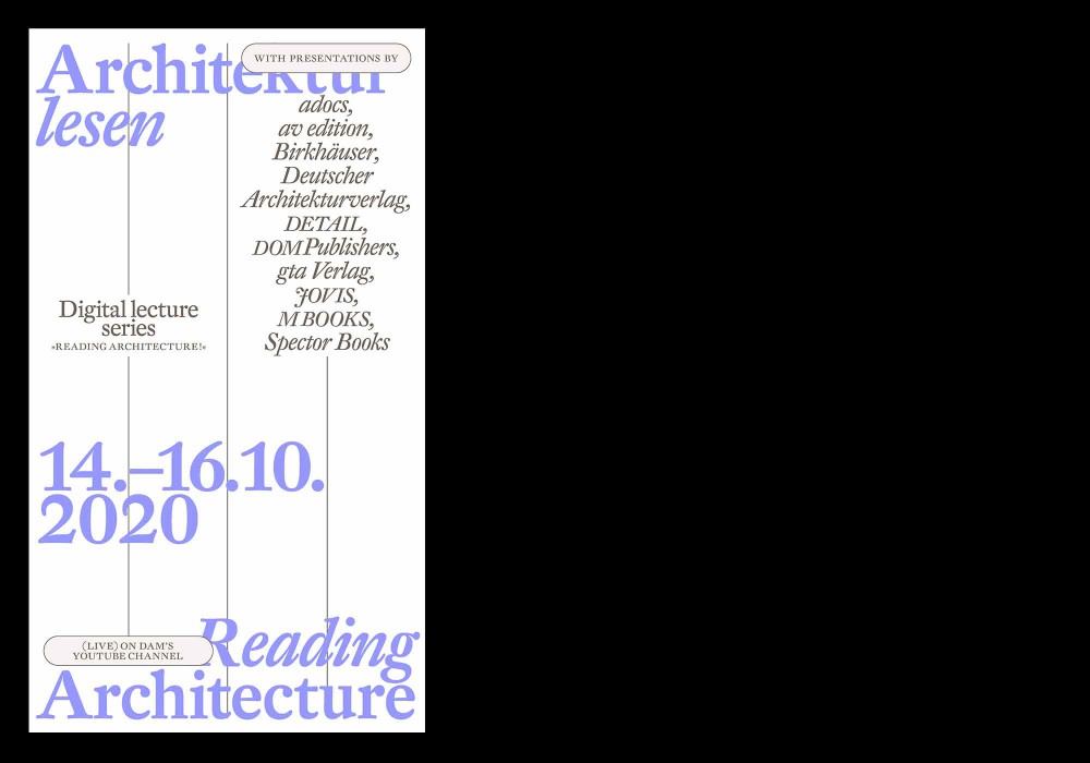
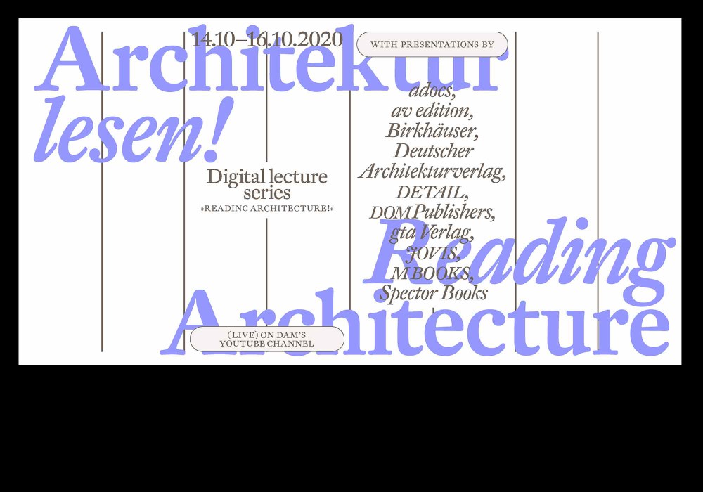
In order to anchor the book medium more firmly in the world of architecture, the DAM supports the Frankfurt Book Fair as a cross-publishing address and long-term partner this year the publishers through a digital event program under the title Architektur Lesen! (Reading Architecture!). Topics, authors and books will be presented in a trade fair-like online format in short contributions and broadcast live on the DAM’s YouTube channel.
Different variations and formats for digital advertising and displays along the event.
Typefaces:
DTL Fleischmann
About:
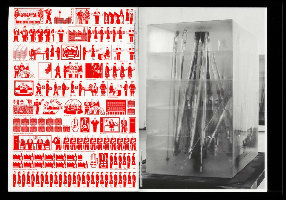
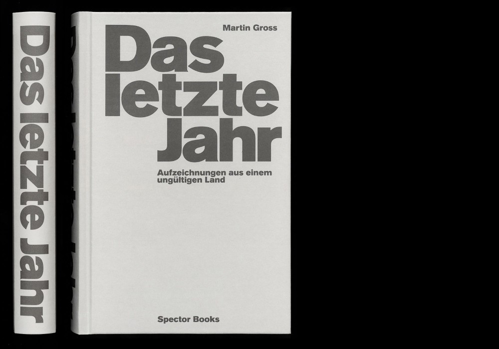
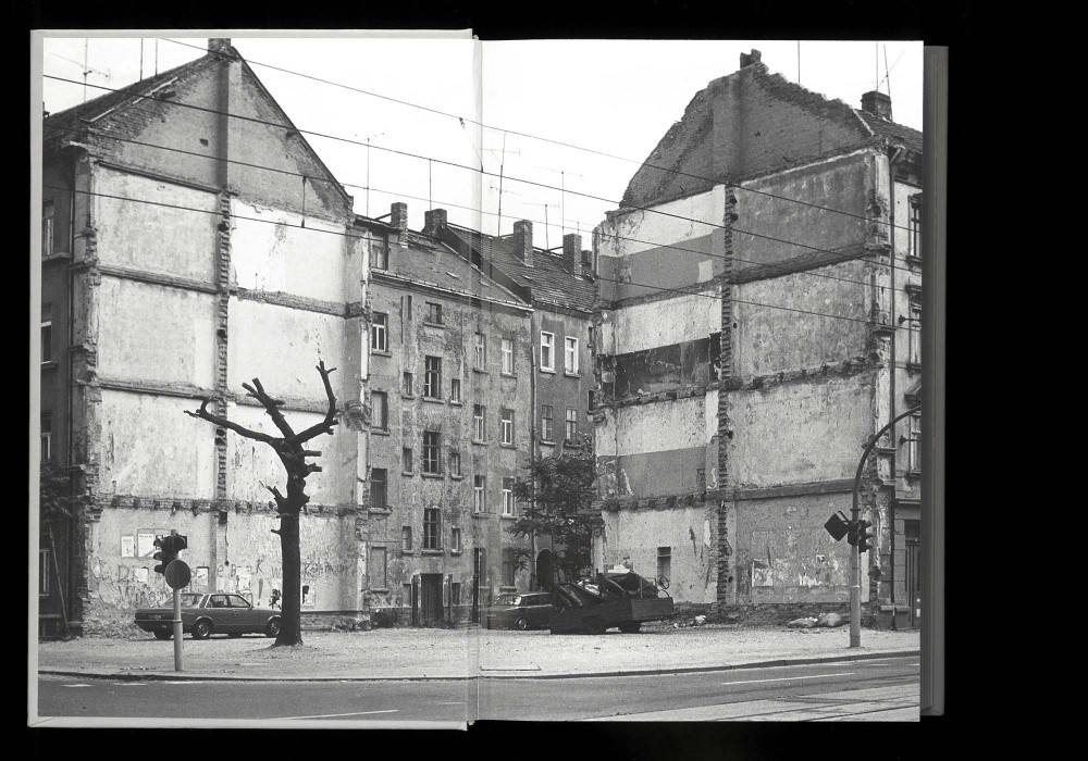
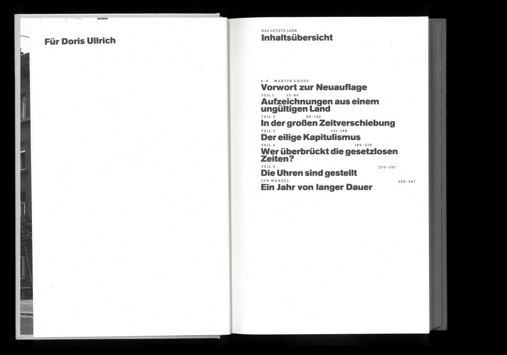
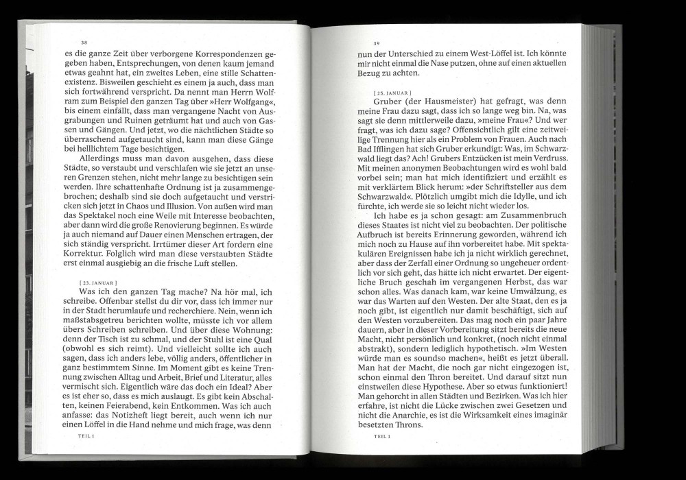
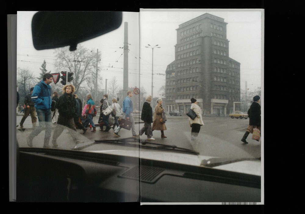
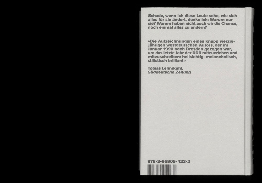
Rediscovered after thirty years: Martin Gross: The last year. Records from an invalid country. The West German author Martin Gross mainly lived in the GDR in 1990 to observe the decline and the redesign of the country up close. In numerous everyday notes, he described how people made the transition from the old to the new system. He portrayed people as diverse as the guard of a former Stasi prison, the branch manager of one of the new supermarkets, the stokers of a power plant, the bodyguards of a minister and the cleaning staff of a government building.
Classic hardcover with a rounded spine and designed toward optimized legibility.
Paper:
Enviro Top 100 g/m²
Typefaces:
Academica (Storm Type)
Akzidenz Grotesk BQ Super (Berthold)
About:
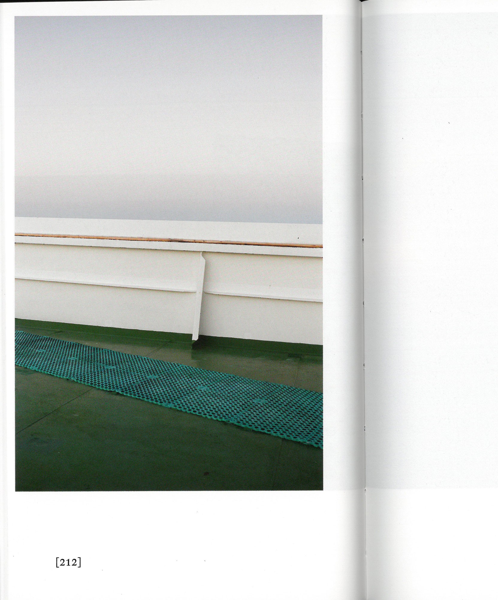
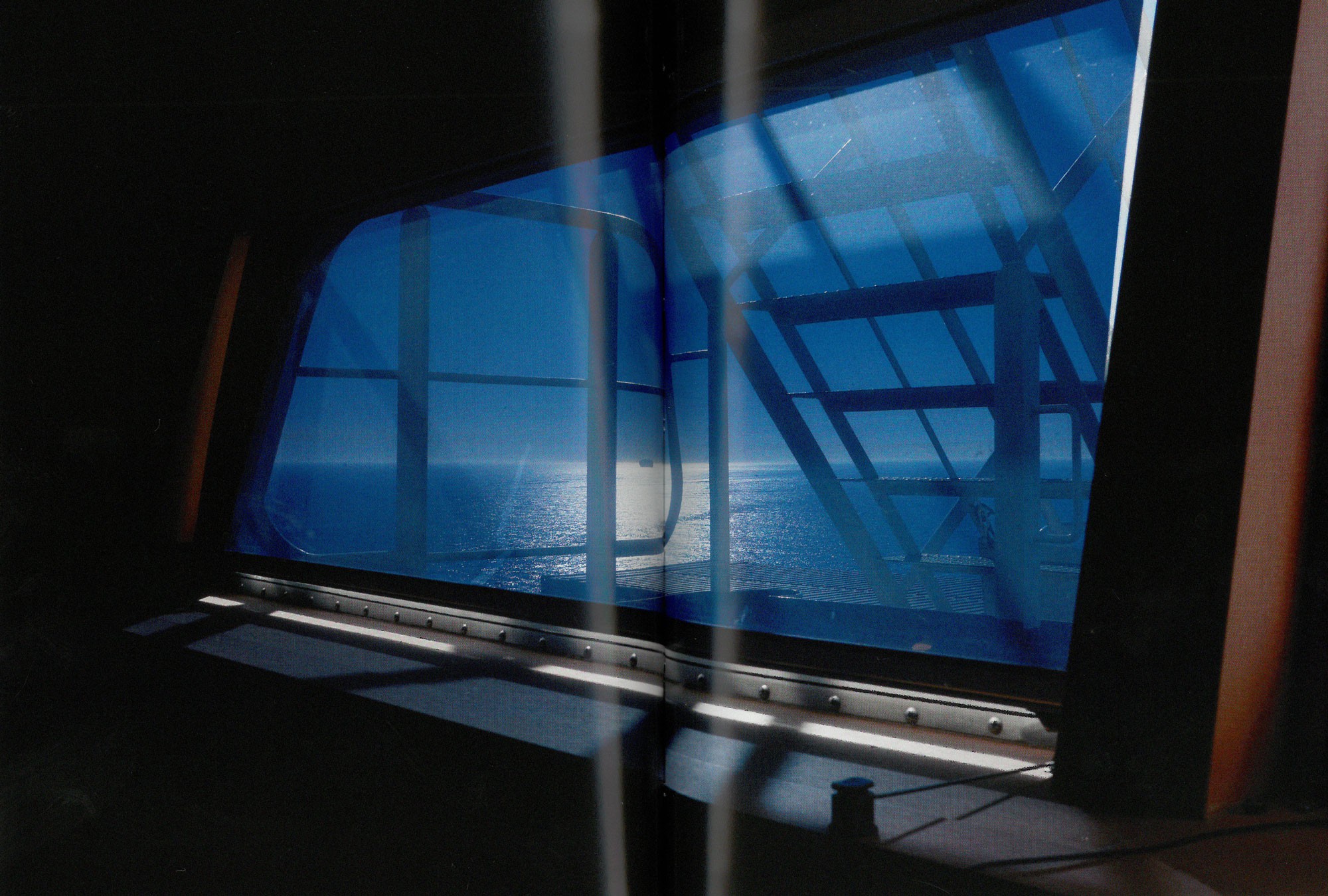
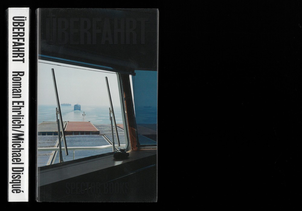
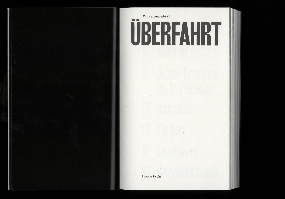
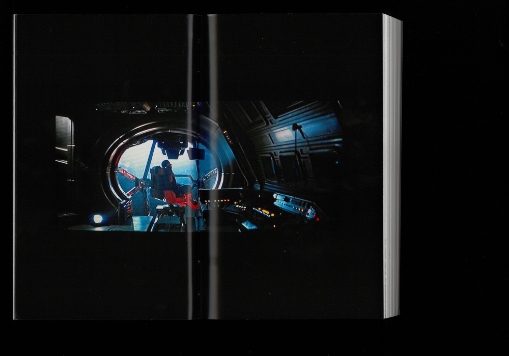
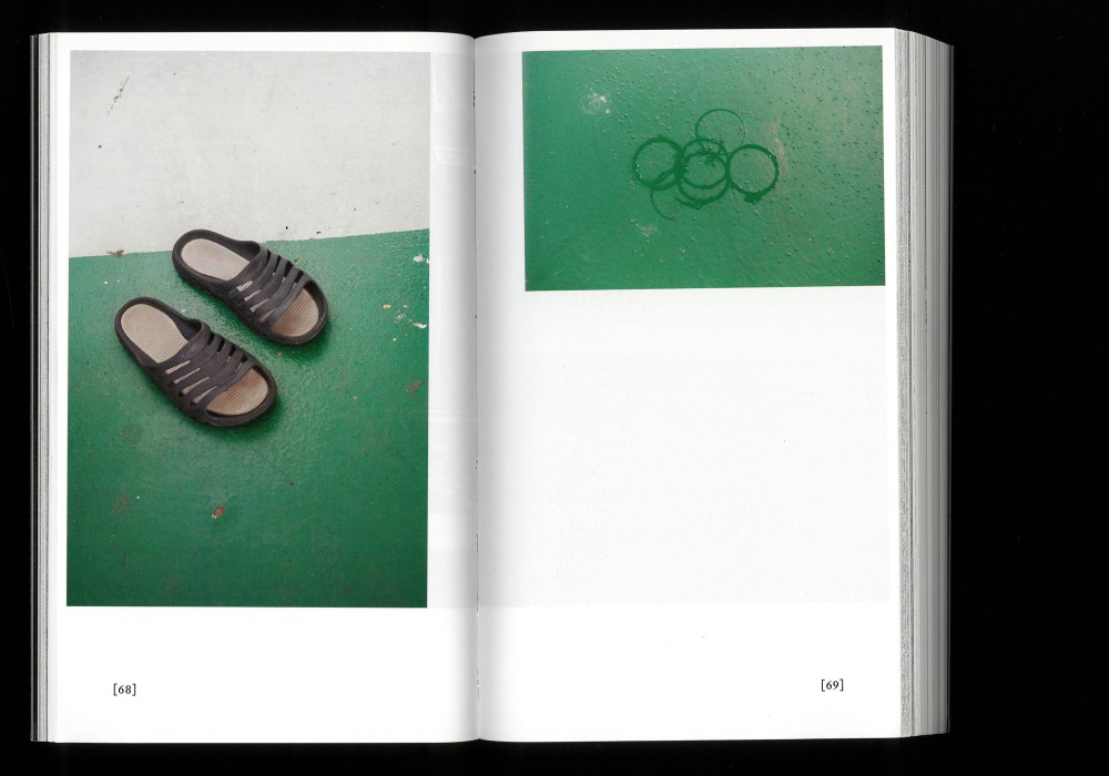
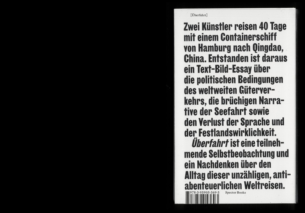
Forty days on a container ship from Hamburg to Qingdao, China. This book by photographer Michael Disqué and writer Roman Ehrlich is a work of participative self-observation and a reflection on a life of quotidian routine that follows its own laws. It is depicting processes and questioning estimated formats of photo-text-books in narrative underlying these world journeys.
Published as #4 in the series
Volte Expanded (Spector Books).
Thread-sewn softcover, otabind with a secret spot, screen printed PVC dust jacket
Awarded «Schönste deutsche Bücher 2021»
Paper:
Circle Offset 90 g/m²
Maxi Gloss 100 g/m²
Typefaces:
DTL Fleischmann
Girott (Radim Pesko)
ISBN:
978-3-95905-369-3
German
About:
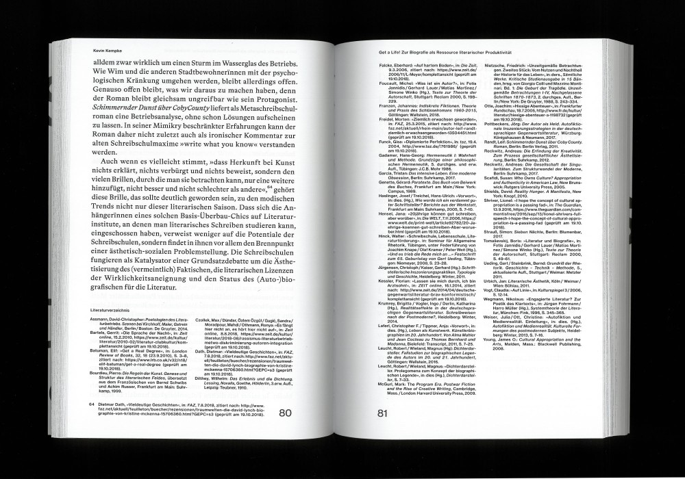
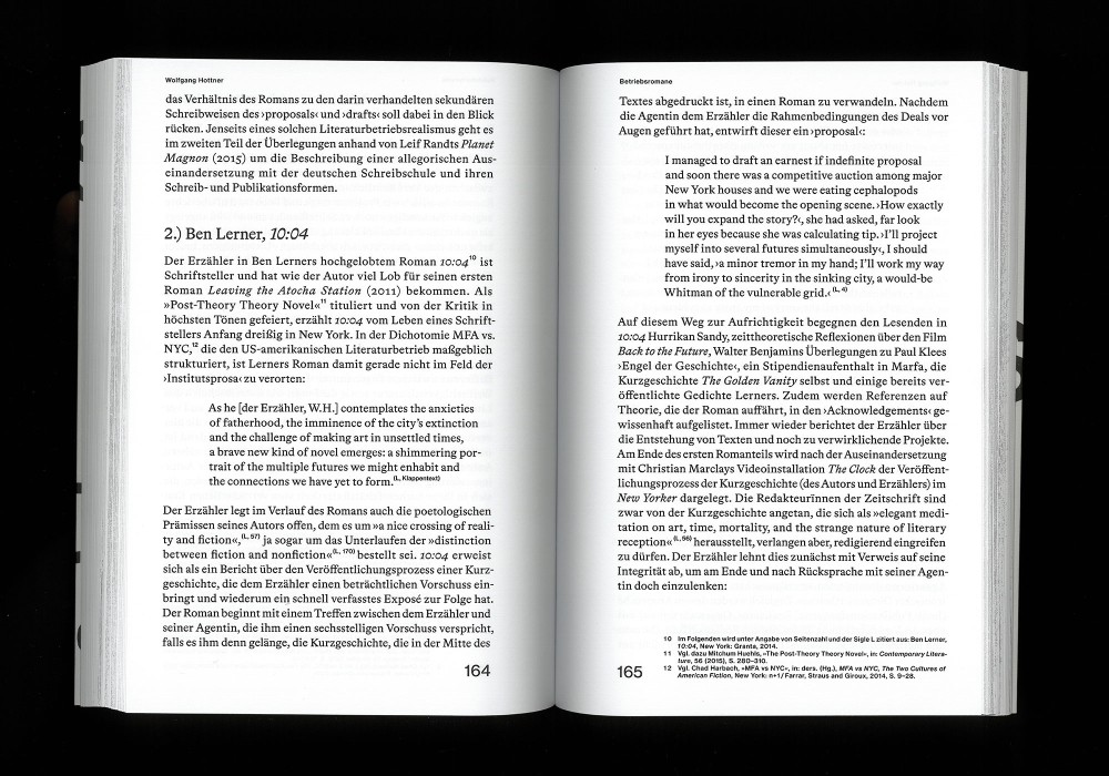
Literaturwissenschaftliche Perspektiven auf akademische Schreibschulen: Academic literary institutes are among the most important institutions in the contemporary world of literature. Yet studies of them—at least in Germany—are notable by their absence.
Thread-sewn softcover with flaps
Paper:
Munken Print White 1.5 80 g/m²
Typeface:
Neue Haas Grotesk (Linotype)
Bradford (Optimo)
About:
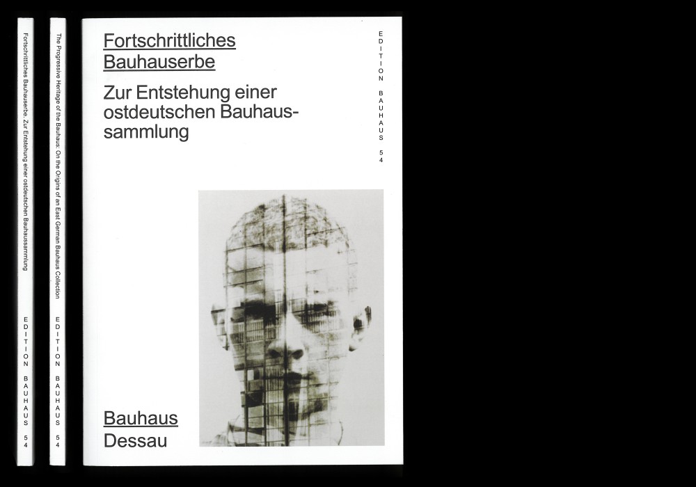
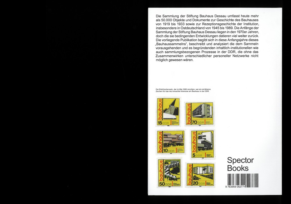
The publication examines the early years of the “Bauhaus collecting process” and describes and analyses the institutional procedures that preceded the establishment of the Dessau Bauhaus collection, while also tracing the history of the Bauhaus reception in the GDR.
Thread-sewn Softcover. Published as Edition Bauhaus 54. Designed based on a concept of Katharina Köhler and Bauhaus Dessau.
Paper:
Munken Print White 16 90 g/m²
Typeface:
Arial
About:
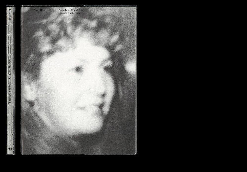
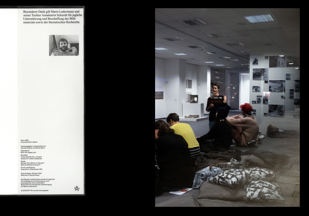
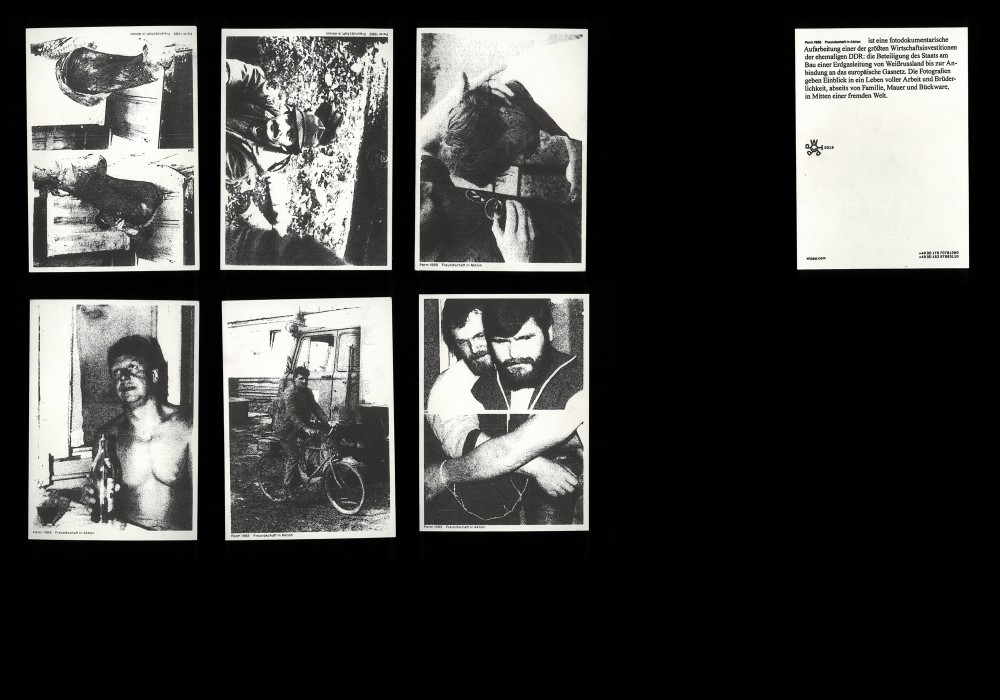
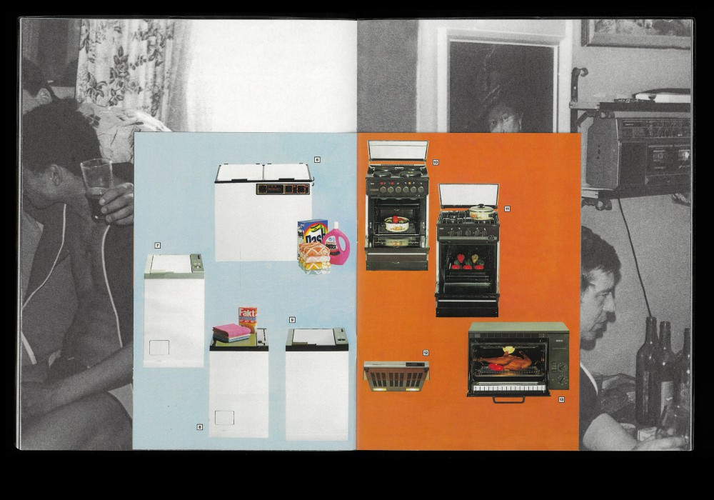
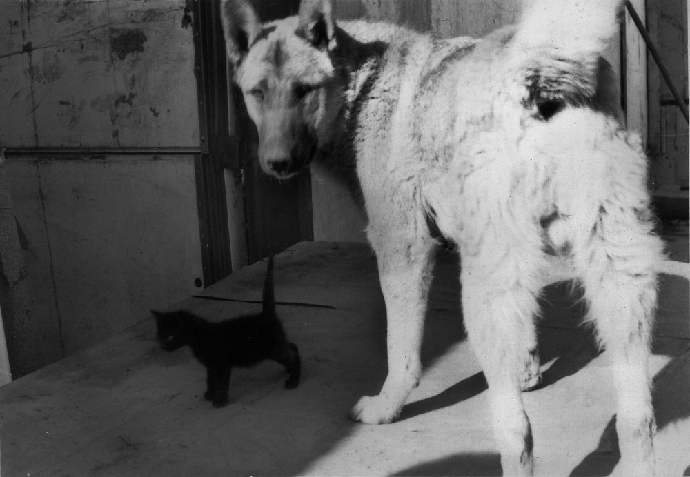
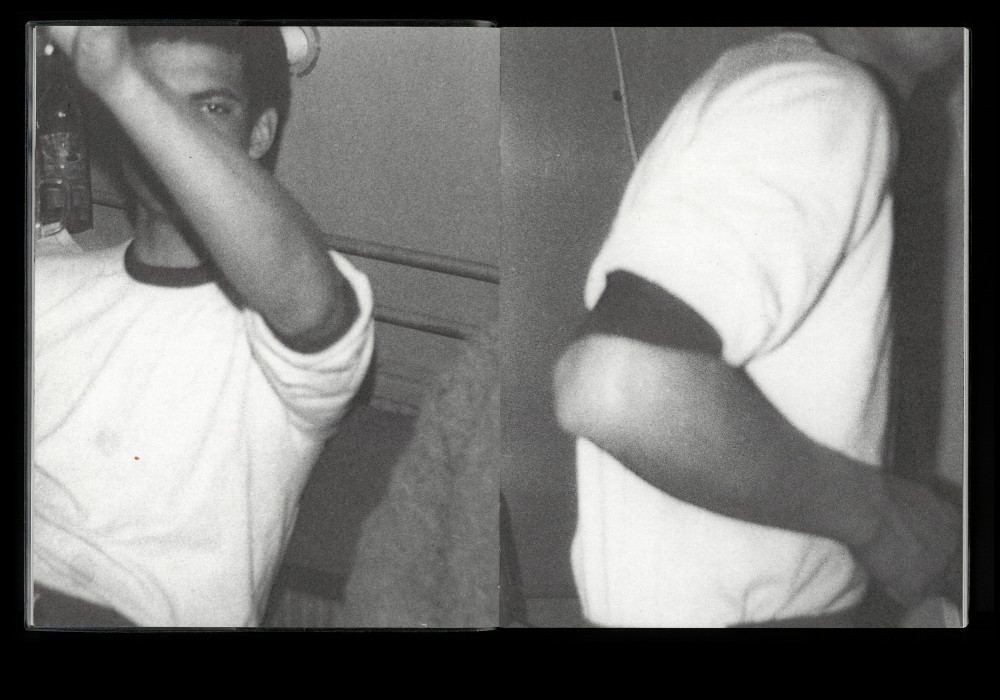
The book Perm 1988. Freundschaft in Aktion (Perm 1988. Friendship in Action) is a photo documentary processing one of the largest economic investments in the former GDR: the participation in the construction of a gas pipeline from Belarus to the joint with the European gas network. The photographs provide an insight into a life full of work and fraternity, away from family and the wall, in the middle of a foreign world.
Edited and designed by Hannes Drißner, Simon Merz and Annekatrin Schmidt. Screen printed PVC dust jacket and 16 pp. 4/4 C catalogue.
Paper:
Munken Print White 1.5 90 g/m²
Bavaria Glänzend 90 g/m²
Typefaces:
Times New Roman (Linotype)
Suisse Int’l (Swiss Typefaces)
Published and available via WTP-PP. Book presentation at Chemnitz Open Space in Oktober 2019.
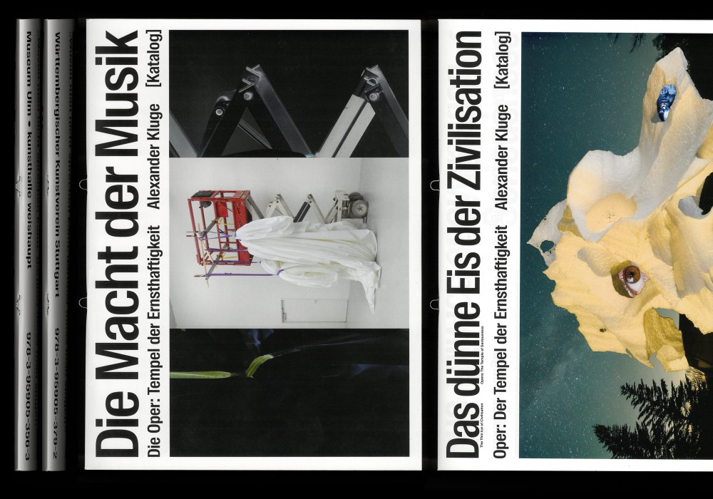
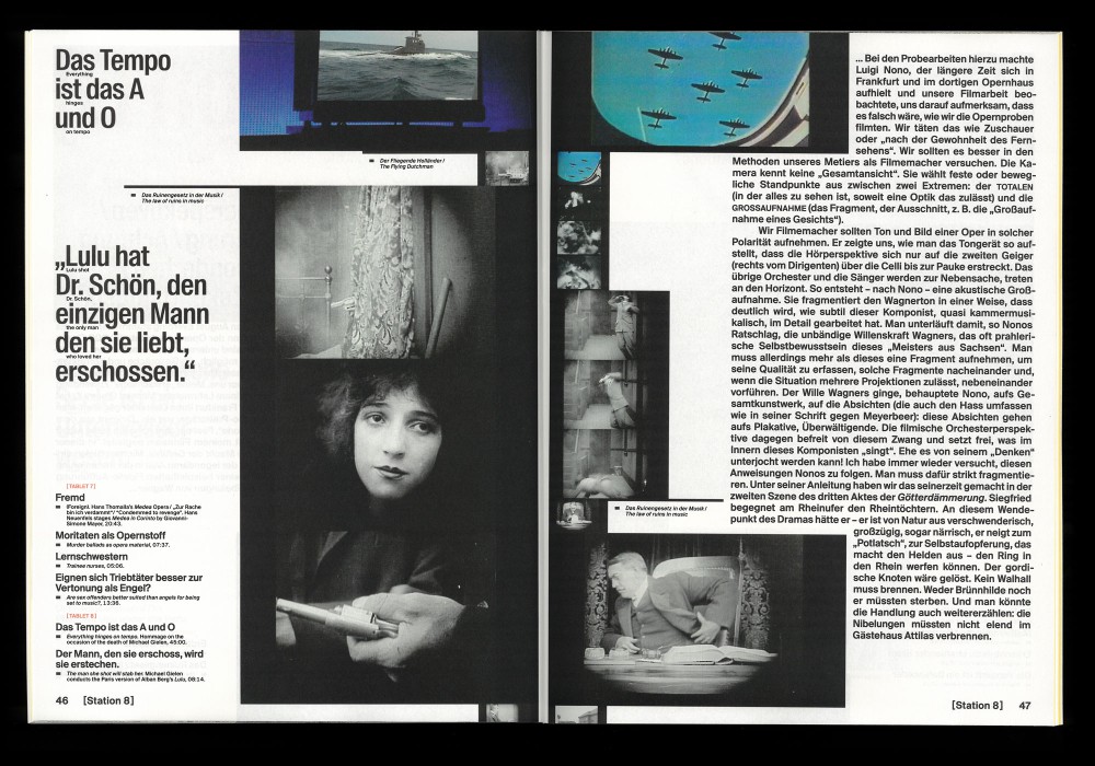
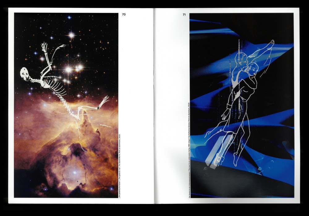
About:
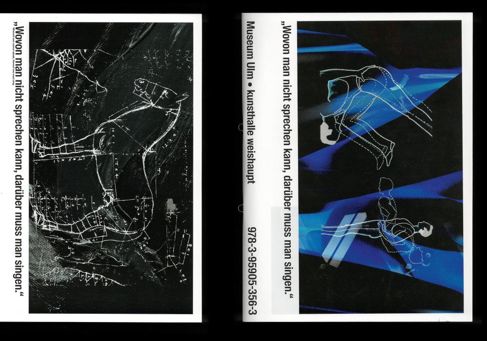
»Without music, life would be a mistake« is the catchline for the multi-part exhibition project, which revolves around The Power of Music. The catalog features image sequences based on exhibited film works in combination with additional texts by Alexander Kluge.
Loop stapled softcover, edition of three catalogs.
Paper:
Sirio Color 80 g/m²
ProfiGloss 115 g/m²
Munken Print White 1.5 80 g/m²
Typeface:
Suisse Int’l / Suisse Int’l Condensed
(Swiss Typefaces)
About:
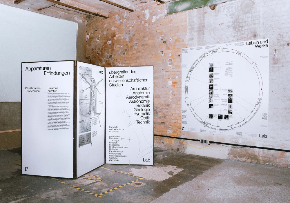
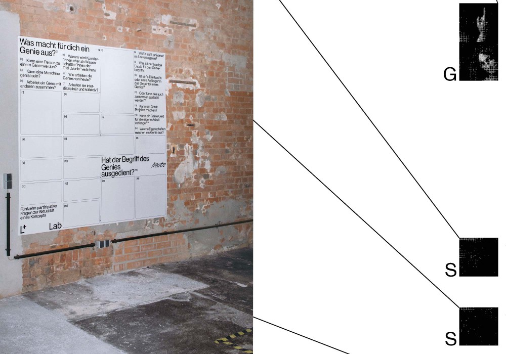
The Kunstkraftwerk-LAB (Leipzig) is a visionary and multidisciplinary project for contemporary communication, which will accompany various exhibitions in the Kunstkraftwerk scientifically, artistically and playfully in an exchange of different generations, arts and experts. The first edition L+, LEOLAB is dedicated to Leonardo Da Vinci in connection with the exhibition »Giants of the Renaissance«.
Forex plates, framed in a mobile steel partition, aswell as a wall hanging system of interactive panels.
1C direct digital printing
partial foiling 90 g/m²
About:
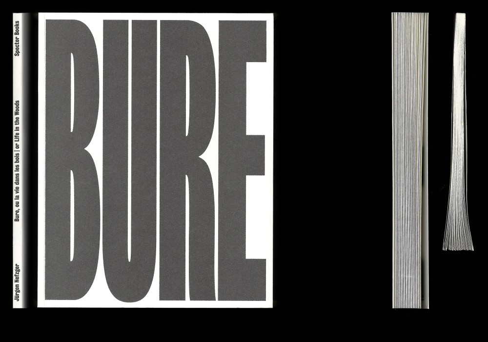
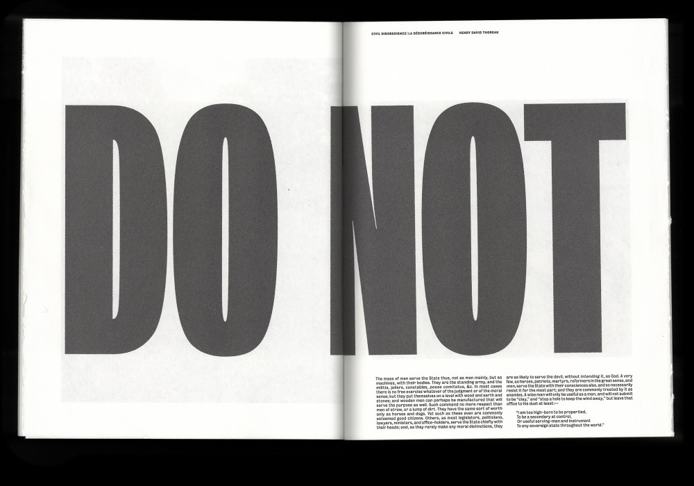
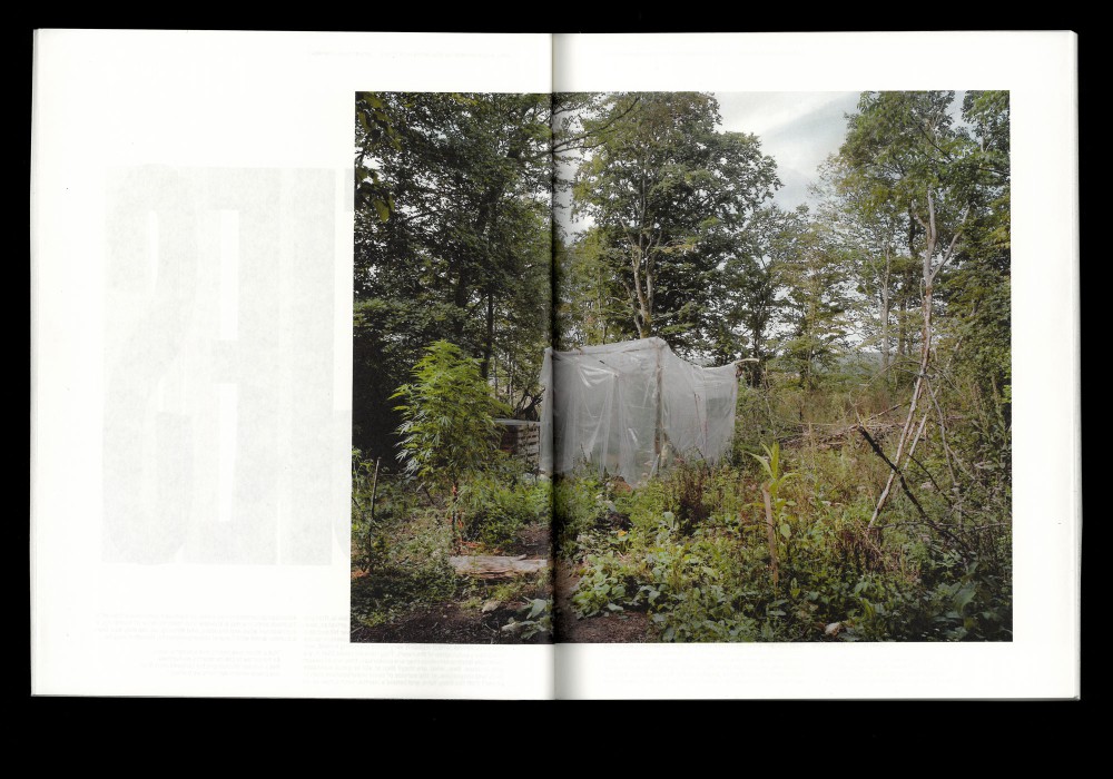
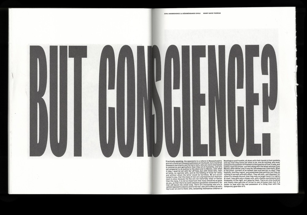
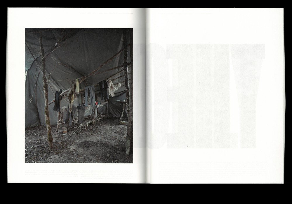
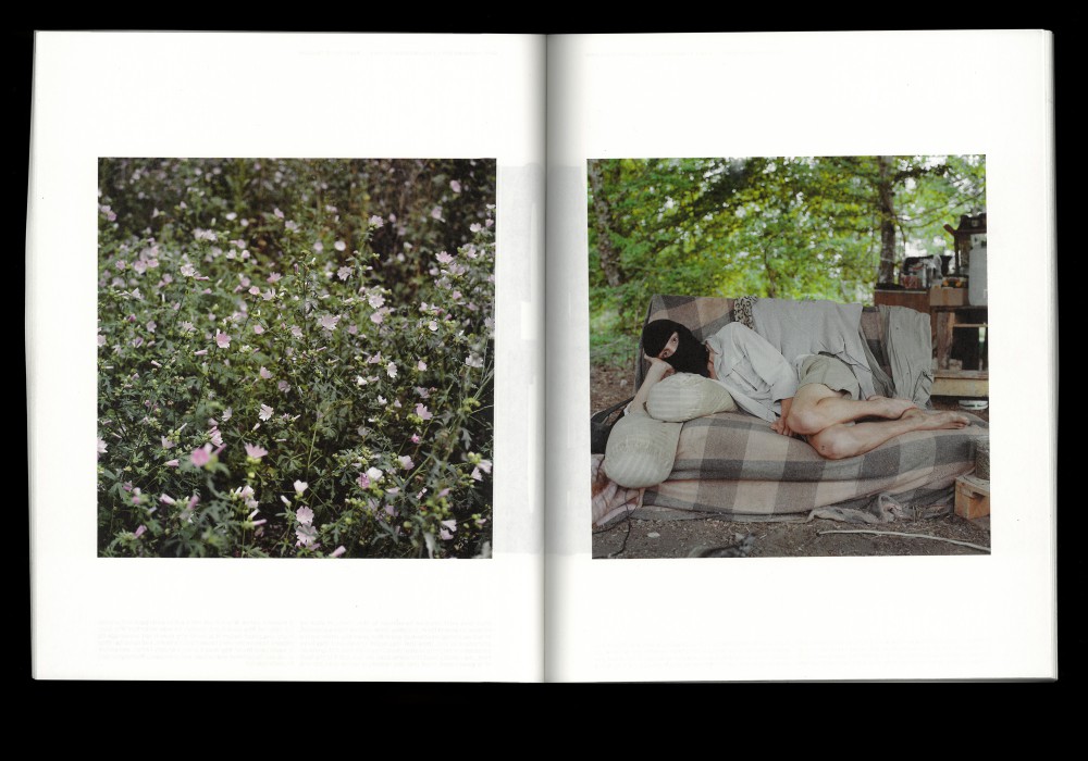
In Bure, French and German opponents of nuclear power have been campaigning for decades against the construction of a permanent disposal site for highly radioactive nuclear waste. Jürgen Nefzger photographed the everyday life of a group of protesters who had made the woods their temporary home until the camp was cleared in February 2018. The book includes the essay On the Duty of Civil Disobedience by Henry David Thoreau printed on the inner/hidden side of the spreads.
Japanese bound softcover with flaps. The book is available here.
Paper:
Munken Print White 1.5 80 g/m²
Typeface:
Bureau Grotesk (Font Bureau)
Awarded with the CNAP publishing grant
About:
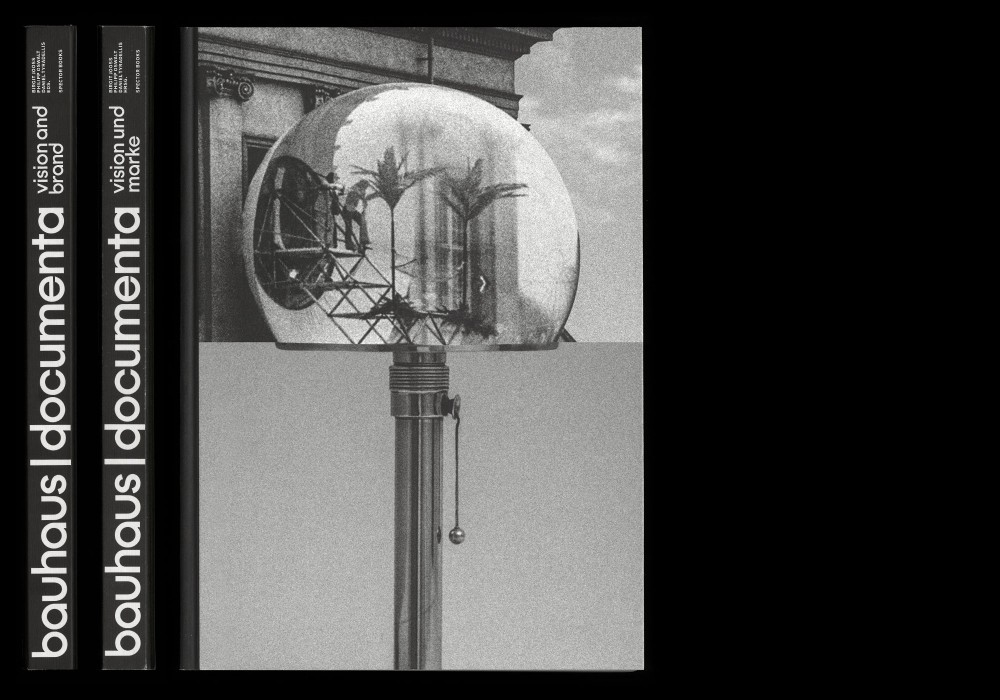
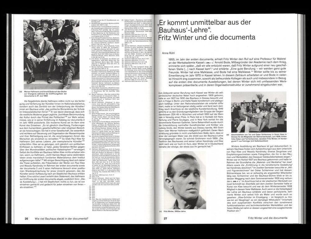
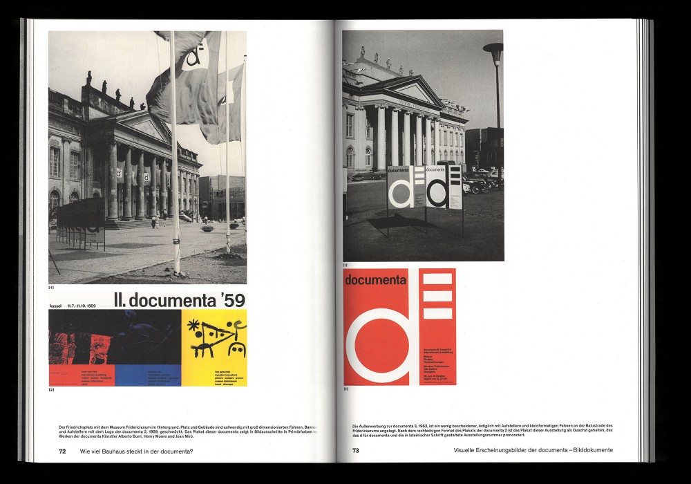
Bauhaus and documenta are two globally successful cultural brands, representing a modern Germany that is both cosmopolitan and innovative. In a series of critical essays, bolstered by a selection of original material, the publication examines fundamental, yet frequently overlooked aspects of the two cultural brands, whose profile is now once again a controversial subject of debate.
Hardcover and stapled brochure as inlay (Supplement). Designed in close collaboration with Markus Dreßen.
Typeface:
Theinhardt (Optimo)
Paper:
Holmen TRND 90 g/m²
Munken Print White 1.5 80 g/m²
About:
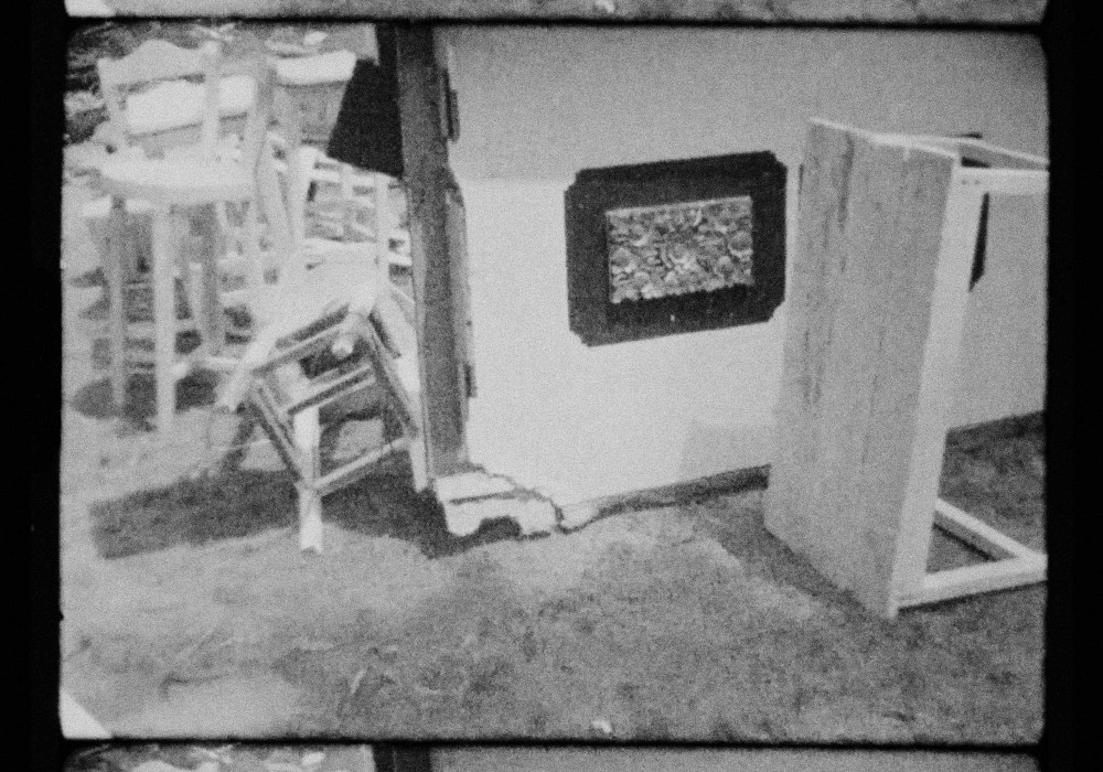
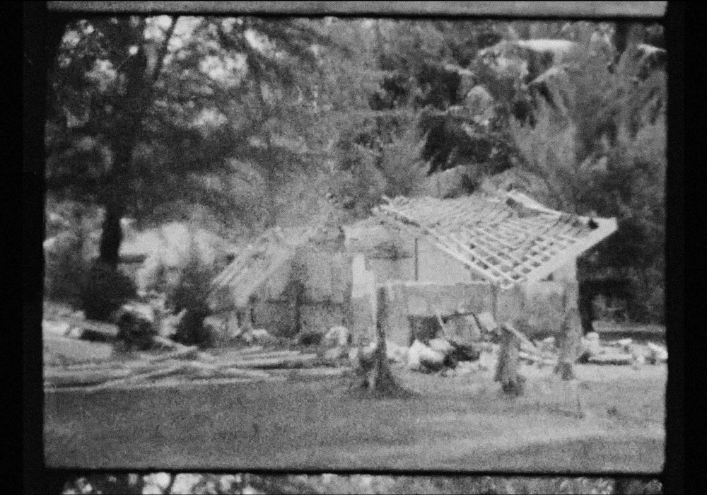
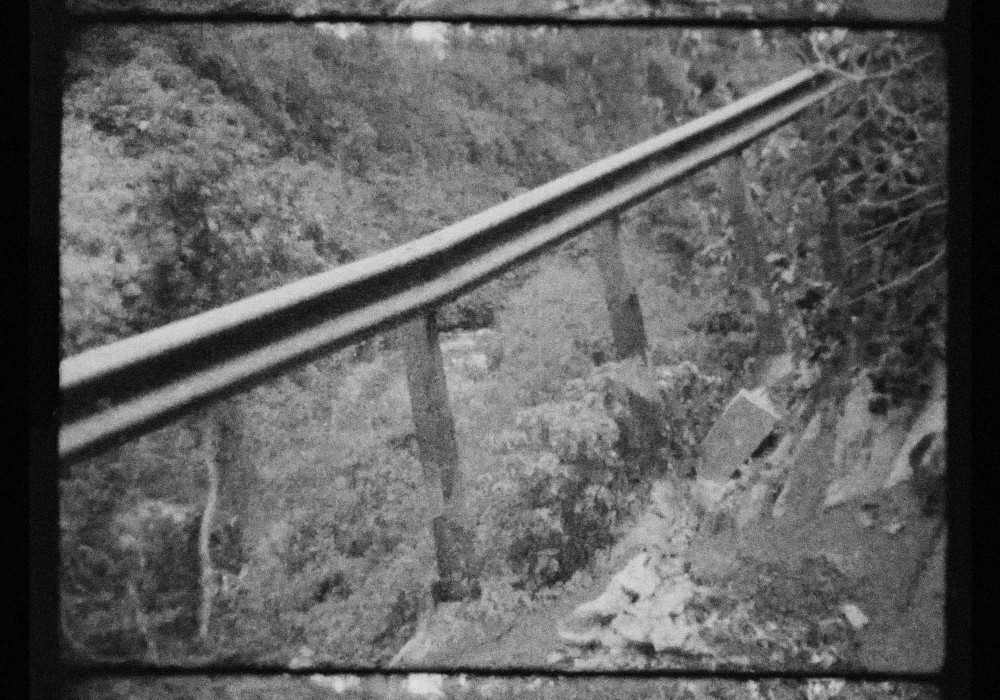
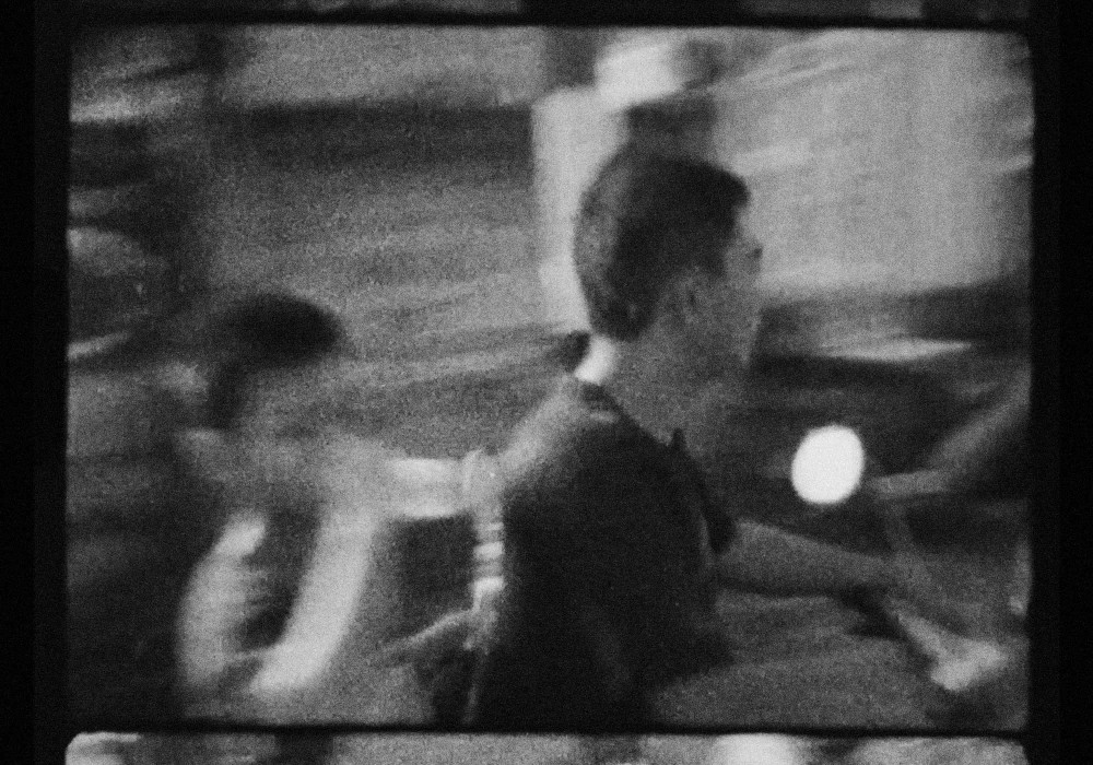
Non commissioned short-film documenting a six week long journey through Indonesia. Shot somewhere around Bali, Nusa Lembogan, Nusa Penida and the Gili Islands.
Super 8 short-film shot on Braun Nizo S480, hand developed and scanned in Berlin.
The video is online on Vimeo
About:
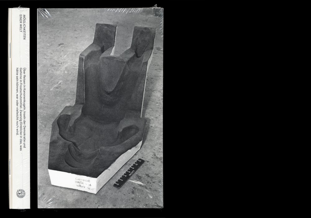
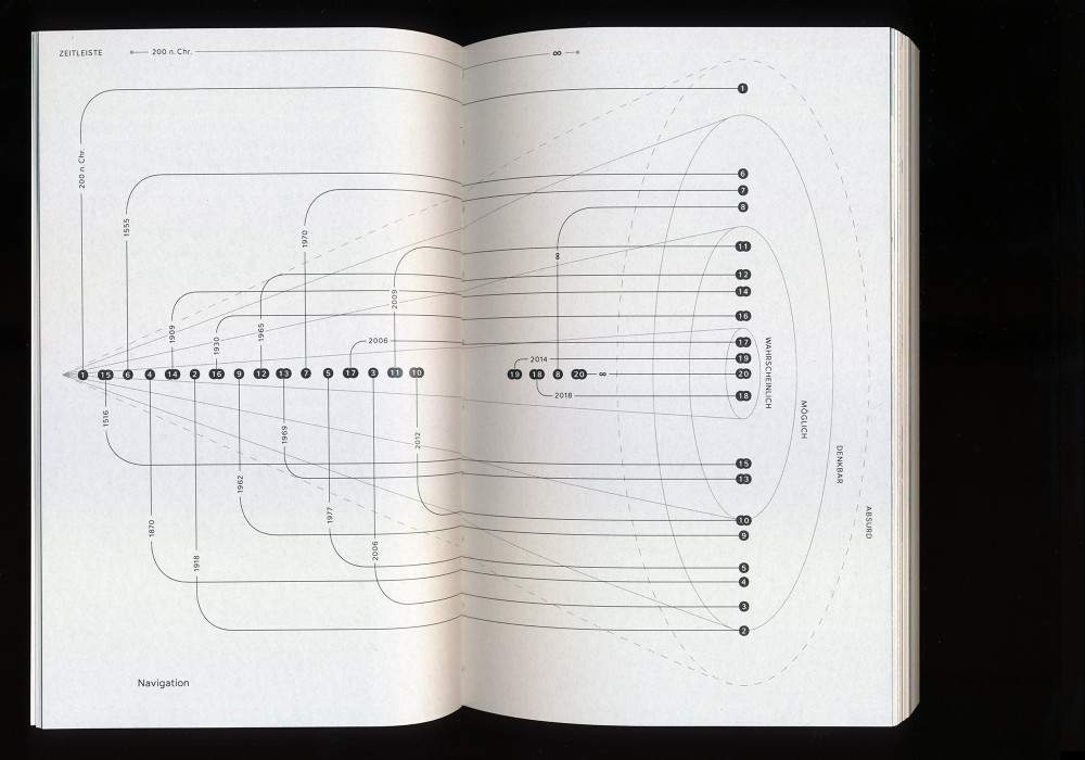
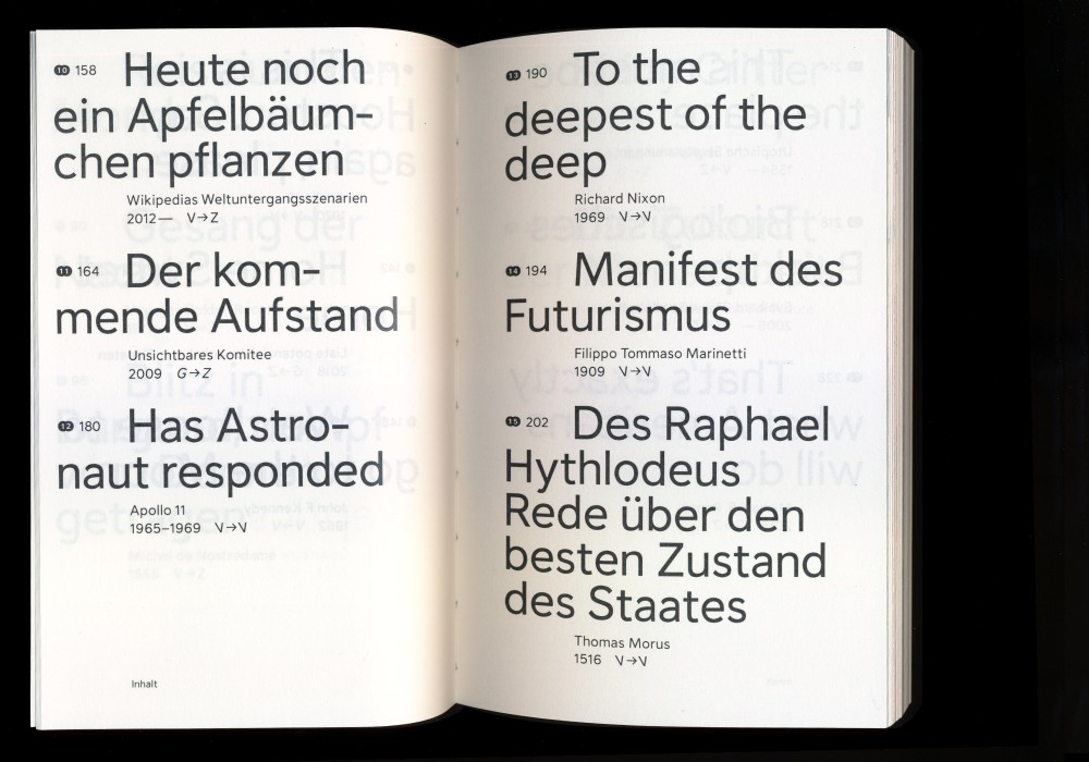
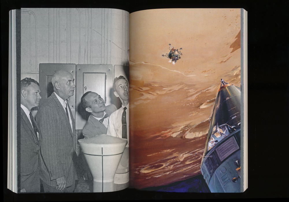
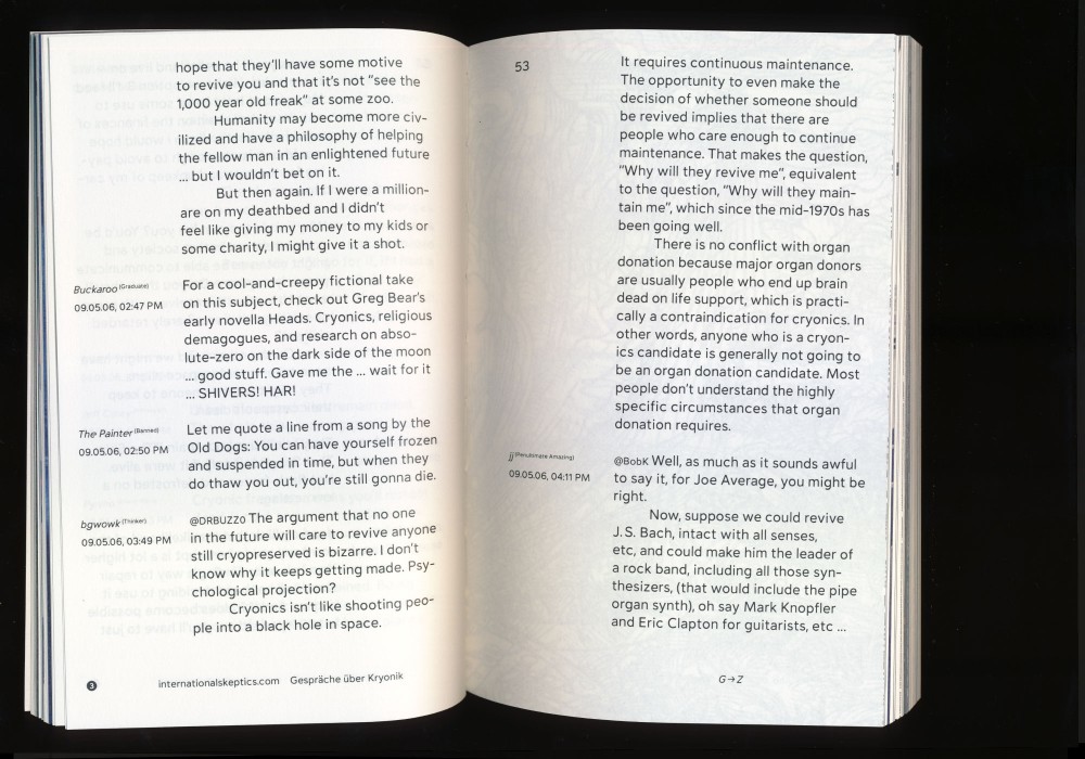
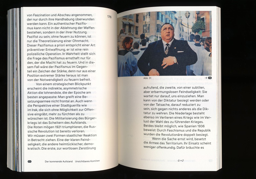
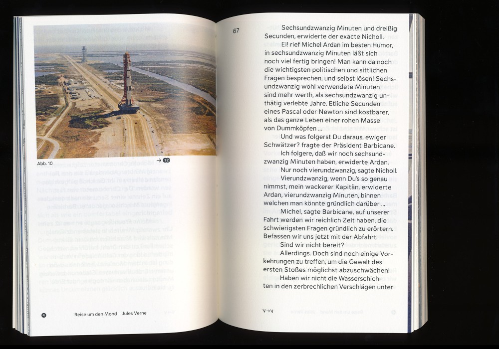
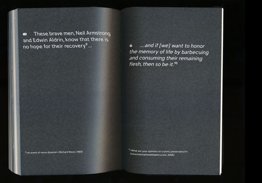
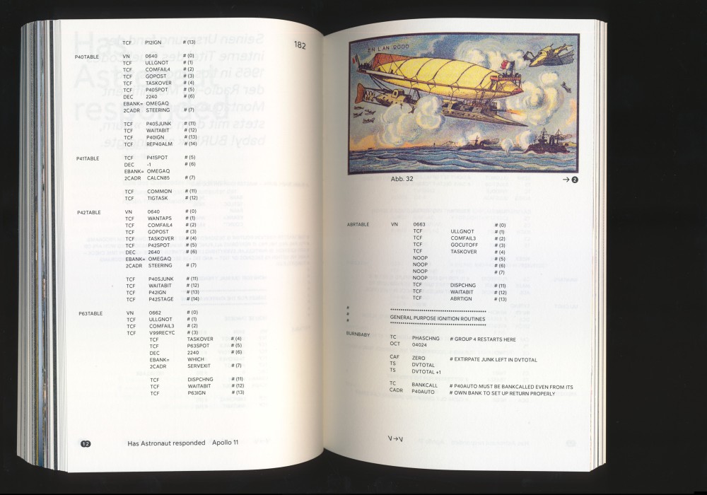
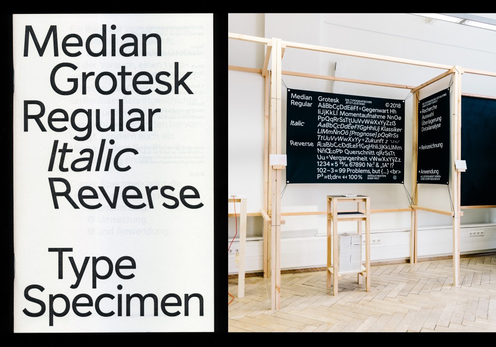
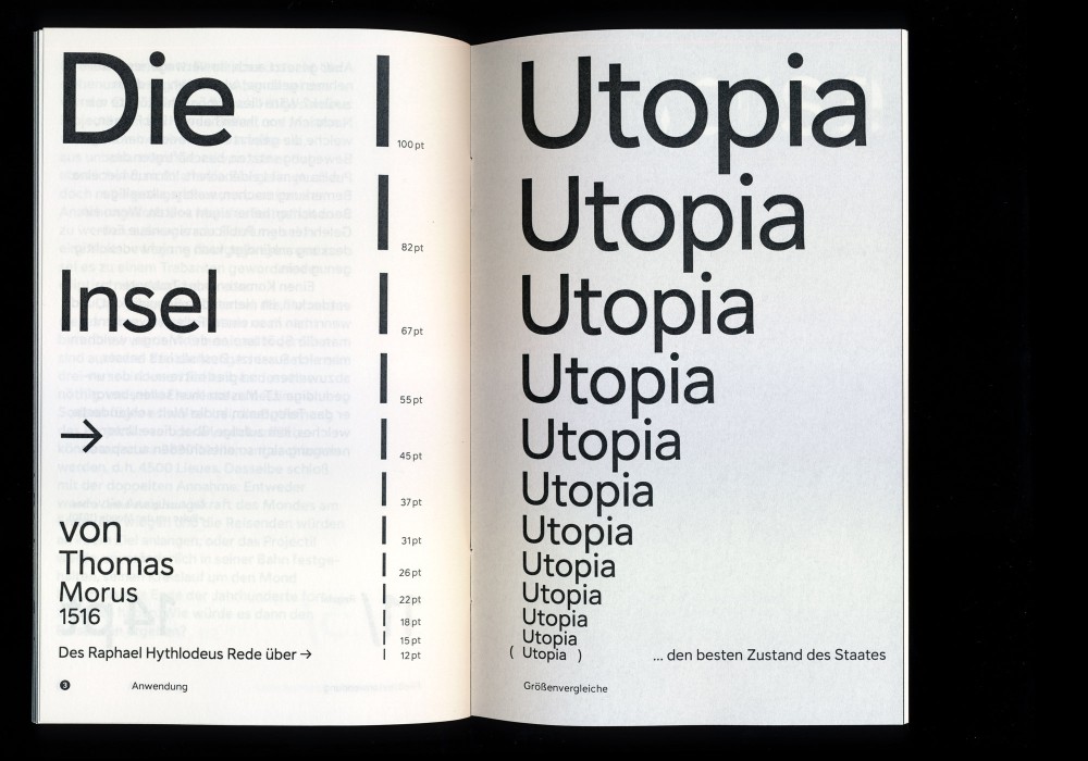
Möglichkeiten einer Welt (Possibilities of a World)—is a book about forecasts for the future. Voyages in cannon balls, islands of democracy and brains in antifreeze. Twenty glimpses into what might have been, was or might will be. Set solely in the accompanying typeface Median Grotesk.
Edited and designed as part of a B.A. project with Daniel Zenker in two editions of 100 copies (sold out) and shortlisted »Förderpreis für junge Buchgestaltung« 2019.
Paper:
Munken Pure Rough 90 g/m² and 200 g/m²
Scheufelen Gloss 135 g/m²
Typefaces:
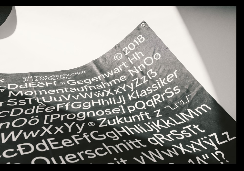
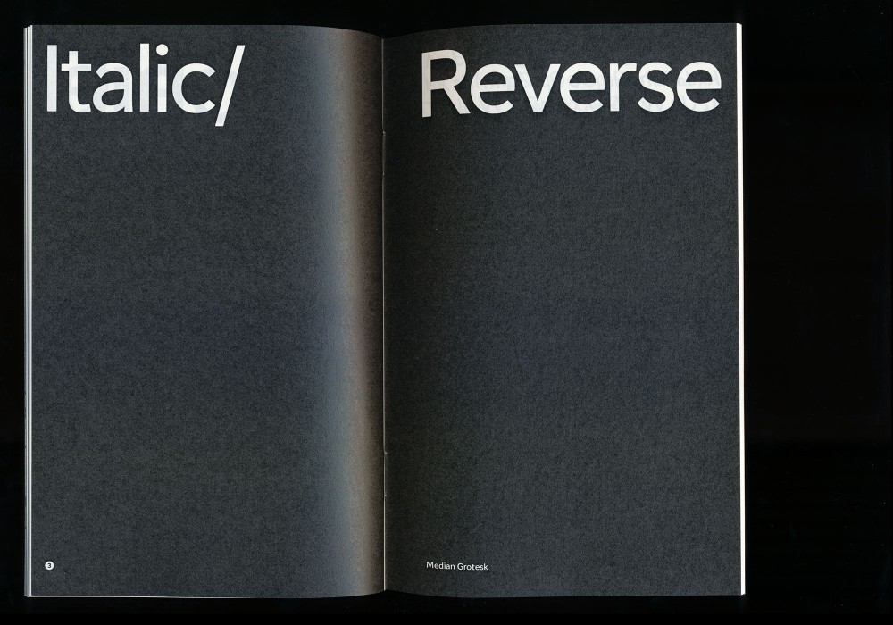
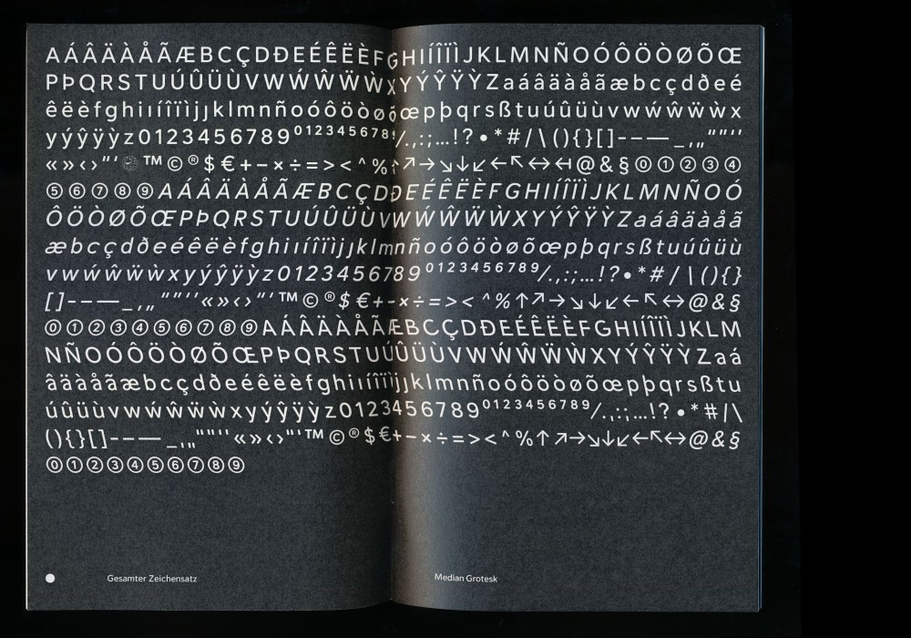
Median Grotesk (Custom)
Regular, Reverse and Italic
About:
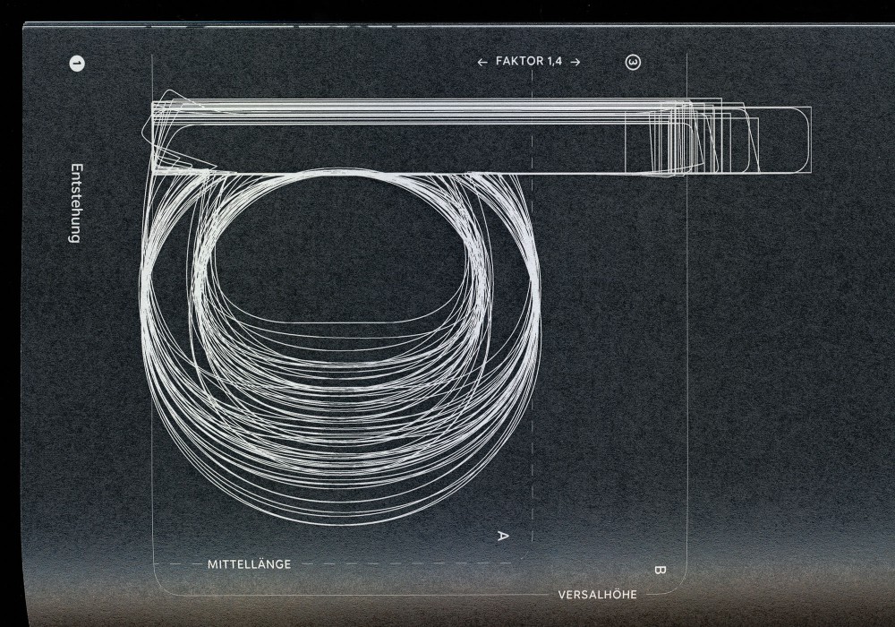
The typeface Median Grotesk is designed with a systematic approach to type design. It visualizes a cross-section of the most relevant sans-serif typefaces, measured in various categories from expert opinions to sales reports. The result was aiming to function as a document or a »screenshot« of sans-serif typefaces in the here and now.
Designed with the legend of Daniel Zenker as part of our shared B.A. project at DHBW Ravensburg.
Characterset:
Latin/Western European (472 glyphs) in three cuts: Regular, Italic and Reverse
Besides the generated and calculated Regular cut, the two additional cuts Reverse and Italic visualize the extreme values of the research process and appear metaphorically leaning back into the past and forward into the future.
The typeface and its trials are available here.
About:
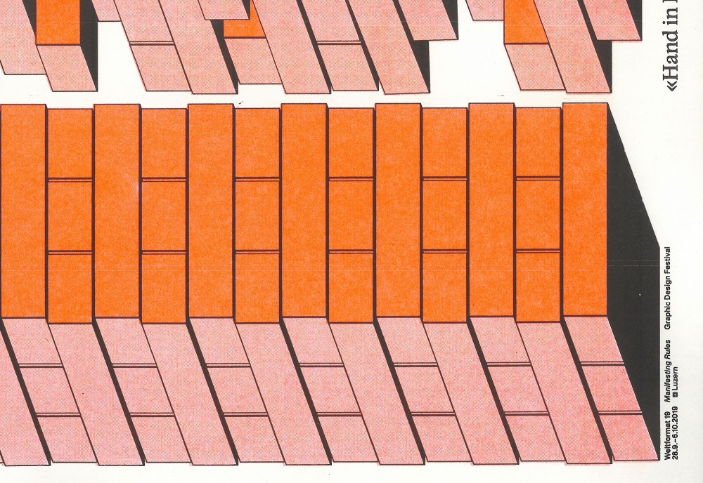
The topic of the 2019 Weltformat Newcomer Award was »Manifesting Rules«—The twenty posters nominated for the award showed what formal and substantive rules designers personally drive—and which they deliberately ignore. The Posters were displayed during the festival and printed in a second risograph edition at Risoclub Leipzig.
Two colored Risograph edition (297 × 420 mm) as reproduction of the single edition festival poster (895 × 1280 mm) printed in Fluorescent Orange and Black.
Paper:
Munken Print Creme 300 g/m²
Typefaces:
Academica (Storm Type)
Helvetica Neue LT (Linotype)
Available on request via mail
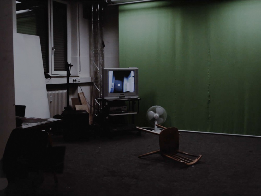
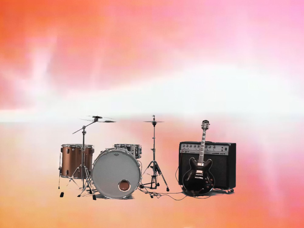
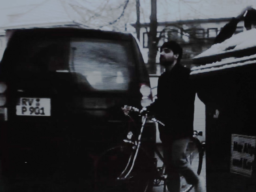
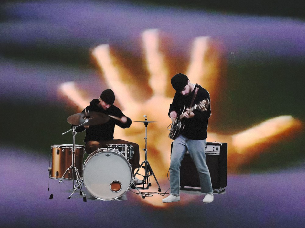
About:
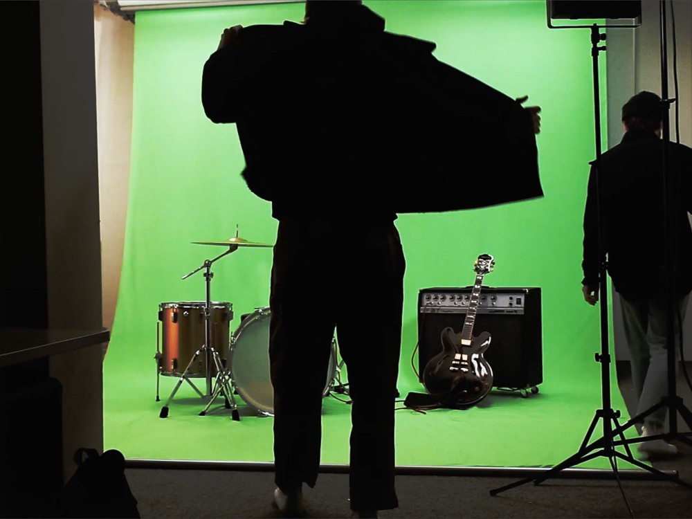
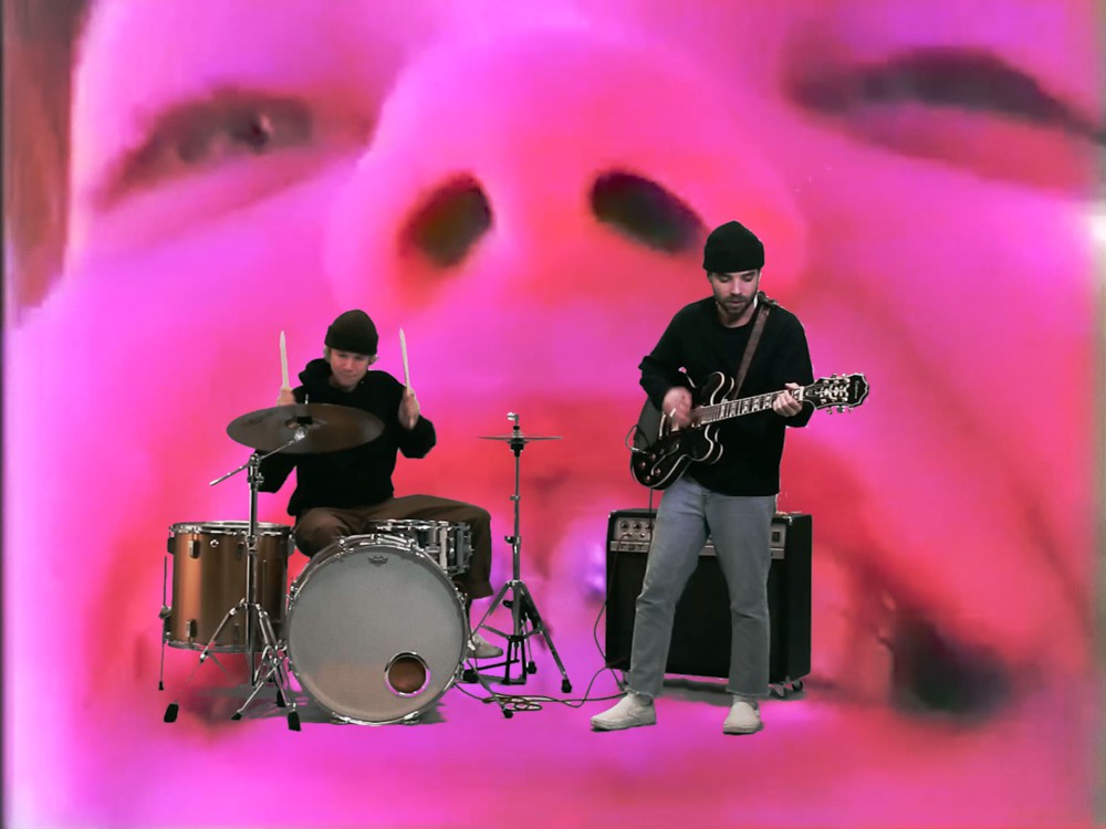
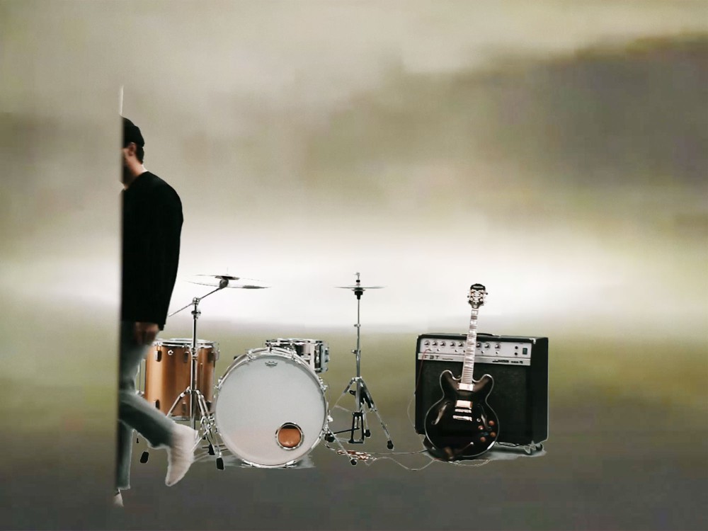
Things I Want to Change is the last single »zad«, a Lo-Fi/Art-Punk project from Simon Merz and Dominik Lassisch. Together we produced a music video in two days, from the idea to realization.
About:
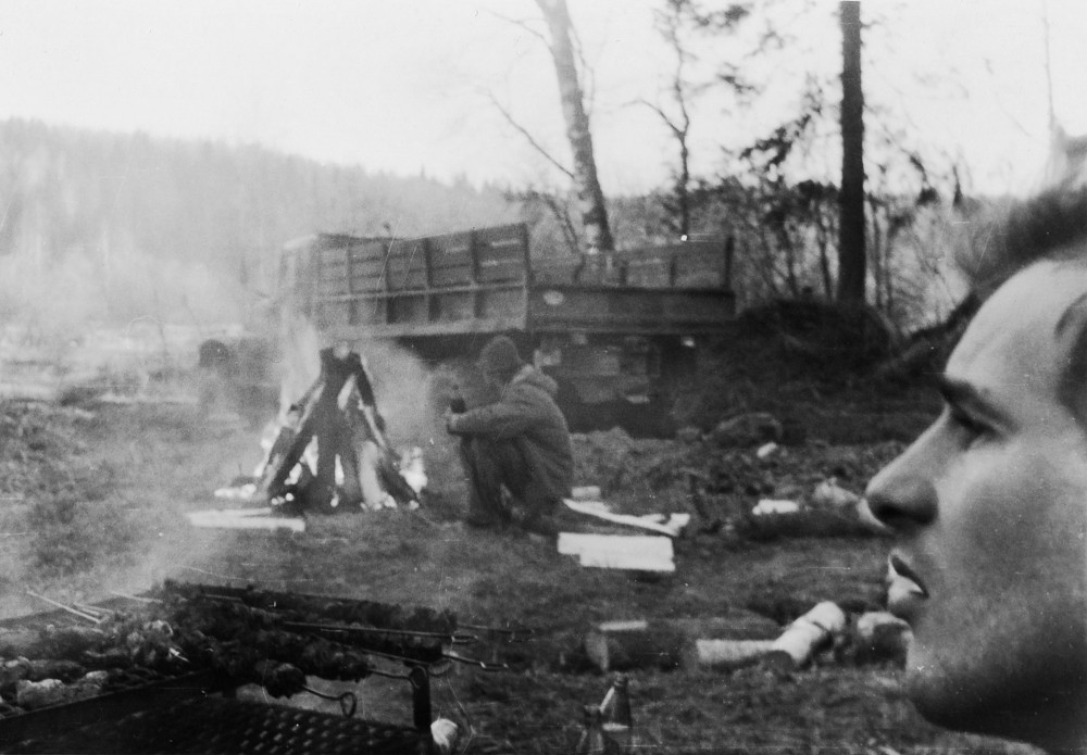
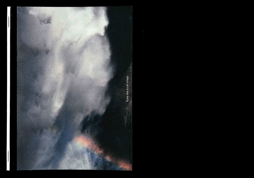
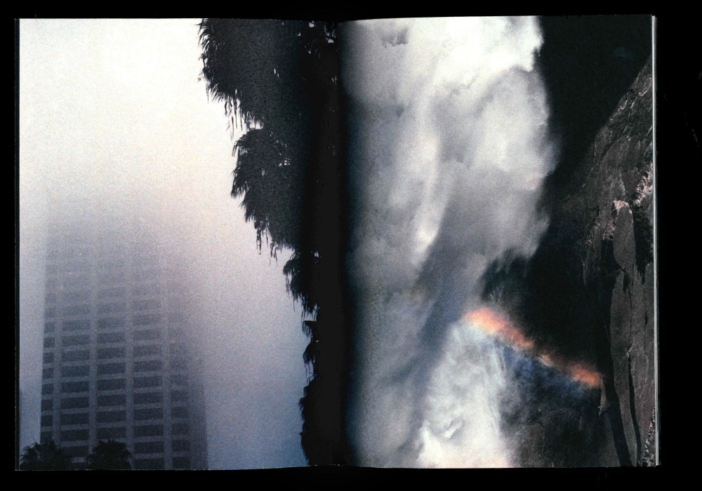
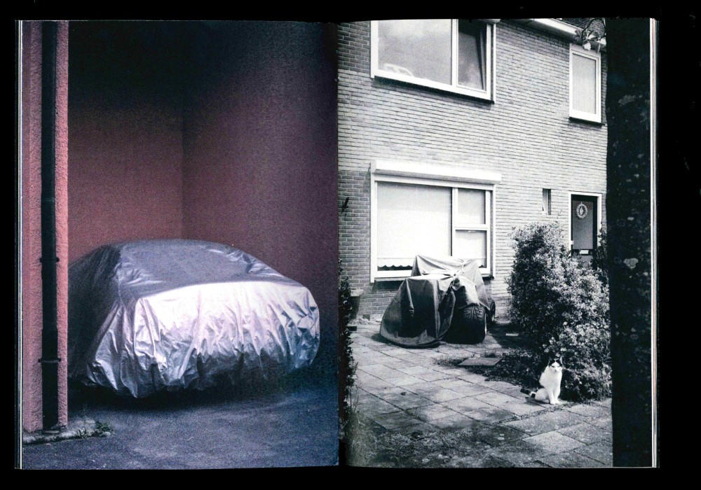
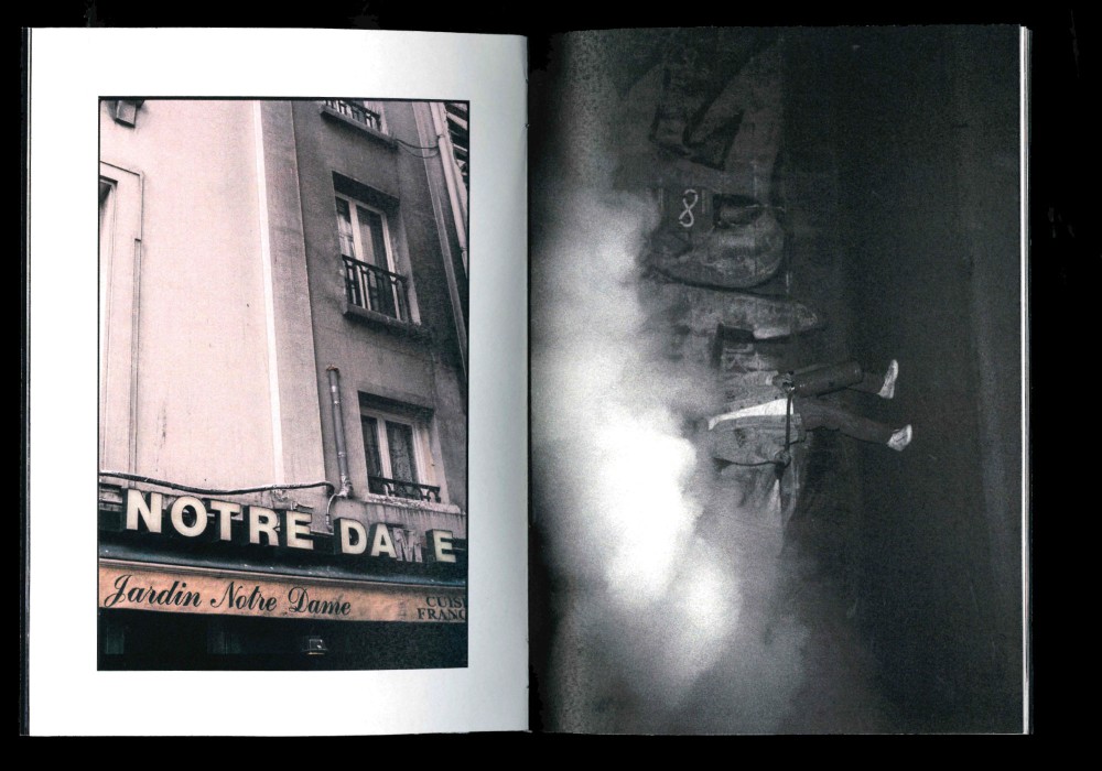
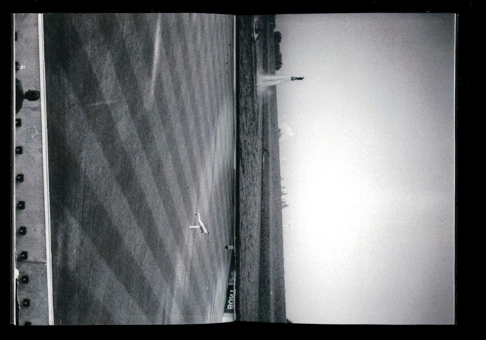
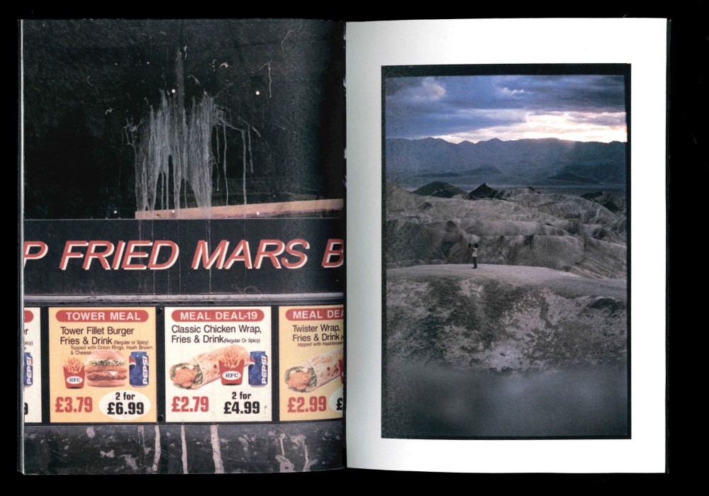
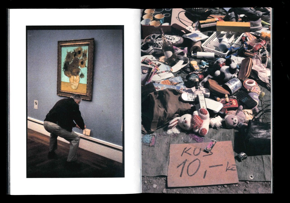
Investigating my private photographic archives in 2017 lead to this selfpublication. Analog photos taken in New York, Copenhagen, Basel, Vienna, Stuttgart and southern Germany.
Edition of 33 signed and numbered zines, saddle stitched with spine.
Sold at Mzin, Leipzig (Out of print).
Paper:
Metapaper Extrarough 105 g/m²